
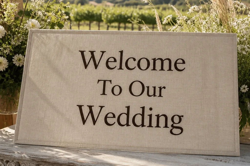
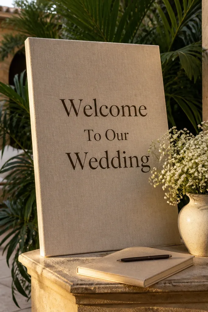
1. Oat linen sign with espresso "Welcome To Our Wedding"
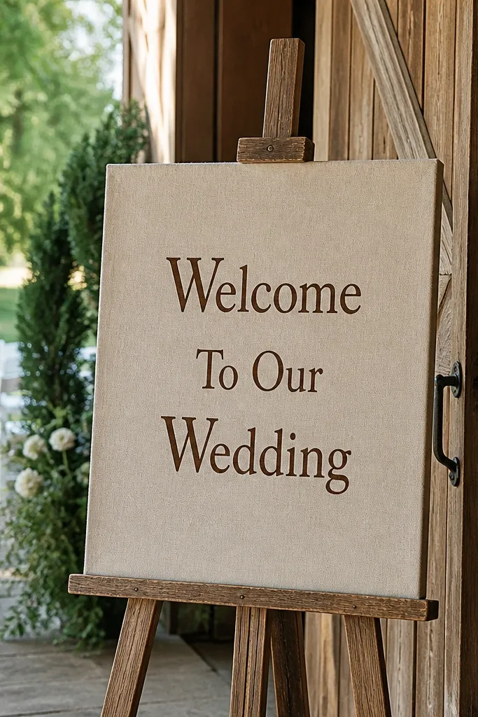
This is the safest “beautiful day” option because oat linen looks warm under daylight and soft indoor lighting. Espresso-brown lettering reads clearly without the harshness of pure black, which keeps the whole welcome area from feeling too stark. It works in gardens, barns, and historic venues because the tone sits between wood and greenery. Guests also tend to photograph better in front of it since the background doesn’t overpower skin tones. If you want your sign to look styled even when the table has minimal decor, this one delivers.
Quick tipIf you’re placing it outdoors, avoid direct midday sun so the texture doesn’t glare.
Start by choosing oat linen with a slightly off-white border area so the text has contrast. Then order the lettering in espresso brown using a thick font (serif or bold sans) so it stays readable from far away. Finally, mount it on a simple wooden easel or a flat board stand and set it at about 4 feet tall; angle it 10-20 degrees toward where guests enter.
Skip thisDon’t use light beige text on oat linen — it fades fast in photos.
2. Black linen welcome sign with ivory border and small serif dates
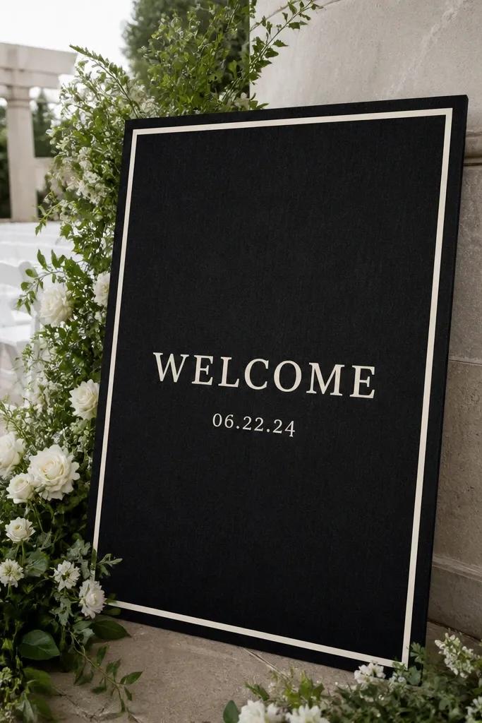
Black linen is dramatic in a good way. It makes the welcome message look intentional, like a printed poster, and it gives you clean contrast against greenery, white chairs, and light walls. Add an ivory border to frame the text and help it “hold” in wide shots where backgrounds get busy. Small serif dates keep it classy without crowding the main line. This design is especially photogenic for evening receptions where lighting is warmer and the sign becomes a dark anchor behind the guest flow.
Quick tipFor night events, position the sign where it catches ambient light from candles or string lights, not a single harsh spotlight.
Start with black linen and specify an ivory border width of about 1.5-2 inches so it shows in photos. Then use a bold, high-contrast font for “Welcome To Our Wedding” and keep the date line smaller, centered underneath. Finally, mount the sign on a matte black stand or a slim easel; place it near a clean background like a curtain or hedge edge to prevent visual clutter.
Skip thisSkip shiny vinyl lettering on black — it can reflect and wash out the text.
3. Ivory linen with deep navy lettering and a thin gold line divider
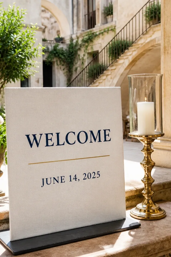
Ivory linen gives a soft, elevated look without going full wedding-white. Deep navy lettering feels crisp and modern, and it photographs clean against both warm and cool venues. A thin gold divider line is the trick that makes the layout look finished; it separates the main welcome line from the date line without adding extra clutter. This one is ideal for venues with white florals, navy bridesmaid dresses, or gold accents in table settings. It’s also a strong choice for hotels where the background is neutral and you want the sign to read instantly.
Quick tipKeep the gold line narrow (around 1/8 inch) so it reads as design, not decoration.
Start by selecting ivory linen with a matte finish. Then order navy lettering for the main phrase and include a date line in navy with a thin gold horizontal rule between the two lines. Finally, mount the sign in a simple frame or on foam board with a clean edge; place it on the welcome table or just beside it at roughly 4 feet so it appears above heads.
Skip thisDon’t stack extra icons or hearts — the gold divider already does the job.
4. Linen welcome sign with watercolor-style greenery arch
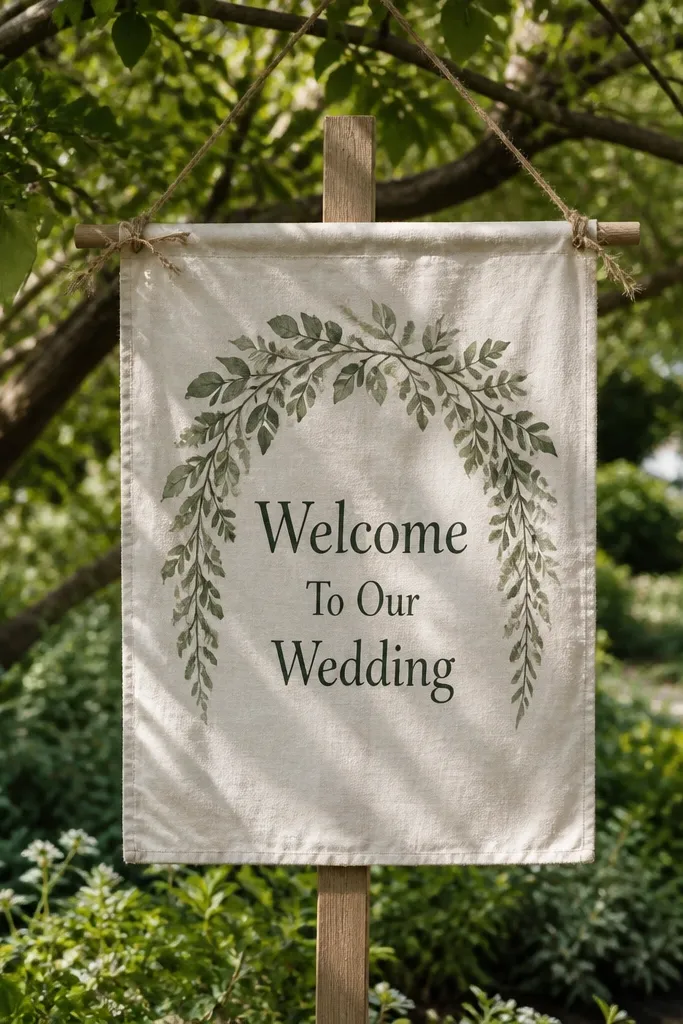
If you want a “beautiful day” look that still feels airy, add a watercolor-style greenery arch. The arch gives the sign a focal point and frames the guest’s eye so the main text lands fast, even in crowded photo backgrounds. Natural linen keeps the greens from looking too artificial, especially in daylight. This design is a perfect match for outdoor ceremonies, courtyard weddings, and rustic venues where you already have real plant textures. It also pairs well with welcome tables that have candles, terracotta, or dried botanicals.
Quick tipChoose greenery tones that match your real florals; mismatched greens look off in photos.
Start by choosing natural or oat linen as the base so the greens look balanced. Then pick a greenery arch artwork in muted sage and olive tones, and keep the lettering color dark (charcoal or deep green) for readability. Finally, use a stand that lets the sign lie flat and straight; angle it slightly toward the walkway so the arch frames the message from guest height.
Skip thisAvoid ultra-saturated neon greens — they overpower the linen texture.
5. Square linen welcome sign with centered monogram and "Welcome" in small caps
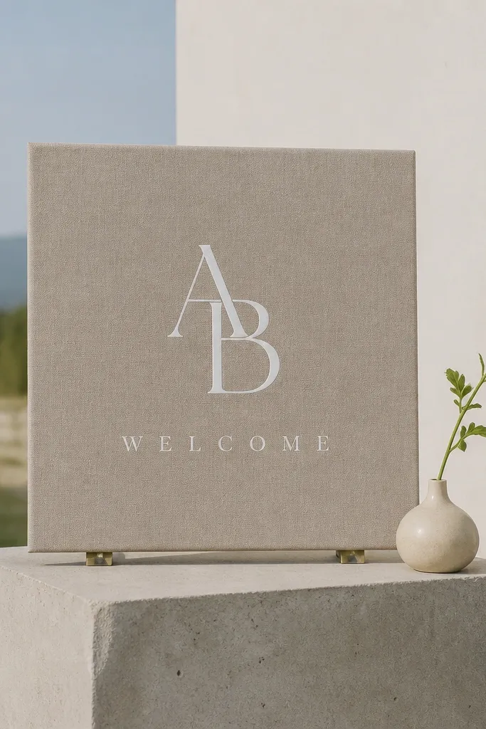
A square sign feels modern and graphic, which makes it easy to style with minimal decor. Center a monogram above the welcome line and use small caps for “Welcome” so it looks crisp, not busy. Linen keeps the whole thing soft instead of harsh, so even a monogram-heavy design feels wedding-friendly. This is great for couples who want clean branding without a full framed print. It also photographs well on welcome tables because the shape reads instantly in overhead and angled shots.
Quick tipMatch the monogram color to your cake topper metal or the sign-invite foil color.
Start by choosing square linen around 18x18 inches so it’s big enough for group photos but not too bulky for tables. Then order monogram initials in a darker color (black, espresso, or deep green) and keep “Welcome To Our Wedding” in small caps below. Finally, place it on a matching stand or mount it on a board with a slight shadow gap so it doesn’t look flat against the background.
Skip thisDon’t pick a thin monogram font — it disappears at distance.
6. Linen welcome sign on a driftwood-style stand with "Welcome" hand-lettered look
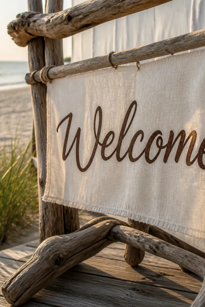
Hand-lettered style text looks intimate, but it can become messy if it’s too thin. The win here is pairing a hand-lettered look with linen so the texture makes the strokes feel intentional. A driftwood-style stand adds tactile texture that shows up beautifully in outdoor light and beachy setups. Keep the main phrase bold enough to read from 8-12 feet, then add the date smaller so it doesn’t compete with the lettering. This idea works best for beach weekends, coastal venues, and any place where wood textures are already part of the decor.
Quick tipIf your venue has strong winds, bring a weighted stand or sandbag — linen flutters and ruins photos.
Start with natural linen and specify a bold hand-lettered font style with thick downstrokes. Then add “Welcome To Our Wedding” as the main line and keep the date in a simpler small serif underneath. Finally, use a driftwood-style stand and place the sign near a natural texture background like a fence, driftwood pile, or tall grasses so it looks cohesive.
Skip thisSkip super-light lettering on this stand — the wood texture will steal attention.
7. White linen welcome sign with black lettering and a single red date line
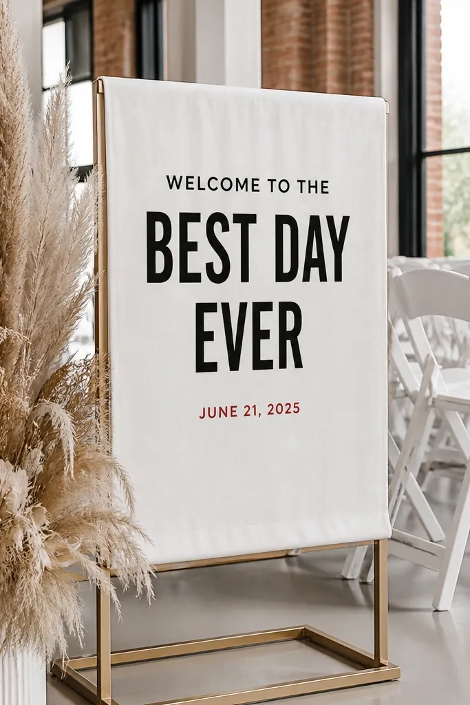
This one is clean, modern, and photo-friendly because it uses color like a design tool. White linen gives you a bright background that makes black text pop, then the red date line adds a strong focal accent. Guests notice the date quickly, and the sign becomes a strong anchor in both daylight and indoor receptions. It’s especially good for venues with lots of warm wood or cream upholstery since the red adds energy without turning the whole sign loud. Keep the red limited to the date line only so the look stays elegant.
Quick tipUse one red tone across your wedding paper suite so photos feel consistent.
Start with white linen and choose pure black lettering for the main phrase. Then set the date line in a deep red (not orange) and keep it centered with generous spacing. Finally, mount the sign flat on a simple stand and place it against a light background like a white wall, white curtain, or pale wooden panel so the red reads clearly.
Skip thisDon’t add red hearts or extra accents — the red is already doing the heavy lifting.
8. Linen welcome sign with border of pressed wildflowers
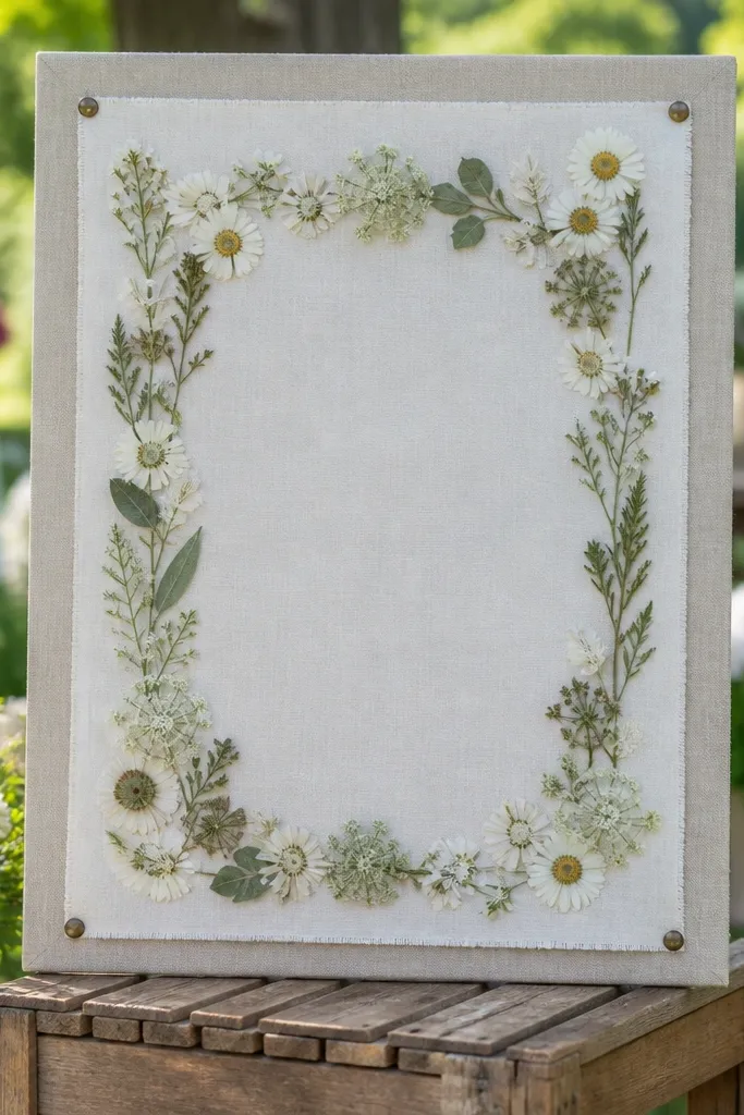
Pressed wildflower borders look like you collected them yourself, but the photo result is what matters: the sign feels seasonal and tactile. Linen is the perfect base for small botanical details because it softens the edges and keeps the border from looking harsh. This idea is ideal for spring and early fall weddings where you want the welcome area to feel organic, not generic. It also pairs well with rustic tableware, kraft paper programs, and natural twine. The best versions keep the flowers subtle and let the welcome message stay the hero.
Quick tipIf you’re using a border with lots of tiny shapes, keep the sign text larger than you think so it still reads at a distance.
Start by choosing oat or natural linen for the base. Then pick a dried-flower style border in a limited palette (cream, sage, muted yellow) and keep the text color dark charcoal for readability. Finally, mount the sign in a way that keeps it perfectly flat; use clips or grommets to avoid ripples, and place it where guests can read it without leaning in.
Skip thisAvoid overly dark flower borders — they make the sign look heavy and muddy in photos.
9. Linen welcome sign with watercolor sunset gradient behind the date
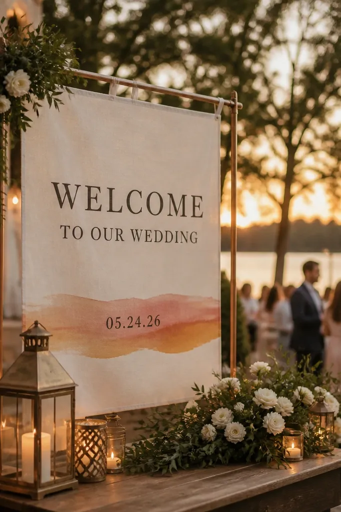
A sunset gradient behind the date turns a simple welcome sign into something guests want to photograph. Linen helps the gradient look softer, not like a flat print, and it adds warmth to evening receptions. Keep the gradient limited to a narrow band behind the date so the main welcome line stays crisp. This is a strong choice for outdoor ceremonies around golden hour, rooftop weddings, and any venue where the sky is part of the vibe. It also works well with warm candlelight and terracotta accents.
Quick tipPlan the sign position so it faces the direction guests will walk from — you want the gradient to be visible, not blocked by people.
Start with ivory linen and choose a gradient that fades from peach to dusty rose or warm gold. Then place “Welcome To Our Wedding” in dark ink across the top and keep the date centered inside the gradient band. Finally, mount the sign on a stand with a slight tilt toward the sky so the gradient looks intentional in camera angles.
Skip thisDon’t put the gradient behind the whole line of text — it reduces legibility.
10. Linen welcome sign with minimalist frame and "Welcome" in bold sans
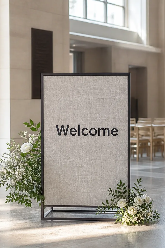
Minimalist frames look expensive because they don’t ask for attention — they earn it with spacing and alignment. A thin frame around the edges gives the sign structure, while bold sans lettering reads clean in both wide and detail photos. This is a great option for modern venues, black-and-white wedding themes, and couples who want decor that doesn’t compete with florals. Linen keeps it from looking too corporate. If your welcome table already has lots of items, this design keeps the overall setup from feeling crowded.
Quick tipUse consistent margins: leave at least 1 inch of blank space between the text and the frame.
Start with natural linen and pick a thin border frame color like black, charcoal, or deep green. Then order bold sans lettering for “Welcome To Our Wedding” and a simple date line underneath in the same color. Finally, place it on a clean welcome table surface or hang it on a backdrop; keep it centered and at about 4 feet so it’s readable in group shots.
Skip thisSkip script fonts here — minimalist frames make thin lettering look messy.
11. Linen welcome sign with oversized ampersand and simple date
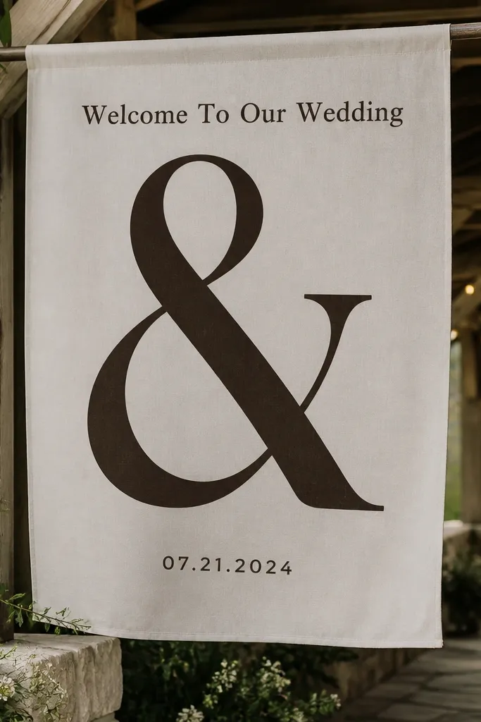
Oversized ampersands photograph like design posters. They give your welcome sign personality without adding clutter, and linen makes the symbol look soft instead of overly graphic. Put the ampersand large in the center, then keep “Welcome To Our Wedding” as a smaller line above or below. A simple date line finishes it cleanly. This idea works best for couples who want something stylish but not overly decorated. It’s also perfect for venues with strong architecture like brick walls, white pillars, or modern staircases.
Start with ivory or oat linen for a calm background. Then choose a bold ampersand in black or deep navy and keep the welcome line in a clean sans or serif small caps. Finally, mount the sign on a sturdy stand and position it where the background is plain; busy backgrounds make the ampersand fight for attention.
Center the ampersand exactly — off-center placement shows up in photos.
Avoid multi-color lettering — the ampersand should carry the visual weight.
12. Linen welcome sign with sailboat or coastal line art in muted ink
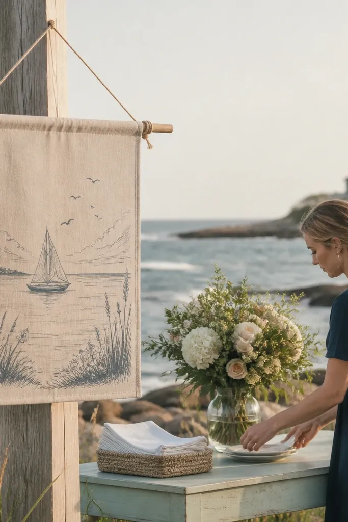
Coastal line art is one of the best ways to make a welcome sign feel themed without turning it into a cartoon. Muted ink on linen looks grown-up, and the texture keeps the lines from looking too sharp or digital. Place the line art above the welcome text so the message stays primary. This works for beach ceremonies, lakeside vows, and any venue where you want subtle references to the location. Guests also tend to love signing their names near the sign when it has open space around the text.
Start with natural linen and choose line art in a muted color like deep teal, slate gray, or espresso. Then set “Welcome To Our Wedding” in a darker ink that matches the line art so everything feels cohesive. Finally, mount the sign on a stand with a flat base and keep it near a guest book or card table so it’s part of the welcome routine.
If your beach is windy, bring binder clips or a fabric-safe weight for the stand.
Don’t use bright sky-blue line art — it clashes with linen’s warm tone.
13. Linen welcome sign with circular monogram wreath and date on bottom
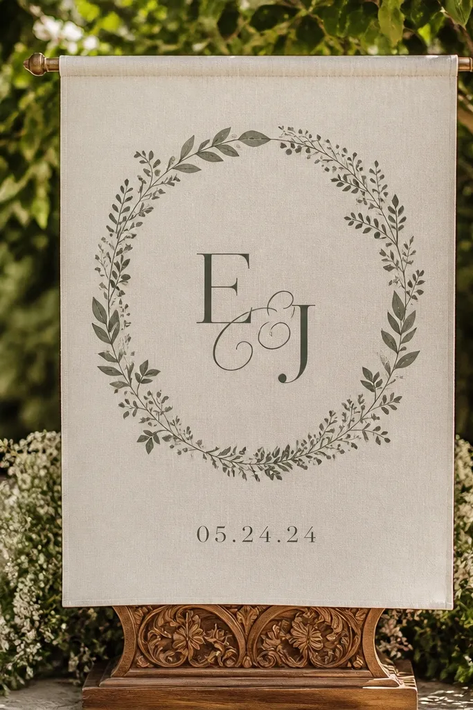
A circular wreath layout creates a natural frame for guests, and it reads well in photos because the shape stays consistent even with busy backgrounds. Use a monogram in the center and a ring of small botanical elements around it. Then place the date at the bottom in a clean, readable font so the sign feels structured. Linen keeps the wreath looking soft and handmade, not printed-on-top. This is a strong fit for garden weddings and classic venues where you want traditional styling with a modern base.
Start with oat or natural linen. Then order a circular wreath design with a monogram in the center and keep the main “Welcome To Our Wedding” line either above or integrated around the top arc. Finally, mount it on a stand that keeps the sign straight; place it near greenery so the wreath matches the environment rather than competing with it.
Choose small botanical shapes in muted greens so the monogram stays the focal point.
Avoid heavy, thick wreath borders — they look bulky and swallow the text.
14. Linen welcome sign with gold foil effect lettering and neutral linen base
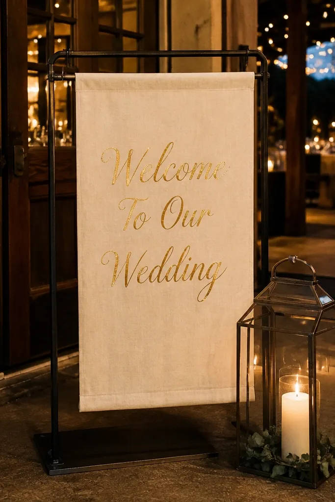
Gold-toned lettering on neutral linen looks like a luxury stationery moment, especially under string lights or warm indoor lamps. The key is keeping the layout simple so the gold reads as a highlight, not a glitter bomb. This design is great for evening receptions, ballroom weddings, and couples who want a clean aesthetic with a touch of sparkle. Linen makes the gold look softer and more wearable than glossy paper, which can reflect too much. If your welcome table has candles, it pairs beautifully because the glow brings the lettering alive.
Quick tipTest your lighting direction: if the sign is backlit, the gold can look muted in photos.
Start with neutral linen like oat or light beige. Then choose gold-toned lettering for “Welcome To Our Wedding” and keep the date in a darker ink color so it stays readable. Finally, mount the sign in a place where it gets ambient light but not direct glare; a corner near candles or uplighting works well.
Skip thisSkip all-gold layouts where the date is also gold — it often loses contrast.
15. Linen welcome sign with large arrow pointing to guest book table
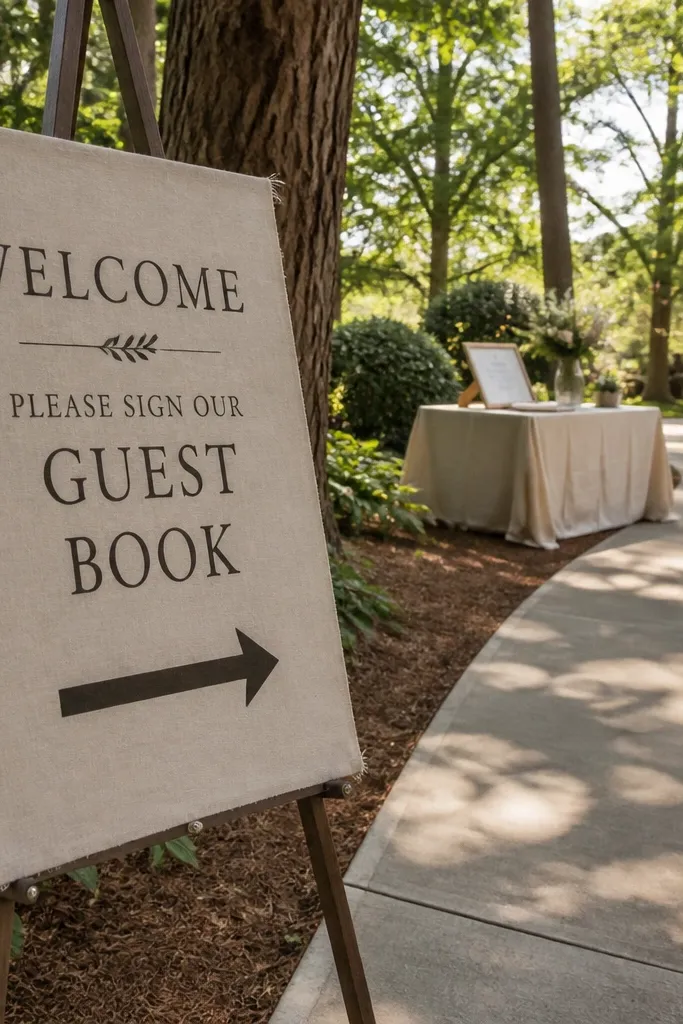
This is the practical, photo-friendly move. A large arrow makes the welcome sign feel functional, and it also guides guests so they naturally cluster near the guest book area for photos. On linen, the arrow looks graphic and clean, not like an afterthought. Use dark lettering for the welcome message and keep the arrow color consistent with the lettering so it looks designed. It’s especially useful for venues where the entrance path splits or where guests need direction from the parking drop-off. The result is a sign that looks good and improves the flow.
Quick tipMatch the arrow direction to how guests physically walk, not how it looks on a map.
Start with ivory or natural linen and design “Welcome To Our Wedding” at the top in bold, readable type. Then place a large arrow beneath it pointing toward where the guest book sits; keep the arrow thick enough to read from 10 feet. Finally, set the sign at the main entrance line of sight and angle it so guests see the arrow immediately without turning around.
Skip thisDon’t place the guest book behind the arrow — the arrow should point to the exact table location.



