
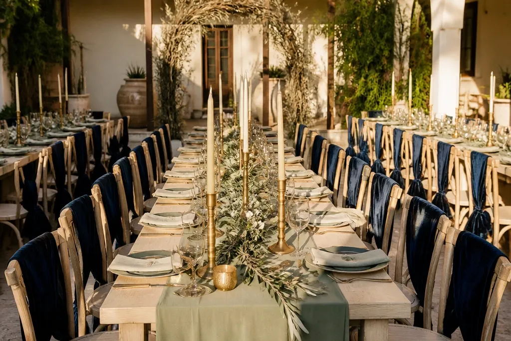
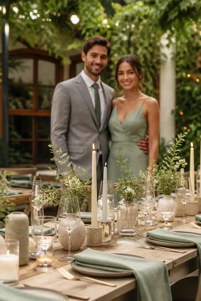
1. Smoked Rose + Oat Linen + Antique Brass
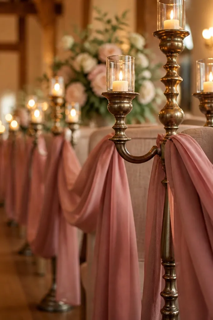
This palette reads romantic without turning pink-on-pink. Smoked rose is muted and forgiving, so it looks good against beige walls and tan wood. Oat linen keeps everything soft and grounded, and antique brass adds warm glints that show up beautifully in candlelight. It works especially well for fall weddings and indoor venues where warm lighting can otherwise wash out bright colors.
Start by choosing oat linen as your base for table runners and napkins. Then build florals around greenery plus smoked rose blooms like garden roses or peonies if you can get them. Finally, add antique brass in small doses — candle holders, menu frames, or a thin metallic ink on signage — and keep the rest matte. For booking, decide your anchor color first, then choose florals that match it in tone, not just “rose-colored.” Spend about 1.5-2 hours collecting sample images of smoked rose in daylight and in warm indoor light to confirm it doesn’t go dusty.
Ask your florist for a “muted rose” reference board, not a bright pink one.
Don’t add hot fuchsia or magenta accents — they make smoked rose look gray instead of soft.
2. Deep Emerald + Cream + Blackened Steel
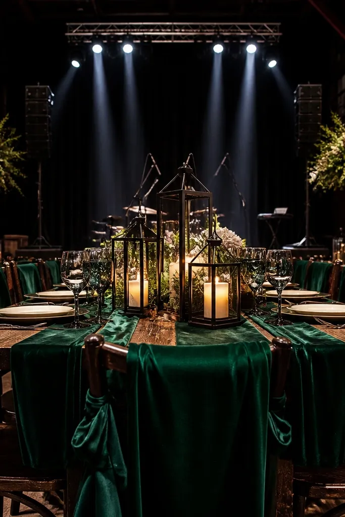
Deep emerald gives you instant drama, but cream keeps it classy instead of heavy. Blackened steel adds a modern edge that photographs sharply, especially in venues with dark wood or industrial beams. This scheme is great when you want bold photos with clean contrast and minimal color clutter. It also flatters a wide range of skin tones because emerald is saturated without being neon.
Start with cream as your base — linens, invitations, and any off-white signage. Then pick deep emerald as the secondary for table runners or bridesmaid dresses. Add blackened steel through candle holders, flatware rentals, or even a dark slate cake stand. For travel planning, confirm your venue lighting: if the room is dim, add extra cream in paper goods so the palette doesn’t collapse into dark tones. Book rentals early because black metal items are popular and get booked out first.
Use matte cream, not glossy satin, so the emerald color stays the star.
Skip bright teal or turquoise — they shift emerald toward a pool-party look.
3. Cocoa Brown + Warm Ivory + Burnt Orange
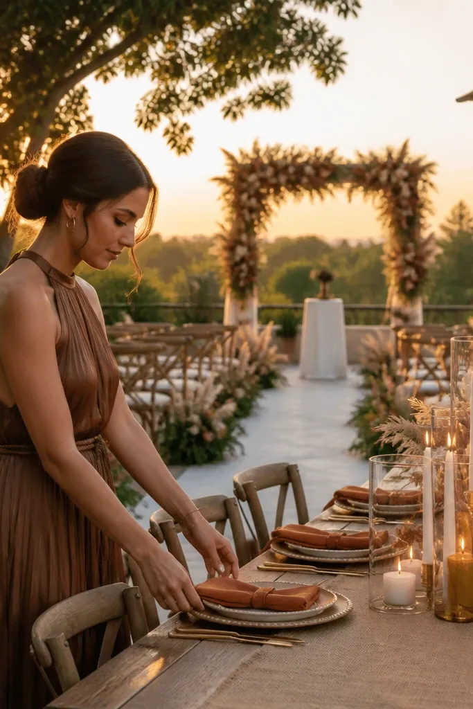
Start with warm ivory for linens and invitation paper so your photos don’t look too dark. Then place cocoa brown in your florals and larger decor pieces — think dried seed heads, cocoa-toned foliage, or brown velvet ribbons. Finally, add burnt orange as the pop through flowers like marigold-toned blooms, orange ranunculus, or dried orange accents. Plan your palette check in golden hour: if it looks good at 5:30 pm, it will photograph well later. Allocate extra time for floral sourcing because burnt orange blooms can be seasonal and vary by farm.
This is the palette for weddings that want cozy, not “rusty.” Cocoa brown looks rich in photos, especially with greenery and soft candlelight. Warm ivory keeps the room bright and clean, and burnt orange adds a sunset pop that reads intentional. It’s perfect for outdoor ceremonies where the background has greenery or dry grass. The color combo also works beautifully with wood textures and neutral stone.
Skip thisDon’t pair cocoa with icy gray — it makes the whole palette feel cold and lifeless.
Quick tipBring a small swatch of cocoa brown fabric to your florist consult — “brown” can mean five different shades.
4. Lavender Smoke + Pearl White + Soft Pewter
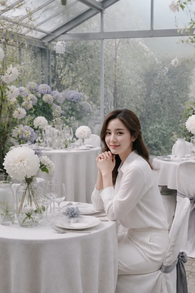
Start with pearl white as the base across table linens, ceremony signage, and any lace details. Choose lavender smoke as the secondary in napkins, bridesmaid dresses, or a single main floral color. Add pewter through candle trays, picture frames, or metallic ink for menus. For logistics, bring your venue lighting schedule into the plan: if the ceremony is outdoors and reception is indoors, keep lavender as the controlled color and let pearl do the brightening. Book pewter rentals early if your wedding is during peak spring weekends.
Lavender smoke gives you a dreamy, slightly dusty tone that feels elevated without being loud. Pearl white makes the palette crisp and bright, and soft pewter adds depth without turning the look industrial. This scheme is a hidden gem for spring and early summer weddings where you want color that still feels airy. It also looks great in outdoor shade because lavender holds its tone without washing out.
Skip thisAvoid bright lilac — it reads childish next to pearl white in flash photos.
Quick tipMatch lavender to the undertone of your venue — if the room is yellow, pick lavender smoke with a slightly cooler cast.
5. Powder Blue + Sandstone + Brushed Gold
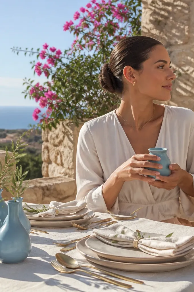
Powder blue is soft and photogenic, but it needs a warm partner to avoid looking like a baby shower. Sandstone does that job — it brings in the warm, creamy beige tones you see in Mediterranean tiles and desert venues. Brushed gold adds a refined warmth that looks great in sunlight and on evening tables. This palette is especially good for destination weddings because it stays flattering in bright natural light.
Start by choosing sandstone for ceramics, charger plates, or table decor bases. Then use powder blue as your primary color in napkins, table runners, or floral ribbons. Finish with brushed gold in place cards, light fixtures, or candle holders. When you pack or plan, prioritize fewer, larger items in powder blue so it shows clearly in photos. Give yourself time to source sandstone tones because “beige” varies wildly — aim for a warm, creamy beige, not gray-beige.
Test powder blue against your venue wall color during a walkthrough photo in daylight.
Don’t add silver — powder blue plus silver can look flat and cold.
6. Black + Cream + Electric Lime Accents
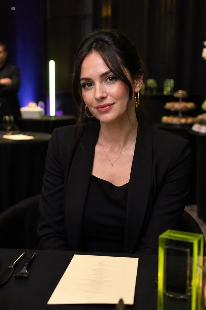
Start with black for linens or chair accents, then lock in cream for napkins, menus, and any signage background. Add electric lime only in controlled points: ribbon on bouquets, a few bright flowers, or a thin stripe on escort cards. For decor, keep black matte and cream matte; shiny fabrics can create glare. If you’re traveling, plan your lime accents last because matching a specific shade is harder than matching neutrals. Budget time for dye lots or ribbon shade checks so lime doesn’t turn neon-yellow in photos.
This is a high-contrast scheme that looks modern in every photo angle. Black and cream create the clean structure, while electric lime accents add a pop that reads clearly even in crowded reception shots. It’s a great fit for urban venues, night receptions, and venues with dark decor where you want the palette to stand out. The lime is small and intentional, so it stays tasteful instead of chaotic.
Skip thisSkip multiple neon colors — lime plus another bright tone makes the whole palette look noisy.
Quick tipPick one lime accessory type and repeat it across the room, like only ribbons.
7. Terracotta Dust + Sage Green + Antique White
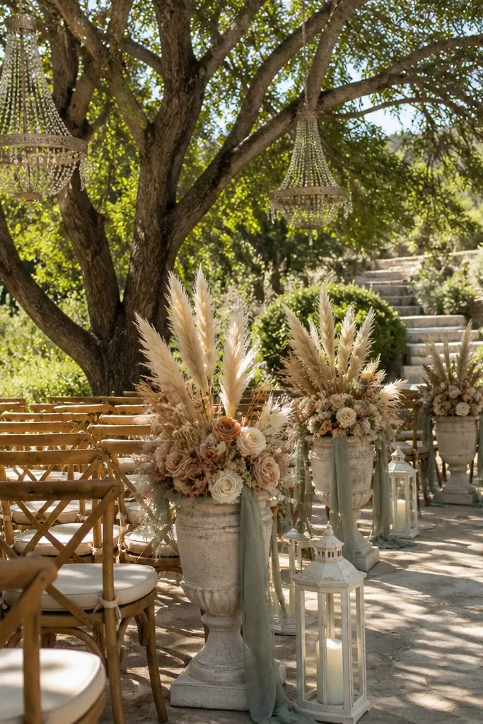
Start with antique white as your base for tablecloths, ceremony fabric, and paper goods. Then use terracotta dust in table runners, terracotta-toned ceramics, or burnt clay ribbons. Add sage green through eucalyptus and soft sage blooms like dusty miller or pale green hydrangea. Plan your centerpieces around shape: use tall greenery to pull the eye upward and keep terracotta mostly in the table layer. Book early if you want real terracotta planters — they get reserved for multiple weddings.
Terracotta dust is muted enough to look grown-up, not orange-flashy, and it pairs perfectly with sage for that natural, airy vibe. Antique white keeps the palette bright, which matters if your venue has warm lighting. This scheme is one of the best hidden gems for outdoor weddings because it looks like it belongs with plants and stone. It also photographs well with dried textures and airy greenery.
Skip thisDon’t use bright tomato red with terracotta dust — it turns the palette into a sports-team look.
Quick tipBring a terracotta clay sample to your rental shop to match undertones.
8. Navy Ink + Porcelain Pink + Copper
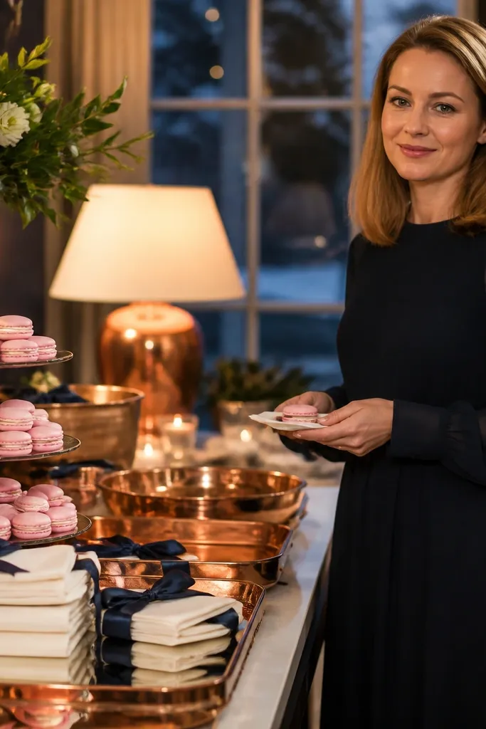
Navy ink gives you crisp structure and makes every lighter color look intentional. Porcelain pink is a soft, slightly muted rose that doesn’t scream for attention, and copper adds warm sparkle without going full gold. This palette is a strong choice for winter weddings because it holds contrast in low light. It also looks great on paper — navy ink with copper foil is a photo magnet.
Start with navy ink for invitations and signage — choose matte paper so the navy looks deep, not glossy. Then use porcelain pink in bridesmaid dresses or the main floral color. Add copper in candle holders, menu frames, or a thin accent line on stationery. For travel planning, build your palette around what you can ship: paper goods and candle trays travel better than large florals. Give yourself two weeks for stationery proofing so copper foil doesn’t arrive too warm or too dull.
Ask for navy that leans slightly cool; warm navy can make porcelain pink look peachy.
Skip bright fuchsia — it clashes with navy and makes porcelain pink look washed out.
9. Forest Green + Ivory + Deep Teal Watercolor Florals
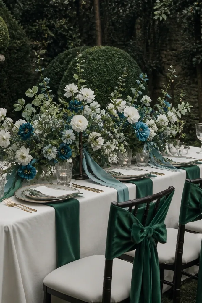
Start with ivory as the base for linens and tablecloths. Then choose forest green for larger decor pieces like drapes, ceremony backdrops, or napkins. Add deep teal in controlled points through ribbon, a few floral varieties, or a watercolor-style printed detail on menus. For best results, keep teal to one “family” — one shade across all items — so it doesn’t look random. Plan your floral schedule around availability because deep teal blooms can be seasonal and may need substitution.
Forest green feels grounded, and ivory keeps it bright. The hidden gem is deep teal used like watercolor — not a full teal takeover, just splashes through florals and ribbons. This gives you an artistic look that still reads clean in photos because the base colors are stable. It’s ideal for moody venues, garden spaces at dusk, and receptions with lots of greenery.
Skip thisDon’t add bright turquoise — it makes the look feel beachy instead of moody.
Quick tipUse teal in smaller areas near candlelight so it catches highlights instead of blending into shadows.
10. Blush Sand + Charcoal + Soft Gold Highlights
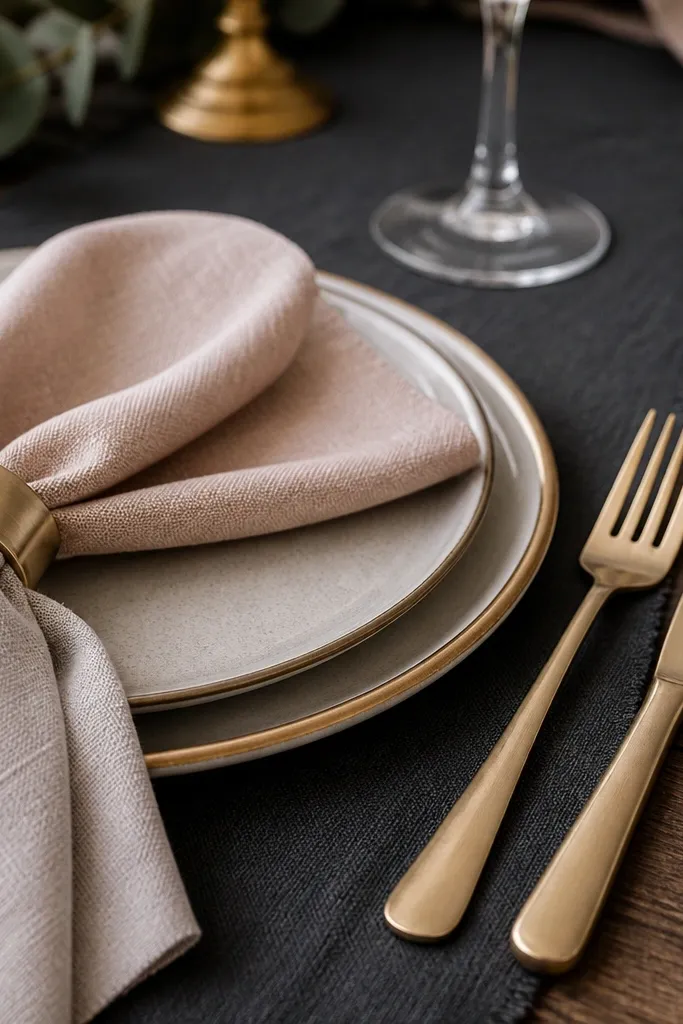
Blush sand is a neutral blush that sits between pink and beige, which makes it forgiving with different skin tones and venue wall colors. Charcoal gives you the contrast backbone, and soft gold highlights add warmth without looking too glam. This palette is photogenic because it creates a smooth gradient from light to dark across the room. It fits modern venues, hotel ballrooms, and city rooftops where backgrounds can be visually busy.
Start with charcoal for table linens or chair wraps, then use blush sand for napkins, signage, and bridesmaid fabrics. Add soft gold only as highlights: small candle trays, frame edges, or a thin gold line on place cards. Keep the gold matte or brushed, not mirror-polished, so it doesn’t produce harsh glare. For travel logistics, pack a few fabric swatches for blush sand and charcoal so your rentals match on arrival. Schedule a mock layout photo at the venue so you can correct any undertone mismatch before setup day.
Blush sand should look warm in daylight; if it looks gray, switch brands or dye lots.
Skip bright white next to charcoal — it can look stark and cheap in flash.
11. Pearl Gray + White + Smoke Blue Ribbon Details
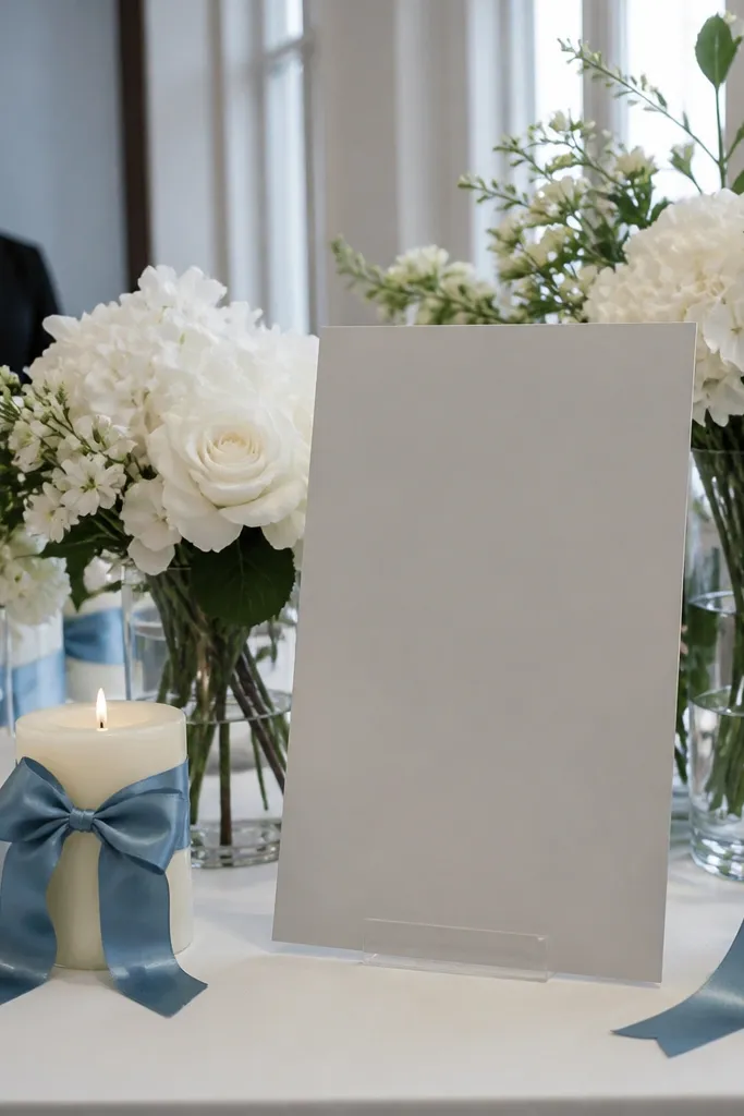
Pearl gray is one of those hidden gems that reads clean and modern without feeling cold. White keeps everything airy, and smoke blue ribbon details add a gentle pop that still looks refined. This scheme is perfect for weddings where you want color but the venue is already visually loud. It also photographs beautifully in both overcast daylight and indoor lighting because pearl gray stays stable.
Start with white linens and paper goods as the base. Then choose pearl gray for napkins, chair accents, or a textured runner. Add smoke blue in one place category — ribbon on bouquets and maybe a small printed accent on menus — so the color stays controlled. For cost, this palette can be cheaper because you don’t need a wide range of floral colors; greenery plus one smoke blue tone does it. Book ribbon and fabric early because ribbon shade is where “smoke blue” often goes wrong.
Match smoke blue to the color of your venue sky or outdoor background if you’re doing outdoor portraits.
Don’t add navy flowers — smoke blue details will look muddy next to true navy.
12. Ivory + Caramel + Deep Burgundy Wine Tones
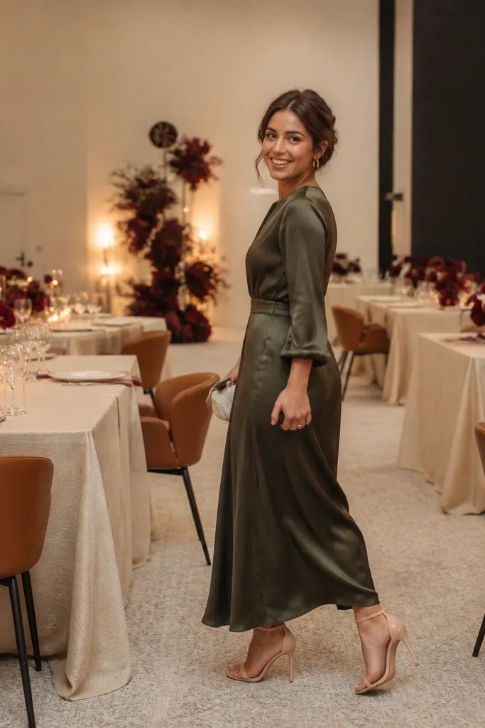
This palette is cozy and upscale, and it reads warm even in indoor venues with beige carpeting. Ivory and caramel create a soft base, and deep burgundy adds the “photo punch” without turning into a Halloween vibe. It’s a strong choice for fall and early winter because wine tones look rich against greenery and candlelight. It also works well for candle-heavy receptions where you want colors to glow instead of flatten.
Start with ivory linens and invitation paper so the room looks bright. Then add caramel through runners, leather-like accents, or caramel-toned dried elements like wheat or seeded branches. Finish with deep burgundy as the pop in florals and napkin folds. Choose burgundy that leans slightly plum, not bright red, to keep it elegant in flash. Plan your floral budget around burgundy because that’s the expensive color; keep everything else neutral and repeat it across tables.
If your venue lighting is yellow, choose burgundy with a cooler plum undertone.
Skip bright red — it makes caramel look orange and burgundy look thin.
13. Coral Rose + Sea Glass Teal + Whitewashed Wood
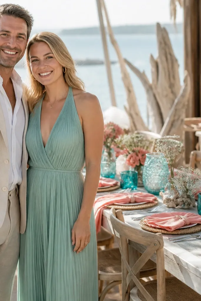
Coral rose is a softer alternative to classic coral, and it plays nicely with sea glass teal for that coastal-y but not beach-themed look. Whitewashed wood adds a light, airy texture that photographs well in daylight and reduces the “too much color” feeling. This palette is a hidden gem for spring and summer destination weddings where you want color that still feels clean against sand-colored backgrounds. It’s also great for outdoor ceremonies where the sky is bright.
Start with whitewashed wood elements: welcome signs, escort card boards, or table number stands. Then use coral rose in napkins or small floral clusters, keeping it lighter than you think so it doesn’t overpower teal. Add sea glass teal through greenery, ribbon, and a few teal-forward flowers. For travel, prioritize items you can transport flat: paper goods and signage, plus ribbon bundles. Allow time to source sea glass teal because it’s easy to accidentally buy turquoise that’s too saturated.
Pair coral with matte textures, not shiny satin, so it reads soft in sun.
Don’t add navy — teal + navy can look like pool accessories instead of wedding decor.
14. Pistachio + Soft Cream + Toasted Wheat Gold
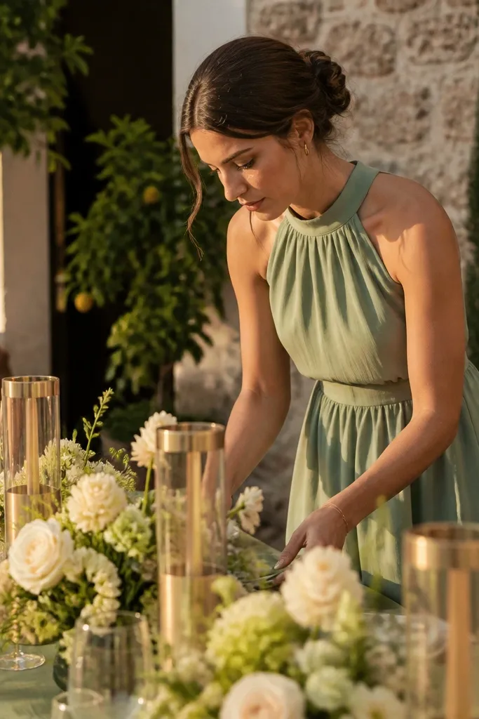
Start with soft cream as the base for linens and paper goods. Then use pistachio in table runners, bridesmaid dresses, or the main floral greenery tone. Add toasted wheat gold in small metallic touches like candle trays, frame edges, or a subtle gold stamp on invitations. For photography, keep the pistachio matte and avoid glossy finishes that can reflect harsh highlights. Book metallic rentals early for peak spring weekends because gold tones get snapped up.
Pistachio is a gentle green that feels fresh without going neon. Soft cream keeps the palette clean and bright, and toasted wheat gold adds warm, sunlit sparkle that looks great in both natural light and candlelight. This scheme is a hidden gem for weddings that want “spring energy” without the usual pastel overload. It also looks stunning when your venue has lots of plants or pale stone.
Skip thisSkip lime green — pistachio should look like a muted herb, not a highlighter.
Quick tipBring a pistachio swatch to your venue walk-through to check it against your wall color under daylight.
15. Sapphire Night + Porcelain White + Silver Leaf Paper
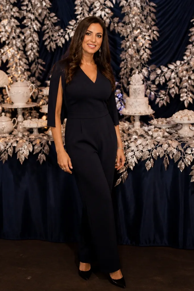
Sapphire night gives you a rich, jewel tone that photographs dramatically without needing heavy decor. Porcelain white keeps the palette crisp, and silver leaf paper details add a modern glow that shows up in close-ups. This scheme is ideal for evening receptions and indoor venues where you want color to look deep, not washed out. It also works well when you want your photos to feel cinematic.
Start with porcelain white for linens and signage backgrounds. Then pick sapphire night for larger fabric elements like drapes or napkins, and keep it consistent across the room. Add silver leaf through stationery — menus, place cards, and envelope liners — rather than scattering metallic decor everywhere. Travel-wise, paper details are easy to handle and cost-effective, so use them to get the “special” look. Plan for proofing the silver leaf effect because it can look more gray or more bright depending on paper stock.
Keep sapphire under control: one strong fabric item per area looks better than trying to cover everything in blue.
Don’t pair sapphire with warm antique gold — it can fight the cool tone and flatten the jewel look.



