
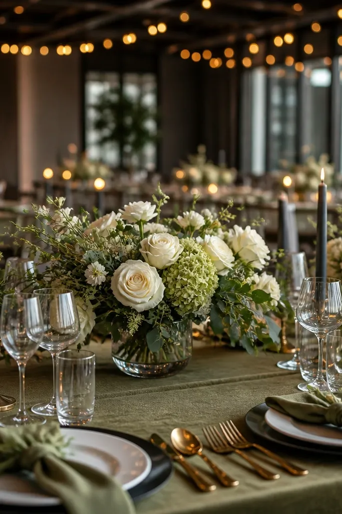
1. Olive + Cream + Dusty Rose Table Garden
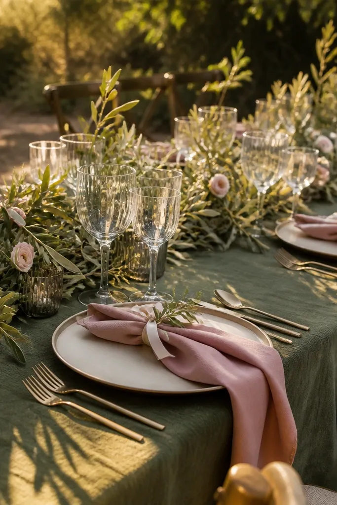
Start by choosing cream as your dominant neutral for plates, linens, or charger plates. Then build the accent through dusty rose in flowers and small paper details like menus or place cards. Finally, repeat olive in at least two places beyond the napkin — ribbon on the ceremony program and olive-toned candle holders or votive glass wraps. For a realistic build, aim for 2-3 rose tones: dusty rose main blooms, a lighter rose filler, and a small amount of deep rose for contrast. Budget-wise, spend more on the flowers that read at distance (roses/dahlias) and use olive foliage as the “cheap volume” that ties everything together.
This scheme keeps olive from looking heavy by anchoring it with cream and then adding dusty rose as the romance color. Olive foliage stays the star, while dusty rose brings softness that shows up nicely in both daylight and evening. It’s a strong fit for outdoor spring and early fall because the palette echoes gardens without copying a “green wedding” cliché. For winter, it still works because cream and dusty rose read warm against darker venues and wood tones. The look is photogenic because the colors separate cleanly: cream is light, olive is grounded, dusty rose is the human-flattering pop.
Skip thisSkip using silver everywhere — it can make olive look harsher and flatten the rose tones.
Quick tipIf your venue has cool overhead lighting, switch to cream cardstock and warm gold ink so dusty rose doesn’t turn gray.
2. Olive + Terracotta + Charcoal Modern Farmhouse
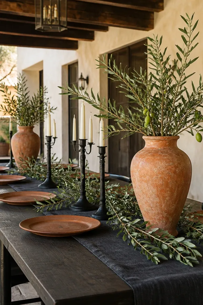
Pick olive as the base through linen napkins, table runners, or bridesmaid dresses. Then choose terracotta for the flowers and the accent color on signage, like place cards or welcome boards. Add charcoal as your secondary neutral using ink, candle bases, or chair covers. Work in 2 flower types plus foliage: terracotta dahlias or cosmos, with olive eucalyptus or olive branches. For travel planning, if you’re hosting away from home, pack or pre-order charcoal paper goods early because last-minute substitutions show up fast in photos.
Olive and terracotta look made for each other because they both sit in warm earth tones, but terracotta adds the orange warmth olive lacks. Charcoal keeps the palette modern and prevents it from reading too rustic. This is the scheme I’d pick for a venue with brick, dark wood, or industrial ceilings because charcoal and black accents hold up in shadowy photos. Terracotta also photographs well at sunset, where it glows instead of dulling. The overall effect is grounded and elegant without feeling overly “country.”
Skip thisDon’t mix terracotta with bright coral; it makes the whole palette look neon under warm lighting.
Quick tipUse matte charcoal cardstock, not shiny black — matte reads softer and more expensive under flash.
3. Olive + Ivory + Deep Plum Night Garden
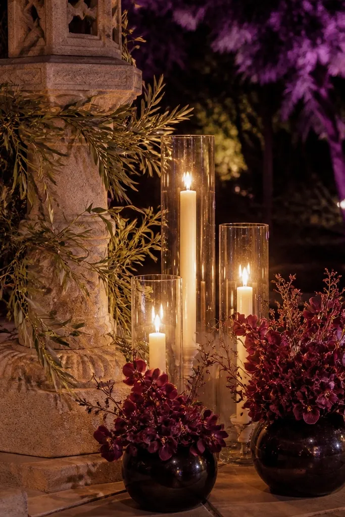
Start with ivory for table linens, ceremony draping, or the base color of your stationery. Then choose plum as your accent through napkin rings, ribbon, or a portion of your floral palette (anemones, lisianthus, or plum-toned blooms). Add olive via foliage and a few small textile hits like olive ribbon on the menu. For a cohesive floral look, keep plum to about 20-30% of the bloom mix and let olive foliage do the rest. Plan lighting early: if you’re doing candles or string lights, schedule a test photo with your exact bulbs so the plum reads rich, not brown.
Deep plum turns olive into a night-garden palette that looks dramatic in evening photos. Ivory keeps everything bright enough that the plum doesn’t swallow the scene. This scheme is perfect for late fall and winter because plum looks natural against dark venues and warm candlelight. It also flatters skin tones because the contrast is strong but not harsh. If you want your wedding to look “intentional” rather than just pretty, this one does it through contrast and depth.
Skip thisAvoid burgundy-red instead of true deep plum — it can clash with olive and pull everything toward brown.
Quick tipUse brass or antique gold hardware with plum; it prevents the palette from looking cold.
4. Olive + Sage + Champagne Minimal Ceremony
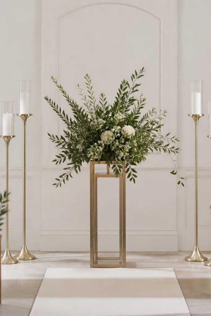
This is the “quiet luxury” olive look with minimal color chaos. Olive and sage are siblings, so the palette stays cohesive and clean. Champagne adds warmth and a subtle glow that reads well in high-contrast venues like modern hotels or white-walled chapels. This scheme works year round because it doesn’t depend on seasonal flower colors; the greenery does the heavy lifting. The aesthetic is clean, photogenic, and easy to execute if you keep your design consistent and light on competing accents.
Choose champagne or warm ivory tableware so the palette stays luminous. Use olive primarily through greenery-heavy centerpieces and taper candle labels. Then layer sage in the florals and any hanging greenery so you get dimension without adding a third accent color. For paper goods, stick to white or cream cardstock with olive ink and one champagne-gold foil detail. Timing tip: order any custom stationery at least 4-6 weeks out so you can approve ink tone under daylight.
Aim for varied leaf shapes — olive olives, eucalyptus, and olive-like branches — because texture does the work when colors are close.
Skip bright neon greenery (like lime) — it makes sage-and-olive palettes look cheap fast.
5. Olive + Mustard + Cream Vintage Market

Start with cream linens and warm-toned glassware like amber or clear with a slight tint. Add mustard through flowers like marigolds, dried-style blooms, or mustard-toned ranunculus. Use olive foliage as the glue and add small olive details on signage with olive ink. For a market vibe, build centerpieces in glass jars or low bud vases, mixing heights so the table looks natural. Keep mustard to about 10-25% of the palette so olive still feels dominant and elegant.
Mustard adds a sunny, vintage warmth that makes olive feel intentional instead of muted. Cream keeps the look airy, so your photos don’t get heavy. This scheme is especially good for fall weddings because mustard reads like late-season harvest without turning into a Halloween palette. It also photographs well in golden-hour light because mustard blooms reflect warmth instead of turning muddy. If you want something that looks “collected” and styled rather than uniform, mustard gives you that lived-in charm.
Skip thisDon’t pair mustard with bright white — it makes the palette look harsh and less vintage.
Quick tipUse kraft envelopes or kraft cardstock with olive ink for place cards — it makes mustard look richer without extra colors.
6. Olive + White + Soft Gold Modern Romance
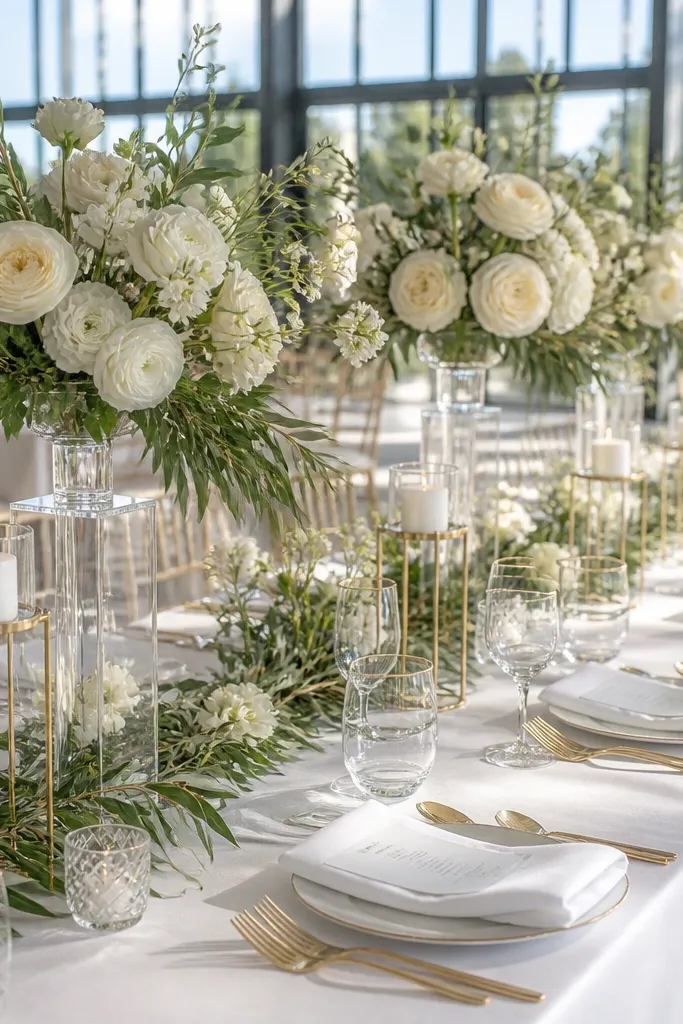
Choose white for the base — tablecloth, napkins, or ceremony drape — then add olive as the runner and in floral mechanics. Use soft gold for candle holders, flatware, or signage accents like thin foil. Keep florals mostly white with olive foliage: think white roses, gardenias, or anemones, anchored by olive leaves. For paper goods, use olive ink on white cardstock and add a small gold element only once, like a wax seal or border line. If you’re traveling, pack a swatch set of olive fabric from the venue or rental — olive shades vary a lot across suppliers.
This scheme is clean and modern: olive grounds the design, white keeps it airy, and soft gold adds glow without shouting. It works year round because white and olive don’t fight seasonal lighting, and gold handles both warm and cool settings. It’s a great pick for venues with lots of natural light since white blooms and white linens keep the scene bright. In evening photos, the gold catches candlelight and makes the palette feel elevated. If you want an elegant look that still feels fresh, this is the safest high-impact combo.
Skip thisAvoid mixing olive with icy gray — it makes the white look sterile and the olive look dirty.
Quick tipPick one gold finish and stick to it — matte gold and bright yellow gold don’t match well under flash.
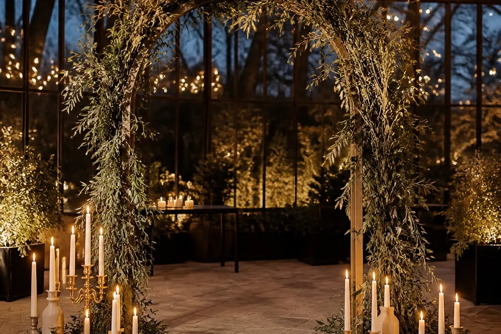
7. Olive + Blush + Warm Taupe Ceremony Arch
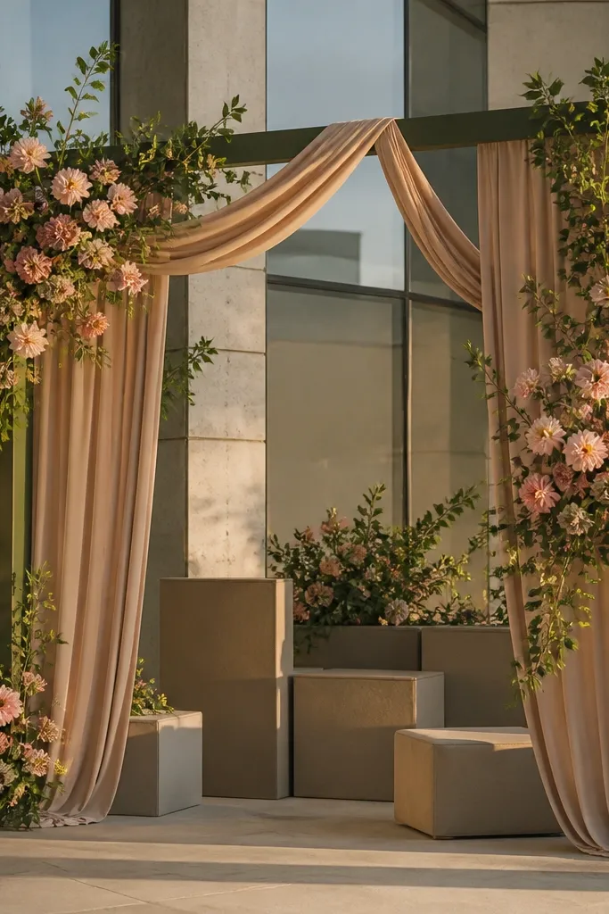
Start by choosing warm taupe for the drape base or aisle runner so the arch has a neutral backing. Then use olive greenery as the main body and add blush fabric or blush floral ribbons for movement. Keep signage in cream with olive ink so the arch doesn’t compete with the ceremony text. For the floral build, use blush blooms sparingly — about 15-30% of the visible flower mass — and lean on olive foliage for fullness. Time-saving move: measure the arch width and height, then order greenery that covers it with at least 10-15% extra for trimming.
This one is built for a ceremony entrance that looks stunning in photos. Olive provides the structure and depth, blush adds romance, and warm taupe keeps it from becoming too pink. It’s a smart choice if your venue has stone, concrete, or large glass panels because taupe and olive soften the sharp lines. Blush also reads beautifully on skin tones and looks good in both daytime and golden-hour lighting. The arch becomes the focal point, and that’s what makes this scheme feel elegant instead of just “color-coordinated.”
Skip thisSkip hot pink — it clashes with olive and makes the entire arch look costume-like.
Quick tipIf blush looks too pink in your venue, swap to dusty blush or add a touch of taupe in the floral mix to mute it.
8. Olive + Light Blue + Cream Coastal-Modern
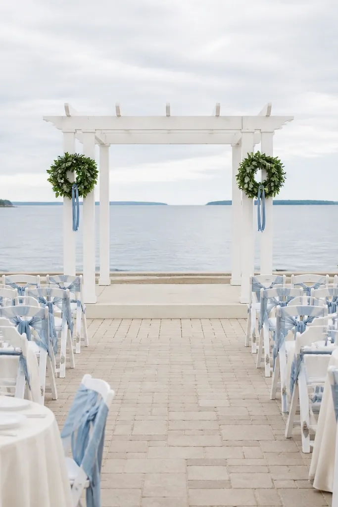
Choose olive for linens or chair ties, then pick light blue as the accent through napkins, ribbon, or a few floral stems. Use cream for the base so the palette stays bright and not cold. For flowers, combine olive foliage with white blooms and light blue accents like delphinium or blue hydrangea heads (if available). Keep the blue restrained so olive stays the anchor — think 10-20% blue coverage. If you’re hosting in coastal wind, weigh down table decor and choose heavier ribbon so it doesn’t snap or twist in photos.
Olive plus light blue is a clean, unexpected combo that still feels natural. The blue adds freshness for spring and summer, while cream keeps the palette soft so it doesn’t feel like a beach event theme. This works especially well for destination weddings near water because the colors echo the horizon without copying the obvious navy-and-white look. In photos, light blue gives you a crisp contrast that makes olive look more refined. It’s also a good solution if you’re tired of rose or terracotta and want a different accent that photographs beautifully.
Skip thisDon’t use teal; it shifts olive toward green-gray and looks off under flash.
Quick tipUse matte light blue fabric — glossy satin reflects harsh highlights in bright sun.
9. Olive + Rust + Oatmeal Paper Set
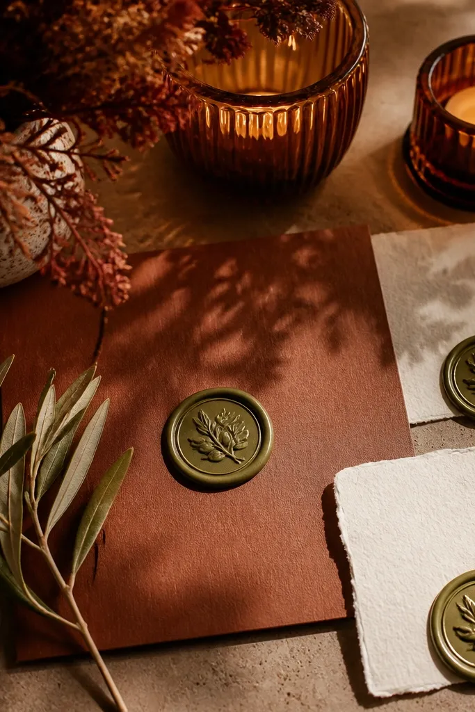
Rust is the autumn cousin of terracotta, but it reads more grounded and less orange. Pairing rust with oatmeal paper makes the design feel handmade and warm without going rustic-rough. This scheme is ideal for fall weddings because rust looks right with dried textures, amber glass, and candlelight. Olive keeps the palette from turning too brown by adding a green counterpoint. The result is a cohesive look where stationery and florals agree, which is where most olive weddings fall apart.
Start with oatmeal or natural kraft paper for menus and place cards. Then use olive as your ink and candle-wrap color so the paper doesn’t float alone. Add rust through florals and a few textile accents like napkin rings or ribbon. For a strong visual, combine rust blooms with olive foliage and a small amount of dried wheat or seeded elements. Plan your print set as one order so the paper texture and ink tone match across cards, menus, and signage.
Order a proof of your ink on the exact paper stock you’ll use — olive ink can shift depending on texture.
Avoid pairing rust with bright cranberry — it competes with olive and makes the palette look busy.
10. Olive + Black + Cream Editorial Contrast
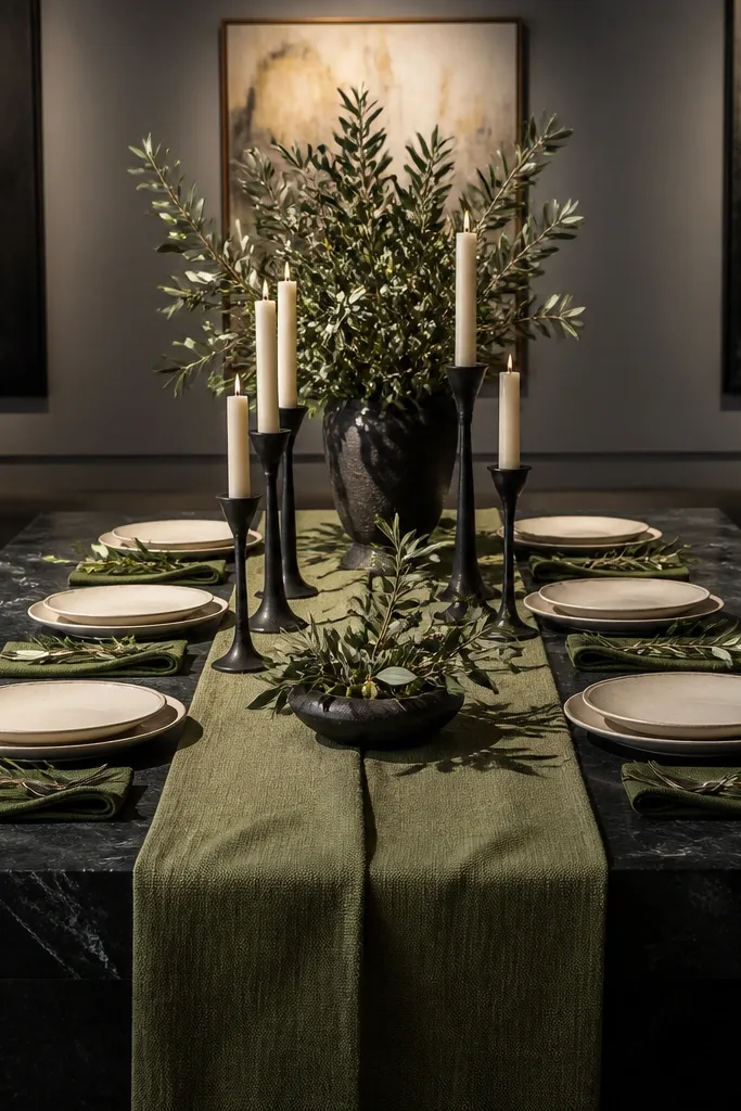
This is the bold, editorial olive palette that looks expensive in photos. Black gives the contrast that olive needs to avoid looking flat, while cream keeps it from feeling like a goth wedding. It’s a great pick for city venues, modern galleries, or any space with clean lines. The scheme also works well for night weddings because black absorbs light and makes candles and florals pop. If you want the elegant look promised by the title without relying on trendy colors, this combo is the cleanest path.
Choose cream as your base for linens or tablecloth and bring olive in through greenery-heavy centerpieces. Then add black through stationery (menu cards, place cards) and candle design. Keep gold out unless you’re using it in tiny doses, because black and gold together can go glam and overpower olive. For florals, use white flowers or pale blush blooms so black doesn’t swallow the palette. If you’re traveling, pack black frames or printed signage flat so you don’t get creases that ruin the look in close-ups.
Use olive tape or olive ribbon to connect black stationery to the florals — it visually links the palette.
Skip gray — it turns olive smoky and makes cream look dingy.
11. Olive + White + Green Marble Stationery Theme
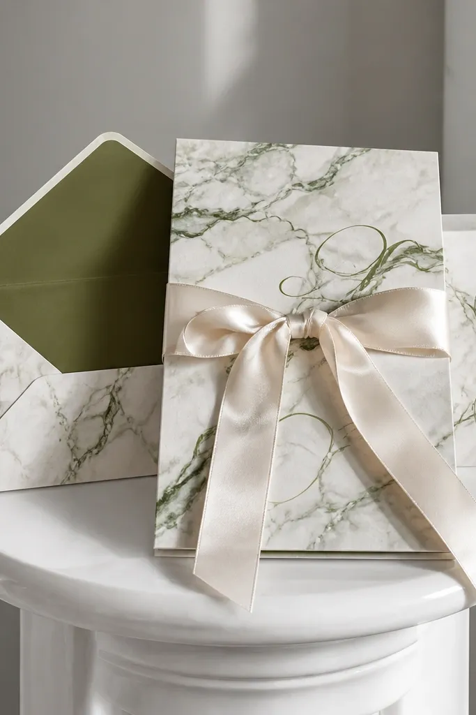
This scheme is for people who want olive to look crisp, not earthy. White is the main color, olive is the accent, and the “marble” effect comes from stationery design and table decor patterns. It’s surprisingly photogenic because the high contrast is controlled — you get that clean editorial feel even with lots of greenery. This works year round because it doesn’t depend on seasonal blooms; you can use any white flowers and olive foliage. If your venue has neutral walls and you want the wedding to look styled from every angle, this is the approach.
Start with a white cardstock base and use olive ink for all text. Add a printed green-marble style pattern on one hero item like the menu or welcome sign. Then keep florals simple: white blooms with olive foliage and a few white candles. Use a marble-pattern runner or a marble-style cake stand to tie the stationery to the table. For travel, bring a small set of olive swatches so you can match the ink tone to your greenery — marble designs highlight mismatch fast.
Keep olive ink consistent across the set; mixing olive shades across cards looks unplanned.
Avoid adding too many extra colors; this scheme works when it stays tight on white and olive.
12. Olive + Powder Blue + Soft Ivory Winter Tables
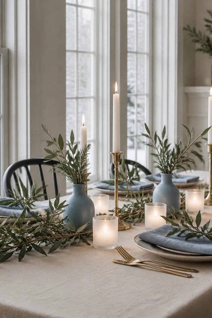
Powder blue makes olive feel light and wintery instead of heavy. Soft ivory keeps the palette calm and gives your photos a bright base even when the day is gray. This scheme is ideal for indoor winter weddings with cool daylight from windows, because powder blue has enough warmth to stay flattering. Olive foliage adds depth and texture, which is what makes the tables look designed rather than plain. The look is airy, elegant, and still grounded — a balance you can’t get with olive alone.
Choose soft ivory for linens and place settings, then add powder blue through napkins and small ribbon accents. Bring olive in via branches, eucalyptus-like leaves, and olive-toned candle wraps. For flowers, stick to white blooms with a few pale blue accents so the palette stays clean. Limit powder blue to about 15-25% of the overall visible color so olive remains the theme anchor. Plan your lighting: if the room is cool, add warm candlelight and avoid harsh blue uplighting that can shift powder blue toward gray.
Use fabric powder blue, not paper-blue prints, for napkins — fabric reads truer in photos.
Don’t use icy blue; it competes with olive and makes the whole scene look colder than it should.
13. Olive + Champagne + Terracotta Clay Place Settings
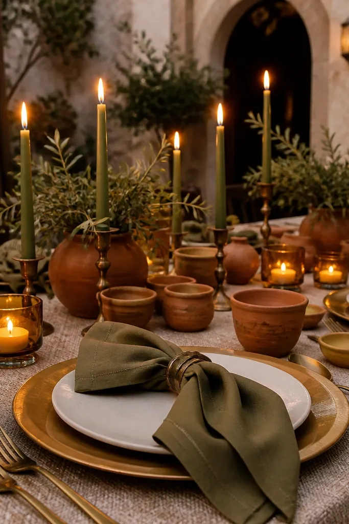
Start by securing your chargers or plates so you know your base colors before buying anything else. Choose champagne for the metal accents and olive for textiles like napkins or table runners. Add terracotta through clay plates, terracotta-toned glassware, or small bud vases. For centerpieces, use olive foliage with minimal flower colors — white or cream blooms keep the terracotta from getting too busy. Travel tip: if you’re renting clay plates, confirm padding and whether the venue has storage — breakage risk is real with ceramic travel.
This is a “table-first” palette built around materials that photograph like luxury. Olive napkins feel grounded, champagne chargers add glow, and terracotta clay place settings bring warmth that looks handcrafted. It’s a great fit for rustic-meets-elegant venues like barns, villas, and outdoor courtyards. The clay texture adds depth even when your flower budget is modest because the table has visual interest. In photos, the palette reads cohesive because the warm and neutral tones are physically present on the table, not only in florals.
Skip thisAvoid pairing terracotta with bright lime green; it makes the olive look sickly.
Quick tipKeep terracotta pieces matte — glossy finishes look plastic in candlelight.
14. Olive + Camel + White Wildflower Ceremony Look
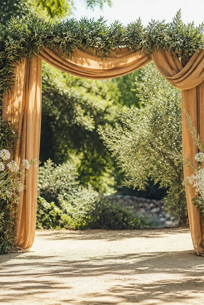
Camel and olive together create a soft neutral palette that feels expensive without being flashy. White wildflowers keep it airy and photogenic, especially in bright outdoor settings. This scheme is excellent for spring and summer because wildflowers look natural in sunlight, but it still works in fall with slightly deeper olive foliage and cream blooms. Camel is the secret stabilizer: it warms olive so the palette looks cohesive instead of contrast-heavy. Your ceremony photos will feel light and romantic, even if you’re using lots of greenery.
Use camel as your neutral base through an aisle runner, ceremony drape, or chair ties. Then build olive into the structure with greenery arches, aisle candles wrapped in olive ribbon, or dense bouquets. Add white wildflowers for movement and softness, mixing in cream and pale green foliage for depth. Keep the wildflower mix mostly white so the palette stays clean and doesn’t turn into a multi-color garden. If you’re traveling, plan your bouquet sizes early — wildflower heads need space to read well in photos.
Choose camel fabrics with visible weave; smooth camel satin can look flat and cheap under flash.
Skip overly large dark floral heads; they can overpower the airy wildflower look.
15. Olive + Ecru + Sage Smoke Candlelight Tables
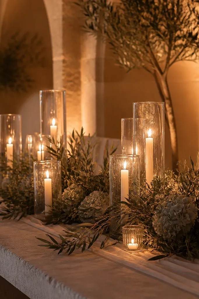
Start with ecru linens and use olive through dense greenery arrangements and taper candle labels. Add sage smoke tones via eucalyptus-like leaves or muted sage floral stems. Then keep flower colors near-white: cream, off-white, and pale green accents. For signage, use olive ink and keep fonts simple so the candlelight atmosphere stays the focus. If you’re booking a destination venue, confirm whether candles are allowed and if the venue provides candleholders — last-minute replacements can ruin the look.
This palette is all about candlelight. Ecru and olive give you a warm, neutral base, while sage smoke tones keep the greenery from looking flat. It’s perfect for venues where the walls are beige, tan, or stone because the palette blends naturally into the background. In evening photos, the candle glow makes ecru look creamy and keeps olive from turning dark. The “smoke” effect comes from using muted sage tones in foliage and flowers, so everything looks soft and cinematic without being dramatic in a costume way.
Skip thisAvoid bright white LEDs; they kill the candle mood and flatten olive into a dark gray.
Quick tipUse taller taper candles in glass holders — they read elegant and reduce the risk of uneven flame height in photos.



