
1. Ecru linen with espresso script + bold date band
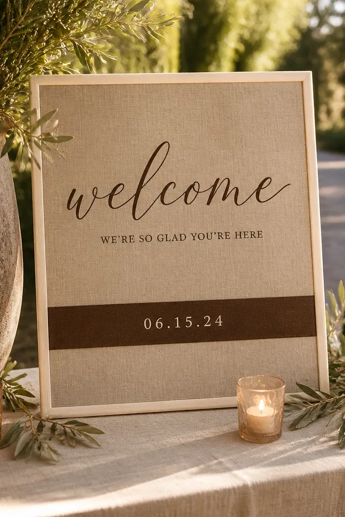
This is the “prints well everywhere” option because the linen color already softens the scene. Espresso ink gives you that grown-up contrast without going full black, and the thick date band keeps the most important info readable even when guests move around. Place it at the entry table where people naturally pause; the script draws them in, and the date band gives it structure. It looks especially good in venues with warm wood or beige walls, because the tones stay cohesive instead of competing.
Start by choosing a sign size that matches your setup: 8x12 inches for a table, 12x18 inches for a wall, or 18x24 inches for an arch. Then design the layout with three blocks: top line for names, a center line for “welcome,” and a bottom thick band for the date. Finally, pack it flat between two rigid boards (like a thin foam board or folder inserts) and wrap the edges with tissue paper so the linen fibers don’t get crushed.
Use a matte black or espresso frame clip that clamps the linen at the corners — it hides slight wrinkles better than tape.
Don’t use thin, light-colored ink for script; it fades fast under overhead lighting.
2. Natural linen banner with hand-lettered "Welcome" and pressed olive sprigs

A banner shape makes the entrance feel like a greeting, not a poster. The hand-lettered “Welcome” gives guests an instant focal point, and pressed olive sprigs add a gentle, Mediterranean feel without turning the sign into a full-on floral wall. This works best outdoors or in bright indoor spaces because the linen texture stays visible and the sprigs look crisp in daylight. If you want something that feels romantic but still restrained, this is the one.
Start by picking a banner size around 12-24 inches wide so it doesn’t look lost behind guests. Then place sprigs only in one zone — for example, along the top third — and keep the center clear for readability. Finally, attach with ribbon ties or small grommets, then pack the banner rolled around a cardboard tube with a clean cloth between layers to avoid creases.
Quick tipBring 2 extra ribbon lengths so you can re-tie at the venue without rushing.
Skip thisAvoid covering the “Welcome” text with sprigs — it kills the focal point in photos.
3. Linen lapel-style sign with serif names and a single eucalyptus line
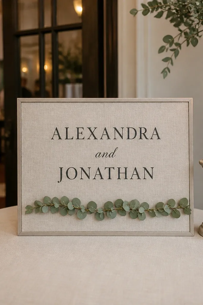
If your wedding palette is simple, this layout is a clean win. The lapel style (a narrow vertical sign with a framed edge) looks polished at the entrance table and reads like stationery. Serif names look crisp against linen, and the single eucalyptus line adds a design element without clutter. It’s a great fit for modern venues with white walls, minimal decor, and lots of negative space.
Start with a vertical orientation like 10x20 inches for a table stand. Then set your names in the largest serif type, and use a thin eucalyptus line as the only divider element. Finally, pack the sign in a poster tube or flat folder with a tissue layer over the linen edge so the fibers don’t get pressed.
Choose a stand with a slim base so it doesn’t block the bottom text in overhead photos.
Don’t add multiple dividers; one line looks intentional, three lines looks busy.
4. Ivory linen with navy block capitals for names + watercolor blush accents
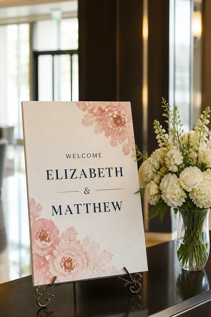
This is for couples who want linen but also want a more graphic, modern look. Navy block capitals give strong readability from a distance, and the blush watercolor accents soften it so it still feels romantic. It photographs beautifully when the venue has neutral decor, because the navy pops without looking harsh. Use this if your florals are pink or peach and you want the sign to echo them without copying the full bouquet.
Start by limiting the palette to three colors: ivory linen, navy text, and blush accents. Then place the names as one bold block and keep the welcome line smaller underneath. Finally, protect the watercolor area by packing the linen flat and keeping it away from any wet items in your bag or box.
Quick tipIf your ink looks too dark in photos, test a swatch under the venue’s lighting and adjust to espresso or deep charcoal.
Skip thisDon’t mix too many watercolor spots; two to three accent clusters look designed.
5. Linen welcome sign with layered crest: oval frame + monogram hearts
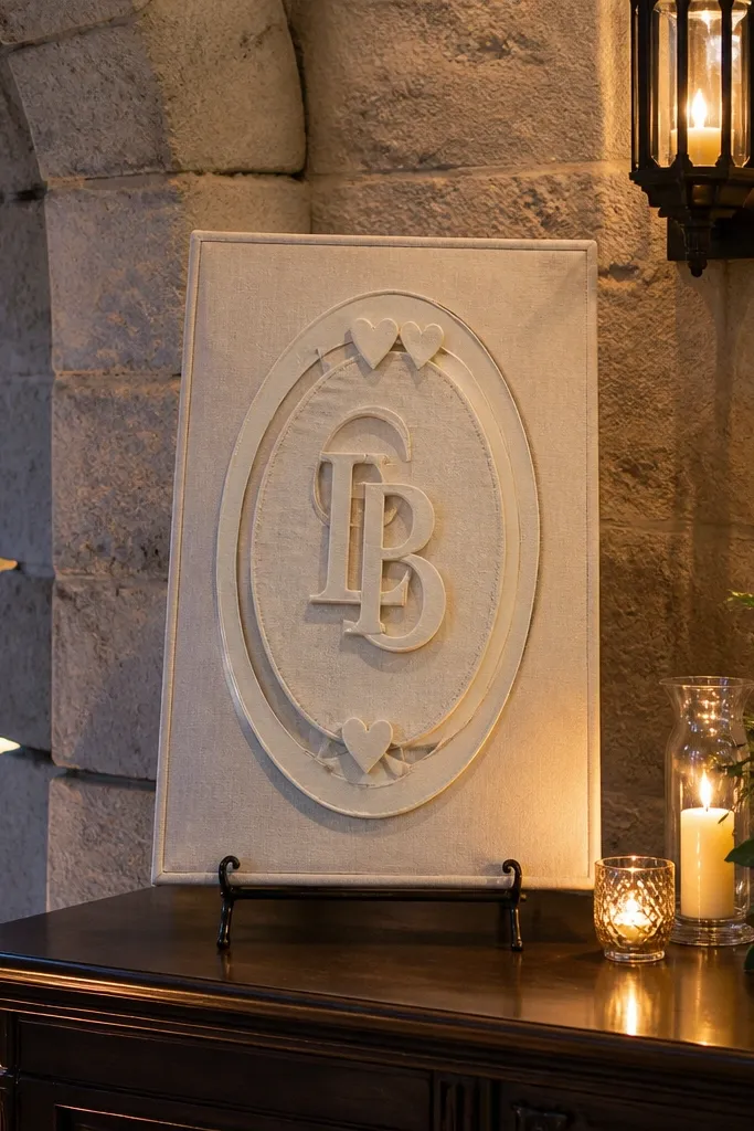
A crest layout makes the entrance feel like a “real ceremony” moment. The oval frame gives you a classic silhouette that stands out in photos, and monogram hearts keep it sweet without turning childish. This works best when your venue has architectural details like arches, columns, or textured walls, because the crest shape harmonizes with the setting. It also suits winter weddings where guests want cozy, traditional cues.
Start with an oval frame size around 8x10 inches for a table or 12x16 for a wall. Then add monograms in the center or inside small heart shapes near the frame corners. Finally, hang using two points on the frame (top corners) so the oval stays flat and doesn’t ripple.
Use velcro strips on the back of the frame so you can remove it cleanly without wrestling the linen.
Avoid clipping the linen directly at the corners; it can leave marks that show in close-up photos.
6. Sand linen with vertical "Welcome to" and wide horizon greenery strip
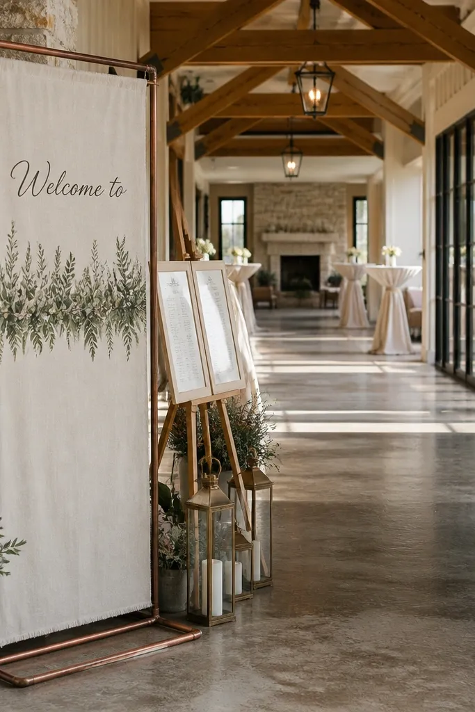
This layout looks stunning when your entrance has a long sightline, like a hallway or a garden path. The vertical “Welcome to” creates movement, while the wide greenery strip grounds the design and makes it feel styled rather than random. Choose this if your florals include grasses or long-stem greens; the strip makes them look intentional. It also photographs well because the horizontal band gives your camera something stable to focus on.
Start by choosing a long, narrow size like 10x24 inches for a hallway table or easel. Then place the main names on the center band and keep the “Welcome to” text above, aligned vertically. Finally, pack rolled but not tight: wrap around a tube with a soft cloth layer so the linen fibers don’t crease.
Quick tipIf the sign is for a hallway, keep it at eye level (about 60 inches from the ground) so it reads in photos.
Skip thisDon’t use tiny florals on a wide strip; scale mismatch makes the design look unfinished.
7. Black linen with gold ink names and palm frond accents
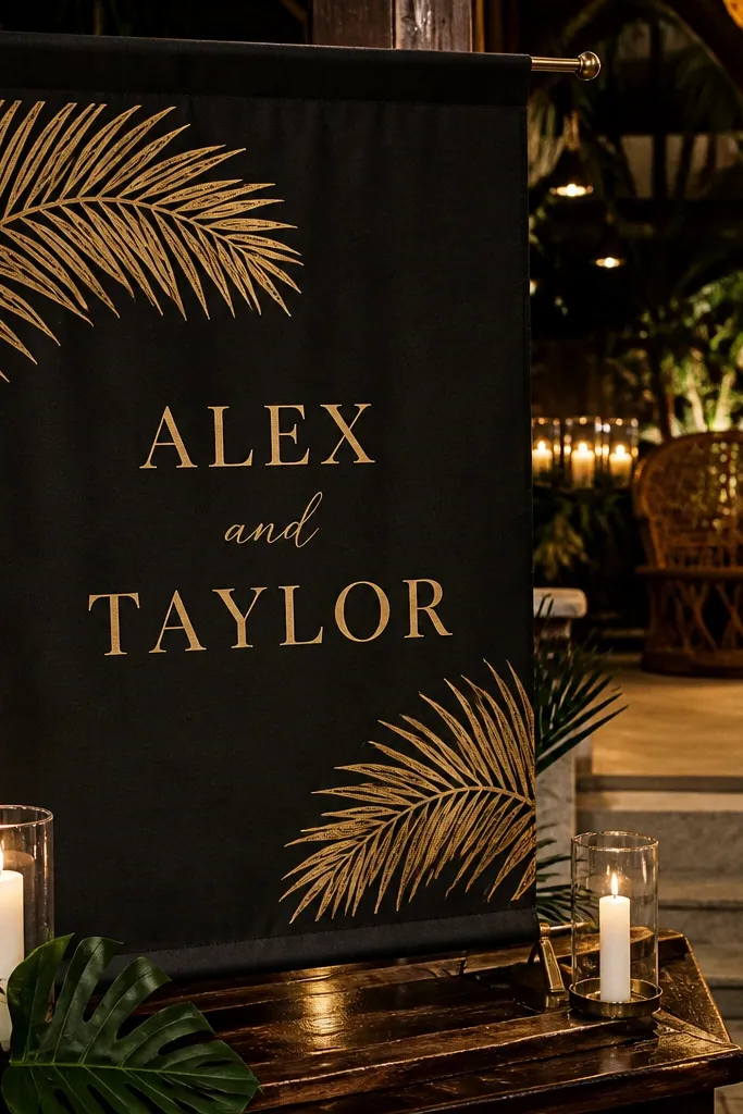
Black linen sounds bold, but it looks incredible under warm lights and candle settings. Gold ink gives you that formal glow, and palm fronds keep it modern rather than traditional. This is a strong choice for tropical destinations, late-summer ceremonies, or venues with dark wood. It also makes your entrance feel dramatic without adding extra decor because the background does the work.
Start with navy or gold metallic ink tests; gold can look greenish if it’s too cheap, so use a true warm gold tone. Then place names in the largest line and keep “welcome” smaller so the text stays readable. Finally, pack the linen flat and avoid heavy pressure on the ink area — metallic ink shows dents and scuffs in photos.
Bring a lint roller or soft brush; black linen shows dust and it’s noticeable in close shots.
Avoid neon greenery colors; they clash hard with black linen.
8. Champagne linen with blush ribbon tie corners and micro florals
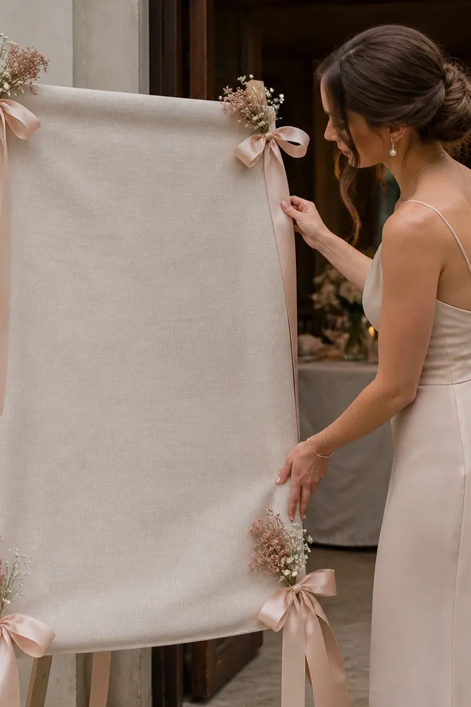
Corner ties make the sign look styled like a gift, not hung like a poster. Champagne linen is forgiving and flatters almost every floral palette, while micro florals add a delicate, editorial vibe. This one works best on a sweetheart table entrance or when you want a soft, romantic feel. In photos, the corner ties create little shadows that add depth and make the sign look more expensive.
Start by choosing a size around 8x12 inches so the corner ties don’t look oversized. Then add micro florals only along the top and sides, leaving the center text clean. Finally, tie with pre-cut ribbon lengths and pack the sign flat with ribbon folded separately in a small pouch.
Quick tipUse satin ribbon if your venue lighting is bright; it photographs smoother than matte ribbons.
Skip thisAvoid tying too tight — it puckers the linen and makes the text warp.
9. Linen tent card style with deckled edge and bold "Welcome"
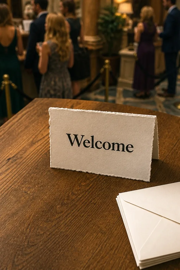
Tent card style is underrated for welcome signs because it reads clearly from different angles. The deckled edge adds a handmade paper effect, and bold “Welcome” keeps it simple. This is perfect for indoor receptions where guests line up at the check-in table. Choose this if you want the sign to look like stationery and you’re not doing a big backdrop.
Start by selecting a tent card base or a stiff backing that holds 20-30 degrees upright. Then design with bold, high-contrast text and keep the names slightly smaller to maintain hierarchy. Finally, pack it in a box with a flat divider so the tent folds don’t crack the backing.
Bring two extra binder clips for the tent base; they fix wobble in seconds.
Avoid thin serif fonts on tent cards; they blur when viewed at an angle.
10. Linen welcome sign on a wooden dowel with vertical name strip
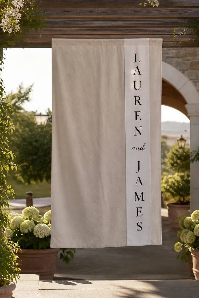
Dowel-hung signs look effortless and elegant, especially when you can hang them at the entrance arch or above a table. The vertical name strip gives you a strong read even when guests are moving, and linen drape stays soft in photos. This works best in venues with open ceilings or outdoor pergolas where the sign can hang freely. If you want your welcome sign to feel like part of the architecture, this is the route.
Start by choosing a linen panel size like 16x28 inches for a noticeable entrance presence. Then print names vertically and keep the welcome line horizontal near the top. Finally, attach the dowel using a sewn channel or clips, and pack the linen rolled with the dowel in a separate tube so corners don’t get crushed.
Hang it slightly above head height so guests don’t block it in photos.
Avoid too much weight on the linen edge; it droops and makes the text uneven.
11. Ecru linen with oversized monogram in the center and small "Welcome" above
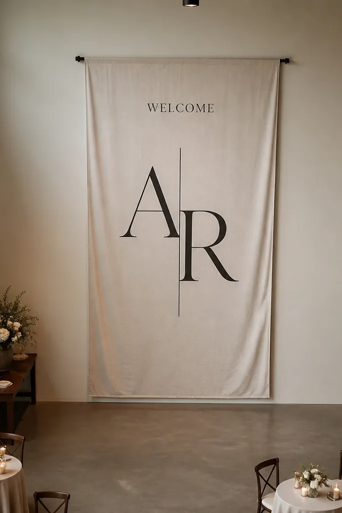
Oversized monograms give you that clean, high-end entrance look because the sign becomes a focal point even from across the room. The small “Welcome” above keeps the purpose obvious, and the monogram does the style work. This is ideal when your venue photos include a lot of space behind the entrance, like a blank wall or open garden gate. It also looks great for minimal weddings where you don’t want heavy florals.
Start by picking a monogram size that fills about 60% of the sign width; anything smaller looks like an afterthought. Then place “Welcome” above in a simple font and add date/location in a tiny line at the bottom. Finally, pack flat with a rigid backing so the monogram area doesn’t get creased.
Use dark charcoal or espresso for the monogram; it stays readable on ecru linen under mixed lighting.
Don’t use a monogram that’s too detailed; thin strokes get lost in photos.
12. Linen welcome sign with sage ribbon border and date in a small capsule
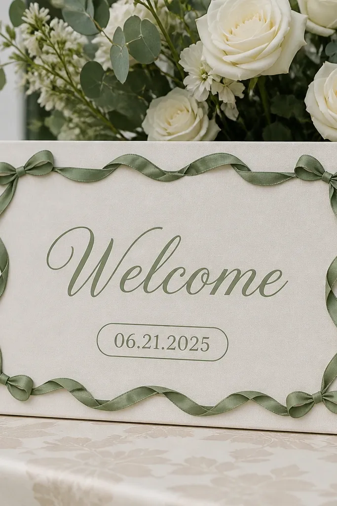
A ribbon border frames the whole sign and makes it look intentional on entry tables. Sage ribbon is a smart color choice because it reads soft with both white and cream flowers, and it doesn’t fight with greenery. Putting the date in a small “capsule” shape keeps it from dominating the design while still being easy to spot. This works well when you want something elegant but not overly formal.
Start by designing the border first: ribbon should sit 1-2 inches from the edge so it doesn’t crowd the linen texture. Then place “Welcome” near the top, names in the center, and the date inside a rounded rectangle at the bottom. Finally, attach ribbon with a light stitch or removable fabric tape so you can remove it and pack without crushing the ribbon corners.
If you’re using removable tape, test it on a linen corner first so it doesn’t leave residue.
Don’t pick a ribbon that’s too bright; neon sage looks cheap in photos.
13. Linen sign with pressed pampas plume arc and "Together" script
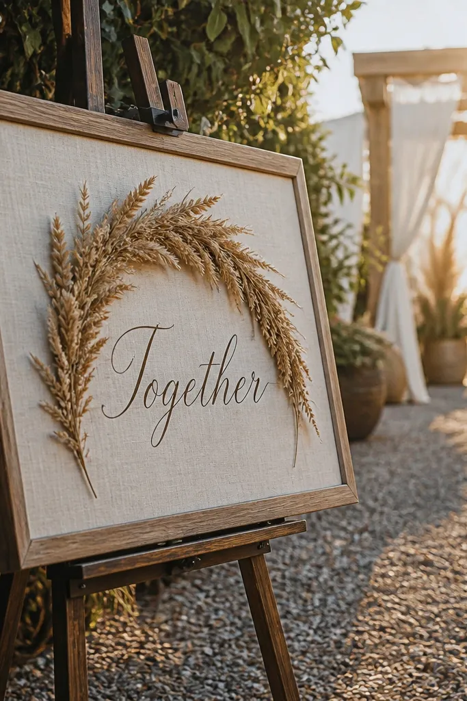
Pressed pampas plumes create a soft arc that frames the text without looking busy. The word “Together” is short, emotional, and reads well when guests are scanning the entrance quickly. This is a great fit for boho-leaning weddings that still want an elegant, photo-ready vibe. Pampas also looks good in both daytime and sunset lighting because it has that feathery texture that catches soft highlights.
Start by choosing a sign size around 12x18 inches so the arc has room to breathe. Then place the “Together” script in the center and arrange pampas plumes in a gentle U-shape above or behind it. Finally, pack the linen flat and keep the plume area protected with a thin sheet of tissue between layers.
Quick tipUse dry-pressed plumes with a matte finish; shiny accents reflect light and look odd on camera.
Skip thisAvoid stacking plumes too dense; it turns the arc into a blob.
14. Linen welcome sign with cream macrame hanger and small floral clusters
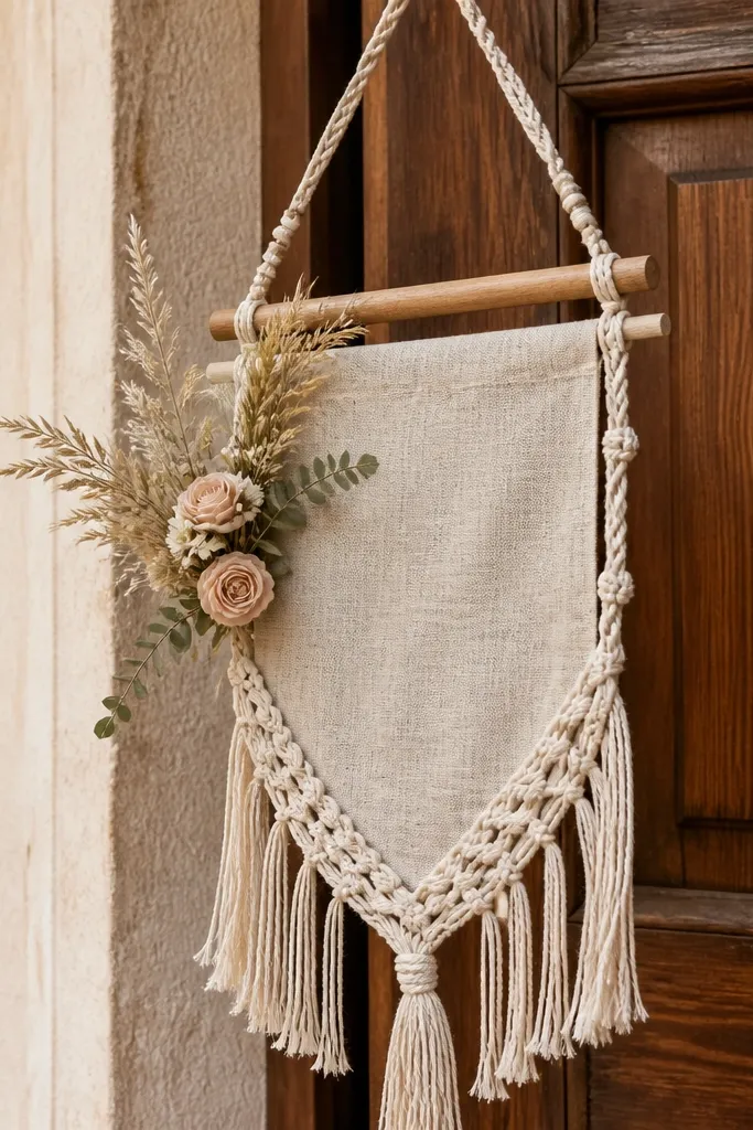
A macrame hanger gives your welcome sign motion and texture even when everything else is static. The cream tone looks cozy and pairs with linen beautifully, and small floral clusters keep it from turning into a craft project. This is perfect for outdoor ceremonies where you can place the sign near a doorway or arch that already has natural textures. In photos, the hanger adds depth and makes the sign feel like part of a styled entrance vignette.
Start by choosing a macrame hanger length that places the sign at about 62-66 inches from the ground when tied to the venue. Then mount the linen to the hanger with clips or a sewn pocket so it hangs straight. Finally, pack the linen flat and the macrame folded loosely — creases in rope disappear faster than creases in linen.
Quick tipBring 6-10 zip ties for quick attachment to chair backs or arch bars if the venue doesn’t allow hooks.
Skip thisAvoid heavy, wet florals on a hanging sign; they droop and stain linen.
15. Linen welcome sign with black ink + thin gold line border (minimal luxe)
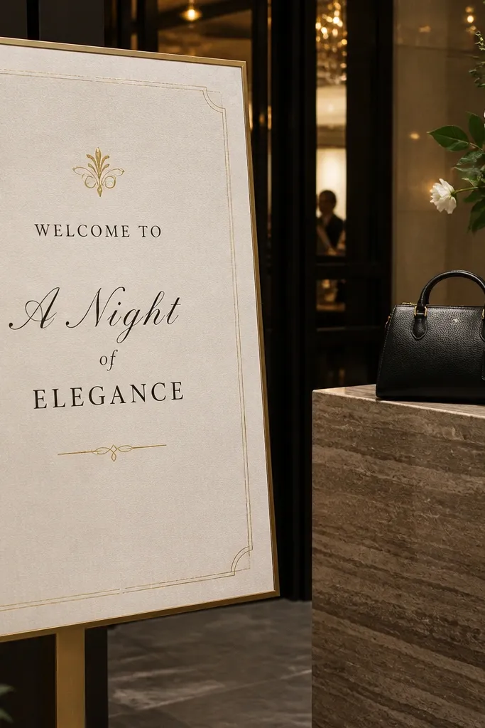
Minimal luxe is the name of the game here, and the thin gold border is what makes it feel elevated without being flashy. Black ink stays crisp against natural linen and reads instantly, even in cluttered entry photos. This layout is best for modern weddings, city venues, and indoor receptions where you want the welcome sign to look like designer stationery. It also makes your florals look more intentional because the sign isn’t competing with them.
Start by picking a thin border thickness so it looks like a line drawing, not a frame. Then set your hierarchy: “Welcome” small at the top, names large in the middle, and date/location in one small line at the bottom. Finally, pack flat in a sleeve and keep the border area protected from rubbing against other items.
Gold line borders look best when the ink is matte, not glossy; gloss catches glare under spotlights.
Avoid thick borders; they make linen look like a cheap placemat in photos.



