
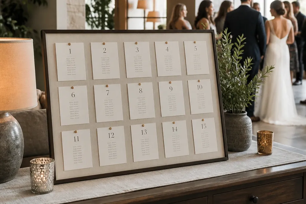
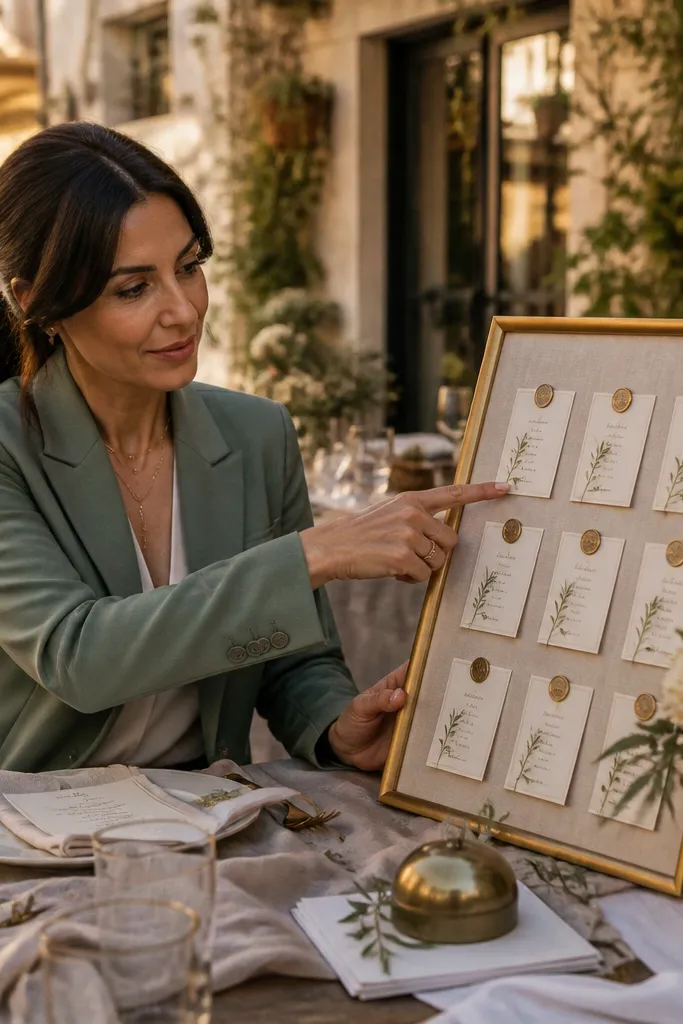
1. Black metal + linen board with pinned table cards
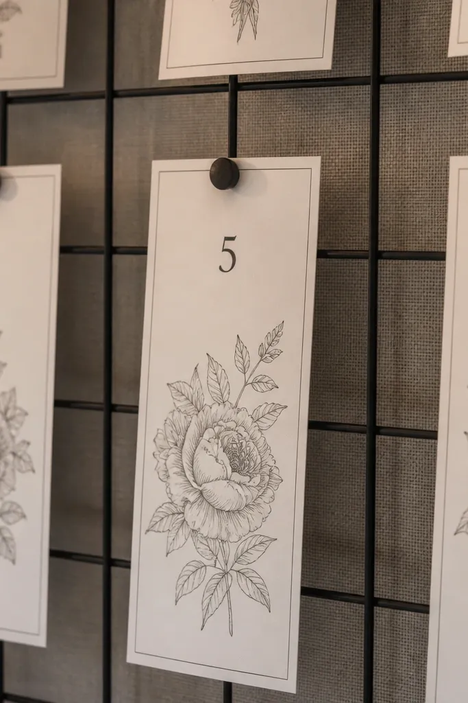
This looks like a boutique hotel mailroom wall, but wedding-ready. The black metal grid gives you clean lines, and the linen background absorbs glare so guests don’t get blinded while reading. Use pinned table cards so the display can look airy instead of packed with paper. It’s ideal for indoor venues with neutral walls or outdoor covered patios where you want a calm, editorial vibe. For photos, it shines when you shoot from the side at table-card height — the pins create tiny shadows that make the whole thing feel dimensional.
Start with a pre-made black metal grid (around 36x48 inches) and stretch or staple cream linen behind it. Then print table cards in one bold font, and pin each table card to the grid with small matte pins so names stay readable. Finally, add a simple title strip at the top and an arrow pointing toward the tables, using the same color as the card text.
Quick tipBring a small pack of spare pins and a lint roller for the linen; one smudge looks messy in close photos.
Skip thisDon’t use glossy photo paper under bright lights — it reflects and makes guests hunt for their names.
2. Framed mirror seating chart with gold table numbers
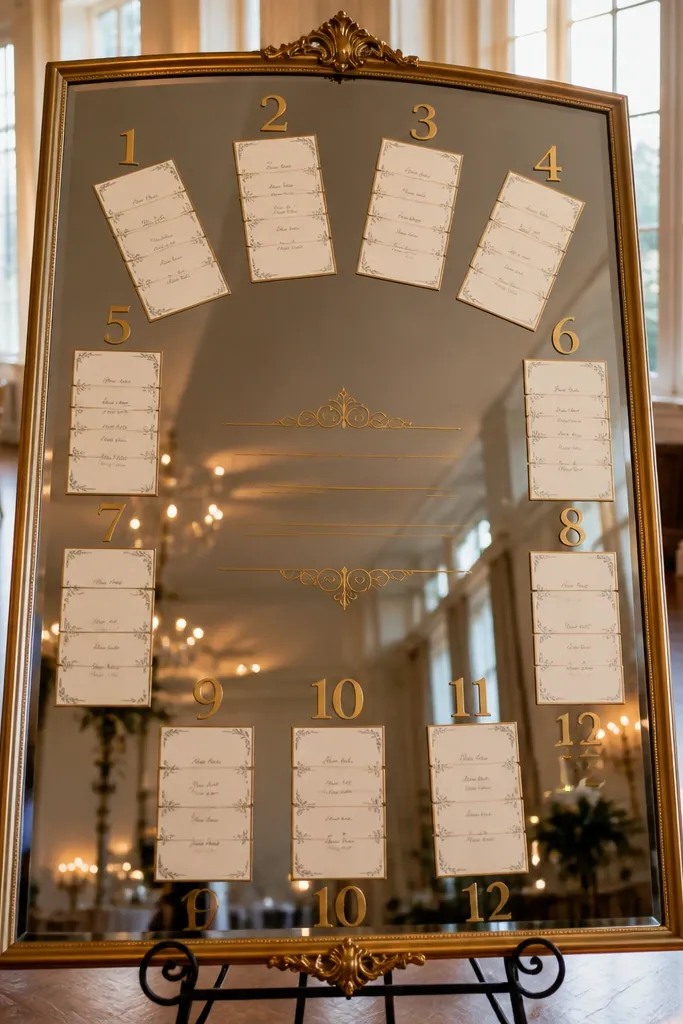
A mirror turns a seating chart into a styled moment. The reflection adds depth and makes the sign feel bigger, so it reads well in wide shots. Keep the guest list minimal by grouping names by table and placing them in a neat ring around the center text. This works best for venues with natural light or warm indoor lighting where reflections look flattering instead of chaotic. It’s also great for weddings with a glam or classic look because gold lettering pops without needing lots of decor.
Start with a vintage-style mirror frame (roughly 24-30 inches wide) and center a printed header behind the glass or on adhesive vinyl applied to the mirror. Then arrange table number blocks in gold vinyl or foil-style sticker paper, with each block holding a card for the guest names. Finally, hang it at eye level near the entrance and place a small stand with a pen so last-minute corrections don’t smear anything.
Use removable adhesive vinyl for the table numbers so you can swap cards without damaging the mirror.
Skip overcrowding; mirrors amplify clutter and make the list harder to read when guests are moving.
3. Wooden shutter seating chart with table sections
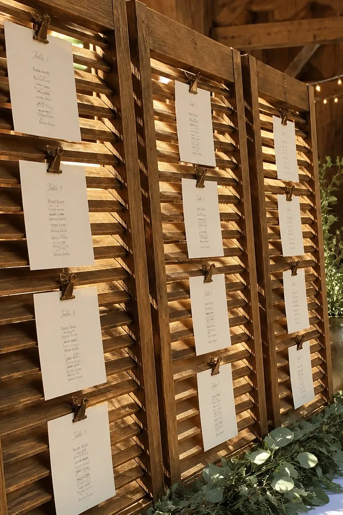
Wooden shutters look like real architecture, not signage. The slats create natural separation between tables, so guests can scan quickly without feeling overwhelmed. This is a strong choice for rustic-chic weddings where you want charm without looking like a craft fair. It also photographs beautifully because the texture shows up in shadows, especially in late afternoon light. Use a clean typographic approach for table numbers so it still feels intentional, not messy.
Start by finding two matching shutters (about 20-30 inches tall each) and hinge them so they open like a folding display. Then paint or stain table-number rectangles and attach guest name cards underneath each one using small hooks or clips. Finally, prop it under a covered area and add a directional arrow sign on the ground so guests know which way to go.
Write table numbers with a stencil and a matte paint marker — it keeps the look crisp even from 10 feet away.
Don’t use too many fonts; the slats already add visual texture and extra styles make it harder to read.
4. Terracotta tabletop chart with stacked place cards
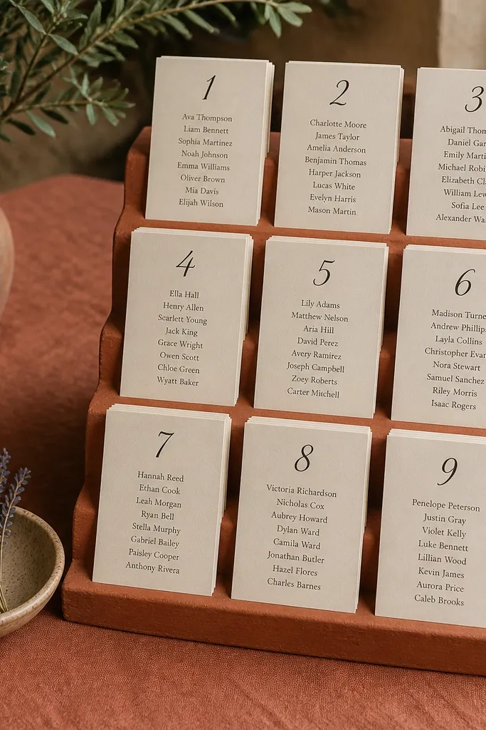
If your venue has earthy tones, a terracotta seating chart looks like it belongs there. Instead of a flat board, you’re using risers to create height, so it reads in a crowd. Place cards can be arranged like little menu stacks: table number label on the top card, names beneath. This is great when guests mingle near the chart rather than line up directly in front of it. In photos, the stacked cards look styled and you can angle them so the sunlight hits the edges.
Start with a terracotta-colored charger or large terracotta slab as the base, then add 2-3 risers in matching tones. Next, print table number labels and stack guest cards so each stack is clearly separated by table. Finally, set it on a stable table near the entrance and add a small sign that tells guests to find their table stack.
Use thicker cardstock for the top label card — thin paper looks flimsy when stacked.
Avoid placing it on a low glass table where reflections hide the card edges.
5. Gallery wall seating chart with mix-and-match frames
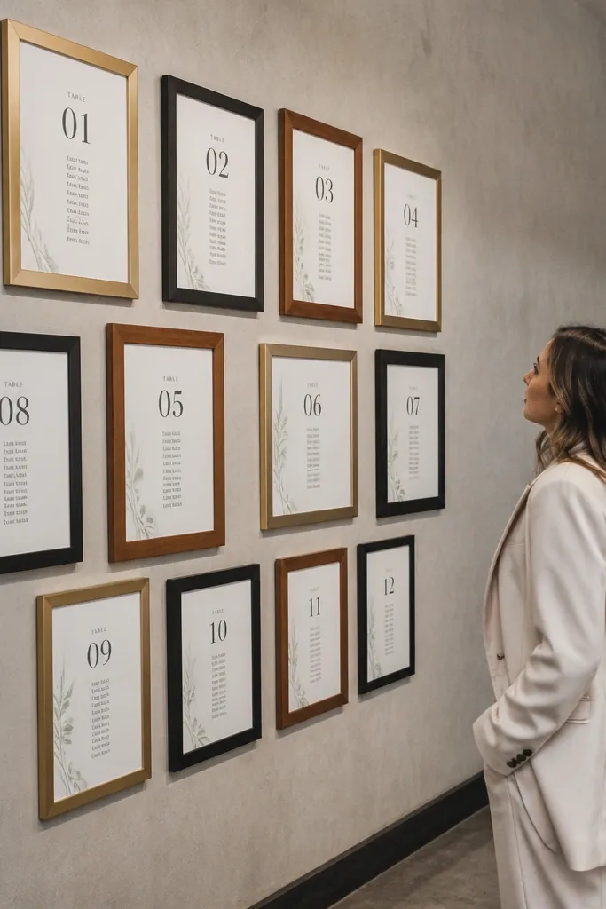
This turns the seating chart into an art installation. Small frames reduce the “giant list” feel and let guests find their table number in seconds. It also gives you flexibility: you can match frame colors to your wedding palette and keep the typography consistent. This is especially good for indoor venues with blank walls or for outdoor receptions with a covered backdrop. Photos look polished because frames create a grid-like structure that reads well even when people are browsing.
Start by mapping a simple layout: one larger header frame centered, with 8-14 smaller frames arranged in rows. Then print each table’s guest names in the same font and size, and mount them with a white mat so the frames look uniform. Finally, hang the whole thing using a picture-hanging system and keep a small spare frame card for day-of corrections.
Choose frames with glass that isn’t too reflective; matte or anti-glare glass keeps names readable.
Don’t use random fonts across frames — it looks like a collage and slows scanning.
6. Chalkboard tiered stand with color-coded table sections
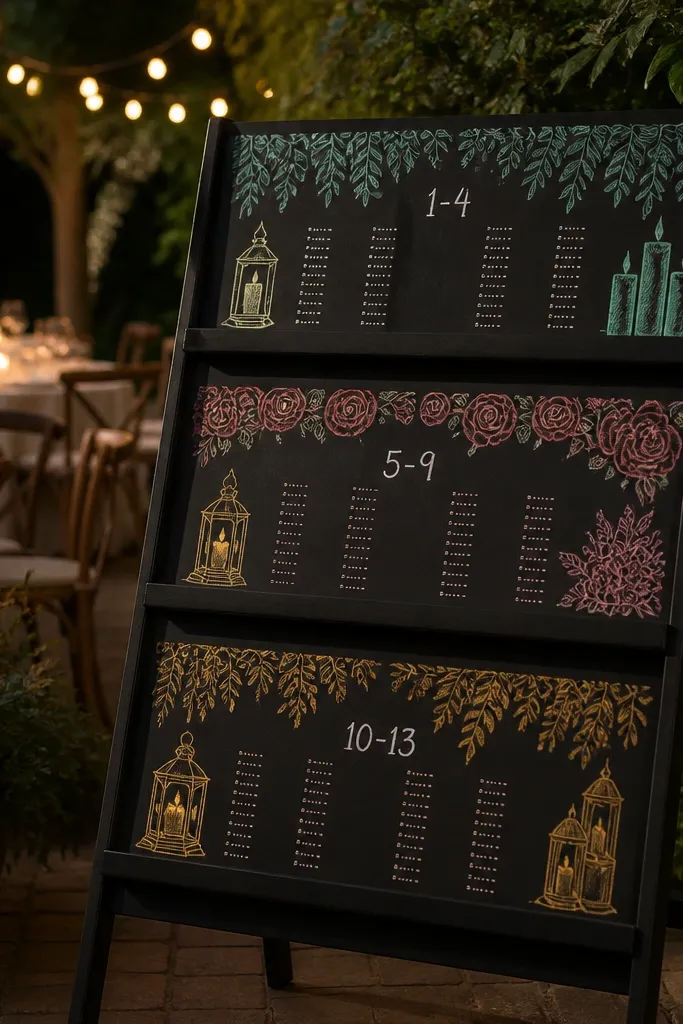
A tiered chalkboard makes the seating chart look like a styled menu. The tiers help guests focus on one table range at a time, and chalk gives you that soft, handwritten texture that photographs well. Color coding is the secret weapon: pick 4-5 chalk colors that match your florals, then use one color per table section. This is ideal for rehearsal dinners or weddings where you want a warm, casual feel without losing clarity. It also works outdoors because chalk reads even when the lighting isn’t perfect.
Start with a tiered chalkboard stand (about 24-30 inches tall) and divide it into sections with light lines. Then write table numbers in one consistent style and assign each table section a chalk color for headings, while keeping guest names in white or light gray. Finally, place it near the entrance and add a small arrow sign so guests don’t walk past it.
Quick tipUse a white chalk marker for guest names; it stays crisp longer than dustier chalk.
Skip thisSkip fancy lettering for the guest names — legibility beats aesthetics at arm’s length.
7. Acrylic menu-style seating chart with floating table cards
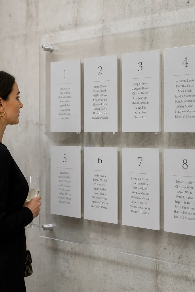
Thick acrylic makes your seating chart feel modern and clean. Floating cards look airy, and the transparency lets the venue texture show through instead of covering the backdrop. This is the best pick for minimal, modern weddings and for venues with beautiful flooring or wall texture you want guests to still see. It also photographs well because acrylic edges catch highlights without looking cheap if it’s the right thickness. Keep the layout simple: header at the top, then table sections in columns.
Start with a thick clear acrylic base sign (at least 8-10mm) and attach a printed header behind it using acrylic-safe adhesive. Then set table cards into clear acrylic holders or stand-offs so each table section floats slightly. Finally, place it at chest height so guests can read without bending, and keep a microfiber cloth nearby for smudges.
Print names in a high-contrast color like black on white; transparency makes light gray disappear in bright sun.
Don’t use thin acrylic that flexes; it warps the layout and looks flimsy in photos.
8. Vintage map seating chart with table pins
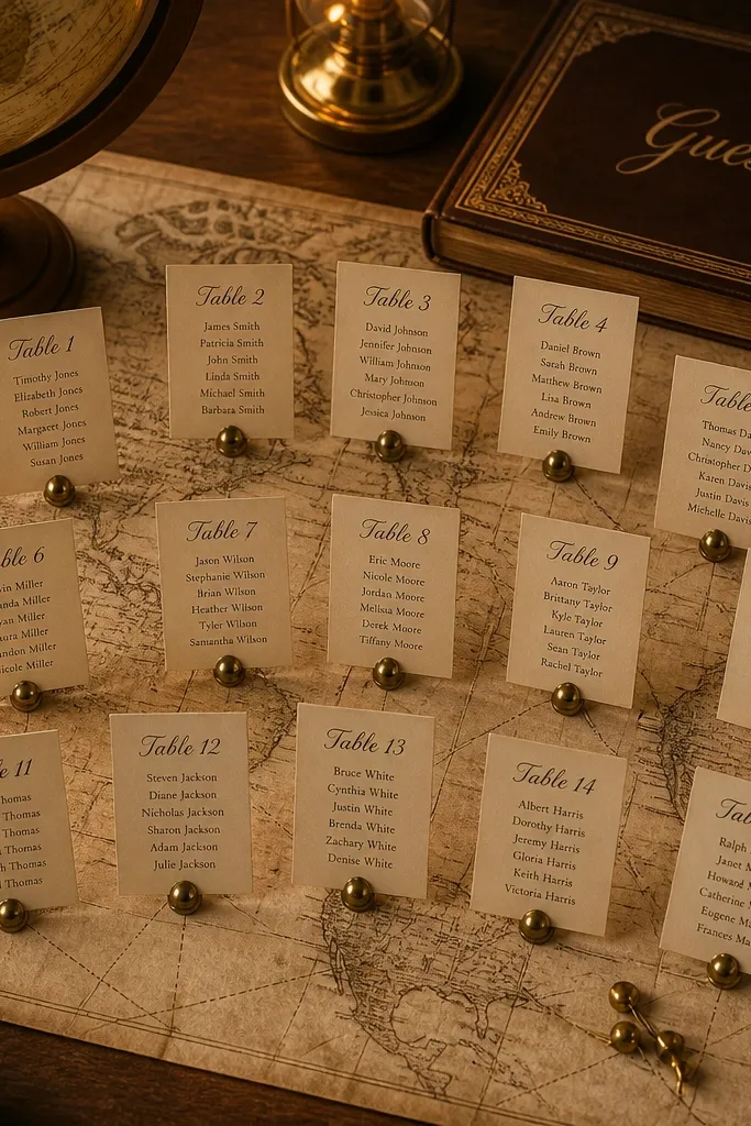
A map turns the seating chart into a story without writing a paragraph. The vintage paper texture gives you depth, and pins make it interactive without being messy. Guests scan by table pins, then read their names on cards placed next to each pin cluster. This works best for destination weddings, travel-themed weddings, or venues with an old-world vibe. For photos, the map’s color variation looks great in both warm and cool light, so it’s forgiving if the weather shifts.
Start by mounting a vintage-style map print on foam board or a framed canvas (around 24x36 inches). Then place table circles or blocks on the map and attach small numbered pins for each table. Finally, attach separate guest name cards near the table clusters using small clothespins or removable magnets, and position the display where guests can stand to the side.
Quick tipUse numbered pins that match your table-number font color so the system feels intentional.
Skip thisSkip tiny font sizes; map textures make small text harder to read quickly.
9. Wood slab seating chart with laser-cut table numbers
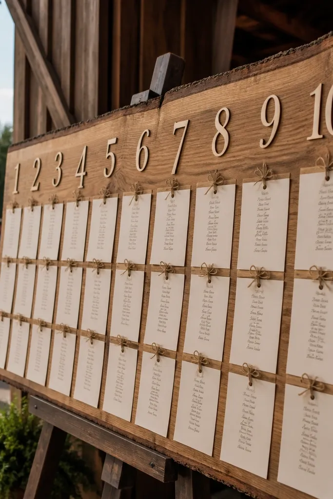
A live-edge wood slab instantly looks like a design object. Laser-cut table numbers add crisp edges that read from farther away than hand-painted numbers. Mount guest name cards in a neat grid under each number so the slab doesn’t turn into a cluttered board. This is perfect for barns, outdoor receptions, and venues with natural textures. In photos, the wood grain is the backdrop, so you get a gorgeous look even with minimal flowers.
Start with a live-edge slab (about 18-24 inches wide) and sand it smooth, then seal it with a matte wood finish. Then attach table number cutouts in a contrasting color and place printed guest name cards beneath each number using small standoffs. Finally, hang it or prop it on a sturdy stand and keep the seating chart angle consistent with the entrance walkway.
Use matte finish on the slab; gloss wood creates glare that hides text.
Don’t crowd the cards tight to the wood edge; leave a small margin so names don’t blend into grain.
10. Wreath-shaped seating chart with table rings
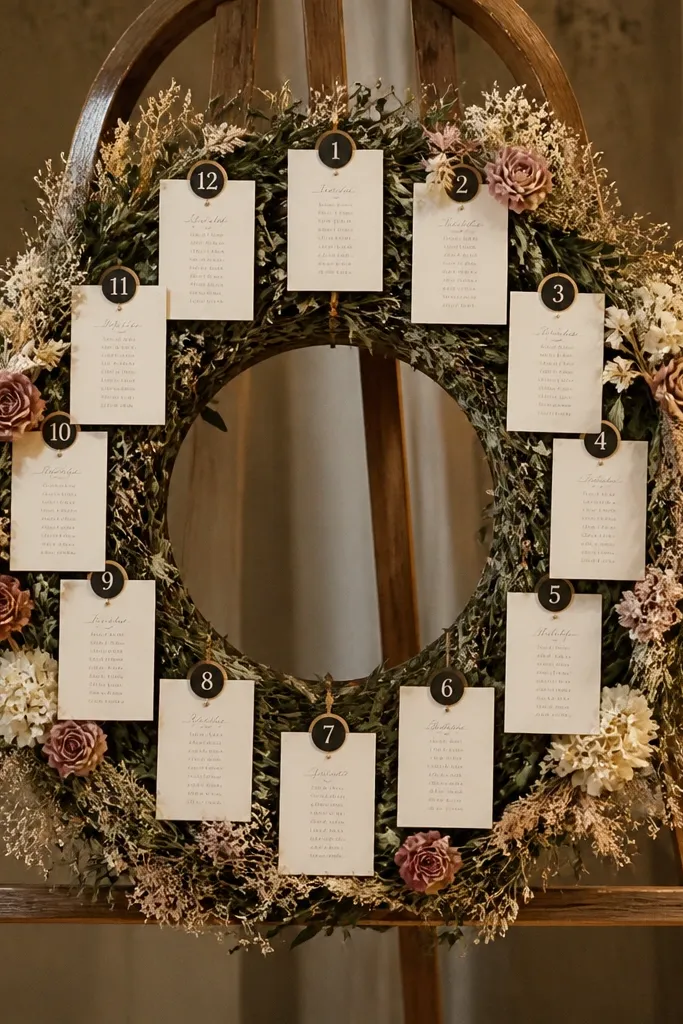
A wreath shape makes the seating chart feel like decor you’d hang anyway. The circular format also helps guests because table numbers repeat in a predictable path around the ring. Use a greenery base with dried flowers, then attach table number labels and guest name cards in sections like a clock. This looks incredible in photos because the frame draws the eye inward and the textures catch light. It works especially well for outdoor ceremonies with a natural background or indoor venues with a statement wall.
Start with a large wreath base (26-32 inches) and build it with greenery, keeping the center clear. Then attach table number labels evenly around the ring and add name cards in small segments using clips or ties. Finally, mount it on an easel or hang it at a slight angle so it doesn’t reflect overhead lights.
Use thick cardstock for name cards so they don’t flop in wind or humidity.
Skip real candles or anything that warms the wreath; heat can wilt greenery fast.
11. Terrarium-style seating chart with mini labeled cloches
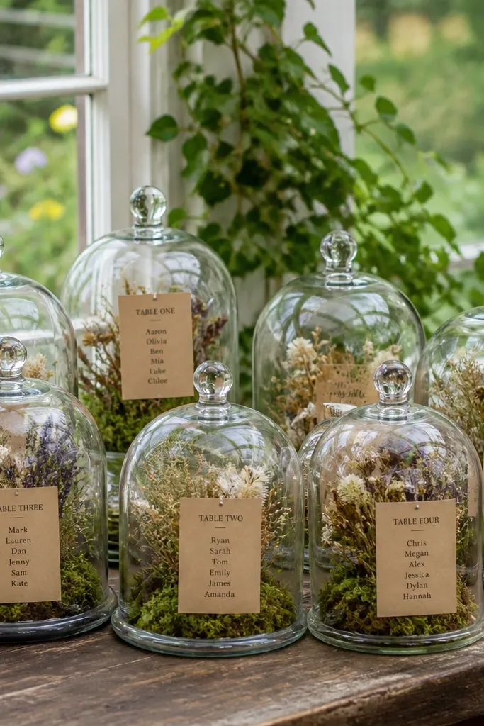
This is a hidden-gem idea because it looks like tabletop decor, not a sign. Small glass cloches keep each table section contained, which makes the chart feel curated and photo-ready from multiple angles. It’s best for weddings with a whimsical, garden, or greenhouse vibe. Guests find their table by the label on the cloche, then read the card inside. The glass also adds sparkle in sunlight, which makes the seating chart feel like part of the ceremony aesthetic.
Start with 8-14 small cloches (the kind used for desserts or display) and label each top with a printed table number sticker. Then place a guest name card inside each cloche on a small stand so it sits at readable height. Finally, arrange the cloches on a long tray or wooden riser near the entrance and add a simple header sign above it.
Quick tipKeep the cloches clean and dry; fingerprints show up fast in natural light.
Skip thisDon’t use flimsy name cards; moisture and condensation can ruin the look.
12. Shadow-box seating chart with layered table labels
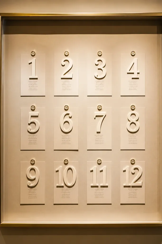
A shadow box makes the seating chart feel expensive because it literally has depth. Instead of one flat print, you build layers: table numbers on the front layer, names on a mid layer, and a clean background behind. This is great when you want a museum-like look that still reads quickly. It photographs beautifully because you get crisp edges and soft shadows around each card. Choose a neutral background like cream linen or textured paper so the layers stand out.
Start by choosing a deep shadow-box frame (at least 2-3 inches deep) so cards don’t press against the glass. Then mount a background sheet and attach table number labels in a consistent grid, with guest name cards aligned under each label. Finally, hang it at eye level and add a small note card holder next to it for day-of updates.
Test readability from 6 feet away before you lock the layout in place.
Skip busy patterned backgrounds; they fight with the text and look messy in photos.
13. Calligraphy-style table scroll with ribbon pointers
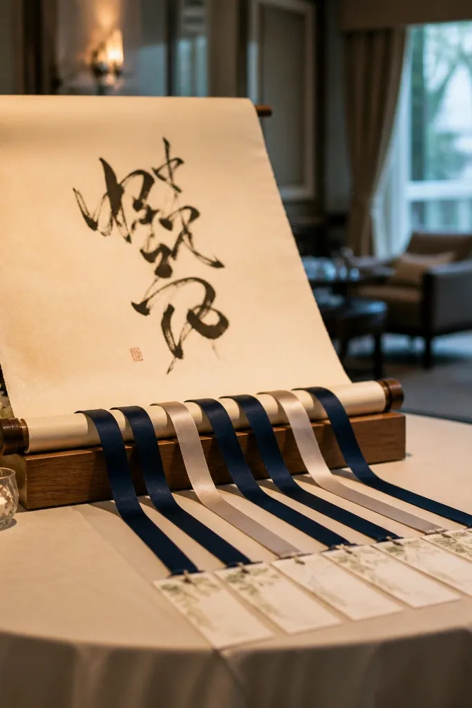
A scroll format looks romantic and feels like an invitation, not a seating list. The trick is to keep it structured: use ribbon pointers that guide guests to the right table card, so they don’t have to read a long continuous line of text. This idea is a strong fit for formal weddings where the stationery vibe matters. It photographs well because the ribbon movement adds softness and the calligraphy style reads as intentional. Keep the scroll short — the display should help people find their table, not act like a storybook.
Start with a rolled parchment-style print mounted in a frame or stand, then place individual table number cards nearby in a neat row or grid. Attach ribbon pointers from the scroll header area to each table card so guests follow a visual path. Finally, add a small “Find your table” header sign and place the whole setup near where guests first gather.
Quick tipUse satin ribbon in two widths max; too many ribbon styles looks chaotic in photos.
Skip thisDon’t write every guest name on the scroll; that turns it into unreadable wall art.
14. Lantern-lit seating chart with hanging table tags
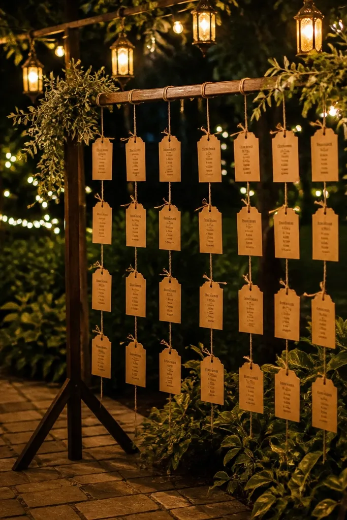
This is the seating chart that looks like it belongs at night. Hanging table tags under lanterns create a glowing, fairy-tale look while still letting guests find their table fast. Use lanterns with warm bulbs so the tags don’t look washed out, and choose a tag size that’s readable even when people are moving. This fits outdoor weddings, evening receptions, and venues with string lights. Photos look gorgeous because the lanterns create a soft background and the tags add vertical lines.
Start with 10-20 small hanging tags made from cardstock or thin wood, each labeled with a table number and guest names. Then suspend them from a simple frame or line above the seating chart area using clear fishing line or thin ribbon. Finally, place lanterns at the base or around the frame and add a sign that explains how to read the tags.
Use warm white bulbs (around 2700K) so the paper colors stay true under light.
Skip thin paper tags; they flutter and blur in photos.
15. Table-number aisle markers that double as seating chart
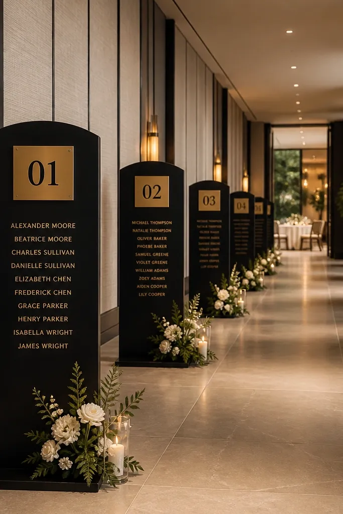
If your guests get confused walking in, aisle markers fix that and still look styled. Instead of a single chart, you place smaller panels along the path from entrance to reception — each panel shows table number and a short guest list. It’s a smart look for venues where people spread out rather than line up. For photos, the repeating markers create a clean pattern along the walkway. This works best for outdoor spaces, long hallways, and garden venues where you want guests to flow naturally.
Start by measuring the walking path and picking 6-12 marker points where guests will naturally slow down. Then create identical panels for each table number with guest names, mounted in matching frames or stand-offs. Finally, secure them so they face the direction guests are walking, and add one overhead header sign that tells them the system.
Keep panels at consistent height and spacing; uneven placement looks sloppy in photos.
Don’t put markers in places where people pass too fast — guests will miss their table and stop less.



