
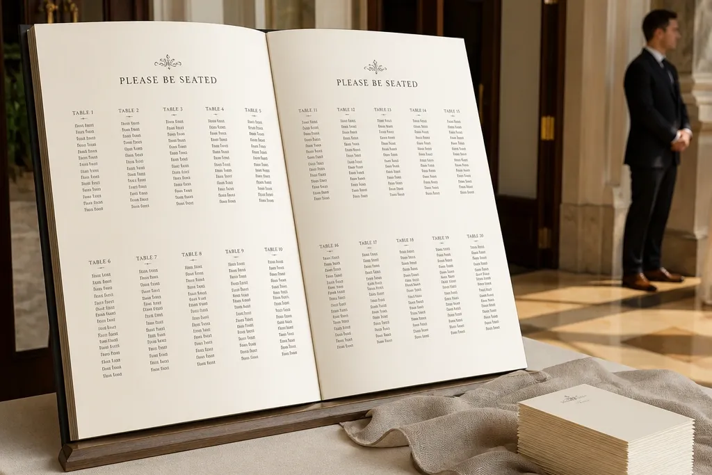
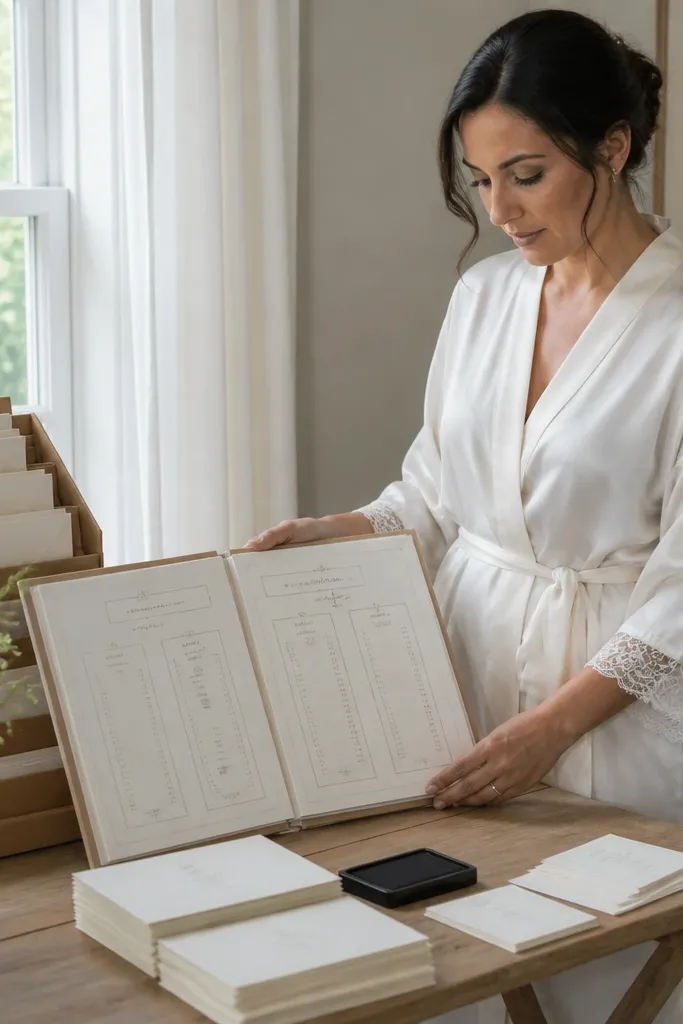
1. Open-Book Wedding Seating Chart on a Ladder Shelf
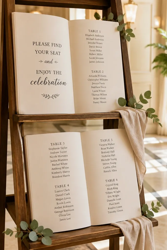
This is the cleanest way to make a seating chart look like decor instead of paperwork. The ladder shelf gives you vertical structure, and the open-book layout creates two readable “pages” where table numbers sit above the guest names. Choose cream or off-white pages with black typography so it stays readable in both shade and warm indoor light. It suits venues with slightly rustic styling, like barns, patios, and modern farmhouses, and it photographs well from the front because the ladder frames the chart.
Start with a small ladder shelf that has 2-4 tiers and place your chart centerpiece on the middle rung for eye-level viewing. Print two matching “pages” (one per side) with table headers large enough to read at 6 feet, then sleeve them in clear laminate. Create guest cards on thick cardstock, and slide them into pockets or clip them with mini bulldog clips so you can swap names without reprinting.
Bring a roll of painter’s tape and map where each card row lands on the page before you add names.
Don’t use thin paper sleeves that wrinkle — the whole look collapses when the pages don’t sit flat.
2. Black Acrylic "Book Spine" Seating Chart with Removable Tabs
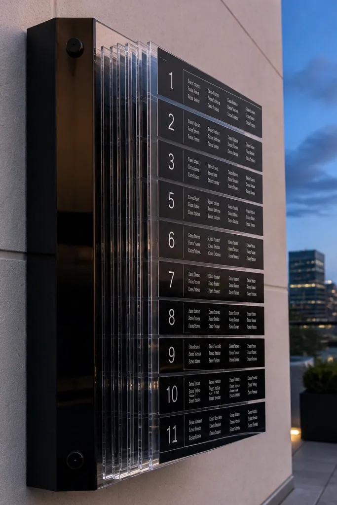
If you want modern and extra photogenic, go with a black acrylic spine and removable tabs. The spine reads like a book cover, and each tab is a separate page for a table, which keeps your chart tidy as names change. This is ideal for venues with clean lines, like hotel ballrooms, modern lofts, and city rooftops. It also holds up in bright daylight because the material stays crisp and the contrast stays strong.
Buy or cut a single black acrylic sheet for the spine and mount it on a stand so the top edge is at about chest height. Print table-number tabs with guest names in a consistent layout, then laminate each tab for durability. Clip the tabs onto the spine using small binder clips or acrylic-friendly standoffs so you can remove and replace tabs quickly if you revise seating.
Use a matte finish if you can — glossy acrylic catches glare and makes names hard to read in photos.
Don’t cram long guest lists into tiny tabs; wrap names to two lines max for fast scanning.
3. Leatherette Photo-Book Seating Chart with Pocket Index Pages
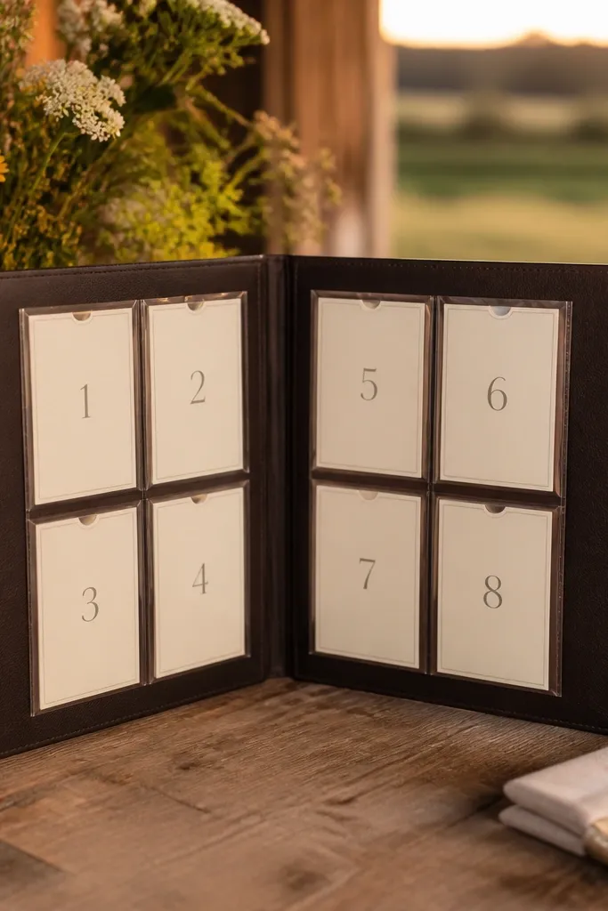
This one looks like an heirloom photo book, which is exactly why it works as a seating chart. Pocket index pages let you show table numbers as tabs while keeping names protected and flat. It suits weddings that lean classic, warm, or editorial, and it looks great in both indoor receptions and countryside settings. Guests also love it because it feels intentional and “keepsake-like,” not like a random sign.
Start with a large leatherette-style photo album or a book binder with clear pocket pages sized for 4x6 inserts. Print table headers on thicker paper and insert them into the top pocket row so they’re visible at a glance. Place guest name cards in the pockets below each table header, then seal the pages with the clear covers so the display stays neat all night.
Use sticky label dots on the back of each pocket page to track table order during setup.
Don’t write table numbers by hand — inconsistent letter size makes the whole thing look rushed.
4. Fold-Out Accordion Book Seating Chart Mounted on a Frame
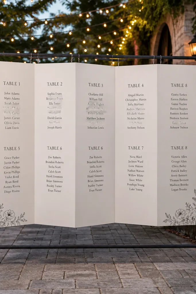
An accordion book layout gives you big readable “pages” without needing a huge table or stand. When mounted on a frame, it looks like a design feature and stays stable while guests browse. This works best for weddings with a dedicated stationery corner or a calm flow near the reception entrance. It’s also excellent for larger guest counts because you can fit more tables across multiple folds.
Quick tipDo a dry-run opening/closing before the wedding so the folds don’t snag on your stand.
Build a frame base using foam board or a lightweight wood panel and mount it on a stable easel or stand. Print accordion panels with table headings on each fold, then laminate the full set. Connect the panels with accordion hinges or pre-made book spine bindings so it opens smoothly, then insert laminated name strips into pockets on each fold.
Skip thisDon’t use glossy lamination if you’re displaying under spotlights — glare makes names disappear.
5. Vintage Book Pages with Tea-Stain Borders and Typed Names
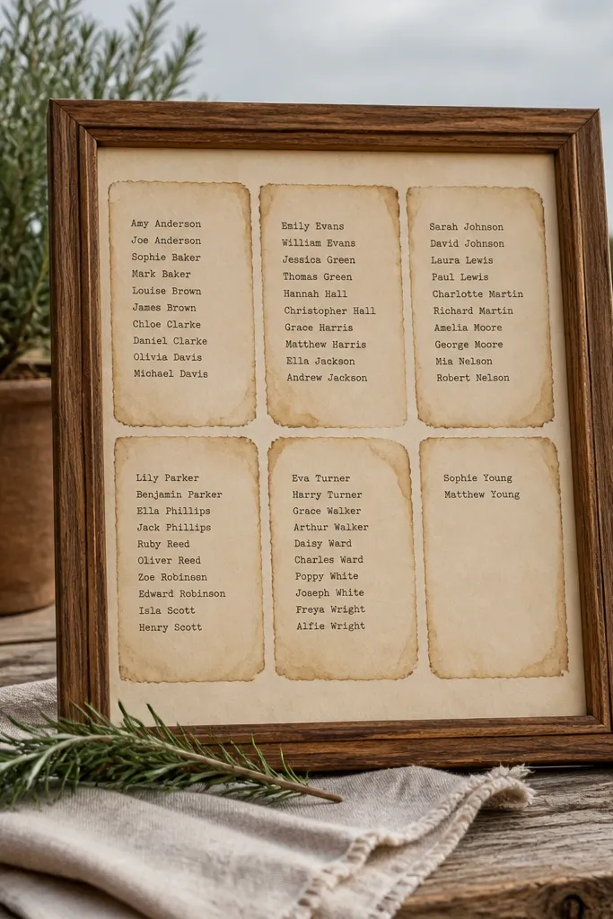
This is the romantic option that still stays readable. Tea-stain borders create that old-book feeling, while typed names keep it clean and legible. It fits outdoor garden weddings, rustic venues, and any theme that wants softness without going full cottagecore clutter. Guests read it quickly because the table headings are consistent and the names sit on a stable printed grid.
Quick tipKeep the stain light — heavy staining makes paper look cool but hurts contrast for dark ink.
Print your table headings and guest names on cream paper, then add a thin tea-stain border only around the edges so the center stays clear. Place each table’s page into a binder clip or within a simple book stand so it looks like one multi-page display. Number your tables in a single font size and keep names aligned in columns; laminate or cover with a clear sheet if you’re in a humid setting.
Skip thisDon’t mix handwriting fonts with typed names; it reads chaotic from a distance.
6. Monogrammed Book Cover Seating Chart with Table Inserts
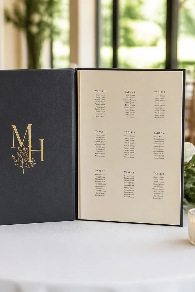
A monogrammed cover turns your seating chart into a piece of branding. The “cover” hides the chaos and only reveals the guest info once you open it, which makes the final look feel intentional. This works for couples who want minimal decor but still want a clear, photogenic seating display. It’s also practical because you can swap inserts if seating changes last minute.
Start with a book-shaped box or a two-panel display that opens like a folder (you want a cover and an inside panel). Add your monogram using vinyl on matte cardstock or printed lettering, then attach it to the front cover. Inside, install table inserts as separate pages with pockets, and place laminated name cards into each pocket under the correct table number.
Label the back of each insert with the table number so you don’t flip the wrong page during setup.
Don’t center everything — guests scan better when table numbers sit in a consistent top-left position.
7. Giant Hardback Book Seating Chart with Side-Loading Name Strips
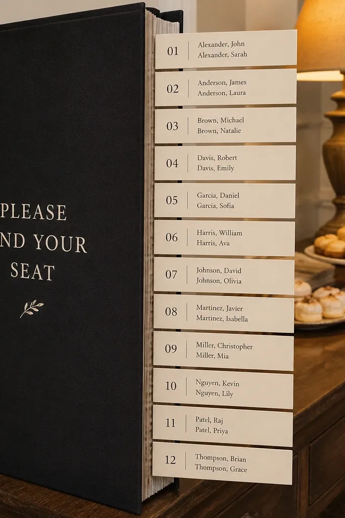
This is the “editorial magazine” look. A giant hardback book turns a seating chart into a statement object, and side-loading strips keep names organized without paper corners poking out. It’s great for indoor receptions where you have a clean wall or a dessert table backdrop. Guests also love it because it looks like something you’re supposed to interact with, not just read from across the room.
Get a large book-shaped display base (or build a rigid box) and add a spine so it reads like a real hardback. Create vertical slots or side pockets where each table’s name strip slides in from the side. Print table numbers larger than guest names, then use laminated strips with consistent spacing so each insertion looks neat even if someone handles it.
Use thicker lamination on the strips — thin sheets curl and catch light in a bad way.
Don’t put every table on one strip; one table per strip keeps it readable and photogenic.
8. Terracotta Terrarium Book Stand Seating Chart with Terracotta Cards
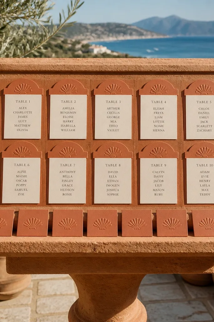
Warm color does half the work for you. A terracotta book stand with matching card stock makes the seating chart feel like decor, especially outdoors. Use terracotta headers with cream name cards so names stay legible even in bright sun. This suits desert-modern, Mediterranean, and earthy palettes, and it photographs beautifully against greenery. The book stand also keeps the display at a stable height so guests don’t crowd and block photos.
Choose a book stand in a warm neutral (terracotta, clay, or burnt sienna) and set it on a small tray for a clean footprint. Print table headings in terracotta ink and names in black on cream cardstock, then laminate the name cards only. Insert name cards into pocket sleeves or clip them to the inside pages so you can adjust quickly if you revise seating.
Place the stand in shade if you can; terracotta ink can get washed out under harsh direct sun.
Don’t use terracotta for the guest names — it kills readability.
9. White Ceramic Book Plinth Seating Chart with Chalk-Style Labels
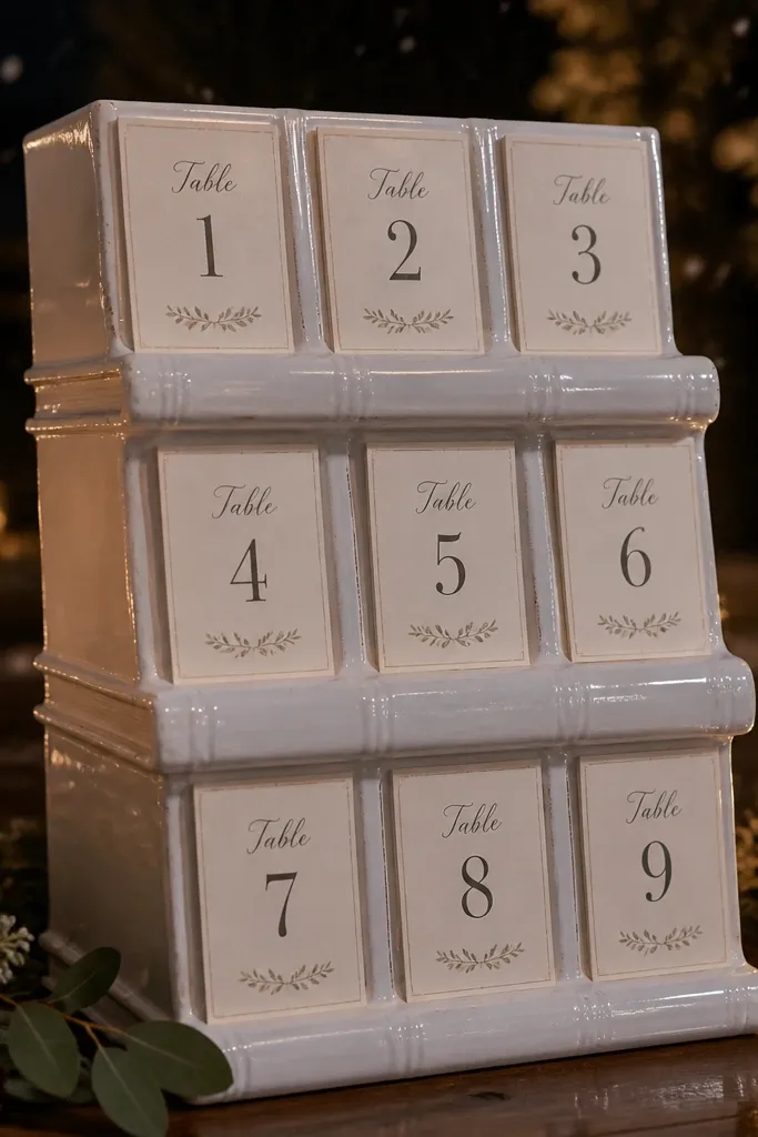
A white ceramic plinth makes the chart look like a styling prop, not a sign. The book layout stays clean, and chalk-style labels give you that soft, handmade vibe while remaining readable. This is a strong pick for winter weddings, garden receptions at night, and any venue where you want bright contrast. Guests find the chart fast because the white base reflects light and the labels sit in a consistent place.
Start with a white plinth or pedestal and place a book-shaped display on top so the top of the chart is around eye level. Print table headings with a chalk-inspired font in dark gray, then laminate so the labels don’t smear. Add guest name cards as removable inserts in pockets, so you can update without reprinting the entire page.
Use dark gray ink instead of pure black if you’re aiming for a softer look in photos.
Don’t rely on real chalk — smudging looks bad fast when guests hover.
10. Garden Wreath Book Seating Chart with Table Cards on Mini Clothespins
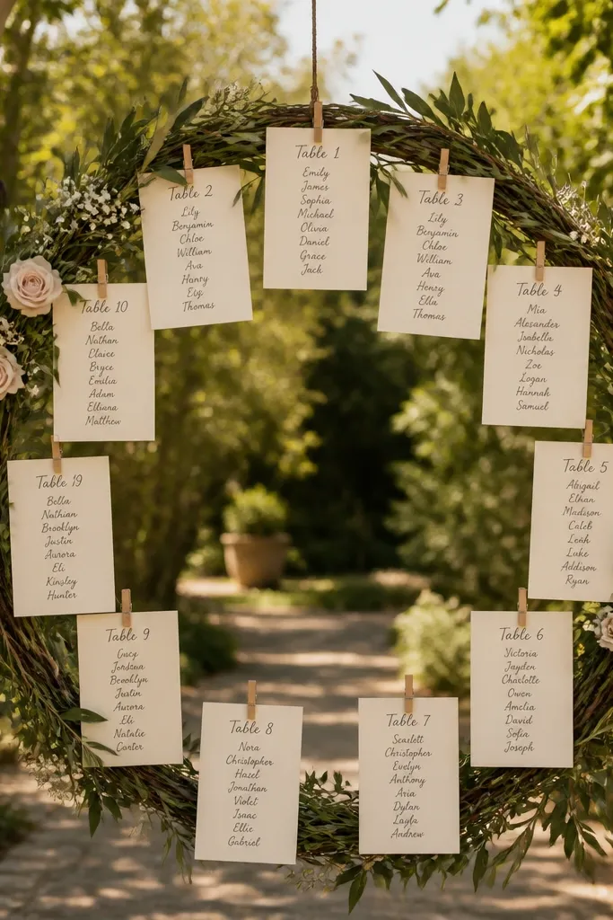
This one is playful and very photogenic. The wreath shape frames the chart, while mini clothespins let each table card hang like a page bookmark. It works best for outdoor weddings, especially near an archway or garden wall. Guests get a clear visual cue because table cards are spaced evenly around the wreath, and names are easy to spot when the clothespins keep each card flat.
Quick tipBring extra clothespins and a couple of spare laminated cards; one slip of wind can misalign a card.
Build a wreath frame (foam or grapevine) and attach a book-style backing board behind it so it feels like one object. Print table headings and guest names on cards sized for clothespins, then laminate them for weather resistance. Clip one table card per clothespin, leaving a small gap between tables so names don’t overlap in photos.
Skip thisDon’t overload the wreath — if every card fights for space, guests can’t read it.
11. Sky-Blue Watercolor Page Seating Chart with Acrylic Cover
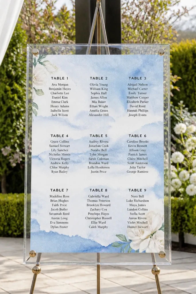
Watercolor backgrounds make the chart look like stationery, not a utility sign. Keep the watercolor subtle and place guest names in crisp black text so the page stays readable. This is perfect for spring and summer weddings, especially with light airy themes. The acrylic cover protects the artwork and keeps it looking fresh across the night. Photos come out clean because the acrylic creates a smooth, glossy barrier over the paper.
Print watercolor-style page backgrounds on thick paper or use pre-printed paper, then overlay table headings and names in dark ink. Place the finished pages into a clear acrylic document cover or frame so the paper stays flat. Add removable name cards in pockets or with small corner tabs so you can adjust without disturbing the watercolor base.
Use thicker paper under the watercolor so it doesn’t warp under lamination or humidity.
Don’t choose watercolor that’s too busy behind the names — it turns readability into guesswork.
12. Navy Hardcover Map-Style Seating Chart with Table Coordinates
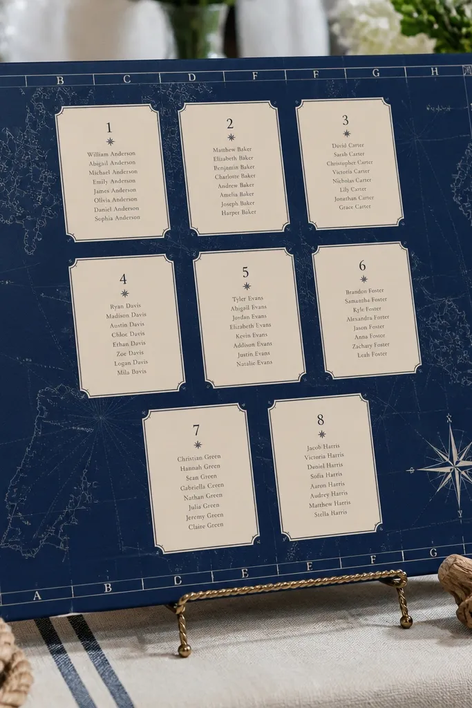
Map-style design gives you a theme that’s instantly visual and still practical. A navy “hardcover” look makes names pop, and coordinate-style table headings feel clever without being gimmicky. This suits beach weddings, travel themes, and couples who want a graphic look. Guests can scan the chart quickly because each table has a clear label pattern and the names sit in neat rows.
Quick tipKeep coordinate labels short (like “Table 12 — Dockside”) so the page stays uncluttered.
Create a navy cover panel and inside pages that look like map sheets (light grid lines, subtle contour marks). Print each table heading like a coordinate label, then keep guest names in a simple two-column layout. Mount the pages in a book binder or clip them into a display so it looks like one volume, and use laminated name cards if you expect last-minute changes.
Skip thisDon’t add decorative icons near names — icons steal space and reduce legibility.
13. Gold Foil Title Book Seating Chart with Numbered Page Tabs
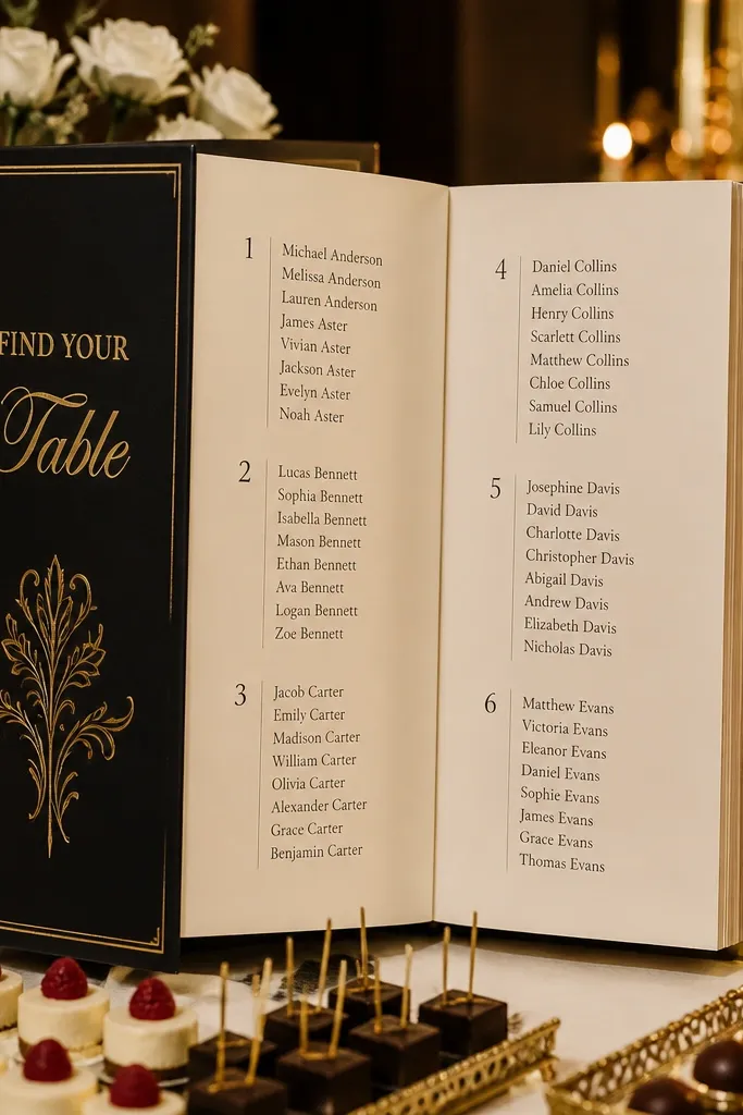
Gold foil makes a seating chart feel like part of the wedding stationery suite. The trick is to keep it controlled: use gold only for the title and table-number tabs, not for the guest names. The numbered tabs act like a real book index, so guests find their table fast. This works especially well in evening receptions, ballroom weddings, and any venue with warm lighting. In photos, the gold adds sparkle without turning the display into a cluttered mess.
Quick tipUse matte laminate on tabs — it keeps the gold from turning into glare stripes in photos.
Print a title page with gold-foil-looking text (or use gold vinyl letters) and place it on the front of your book-style display. Create numbered tabs for each table and laminate them so the edges stay crisp. Under each tab, insert laminated guest name cards into pockets or clip them to a ruled grid so the alignment stays consistent.
Skip thisDon’t use gold ink for names; it reads gray in many lighting conditions.
14. Origami-Fold Page Seating Chart with Table Number Booklets
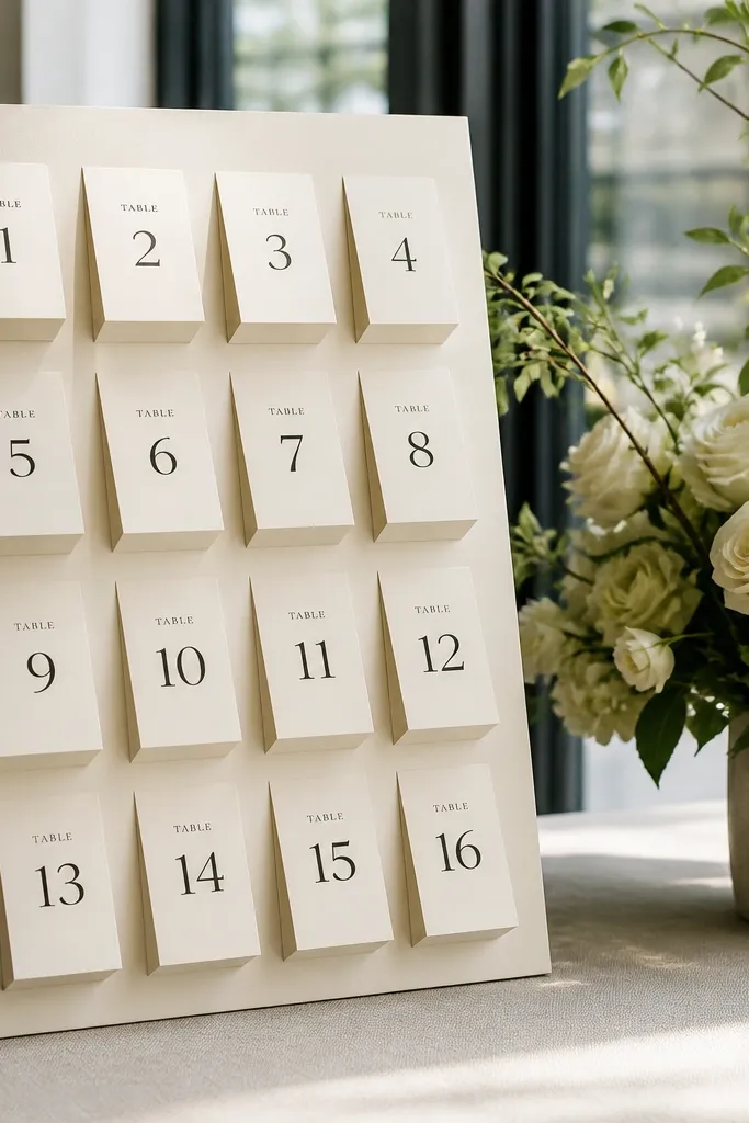
Origami-style folds add movement and make the chart look like art. Instead of one flat sign, you get mini booklets for each table number, which makes photos interesting and keeps names contained. This suits modern weddings that want texture, like minimal venues with lots of natural light. Guests can flip each booklet open to read names, so the interaction feels fun while still staying organized.
Make small booklet pages for each table using thick cardstock and fold lines that hold shape (simple tri-fold or bi-fold works best). Print table number text on the cover of each booklet and guest names inside in two columns. Arrange the booklets standing up in a display tray or on a base board like a library, and laminate the covers only so the folds don’t soften.
Score folds with a bone folder so the crease is sharp — soft folds make the display look cheap.
Don’t use thin copy paper; folds collapse and the table numbers stop looking intentional.
15. Transparent Pocket Organizer Book Seating Chart on a Stand
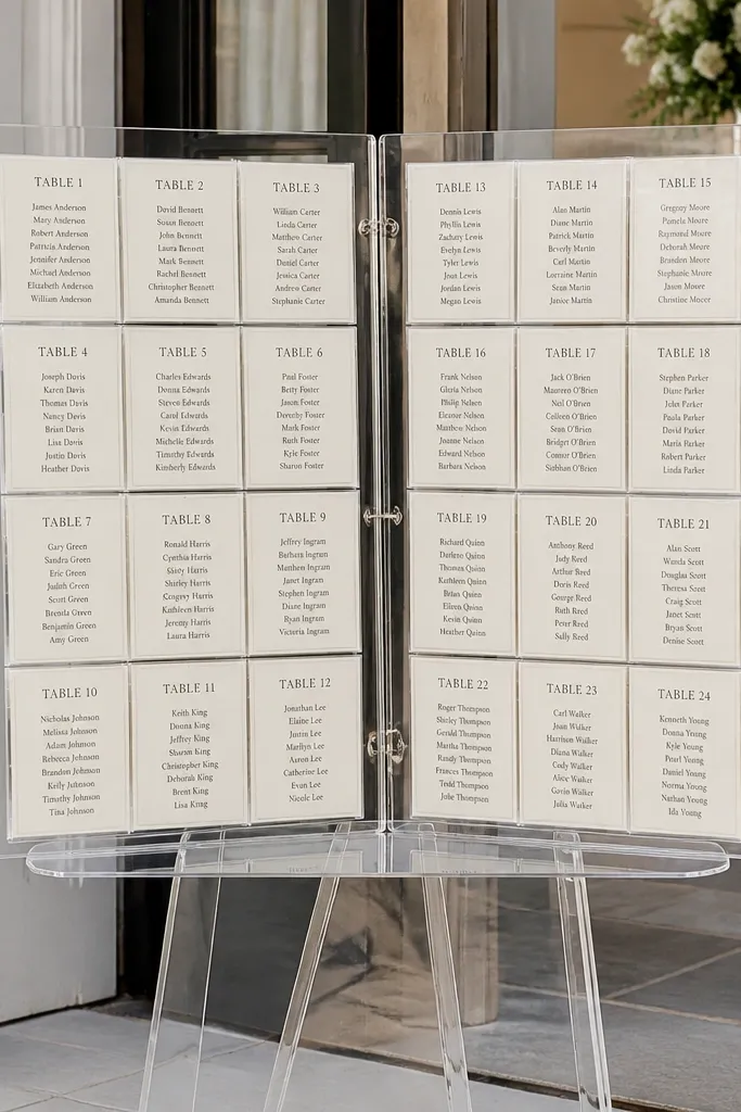
This is the “fast and clean” option that still looks styled. A transparent pocket organizer gives you uniform cards, consistent spacing, and easy updates. Book-style pages make it look like a curated display, and the clear pockets protect everything from spilled drinks and late-night handling. It fits almost any venue style because the structure is neutral. Best of all, it’s reliable if you have last-minute seating edits.
Buy a transparent pocket organizer that opens like a book or use clear pocket sheets inside a binder-style display. Print table headers in bold and place them above each pocket row, then insert laminated name cards into each pocket. Stand it on an easel so the top is at eye level, and use a label on the stand base so staff can direct guests if questions pop up.
Laminate name cards even if the pockets are clear — lamination makes text stay crisp when handled.
Don’t mix card sizes; one pocket size and one font scale keeps the whole thing looking designed.



