
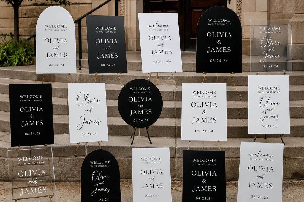
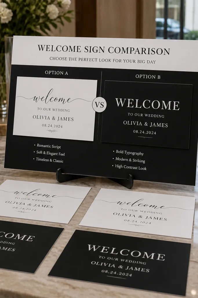
1. Matte cardstock in a 18x24 wood frame
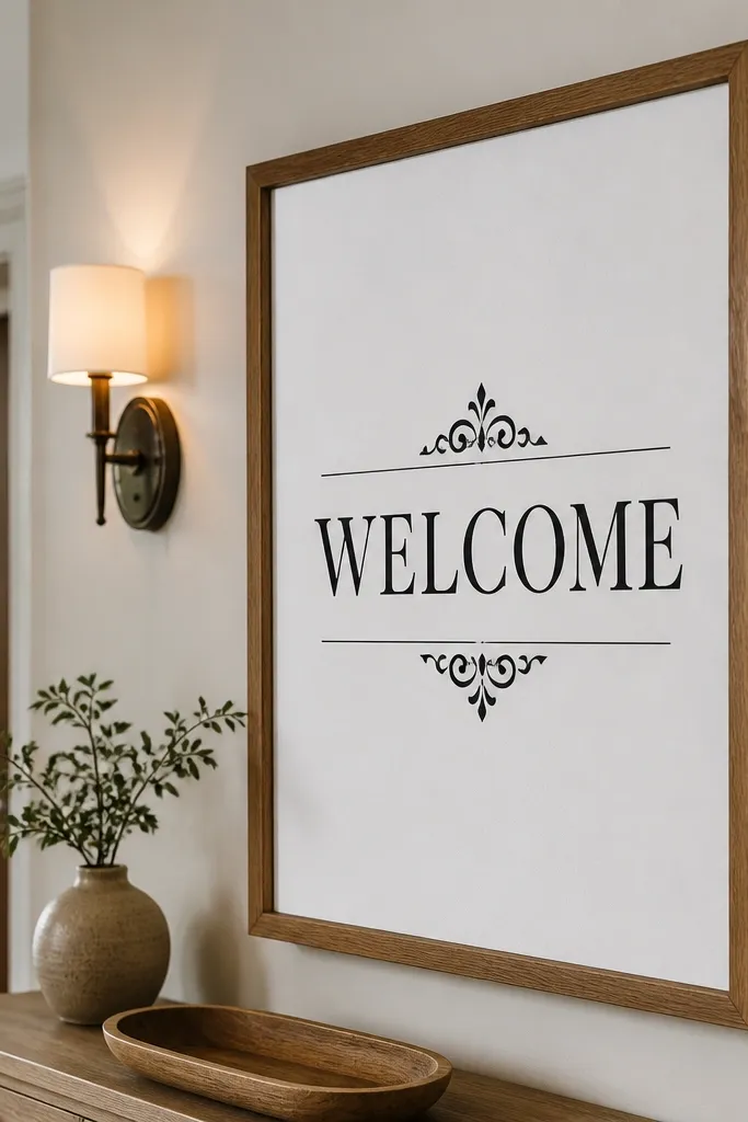
This is the “works in every venue” choice because matte cardstock kills glare and the wood frame adds warmth to otherwise stark black-and-white. The contrast stays crisp in both daylight and indoor lighting, so your sign reads in wide venue shots and close selfies. If your entrance has white walls or neutral decor, the white background makes the typography look clean instead of harsh. It also lets you use a bolder font without the sign looking heavy or crowded.
Quick tipIf your venue has overhead lights, matte beats glossy every time.
First, pick a finished frame size of 18x24 and order the print at 16x20 so it leaves a clean inner margin. Then choose a matte paper finish (not glossy) and test readability by holding the sign at arm’s length and checking if the date line is still obvious. Finally, place it on an easel at guest eye level, not on the floor. Budget for $25-70 depending on print quality and frame style, and plan to assemble the day before so you’re not fighting alignment.
Skip thisDon’t stretch a small print to fit a big frame — it shows immediately in photos.
2. Black-on-white welcome sign with oversized date line
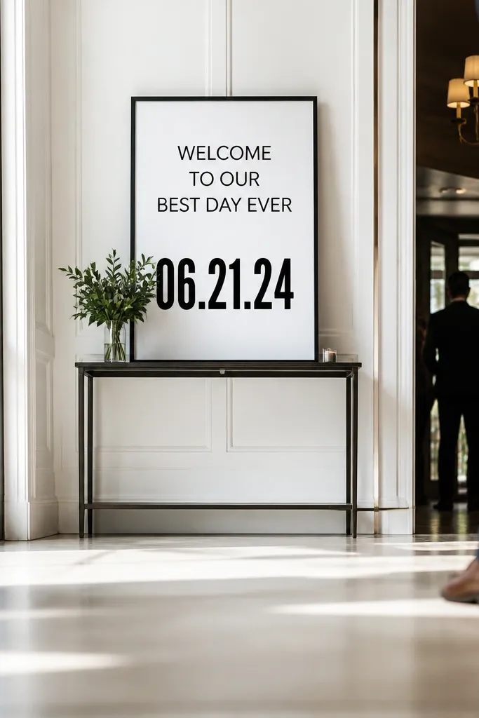
Oversizing the date line is the simplest way to make a black-and-white sign feel designed instead of generic. Guests remember the date, and the biggest visual element should match that. This format works best when your sign sits a little farther back, like near a hallway entrance or at the end of a walkway. It also photographs well because the date becomes the focal point even when people are moving through the frame.
Quick tipUse two font styles max: one for names, one for the supporting line.
Start by limiting the layout to three blocks: names, “Welcome,” and the date. Then set the date line at about 1.8x the height of the names, and keep the font weight bold so it doesn’t look thin. Finally, print on matte white stock and mount it on foam board if you’re using an easel outdoors. Expect roughly $30-90 depending on size, and plan for 1-2 days from design approval to print pickup or delivery.
Skip thisSkip script fonts for the date — they blur when the sign is far away.
3. White-on-black acrylic with thin gold accent line
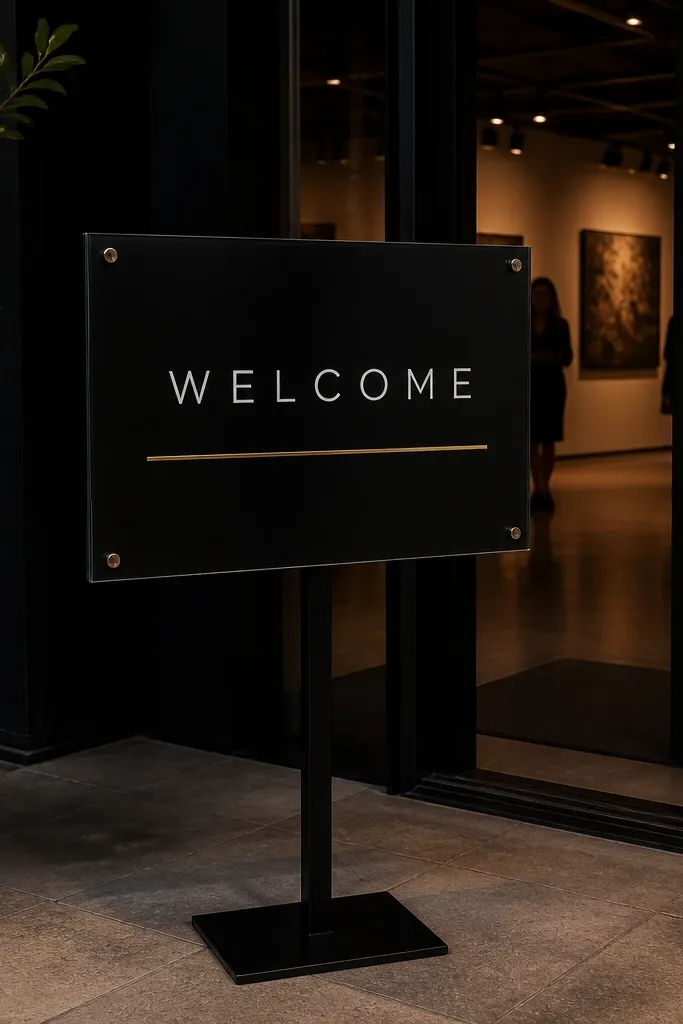
White-on-black acrylic is dramatic without needing color, and it stays readable at night because the background is dark and solid. The key is keeping the typography clean: thin serif or heavy sans both work, but the spacing has to be generous. This is a strong pick for venues with dimmer lighting, modern galleries, or receptions where you want the sign to look intentional in every photo. The subtle gold accent line gives you a “designed” feel while still staying in a black-and-white world.
First, choose a rigid acrylic size like 8x12 or 12x18 based on your placement distance. Then request or design a backer so the black background is uniform and doesn’t look patchy through the acrylic. Finally, mount it on a stand or hang it with clear standoffs so it doesn’t reflect overhead lights too hard. Pricing is commonly $80-220, and you should order at least 2 weeks before the wedding to avoid rush fees.
Place it where it won’t catch direct spotlight glare — angle it slightly if it reflects harshly.
Don’t use super fine fonts on acrylic; thin strokes disappear under reflections.
4. Laminated cardstock on foam board for outdoor entrances
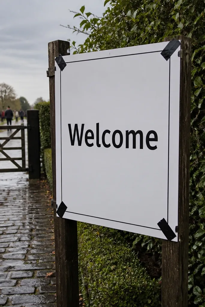
If your welcome sign will face wind, this is the practical black-and-white option. Lamination adds scratch resistance and holds up to light rain drips better than paper alone. Foam board keeps it flat, so it won’t curl after a windy drive to the venue. This style still looks clean and modern if you keep the layout simple and use matte laminate.
First, print on matte white cardstock and laminate it with a clear matte film. Then mount the laminated sheet to foam board, using spray adhesive or double-sided mounting tape along the edges for a smooth finish. Finally, add a sturdy base or use an outdoor sign holder so the board doesn’t wobble. Cost typically lands $35-90, and you’ll want to assemble 24 hours before so it stays flat.
Take one photo of the sign in the same lighting you’ll have at the venue before you leave home.
Avoid glossy laminate outdoors — it turns light into glare and washes out the text.
5. Chalkboard-style black sign with printed texture
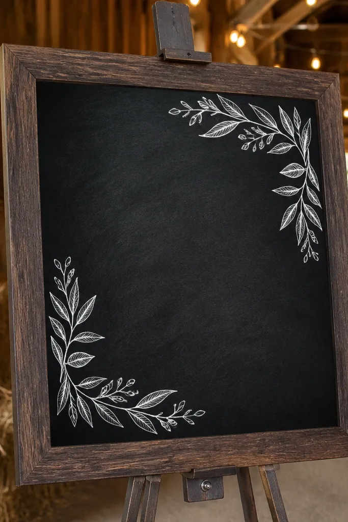
Chalkboard-style signs look warm and classic, but you’re not dealing with real chalk smudging or messy fingerprints. The printed texture gives depth, while the white lettering keeps it readable in black-and-white photos. This works best in venues with wood accents, barn doors, or rustic decor where a stark modern sign would feel out of place. If your venue is dim, it’s still readable because the text is bright against a dark field.
Start with a pre-made chalkboard-style board or a printed matte sign designed for chalkboard texture. Then choose a font that looks like chalk but stays bold enough for distance viewing, especially for the date line. Finally, place it under covered areas or near a wall so wind and direct overhead lights don’t create glare. Budget for $40-120, and aim to have it ready the day before since chalkboard finishes show scuffs if handled late.
If you’re using an easel, tighten the legs — chalkboard-style boards wobble more than rigid acrylic.
Don’t add too many lines; chalkboard textures make small text harder to read.
6. Vinyl decal on glass door with mirrored-friendly layout
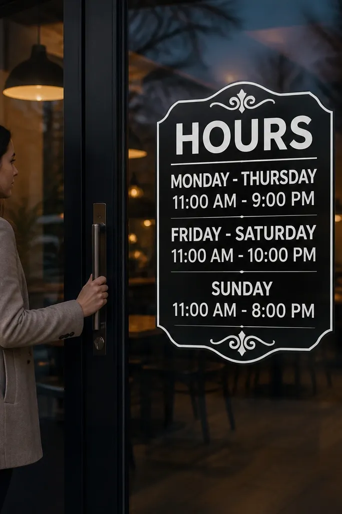
Vinyl decals are a smart move for venues where you don’t want a freestanding sign blocking traffic. On glass doors, black-and-white lettering reads clean and looks sharp in both wide and close photos. The layout is the difference: you want thick strokes and centered spacing so it doesn’t look cramped when it’s seen from an angle. This format also stays crisp across the day because it’s not affected by mounting or paper warping.
Quick tipClean the glass with alcohol wipe first; fingerprints kill contrast and show up in photos.
First, measure the glass area and pick lettering that spans about 70-80% of the door width, leaving a margin for the door frame. Then apply vinyl using an application tape so you don’t stretch the letters and ruin alignment. Finally, step back and check readability from the main walkway — adjust height so guests see it before they reach the door. Vinyl is often $20-80 depending on size and installation help, and you should apply it 1-2 days before so adhesives settle.
Skip thisSkip thin, delicate lettering — it breaks up on glass reflections.
7. Metal welcome sign with powder-coated matte finish
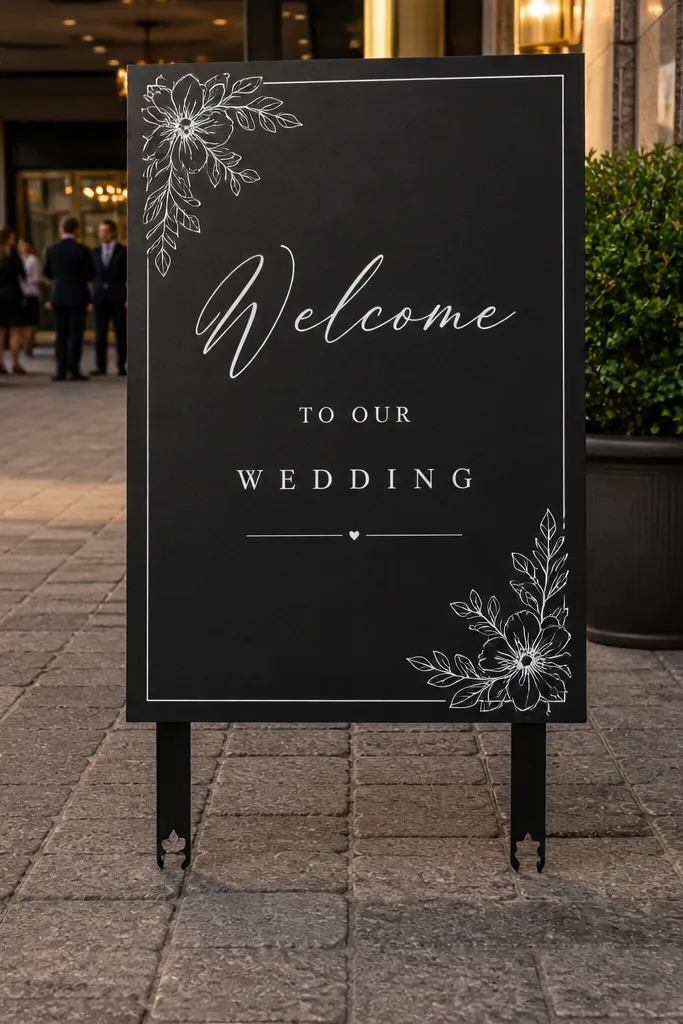
Powder-coated matte metal gives you the most durable black-and-white look. It doesn’t curl, it resists scuffs, and it reads well under harsh lighting because matte finishes reduce glare. This is the best fit when your venue has lots of foot traffic near the entrance or you want a sign that can be reused for future events. The feel is heavier and more “event-ready” than paper or acrylic, which shows up in photos as a grounded, solid presence.
Quick tipIf you’re using it outdoors, keep it off the ground and away from sprinklers.
First, choose a size like 12x18 or 18x24 based on how far guests stand from it. Then pick matte powder-coated black with white or cream lettering, and confirm the lettering is baked or permanently adhered so it won’t peel. Finally, use a stable easel or wall mount so it doesn’t tilt. Expect $120-300, and order early because metal signs are slower to ship than paper prints.
Skip thisDon’t choose glossy metal; reflections look cheap fast.
8. Acrylic frame insert with black-and-white print
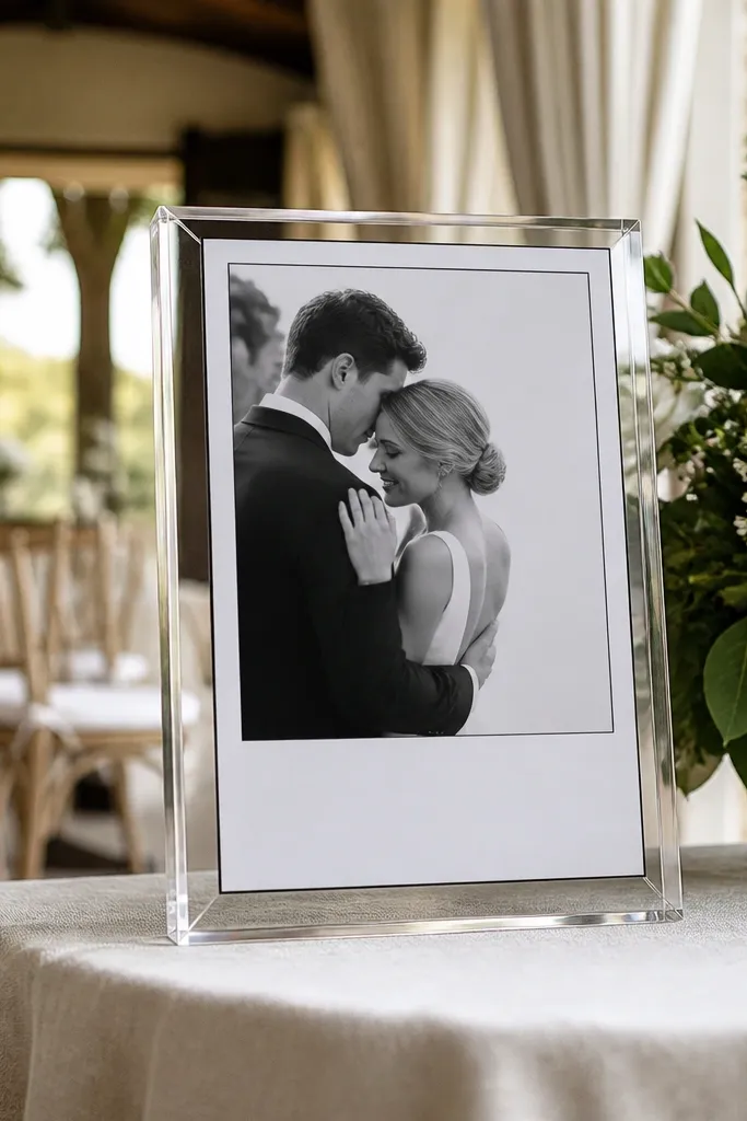
This is the clean, modern hybrid: the rigid acrylic gives structure, but you’re still using a paper insert for the design. You get crisp typography and easy updates if you want to swap the date or add a second line for a welcome drink. It’s also a good pick when you want your sign to look finished without paying for a full custom acrylic cutout. The only real trade-off is glare control — you need a matte insert or the right placement.
Quick tipUse a matte insert even if the frame is acrylic; it cuts glare more than people expect.
Start by ordering an acrylic frame sized for a standard print insert like 8x10 or 11x14. Then choose a matte print finish and insert it so the paper sits flat behind the acrylic. Finally, mount the frame on a sturdy easel and place it away from direct overhead spotlights. Cost is commonly $60-160, and you can assemble in minutes once the insert arrives.
Skip thisDon’t place it directly under a moving light source; reflections can flash across photos.
9. Oversized paper roll-up banner in black and white
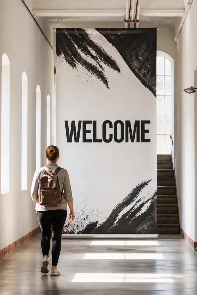
A roll-up banner is a practical solution when you need big, readable text without building a frame setup. It’s great for long hallways or venues with multiple entrances where you want guests to spot the welcome message quickly. Black-and-white keeps it clean, and the larger scale makes it forgiving if people move through the frame. The trade-off is that it can look “event trade show” if the design is too busy.
Quick tipUse a matte vinyl or matte banner print option if the venue has strong indoor lighting.
First, pick a banner height like 24-36 inches so the names and date stay readable from the entrance. Then keep the design to bold typography and one simple graphic element if you want it — no small flourishes. Finally, position it so the banner faces incoming guests and doesn’t fold at the edges from wind. Cost typically sits around $50-140, and you should order based on your venue measurements so it fits the space without looking oversized.
Skip thisSkip tiny script decorations — distance makes them look like noise.
10. Wood plaque with black stencil lettering
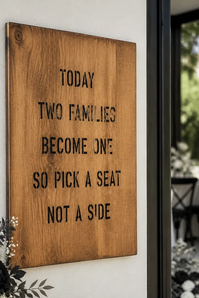
Wood plaques add texture and warmth, which makes black-and-white feel less stark and more “kept forever.” A stencil-style typography approach keeps the look modern and readable, even when the plaque has natural grain. This works especially well for farmhouse, modern rustic, and ceremony spaces with wood beams. If you’re pairing it with black candles, white florals, or neutral table settings, the plaque ties the vibe together.
Quick tipMatch the plaque finish to your furniture — matte wood with matte candles looks better than shiny wood with glossy decor.
First, choose a wood plaque size around 12x18 or 16x20 so the lettering isn’t cramped. Then opt for stencil-like typography that uses bold, uniform strokes for the date line. Finally, place it on a stand or hang it where it won’t catch direct sun flare. Expect $70-200 depending on finish, and order early if you want a specific font style and lettering layout.
Skip thisDon’t pick thin, decorative lettering; wood texture makes fine details disappear.
11. Black-and-white hand-lettered style on whiteboard-style sign
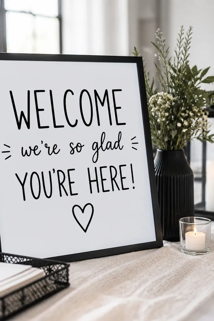
Whiteboard-style signs look clean in photos because the background stays bright and the black lettering has crisp edges. The hand-lettered look adds charm without needing real chalk, and it works well for modern rustic events where guests want something softer than a strict typographic poster. This option is also strong for indoor receptions because overhead lighting won’t punish the finish as much as glossy paper. Keep the design minimal so the welcome message stays readable.
First, choose a rigid whiteboard-style surface or a matte printed sign made to mimic that look. Then design with a clear hierarchy: “WELCOME” in bigger letters, names next, date last with bold spacing. Finally, mount on a frame or easel so the surface stays flat and doesn’t warp. Cost is often $40-120, and you should confirm the surface is matte to avoid glare from venue lights.
Use black lettering with thick strokes so it stays legible in low light.
Don’t add lots of decorative lines; it turns into scribble at distance.
12. Black-and-white typographic welcome sign with thin border

This is the “graphic design” option: simple typography, lots of white space, and a thin border that frames the text without adding clutter. It looks sharp for modern venues, city weddings, and anything with monochrome tablescapes. The border helps the sign read as a single piece instead of a random print. If your decor is already busy, this style keeps the welcome sign from competing.
Quick tipLeave extra margin around the border so it doesn’t get cropped by the frame mat.
Start by picking a sign size like 11x14 framed or 16x20 for a more prominent entrance. Then set a thin border line at consistent spacing from the edges — think 3/8 to 1/2 inch margin. Finally, print on matte white stock and keep the layout to two font sizes so it doesn’t look busy. Price is commonly $25-80, and you can reuse the frame easily if you edit the text later.
Skip thisSkip heavy drop shadows; they look muddy on matte paper.
13. Monochrome photo-to-text welcome sign
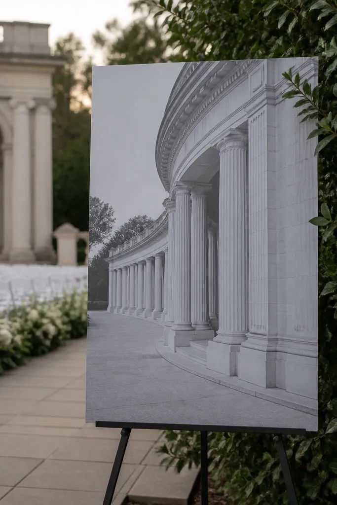
If your venue has a strong black-and-white theme, a monochrome photo background can look stunning. The trick is making the text readable: you need a background that isn’t too busy behind the typography. This style is best when your sign is near the ceremony area and guests will approach it, like at a welcome table. It can be gorgeous in photos, but it’s the easiest option to mess up if the background has high contrast behind the text.
Quick tipDo a test print at the same size — screen previews lie about contrast.
First, pick a background image that has large, calmer areas where text will sit, and convert it to black-and-white with a soft contrast. Then add a semi-transparent white overlay behind the text block, keeping the text black for a clean look. Finally, print on matte paper and frame it or mount it on foam board so it doesn’t curl. Cost varies by print type, usually $40-120, and you should check readability in the room lighting before the event day.
Skip thisDon’t place text directly over busy parts of the photo; it kills legibility.
14. A-frame chalkboard sign with double-sided messaging
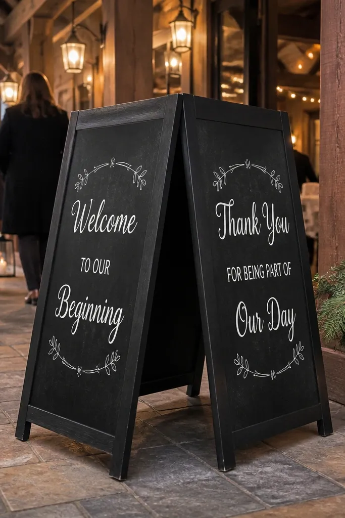
A-frame chalkboard-style signs are great for entrances because they face guests from different angles. Double-sided messaging makes the sign useful even if guests walk past it from the side, which is common at receptions with multiple entry paths. The black-and-white look stays cohesive, and the A-frame shape gives you that classic welcome feel. This works best when you want guests to find the right direction for check-in or the gift table, not just take a photo.
Quick tipIf it’s windy, add a small weight to the base so the A-frame doesn’t tip.
First, choose an A-frame board size around 24-30 inches tall so it stands out without blocking people. Then keep the text short on each side: welcome line and names on one, date and time on the other. Finally, position it where guests naturally stop, like near the bar or check-in, and secure the base if it’s outdoors. Price is commonly $60-180, and you should assemble on-site if the board ships in parts.
Skip thisDon’t cram the date and full address on both sides; it becomes unreadable.
15. Minimalist black-and-white tent card welcome sign
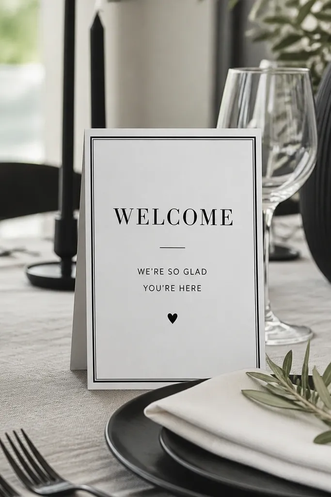
Tent cards are the underrated pick when the welcome sign is meant to guide guests at a welcome table, not act like a standalone entrance billboard. Black-and-white tent cards look crisp, they’re easy to place among centerpieces, and they won’t block sightlines. Choose this if your venue already has signage and you want a clean add-on that still looks intentional in close shots. It also works for rehearsal dinners and welcome drinks where guests are seated nearby.
Quick tipAdd a thick border around the card so it stands out against busy table textures.
First, pick a tent card size like 5x7 or 4x6 and keep the layout to a single welcome line plus names. Then choose a matte card stock and print with bold sans or bold serif so it reads clearly at tabletop distance. Finally, place it upright on a table edge where guests naturally look when they pick up programs or drink tickets. Cost is usually $12-40 for a set, and you can print extra for contingencies.
Skip thisDon’t use a light gray font; it disappears on camera and in dim lighting.



