1. Rattan shadow box with dried-bouquet corner
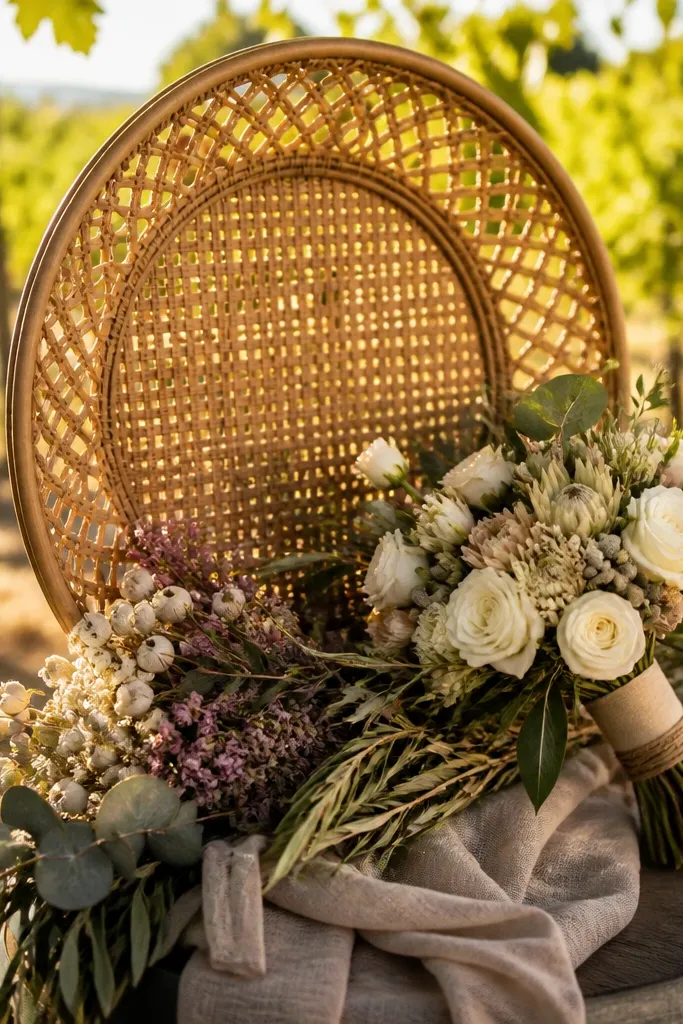
This is one of those hidden gems wedding photo ideas that makes your display feel handmade without looking messy. The rattan texture adds warmth and soft shadowing, so even a simple portrait photo looks dimensional. It’s especially good for photos that include florals — think bride’s bouquet in-frame, ceremony aisle flowers, or a close moment with a veil. The shadow box format also lets you tuck in a small preserved bouquet corner or ribbon strip, which turns the frame into a story object. Best time for this look is fall and winter weddings because warm textures photograph beautifully against darker outfits and richer backgrounds.
Start by choosing a shadow box depth of at least 1.5 inches so the preserved piece doesn’t press against the glass. Then pick one photo to center and place the bouquet element in the top-right or bottom-left corner so the composition feels intentional. Finally, hang it with a level spacer — rattan frames look straight even when the wall isn’t, so use a bubble level and tape marks before you drill. If you want it to look cohesive with other frames, match the mat color to your wedding paper suite (cream for classic, off-white for modern).
Preserve only a tiny piece — anything thick will create glare and make the glass look cloudy.
Don’t crowd the box with multiple items; one preserved element looks designed, three looks cluttered.
2. Black metal grid frame with 9 micro-portraits
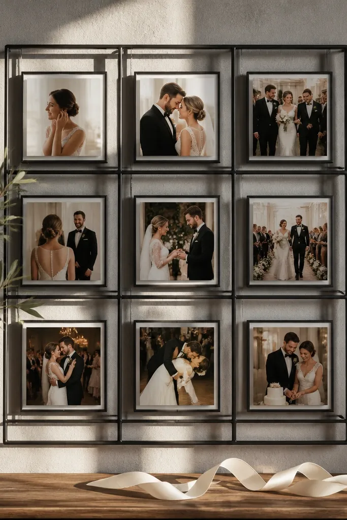
A black metal grid is a hidden gem wedding photo idea because it adds structure to an otherwise sentimental wall. The thin metal lines give a gallery feel, and the small portrait sizes make it perfect for capturing a sequence: getting-ready, first look, vows, and dancing. It works best when your photos are consistent in exposure — the grid makes differences more noticeable, so aim for images with similar brightness. Pick six portrait moments and three detail shots (ring, shoes, bouquet) so the grid reads like a mini story. This look is strongest for modern weddings or any couple who likes clean typography-style visuals.
Start by selecting nine photos that share a similar color temperature — warm indoor shots together, cool outdoor shots together. Then group them by mood: three getting-ready moments in the top row, the ceremony in the middle, and celebration at the bottom. Finally, mount the frame with the long side level, and keep it as the “anchor” in your layout — put it where the wall center would naturally fall. For spacing, leave a 2-3 inch gap between this frame and nearby frames so the metal grid doesn’t feel cramped.
Quick tipMat all the photos inside the grid if the frame allows it; white mats stop the grid from turning into a blur.
Skip thisAvoid mixing wide landscapes and tight portraits in the same grid unless they all have matching aspect ratios.
3. White linen mat with clear acrylic edge frame
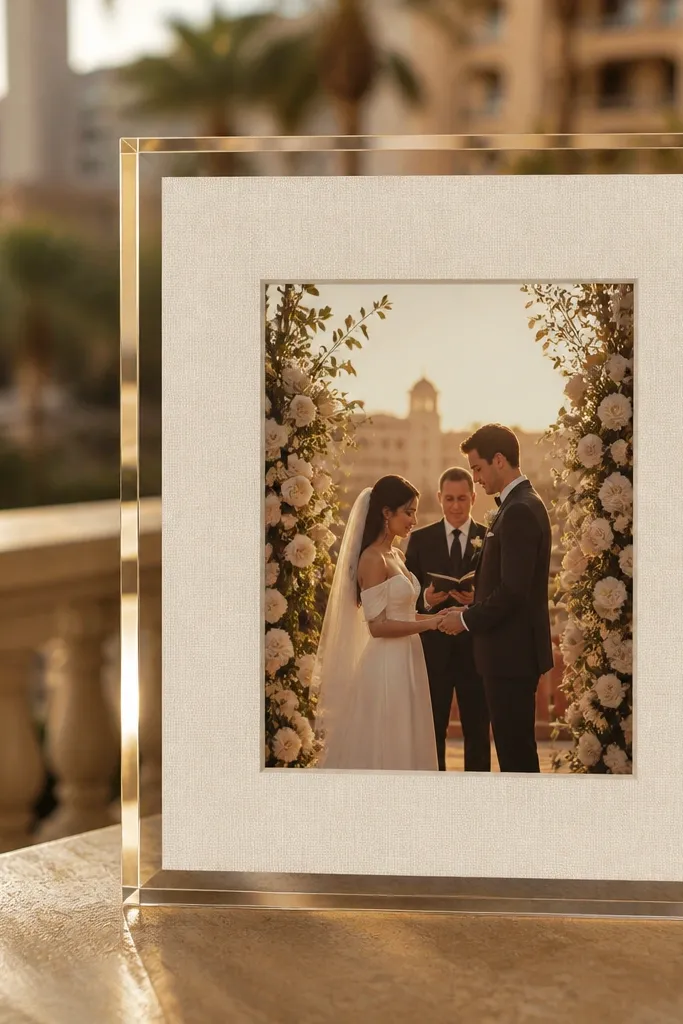
This look is clean, airy, and photogenic in a way that a standard wooden frame can’t match. The linen mat has a subtle texture that catches light softly, while the clear acrylic edge keeps the image feeling modern and floating. It’s perfect for soft-focus portraits, veil shots, and golden-hour ceremony photos where you want the background to stay gentle. If your wedding palette is blush, sage, ivory, or dusty blue, this frame style makes those colors read true. It’s also a great choice for displays in bright rooms because the acrylic edge reflects light with a controlled shine.
Start by choosing a photo with good negative space — sky, open aisle, or a plain wall behind the subject looks best. Then order a linen mat that’s 2.5-3.5 inches wider than the photo on all sides, so the image breathes. Finally, install it with standoffs or a frame hanger that keeps the acrylic from touching the wall directly. If you’re mixing with other frames, keep the linen mat color consistent across the set.
Wipe acrylic with a microfiber cloth right before hanging; tiny smudges show up fast in daylight.
Don’t use this with photos that already have heavy contrast and busy backgrounds — the clean frame will highlight every distraction.
4. Walnut floating frame with 3/4-inch reveal
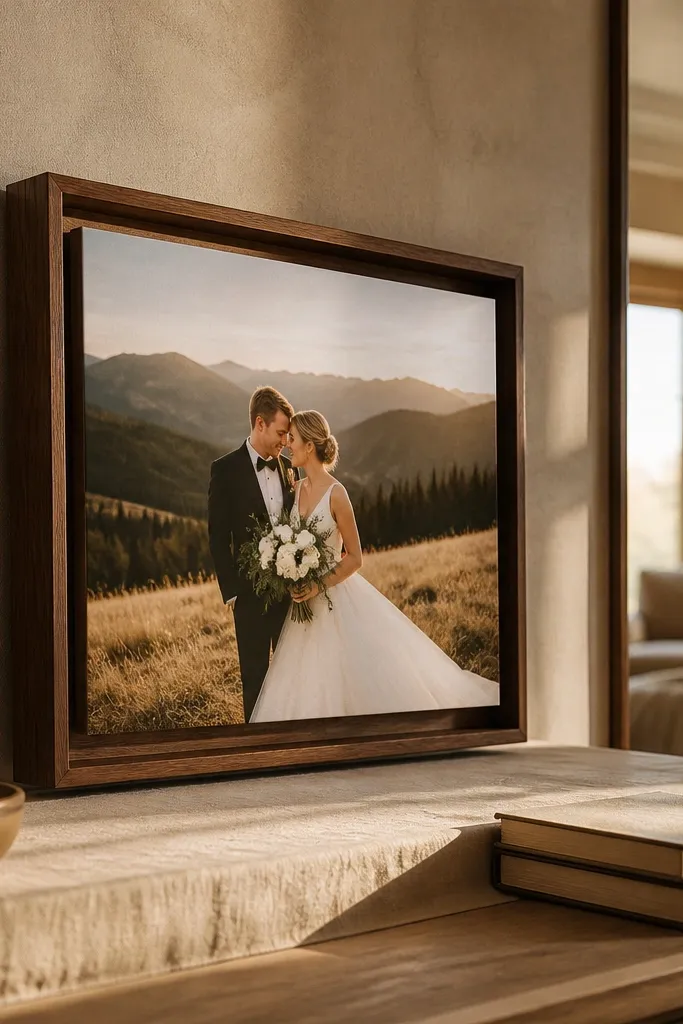
A floating frame is one of the most reliable hidden gems wedding photo ideas for making a single photo feel like a centerpiece. The walnut finish adds warmth, and the wider reveal (space between the photo and the backing) creates depth so your image doesn’t look pasted on. Use this for your best portrait or your first-look photo because the floating effect makes the subject pop. It also looks gorgeous with black-and-white images — the walnut and the grayscale contrast feel intentional. This is the move when you want the display to feel gallery-grade without going full collage.
Start by picking a photo with a clear subject and minimal clutter at the edges. Then choose a floating frame with a reveal around 0.75 inches so the depth is visible from across the room. Finally, center the photo carefully using the frame’s guide or measure the photo’s border to the frame opening before inserting. Hang it as the center of your arrangement and build outward with smaller frames so it stays the focal point.
If your photo has a white border already, reduce the reveal or crop slightly so the floating space doesn’t look uneven.
Don’t hang a floating frame too high — if the center lands above eye level, the depth effect disappears.
5. Arch frame for a ceremony moment with aisle leading lines
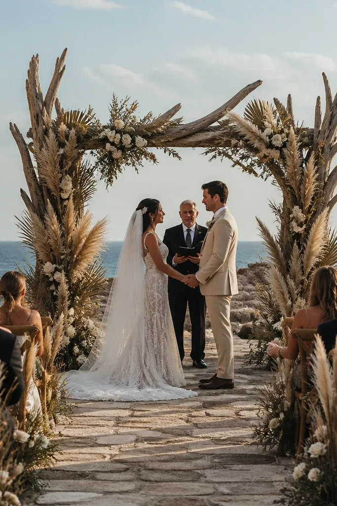
An arch frame is a hidden gem wedding photo idea because it naturally draws the eye inward, which makes ceremony images feel cinematic. The arch shape works especially well with aisle photos where the lines guide toward the couple — the frame turns a normal perspective into a framed “moment.” Pick a photo taken from near the end of the aisle or a shot where the background has soft bokeh. This style also photographs beautifully with wedding signage or florals at the edges, since the arch gives everything a neat boundary. It’s a strong choice for churches, garden ceremonies, and any venue with archways or door-like frames.
Start by choosing an image where the couple is centered or slightly below center so the arch doesn’t cut into heads. Then test the crop: you want the arch to frame the top of the scene cleanly, with at least 1 inch of margin from the photo edges. Finally, mount it so its base sits around 6-10 inches above the tallest neighboring frame — that keeps the arch from looking like it’s floating too low. Use painter’s tape to mock the arch placement before you commit to the nails.
Quick tipIf you have a matching archway in the venue, use that photo — the shape repetition looks intentional.
Skip thisAvoid using an arch frame for a wide group photo; the curve compresses faces and makes it feel cramped.
6. Deep espresso wood frame with wide cream mat
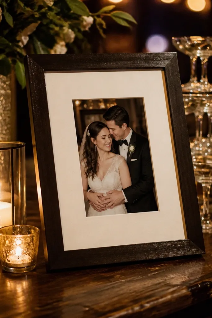
Deep espresso wood with a wide cream mat is one of the best hidden gems wedding photo ideas for making color photos look richer. The dark frame anchors the image, and the cream mat prevents the photo from blending into the wall. This combo is especially good for evening receptions where outfits are darker and skin tones can look flat if the frame is also dark. Use it for your best dance floor shot, the wedding party portrait, or any photo with strong reds, greens, or golds. The wide mat also helps if your photos have slight edge cropping — it hides minor printing inconsistencies.
Start by matching the mat cream tone to your wedding stationery: if your invite was warm ivory, use warm cream mat. Then choose a mat width of about 2 inches for portrait frames and 1.5 inches for smaller sizes so it stays balanced. Finally, keep the frame finish consistent across multiple photos — mixing espresso with bright black metal in the same section can look random. Hang using a consistent top alignment so the wide mats create a clean horizontal rhythm.
Use a matte photo finish with this frame style; gloss makes dark frames look sweaty under indoor lighting.
Don’t pair a deep dark frame with photos that already have heavy blacks everywhere — it can swallow details.
7. Gold leaf frame with off-center photo placement
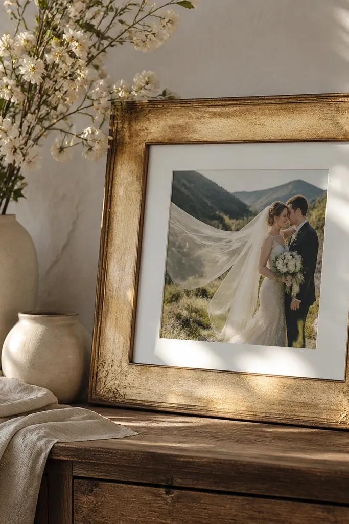
Gold leaf frames can look overdone, but used with off-center placement they become a hidden gem wedding photo idea that feels art-gallery. The gold adds sparkle without being flashy because the uneven photo position gives it a designer vibe. It’s best for one “hero” image: a ring close-up, a veil moment, or the couple’s portrait with bright highlights. Keep the photo fairly minimal — fewer busy elements makes the asymmetry look intentional instead of accidental. This frame style is stunning for spring and summer weddings because the gold mirrors natural light.
Start by picking a photo with a strong focal point and clean edges so the off-center crop doesn’t feel chaotic. Then place the photo with the top margin slightly larger than the bottom margin — aim for a 1-inch difference for a standard 8x10. Finally, use a thin mat or no mat if the frame already has a built-in border, so the gold doesn’t eat the image. Hang it slightly higher than your other frames so the gold catches light when you walk past.
Quick tipIf you’re worried about glare, position the frame so it doesn’t face a direct window beam at midday.
Skip thisAvoid gold leaf with photos that are already super warm and orange-heavy; the gold will push skin tones too far.
8. Clear acrylic photo stand wall row (floating line display)
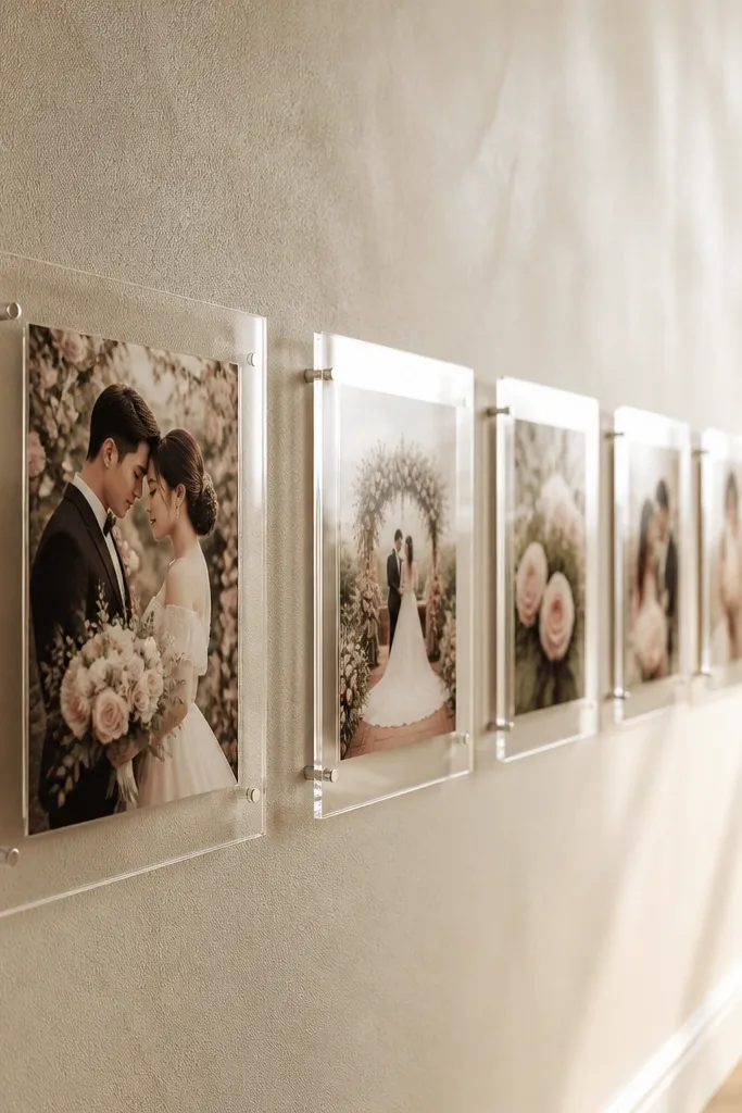
Clear acrylic stands are a hidden gem wedding photo idea when you want the photos to feel like they’re floating. Instead of a single gallery wall, you get a clean vertical or diagonal “line” that reads modern and intentional. This works great for small format prints like 5x7s or 4x6s — the acrylic makes them look like display cards. Use it for a sequence: engagement ring, bouquet, ceremony, portraits, and first dance. It’s also practical if you like swapping photos seasonally; you’re not stuck with one arrangement.
Start by choosing acrylic stands that hold at least 5x7 or 4x6 securely without wobble. Then plan the spacing: leave 1.5-2 inches between each stand so the images don’t merge visually. Finally, mark wall anchor points with painter’s tape and install in a level line — acrylic displays reveal crooked lines immediately. For best look, use a consistent background color behind the stands, like a neutral wall or a light fabric panel.
Use matte photo paper with acrylic stands to reduce glare stripes.
Don’t mix sizes in the same row unless the stand system is designed for it.
9. Cedar plank photo frame with a single nail-hang corner
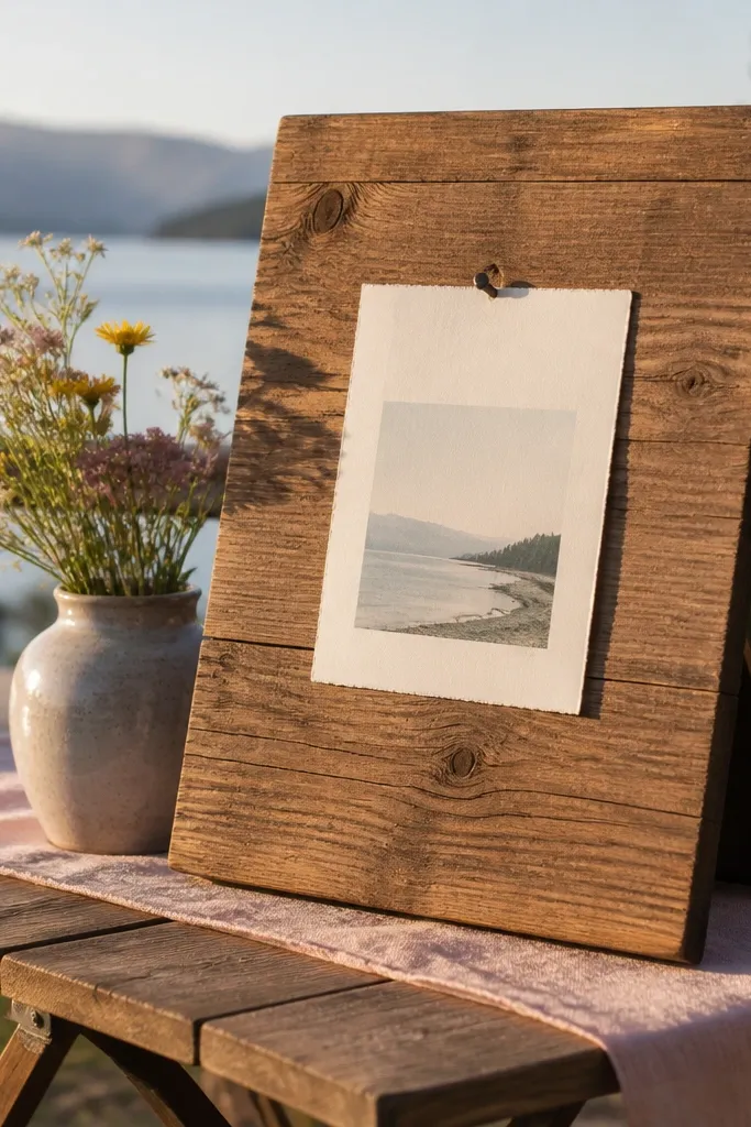
Cedar plank frames look like craft wood, but the clean setup makes them look intentional, not rustic chaos. The warm grain adds texture, and the one-corner hang detail gives a “designed” asymmetry that’s photogenic from the side. This style is perfect for outdoor weddings and couples who want the display to feel tied to the venue vibe. Choose photos with natural backgrounds: garden arches, wooden ceremony benches, or open-field portraits. The cedar color also plays nicely with earthy wedding palettes like terracotta, sage, and cream.
Start by getting a plank frame that’s at least 1 inch thick so the wood texture reads at a distance. Then mount the photo with a simple centered mat, keeping the mat thickness around 0.25-0.5 inches so it doesn’t look bulky. Finally, attach the frame using a single strong nail or wall hook point near the top-center to maintain the clean hang. If you’re building a set, repeat the same plank finish on at least 3 frames to keep the wall cohesive.
Quick tipSeal the wood lightly so the cedar tone stays steady and doesn’t darken unevenly on one side.
Skip thisAvoid heavy carved frames; they compete with the photo and steal attention.
10. Black and white gallery strip with thin black frames

A gallery strip is a hidden gem wedding photo idea when you want your wall to read like a magazine layout. Thin black frames create crisp borders, and the long horizontal format makes it perfect for the “story” photos: ceremony line, couple walking, party shots, and the dance floor. Keep the photos black and white or nearly monochrome so the strip stays cohesive. This layout is also great for hallways because it draws the eye forward without taking over the whole wall. The look works in any season, but it’s especially clean for winter weddings with darker tones.
Start by selecting 5-7 photos that flow left to right — the sequence matters more than variety here. Then choose frames with the same outer dimensions and glass type so the spacing looks even. Finally, mount the strip so it sits about 58-62 inches from the floor to the center of the middle frame. Use a measuring tape and mark every anchor point before drilling; thin frames make tiny misalignments obvious.
Quick tipIf your hallway has bright lights, use anti-glare glass to keep reflections from washing out the strip.
Skip thisDon’t mix color and black-and-white in the same strip unless you’re intentionally creating contrast.
11. Porcelain photo transfer frame with a blue floral border
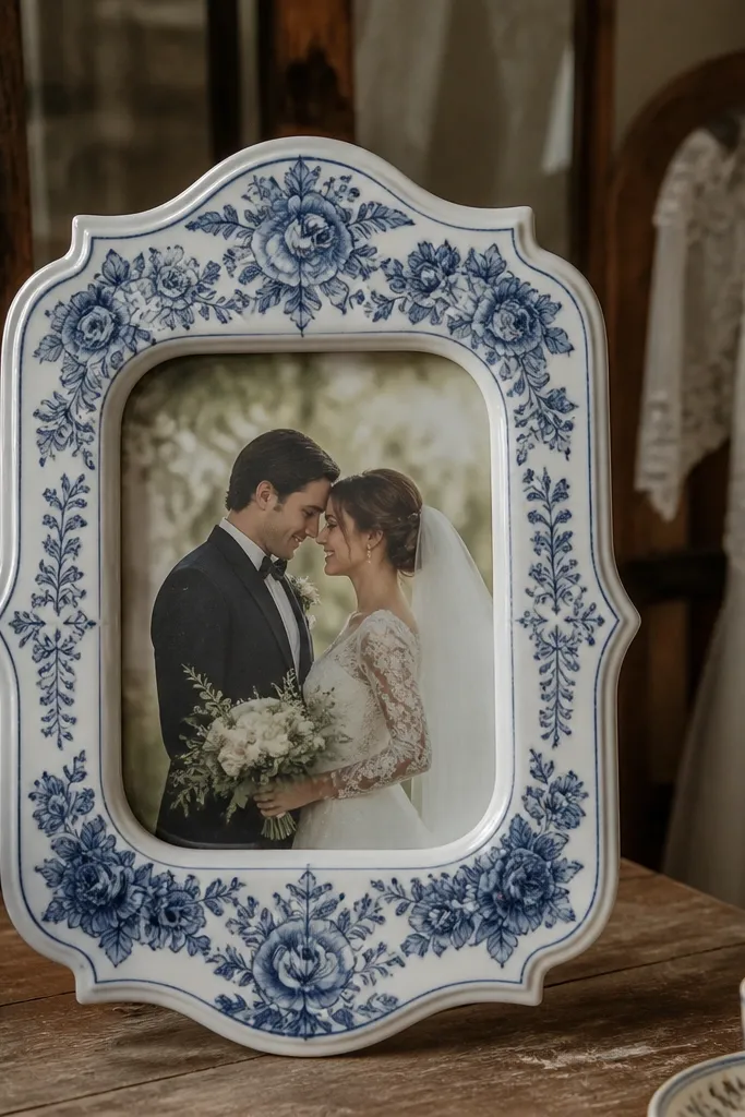
This is a true hidden gem wedding photo idea for couples who want something pretty that still feels personal. A porcelain-style frame with a blue floral border adds pattern that looks gorgeous in photos and on camera — it frames your wedding image like it belongs in a vintage shop window. It’s best for classic ceremony portraits, bridal details like earrings or invitations, and any photo with soft whites and gentle blues. The border gives you visual texture even if the photo itself is simple. This look is especially strong for spring weddings, coastal venues, and couples who love blue-and-cream stationery.
Start by picking a border color that matches your wedding accents — blue and cream is the easiest to coordinate. Then choose a photo with light tones so the porcelain frame doesn’t overpower it. Finally, keep the mat minimal and let the border do the work; too much mat makes the frame feel busy. Hang it alone at eye level or pair it with one simple cream mat frame so the porcelain remains the statement.
Quick tipUse this for one standout piece, not a whole wall — the pattern is the star.
Skip thisAvoid pairing porcelain frames with heavy dark espresso frames all at once; the mix can feel harsh.
12. Multi-photo wedding timeline frame with date labels
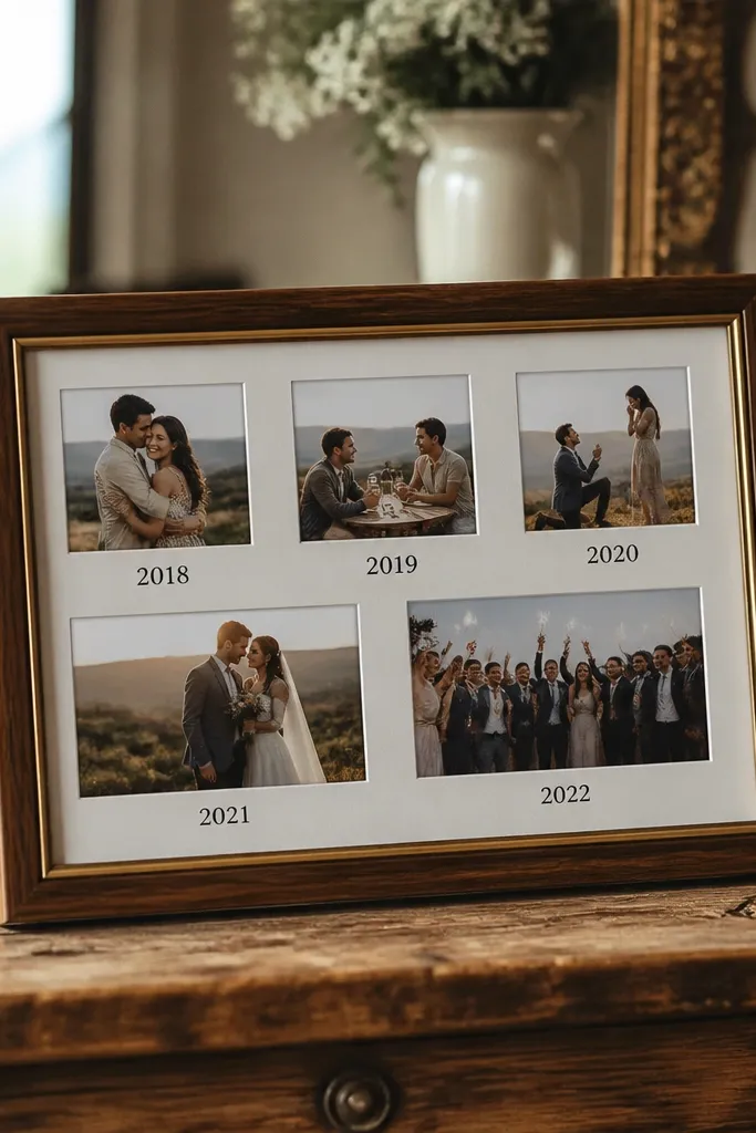
A timeline frame is a hidden gem wedding photo idea because it solves a real problem: people don’t always know which photo came first. When you add small date labels or short captions inside the frame design, the display becomes readable instantly. It also makes the wall feel curated without needing a complicated gallery layout. Use it for the key beats: getting ready, first look, ceremony, portraits, and reception highlights. Pick photos that share a consistent look so the timeline doesn’t feel like a random slideshow printed on the wall.
Start by choosing a timeline frame layout that holds at least 6-10 photos so you can cover the story arc. Then crop each photo to match the frame’s aspect ratio and keep the date labels in one consistent font color. Finally, place the timeline frame as the center piece — it gives structure to everything around it. If the timeline frame has a built-in backing, use it; DIY backing tends to create waves that you’ll see in photos.
Quick tipUse short dates only (like 8.12.24) — long captions clutter the design and reduce photogenic clarity.
Skip thisSkip timeline frames if your photos vary wildly in color temperature; the labels won’t fix a mismatched set.
13. Mirror-backed frame with one photo doubled for sparkle
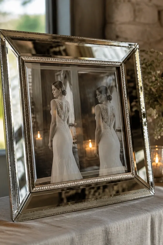
Mirror-backed frames are a hidden gem wedding photo idea because they add sparkle and depth without adding clutter. The mirror reflects ambient light, so the photo feels brighter and more dimensional. This works best for a single statement image like the bouquet toss moment, a veil with light behind it, or a portrait with soft highlights. You can also double a photo inside the frame if the frame design allows it — one version normal and one reflected — which creates a symmetrical, editorial look. This style is a great choice for evening receptions or venues with chandeliers because the reflections match the vibe.
Start by choosing a frame with a real mirror backing, not just reflective foil. Then select one photo with highlights that look good in reflection — avoid flat, low-contrast images because the mirror will make them look dull. Finally, place the frame where it catches indirect light, like across from a lamp or near a window but not in direct sun glare. If you’re pairing it with other frames, keep the other frames matte so the mirror doesn’t overpower the whole wall.
Quick tipTest glare by holding the frame at the intended spot; if you see bright streaks, reposition it.
Skip thisDon’t use mirror-backed frames in bathrooms with bright overhead lights — reflections get messy fast.
14. Floating locket-style frame for ring close-up
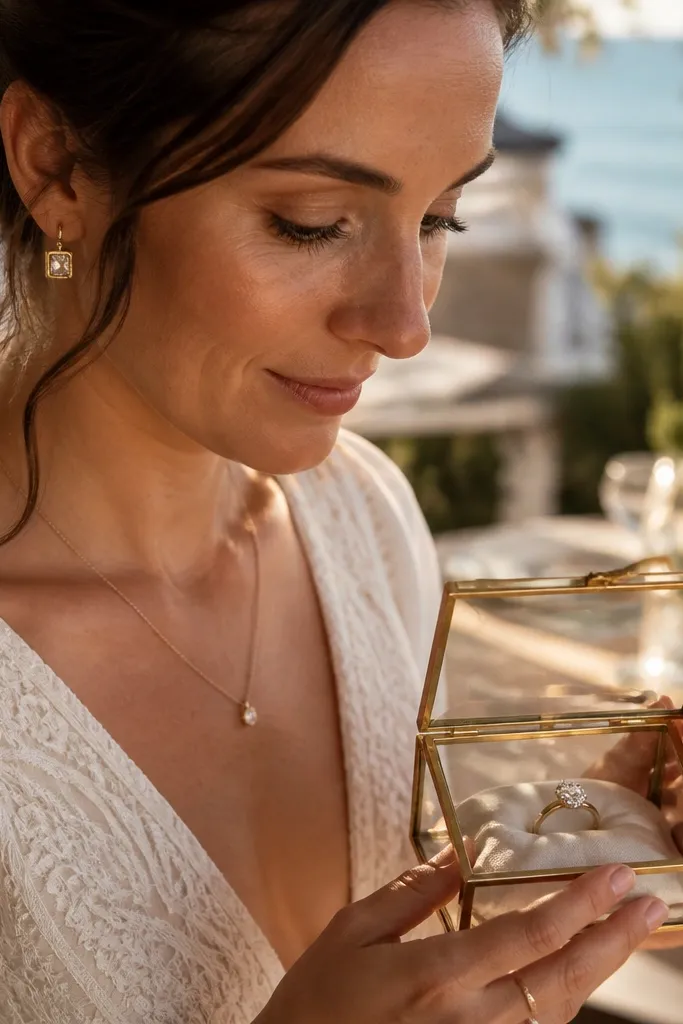
A locket-style frame is a hidden gem wedding photo idea when you want one detail photo to feel like jewelry. The shape cues romance instantly, and the small scale makes it feel precious instead of generic. Use it for ring close-ups, cufflinks, hairpins, or invitation details that have strong texture and shallow depth of field. This works especially well if the photo includes metallic tones — gold rings, silver watch faces, or subtle pearl accents. Place it in a gallery cluster with larger frames so it becomes a “spotlight” moment when someone walks by.
Start by choosing a close-up photo with crisp edges — ring shots should have sharp highlights, not fuzzy blur. Then order a locket-style frame that holds a small print without bending it; thin prints crease easily in tight inserts. Finally, mount it with a slightly higher placement than your surrounding frames so it reads as a focal detail. If you’re building a cluster, keep the locket frame within 2-3 inches of a larger portrait frame so the eye connects the stories.
Quick tipUse a black or deep brown backing behind the photo; it makes metal tones pop.
Skip thisAvoid locket frames for wide group photos — the shape makes them look like a label, not art.
15. Oversized polaroid-style frame with thick white border
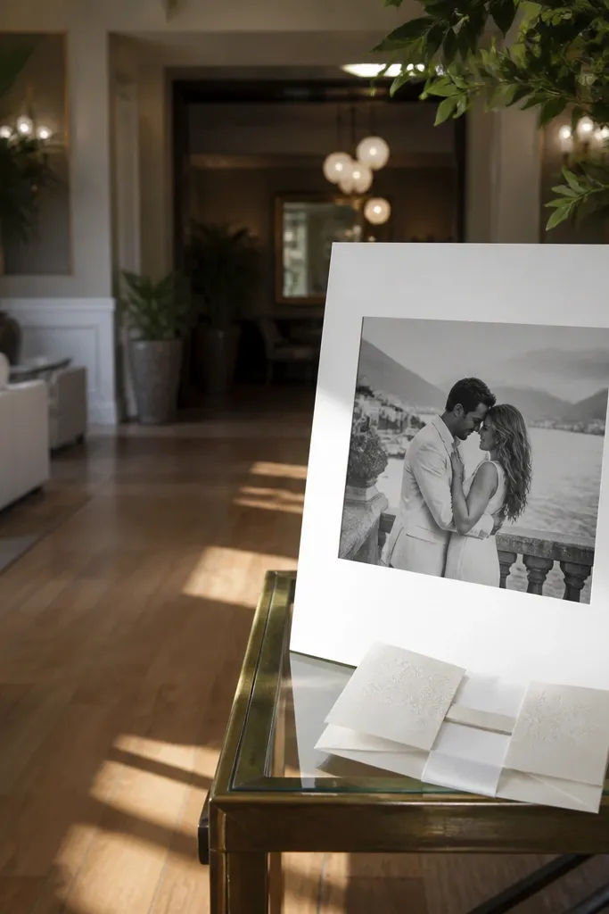
Oversized polaroid-style frames are a hidden gem wedding photo idea because they add a playful, modern vibe while still looking clean on a wall. The thick white border gives you instant separation from the background, and the oversized scale makes it feel like a print you’d see in a boutique gallery. Choose one or two for your best candid moments — the couple laughing, a portrait with movement, or the first dance. This look also works well for black-and-white photos because the border becomes part of the graphic design. It’s great for couples who want the display to feel warm and not too formal.
Start by picking a photo that benefits from a slightly wider crop — candid moments look better when there’s room around the subject. Then choose a frame with a thick white border around the print, typically 1.25-2 inches depending on frame size. Finally, place these frames where they’ll get direct attention, like the wall above a console table or the top of a staircase. Keep the rest of your frames simpler so the polaroid style doesn’t compete.
Quick tipUse matte paper prints inside polaroid frames; glossy prints reflect room lights and ruin the clean look.
Skip thisDon’t stack multiple polaroid-style frames of different border widths in one spot.