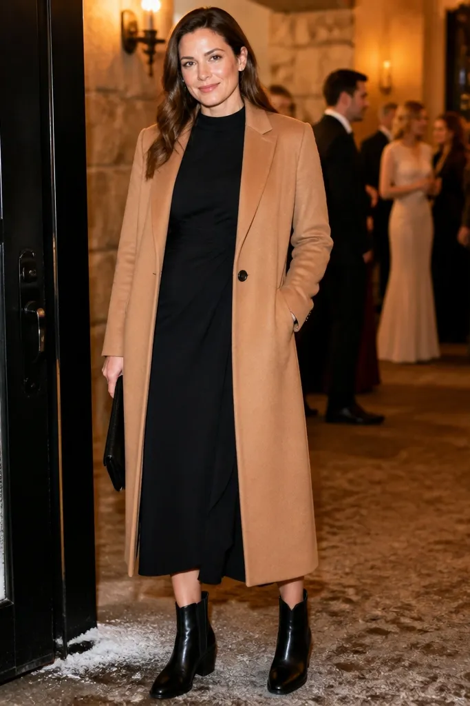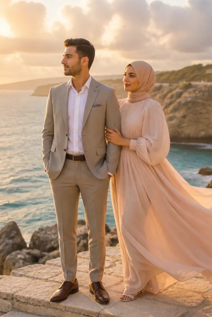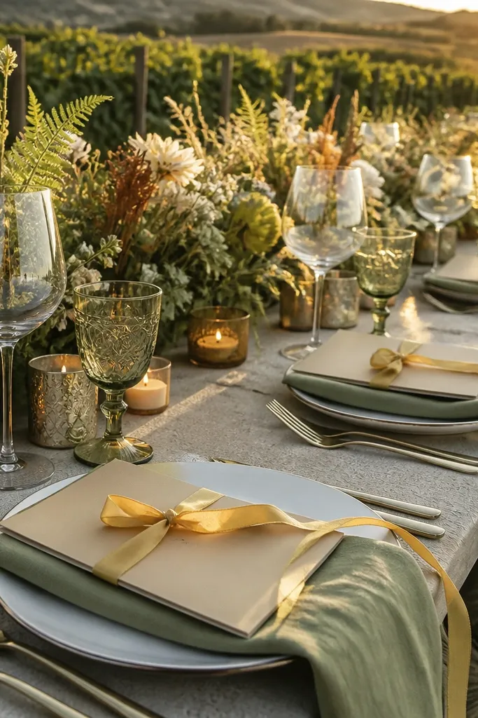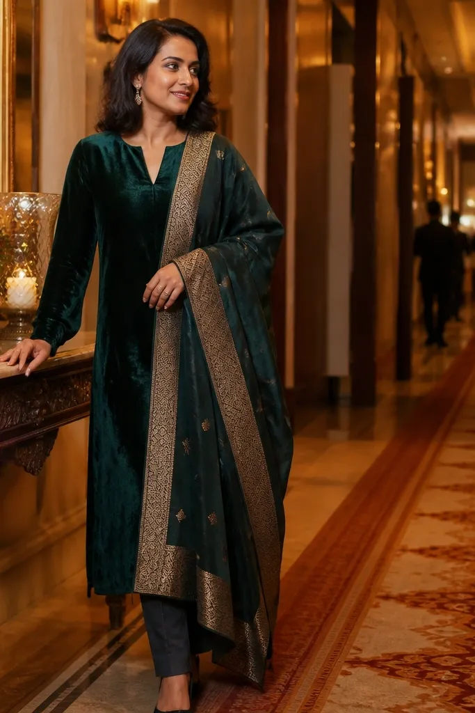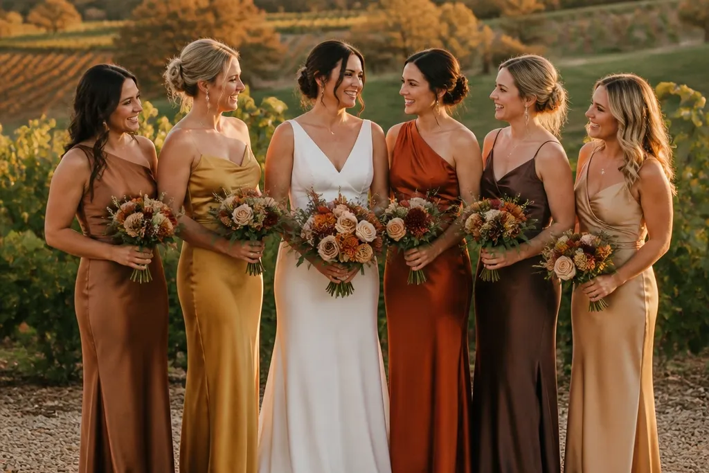
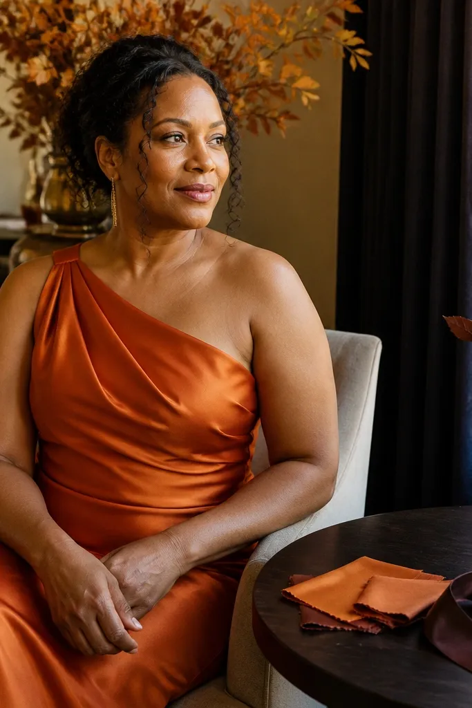
1. Burnt Sienna + Caramel Neutrals
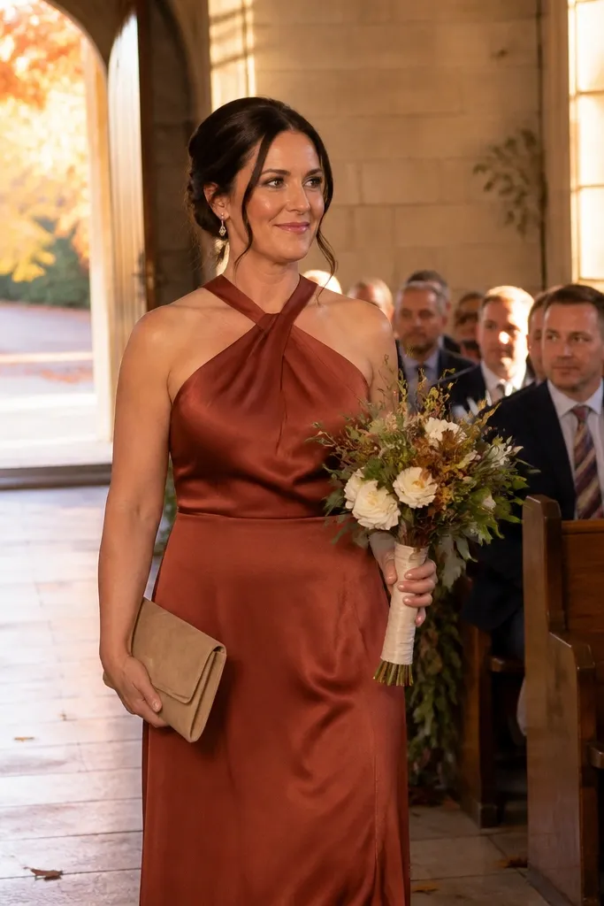
Burnt sienna looks like fall leaves without turning orange-red in photos. It flatters a wide range of skin tones because it sits in the warm middle between rust and chocolate. Pair it with caramel neutrals to keep the palette soft enough for daytime ceremonies and still rich enough for evening receptions. Choose satin or charmeuse for the sienna so it catches golden light; chiffon wraps in caramel make the group look styled instead of “all the same dress.”
Start by picking burnt sienna as the hero shade for most bridesmaids. Then add caramel chiffon wraps or a caramel accessory color for contrast — you can keep dress colors the same and still get dimension. For a budget-friendly approach, buy one main sienna shade in your chosen fabric and use the wraps to create variety instead of buying multiple dress colors. Keep the palette tight: avoid adding red or pink tones that fight the caramel warmth.
If you’re shopping online, order a fabric swatch in burnt sienna and compare it to your venue’s fall foliage photos in daylight.
Don’t mix burnt sienna with cool gray dresses unless your venue has very neutral lighting.
2. Oxblood Wine Velvet
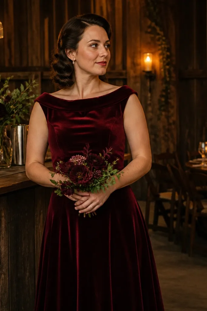
Oxblood wine reads expensive because it’s deep, slightly complex, and doesn’t look flat on camera. Velvet makes the color look fuller even if you’re not using heavy embroidery or extra fabric weight. This palette suits fall evening weddings, barn venues, and candle-lit receptions where dark colors photograph with clear contrast. It also works for mixed body types because the fabric drapes smoothly and hides minor fit issues.
Quick tipAsk for the dress color name plus a dye code in writing from the retailer if you’re ordering multiple dresses.
Pick oxblood as the single main shade and keep everyone in the same color for the cleanest look. Choose velvet for at least the majority of the group; if that’s too pricey, do velvet for a few bridesmaids and use crepe or satin in the same oxblood tone for the rest. For getting there, plan hair and makeup to match the depth: warm bronzer and berry lip shades keep the look cohesive. Book fabric shipments early because velvet dyes can run slightly differently between batches.
Skip thisSkip “deep burgundy” that pulls too purple; oxblood should lean warm, not magenta.
3. Dusty Rose Mauve with Warm Taupe
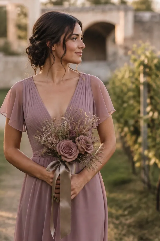
Dusty rose mauve gives you fall romance without going full pink wedding. The key is the mauve undertone — it should feel like dried petals, not bubblegum. Warm taupe adds structure and helps photos look intentional rather than pastel-sweet. This combo is great for outdoor ceremonies in late September and early October when the air still holds some warmth but the light starts to soften.
Quick tipUse taupe in photos as the “anchor” — it helps your bouquet and background foliage look richer.
Choose dusty mauve as the hero shade and keep it consistent across the group. Add warm taupe through sashes, shawls, or mismatched dress panels — a small neutral detail reads like design work and costs less than full dress color changes. Shop for taupe accessories in satin or crepe so the sheen matches mauve’s softness. For time management, order accessories first and then finalize dress color once you see the taupe in person.
Skip thisDon’t pair mauve with icy lavender; the temperature clash makes the group look tired in photos.
4. Forest Emerald + Cognac Leather Accents
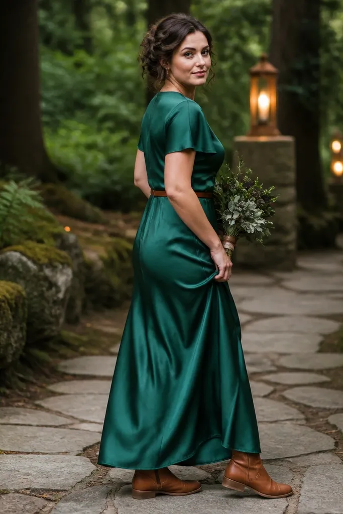
Forest emerald turns fall into a jewel-toned moment. It photographs with strong contrast against wood, stone, and tan venues, and it looks sharp even when you’re standing in shade. Cognac accents bring warmth so emerald doesn’t feel too wintery. This palette is a strong choice for couples who want modern, not rustic-cutesy — it’s clean, bold, and camera-friendly.
Quick tipHold a small swatch of cognac next to emerald in daylight; the warmth should look intentional, not neon.
Pick emerald satin or crepe for the bridesmaid dresses. Add cognac through belts, small bags, or even shoe color — you can coordinate without changing the dress shade for every person. If you’re mixing fabrics, keep the color the same and let satin vs crepe do the texture work. For travel and planning, allocate extra time for shoe matching because cognac shoes are the easiest place to accidentally go too orange or too dark.
Skip thisAvoid pairing emerald with bright yellow florals; it can make the green look sickly.
5. Marigold Gold + Dark Chocolate
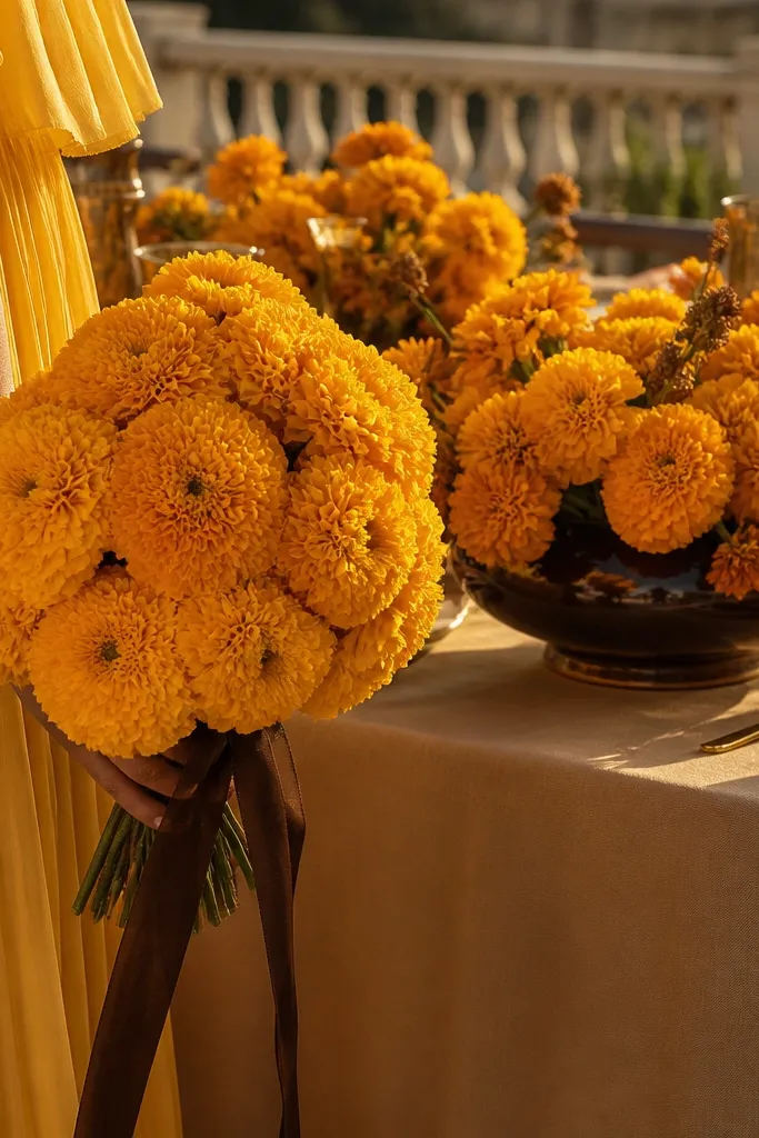
Marigold gives you that classic fall glow, and it looks especially good outdoors at golden hour. The trick is adding dark chocolate so the palette has depth and doesn’t turn into a single-note yellow. Marigold chiffon looks airy and flattering; when you add chocolate ties or bouquets, the whole group looks styled rather than costume-y. This is a great pick for garden venues, vineyard rows, and any ceremony with warm-toned backgrounds.
Choose marigold as the hero shade for most dresses in chiffon or crepe. Add chocolate through ties, small wraps, or a consistent bouquet dark base. Keep the chocolate tone steady: aim for deep brown with a warm undertone, not gray-brown. To save money, buy one marigold dress style and do chocolate accessories instead of multiple dress colors.
If your venue has lots of greenery, marigold reads best when it’s not too pale — go medium to deep.
Skip pale pastel yellow; it often washes out in late-day light.
6. Rusty Terracotta + Creamy Ivory
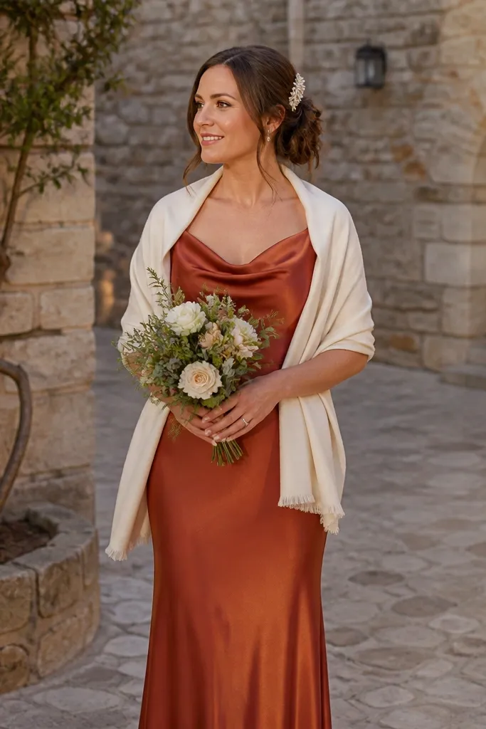
Rusty terracotta looks handmade and warm without leaning too orange-red. Pair it with creamy ivory for a softer contrast that still feels autumn. This palette flatters many undertones because the cream balances the warmth and makes the terracotta look intentional. It’s gorgeous for ceremonies with stone walls, warm wood, or desert-toned landscapes where you want your bridesmaids to blend beautifully but still stand out.
Quick tipUse ivory only as an accent; too much ivory can make the palette feel bridal instead of bridesmaid.
Pick terracotta as your main shade in crepe or satin so it holds color depth. Add ivory through lace wraps, hair ribbons, or a consistent neutral accessory — keep it cream, not bright white. When ordering, check that terracotta isn’t pulling red; you want a clay-like tone. Plan photos around midday light for terracotta — it reads best when the color has enough brightness to show its texture.
Skip thisDon’t pair terracotta with stark black; it creates harsh contrast that fights fall warmth.
7. Blue-Gray Slate + Pewter Metallic Details
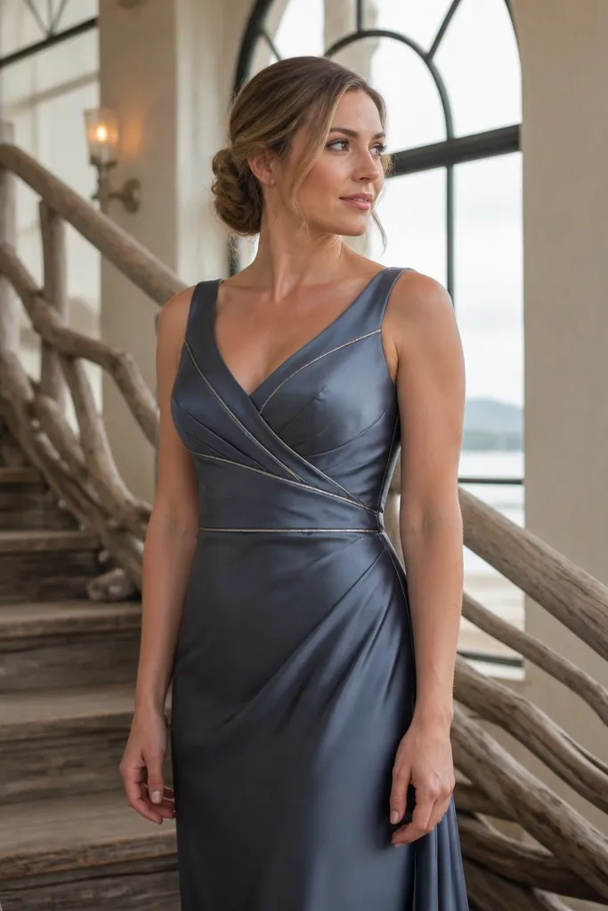
Blue-gray slate is the underused fall color that looks modern in photos. It’s cooler than most fall palettes, but it works because slate is muted, not icy. Pewter metallic details add a soft shimmer that reads “seasonal” without needing sequins. This combo is perfect for indoor venues, coastal climates in fall, or weddings with gray stone and neutral decor.
Quick tipBring your bridesmaids' shoes to a fitting and match them to pewter, not to the dress fabric shade.
Choose slate dresses in satin, crepe, or matte jersey for a smooth silhouette. Add pewter through hair clips, small jewelry, or clutch bags — keep everything in the same metal tone. For a budget approach, you can buy one slate dress style and let pewter accessories create the variation. When you plan, confirm your venue’s wall color; slate can look dull against very warm walls, but it looks sharp against neutral or cool backdrops.
Skip thisAvoid pairing slate with bright cobalt; it breaks the muted, fall-friendly mood.
8. Dusty Sage + Mushroom Brown
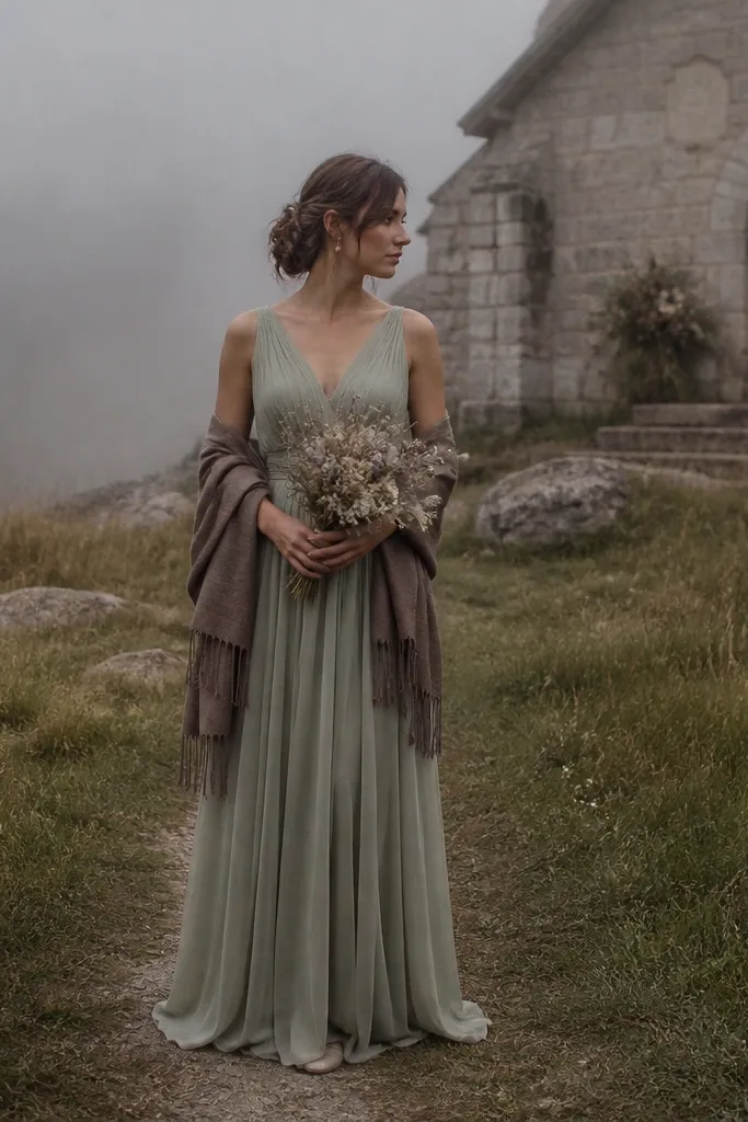
Dusty sage looks like dried herbs and foggy mornings, which makes it feel genuinely fall. It photographs softly and flatters lighter and deeper skin tones when the shade is dusty rather than pale. Mushroom brown adds grounding so the palette doesn’t read too “green spring.” This is a great choice for outdoor ceremonies where the background has trees and muted foliage.
Quick tipIf your bridesmaids have warm undertones, sage looks best when it leans slightly gray, not yellow-green.
Pick dusty sage for most dresses, ideally in chiffon, crepe, or matte satin. Add mushroom brown through belts, shoes, or wrap scarves so the group looks styled even if everyone wears the same dress. Shop for accessories in leather or suede-look materials to keep the brown warm. If you’re traveling for the wedding, pack a small swatch of sage and compare it to your venue flowers — sage can clash with bright lime greenery.
Skip thisSkip neon green undertones; they look harsh in fall photos.
9. Plum Purple + Antique Gold
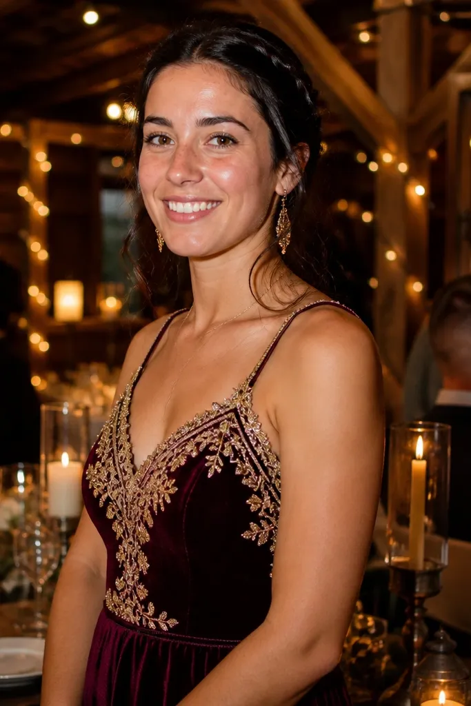
Plum purple is the easiest way to get that fall jewel look without going too red. It flatters a huge range of skin tones and looks rich under both natural light and indoor lighting. Antique gold accents make it feel festive, not gloomy. This palette is ideal for venues with warm lighting, wood beams, and candle setups where deep purple will pop.
Quick tipMatch gold tone to your venue decor — antique gold looks best with warm metals, not silver-heavy spaces.
Choose plum as the hero shade and keep the dresses in satin or crepe for a clean, photo-ready finish. Add antique gold via earrings, hair combs, or small clutches. If you want variety, let one group wear a slightly lighter plum tone, but keep it within the same purple family. For ordering, request sample photos from the retailer because plum shades vary wildly from one dye lot to another.
Skip thisDon’t pair plum with bright fuchsia; the colors fight on camera.
10. Cinnamon + Deep Olive
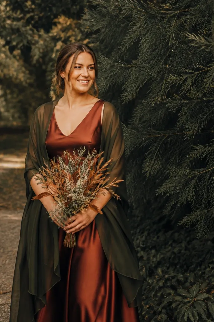
Cinnamon and deep olive create a grounded fall palette that looks “grown-up” and not overly themed. Cinnamon brings warmth and softness; deep olive adds depth so the group doesn’t look washed out against greenery. This is a strong choice for weddings with lots of trees or outdoor paths where your bridesmaids need contrast against leaves. It also works well for both day and early evening ceremonies.
Start with cinnamon dresses in crepe or matte satin for a soft, flattering look. Add deep olive through shawls or wrap skirts so you can create variation without changing full dresses. Keep olive dark enough to read as a jewel tone, not a light sage. For budget control, buy cinnamon first; then choose olive accessories that match the undertone when you see the cinnamon in person.
Use olive in your hair accessories too; it ties the palette together in photos.
Skip light olive or apple green — it makes the cinnamon look too orange.
11. Teal Peacock + Soft Pewter
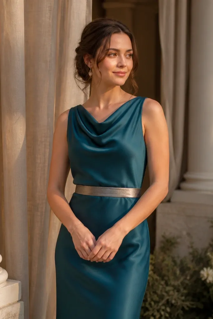
Peacock teal reads bold, modern, and gorgeous next to fall neutrals. It’s a standout color that still fits the season because it has enough depth to feel autumnal, not beachy. Soft pewter keeps it from feeling too dark and gives you a metallic highlight in photos. This palette is best when the wedding decor is neutral — think wood, white florals, and warm candles — so teal stays the star.
Pick peacock teal as the hero color in satin or crepe. Add pewter through clutches, jewelry, or shoe color; you can keep dresses identical and still get a designer look. If you’re trying to stay on budget, choose one teal dress style and let accessories do the rest. Plan your photo timeline for late afternoon when teal’s color depth looks richest.
Avoid pairing teal with bright orange flowers; it can turn the scene into a traffic-light palette.
Don’t choose teal that pulls too green; you want peacock depth.
12. Champagne Rose + Espresso Brown
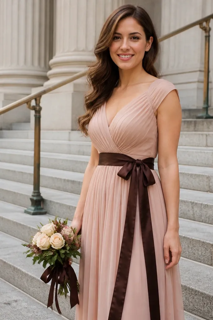
Champagne rose is a warm nude-pink that looks expensive in fall because it matches the season’s beige warmth. Espresso brown adds contrast and makes the dresses look intentional instead of “pretty but hard to define.” This palette works for courthouse weddings, vineyard weddings, and venues with neutral decor where you want bridesmaids to look polished. It also photographs well in both shade and indoor lighting because the rose is warm, not pale.
Choose champagne rose in satin or satin-blend so the color stays readable on camera. Add espresso brown through boots, belts, or matching hair ribbon. If your bridesmaids are wearing different dress lengths, keep the rose shade identical and only vary the espresso accessories. When ordering, double-check that champagne rose isn’t too peach — peach can skew too summery and lose the fall mood.
If you’re doing outdoor photos, keep bouquets in warm whites and brown accents so they don’t fight the rose.
Skip cool taupe; it can make champagne rose look washed out.
13. Maroon Brick + Dark Walnut
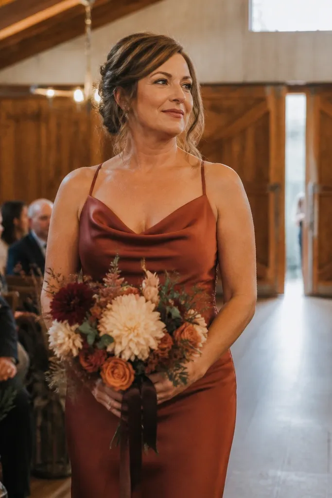
Maroon brick sits between burgundy and terracotta, so it looks fall-forward while staying flattering. It’s also a safer choice if your wedding has a lot of wood and leather decor because it matches the warmth. Dark walnut accents deepen the look without adding another random color. This palette is especially good for rustic venues where you want bridesmaids to look styled, not like they’re blending into the furniture.
Pick maroon brick as the primary dress color in crepe, satin, or matte jersey. Add dark walnut through sashes, ties, or shoes. Keep the walnut undertone consistent — warm brown only. For shopping, order one dress first and confirm the maroon reads brick-like in your venue’s lighting, then place the full order once you see the photos.
Make sure your bridesmaids' lip colors are warm-toned; maroon brick pairs best with berry-brown shades.
Don’t pair maroon brick with bright red accents; it makes the palette feel chaotic.
14. Lavender Brown with Antique Bronze
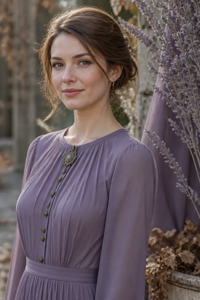
Lavender brown is a muted mauve-brown that looks like dried lavender stems and fallen leaves. It gives you a different color direction without going too purple or too gray. Antique bronze adds warm metallic glow, which makes the dresses look intentional and festive. This palette is great for fall weddings in neutral venues — think stone churches, art spaces, and modern halls with warm lighting.
Quick tipTest the shade next to your bridesmaids' skin tone in daylight; lavender brown should look flattering, not dusty-gray.
Choose lavender brown in chiffon or crepe so the color stays soft and readable. Add antique bronze through jewelry and hair pins; keep everything in the same metal family. If you want variety, add one darker brown tone as an accent wrap rather than adding another full dress color. For budget planning, focus money on the dress color and keep jewelry simple — bronze gives that “finished” look without expensive extras.
Skip thisSkip silver jewelry; it can make the lavender brown look colder than you want.
15. Warm Navy + Gold Buttons
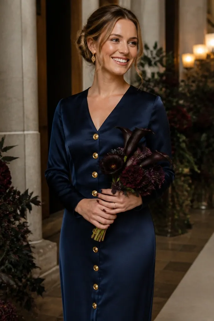
Warm navy is the secret weapon for fall weddings that still want a dark, formal vibe. It avoids the harshness of black and looks more seasonal when paired with warm gold accents. The navy shade photographs cleanly against wood, stone, and darker floral arrangements. If you’re worried about fall colors feeling too bright, warm navy gives you depth and elegance without losing the autumn mood.
Pick warm navy as a single hero shade in satin, crepe, or matte jersey. Add gold through buttons, jewelry, or small accessories like hair combs. If you need variety, do different necklines or dress lengths while keeping the same navy color so the group still reads cohesive. For costs, buy the dress in one color and spend on a consistent gold accessory set.
Gold accents look best with warm lighting; if your venue is very cool, swap to champagne-gold instead of bright yellow gold.
Avoid pure black; it makes fall palettes look less intentional and can flatten skin tones.
16. Buttercream + Burnt Orange Terracotta
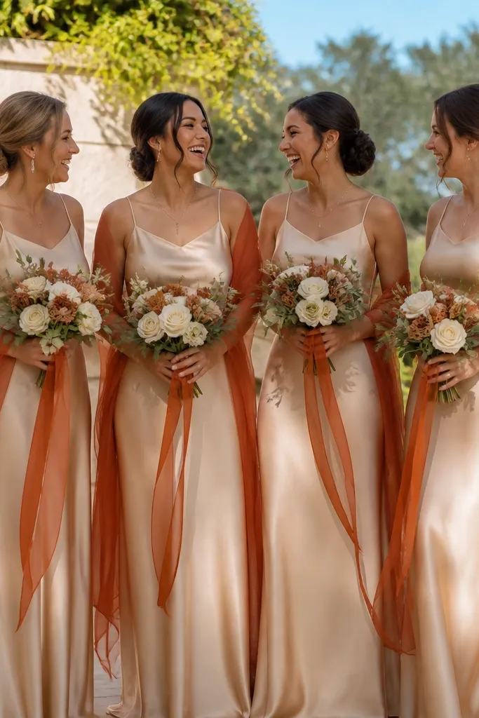
Buttercream with burnt orange terracotta is a fresh fall combo that still looks warm and photogenic. Buttercream prevents the palette from feeling too heavy, and terracotta adds the fall punch. This works especially well for outdoor ceremonies where the background is green or light stone. It also looks great in wedding photos because it gives you both soft highlights (buttercream) and grounded color depth (terracotta).
Quick tipUse warm white bouquets and golden foliage so the cream doesn’t look too bridal next to the terracotta.
Choose buttercream as the base dress color in chiffon or crepe. Add terracotta through sashes, overskirts, or a consistent accessory color like shoes or wraps. Keep terracotta medium, not bright orange — you want clay warmth. For ordering, buy buttercream first, then choose terracotta accessories after you see how buttercream reads on your bridesmaids' skin.
Skip thisSkip bright tangerine; it can overpower buttercream and make photos look too loud.
17. Smoked Rose + Ash Gray
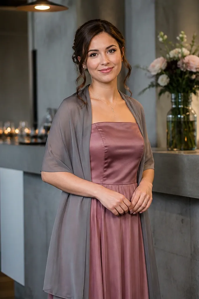
Smoked rose is a deeper, moodier pink that fits fall better than dusty rose alone. Ash gray adds a modern edge and helps the rose look more intentional in photos. This palette is ideal for couples who want a softer look than plum but still want depth. It also works well for indoor receptions where gray decor or concrete backdrops are present.
Quick tipIf you’re doing an outdoor portrait session, plan it when the sky is bright but not direct sun; smoked rose looks best in soft light.
Pick smoked rose as the hero dress color in satin or crepe. Add ash gray through shawls, ties, or umbrellas for rainy photos. Keep the gray medium-dark so it doesn’t turn the palette into pale rose and nothing else. For budget control, avoid buying multiple dress colors: keep the rose consistent and buy gray accessories.
Skip thisAvoid pairing smoked rose with bright white; it can make the rose look more pink than smoky.
18. Cocoa Brown + Cinnamon Highlights
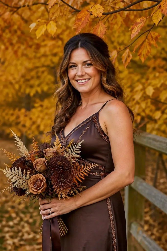
Cocoa brown looks rich and grounded, and it photographs beautifully against fall foliage and wood tones. Add cinnamon highlights to keep it from looking flat or too dark. This palette feels “autumn fashion” rather than “wedding theme,” which is why it works for many venues. It’s also a strong choice when you want bridesmaids to look elegant without bright colors taking over your photos.
Quick tipMatch cinnamon accents to your bouquet stems or ribbon so everything reads connected.
Choose cocoa brown as the primary dress color in satin or matte crepe. Add cinnamon through ribbon, small scarves, or jewelry — keep it as an accent. If you want variation, pick one darker cocoa shade for a small group, but keep it in the same brown family. For travel planning, pack a small steamer so the satin doesn’t show wrinkles in transit.
Skip thisSkip very dark black-brown; it can swallow detail in shade.
19. Terracotta Pink + Soft Sage Green
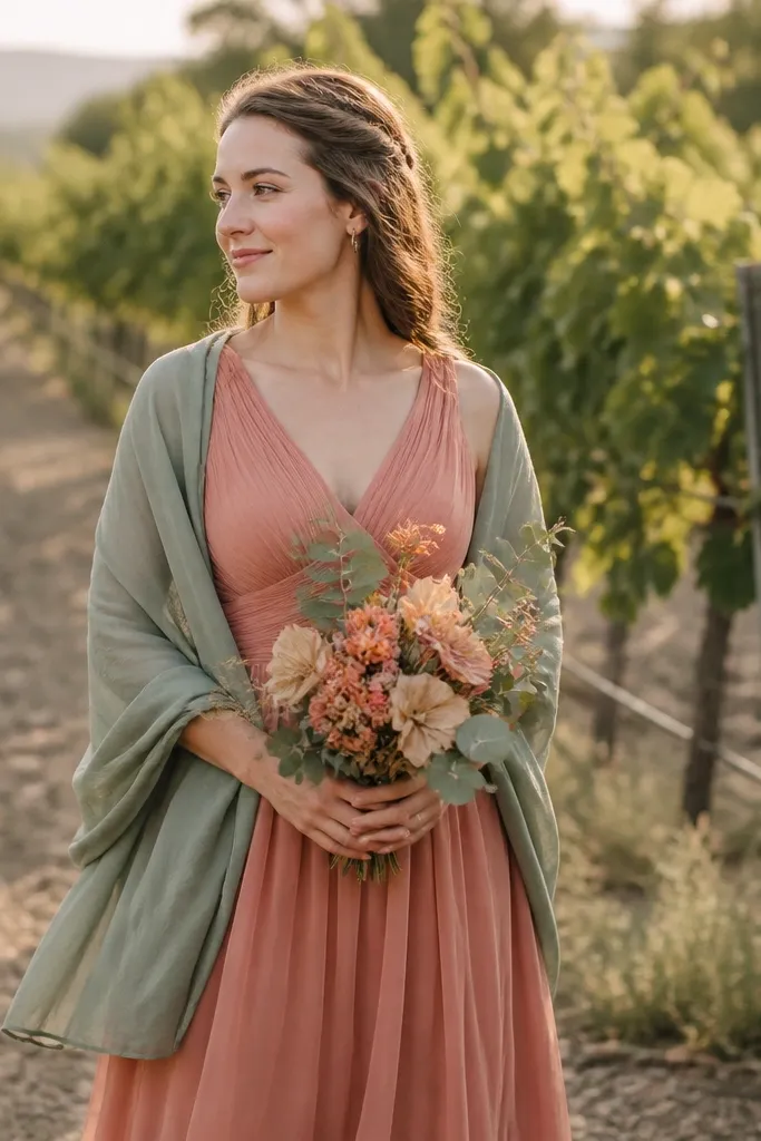
Terracotta pink gives you a warm blush that feels fall instead of spring. It’s more interesting than dusty rose because it has orange-brown pigment, which reads like leaves and sunset. Soft sage green balances it and keeps the palette airy. This is a great pick when you want bridesmaids to look light and flattering but still seasonal — especially for daytime garden ceremonies.
Quick tipChoose sage that leans gray; minty sage makes terracotta look louder than intended.
Start with terracotta pink as the hero dress color in chiffon or crepe. Add soft sage through shawls, hair ribbons, or a small set of matching shoes. Keep the sage muted so it doesn’t look like mint. For budget, focus on finding one terracotta pink dress style you like, then buy sage accessories in bulk so you don’t overpay per person.
Skip thisDon’t pair terracotta pink with bright lime or neon green decor.
20. Deep Smoke Blue + Umber Brown
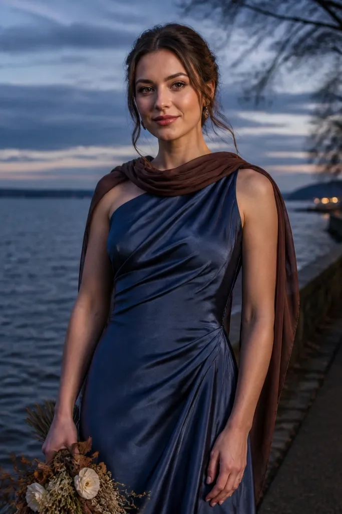
Deep smoke blue is a darker cousin to navy that looks moody and cinematic without going too goth. Umber brown grounds it and keeps the palette warm enough for fall. This combo photographs well in portraits because the blue reads clearly while the brown adds a soft earthy tone. It’s a solid choice for weddings with dark wood, leather, or moody floral arrangements.
Quick tipBrown accents show up in group photos — use them consistently on shoes or hair ribbons.
Pick deep smoke blue in crepe or matte jersey so the color stays readable without shiny highlights. Add umber through ribbons, boutonnieres, or small accessories that appear in photos. If you want variety, keep the dresses the same blue and vary only the brown accent — that gives you a designed look without the hassle of multiple dress colors. Order early and check the blue in natural light because smoke tones can skew purple or green.
Skip thisSkip cool silver accessories; they make the blue look colder and less fall-friendly.
21. Saffron Gold + Dark Olive Green
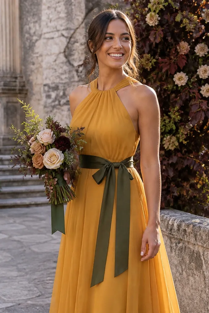
Saffron gold is deeper and more golden than standard yellow, so it stays flattering and seasonal. Dark olive green gives the palette contrast without turning it into a green-and-yellow festival. This color pair looks incredible against stone, wood, and dark floral backdrops. It’s also a strong choice for fall weddings where you want a warm, energetic look but not the full marigold intensity.
Choose saffron gold for most bridesmaids in satin or charmeuse so the gold reads rich on camera. Add dark olive through shawls or small wraps that show in photos. Keep olive dark enough to feel jewel-like, not light sage. For budget, buy one gold dress style and do olive accessories; it’s cheaper than multiple dress colors and still looks intentional.
If your venue has a lot of yellow flowers, pick a slightly deeper saffron so it doesn’t blend.
Avoid pale yellow; it looks washed out next to olive.
22. Sea Glass Teal + Umber Tan
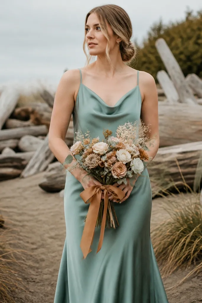
Sea glass teal brings a softer, cooler fall color that still reads “autumn” when paired with umber tan. It’s not the same as winter teal because it’s lighter and more muted, which makes it flattering in outdoor light. Umber tan adds warmth and keeps the teal from feeling like a beach wedding. This palette works well for fall coastal climates, lakeside venues, and ceremonies with neutral decor.
Quick tipBring a tan fabric swatch to a shopping visit; umber should look warm, not beige-gray.
Pick sea glass teal in chiffon, crepe, or matte satin — avoid very glossy fabrics if the teal is light. Add umber tan through belts, shoes, or small clutches so the palette feels styled. Keep the tan consistent across the group; variations make it look random. For planning, schedule photos when there’s bright but indirect light so the teal stays crisp without glare.
Skip thisDon’t pair sea glass teal with bright coral; it makes the teal look too green.
23. Rosewood Brown + Soft Gold Champagne
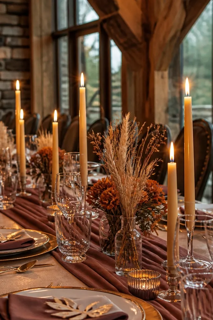
Rosewood brown is a warm, slightly red-brown that reads rich and autumnal without going overly dark. Champagne gold accents make it look festive and photo-ready, especially in candlelight. This palette is great for fall weddings that want a “cozy” vibe but still look polished. It’s also flattering because rosewood has enough warmth to brighten skin tones.
Quick tipUse gold in hair and shoes; those show up in most wedding photos more than jewelry does.
Choose rosewood brown in crepe or matte satin so the color stays smooth in photos. Add champagne gold through hair accessories, jewelry, and small details like clutch hardware. If you need variety, do different dress necklines in rosewood rather than adding another color. For cost control, buy accessories in a matching set — it’s cheaper than hunting for multiple gold shades.
Skip thisSkip bright yellow gold; champagne gold should look slightly muted and warm.
24. Smoke Plum + Warm Ivory
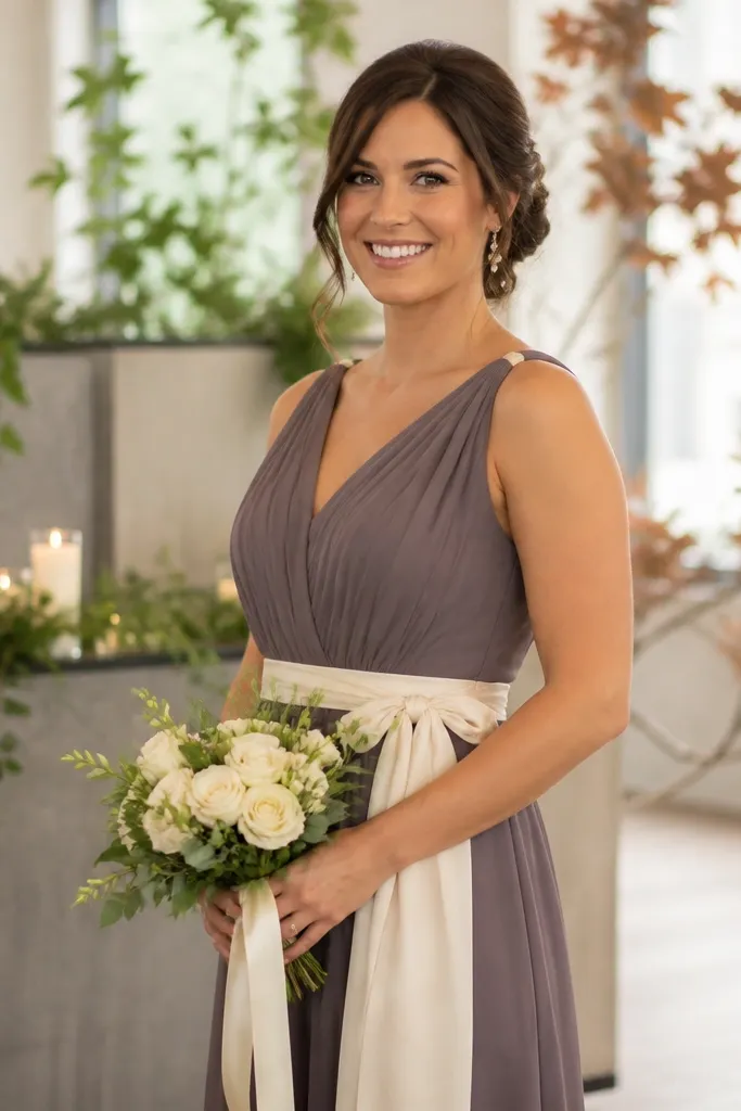
Smoke plum is plum that has a gray softness, so it feels modern and fall-ready without being too loud. Warm ivory wraps lighten the look and make the plum feel more romantic. This palette works for indoor venues where plum can look heavy; the ivory keeps it balanced. It also looks great in fall gardens because the smoky tone blends naturally with background leaves.
Quick tipFor photos, use a warm-toned bouquet so the ivory doesn’t get washed out against cool backgrounds.
Pick smoke plum as the main dress color in satin or crepe. Add warm ivory through wraps, sashes, or small lace accents so the group looks coordinated. Keep ivory warm, not bright white, or the dresses can look too stark. For ordering, buy the ivory wraps first and confirm the shade against the plum; ivory and plum undertones need to match closely.
Skip thisDon’t pair smoke plum with icy gray; it makes the plum look dull.
25. Sienna Orange + Deep Navy Contrast
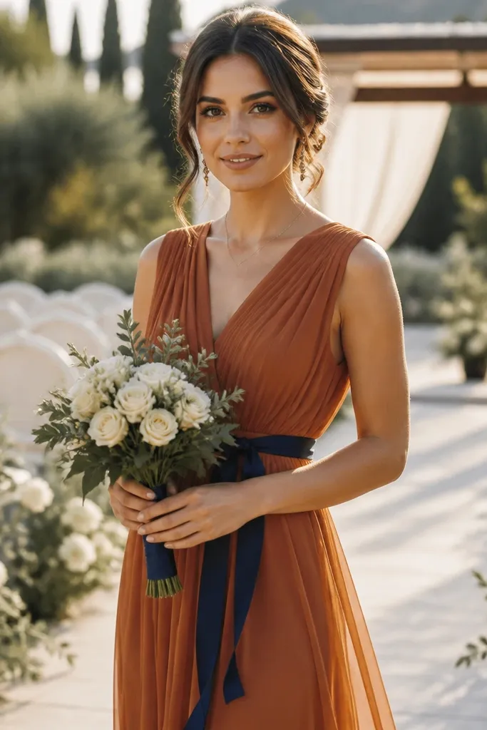
Sienna orange is a wearable fall orange that can look chic instead of loud when it’s paired with deep navy. The navy contrast adds structure and keeps the palette from feeling too sweet. This is a strong pick for fall weddings with white or cream decor, because the navy anchors the color and makes everything pop. It also photographs well in outdoor shade where orange can otherwise fade.
Quick tipCoordinate bouquets with navy elements like dark berries or deep green stems to tie the colors together.
Choose sienna orange for the bridesmaid dresses in chiffon or crepe. Add deep navy through ties, shawls, or shoes so you get contrast without buying a whole second dress color for everyone. Keep navy consistent and dark; avoid lighter blues. For budget, use navy accessories for the “secondary shade” effect and keep dress purchasing simple.
Skip thisDon’t pair orange with black; navy gives you the contrast with a softer, fall-friendly look.