1. Terracotta Clay With Warm Cream
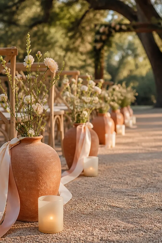
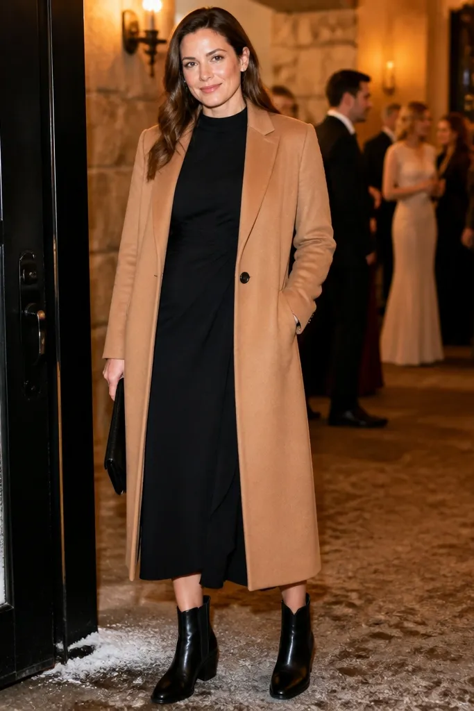
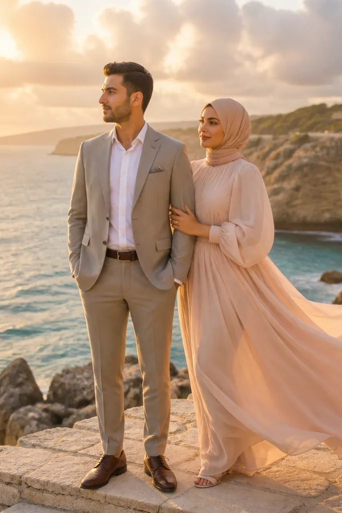
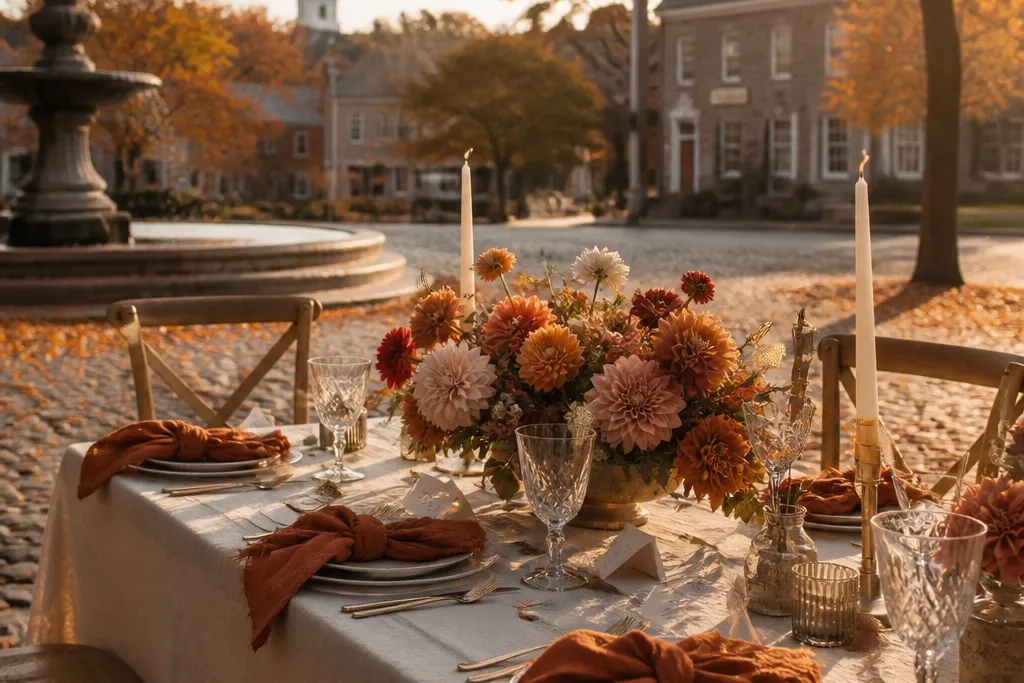
Terracotta clay is the early-fall color that reads like sunshine even when the weather cools. Pair it with warm cream so the palette stays soft and bridal, not rustic-hard. In photos, terracotta flatters skin tones because it sits between orange and muted rose — it doesn’t scream, it glows. This works best for outdoor ceremonies with neutral backgrounds like stone paths, tan walls, or sandy earth where the color won’t fight the scene.
Quick tipBook your outdoor portraits for 60-90 minutes before sunset so terracotta stays rosy instead of turning flat.
Start by choosing terracotta as your base shade for dresses or main floral mass. Then add warm cream for linens, candle wax, or a second bouquet so the terracotta has breathing room. Finally, keep contrast objects in medium brown — think leather shoes or a caramel ribbon — and avoid black for early-fall looks.
Skip thisSkip bright orange — it looks neon against early-fall skies.
2. Dusty Rose With Oat Milk Gold
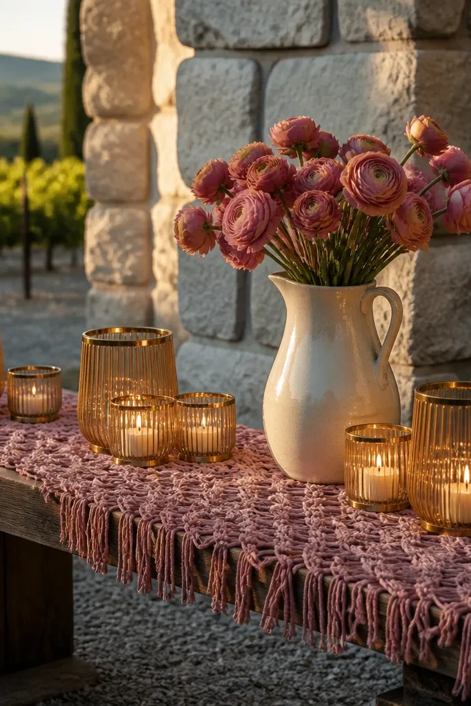
Dusty rose is the “soft elegant warmth” shade that still feels seasonal. When you pair it with oat milk gold, the warmth looks intentional instead of costume-y. This palette photographs beautifully in late afternoon because dusty rose holds color without going pink-magenta. Use it when your venue has cool tones — gray stone, modern concrete, or shaded courtyards — because the oat-gold warmth balances the background.
Quick tipUse matte gold finishes for signage and candle holders; shiny brass can blow highlights in fall light.
Start with dusty rose for napkins, a table runner, or a bridal accessory like a sash. Then choose oat milk gold for small metal accents: flatware, signage ink, or candle holders. Finally, keep florals in blush + garden greenery so the rose reads velvety rather than sugary.
Skip thisAvoid fuchsia — it clashes with dusty rose under overcast skies.
3. Sage Green With Butter Yellow
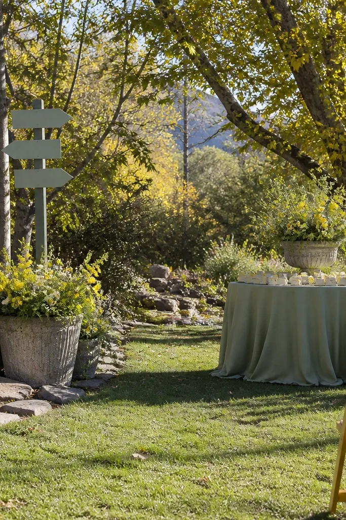
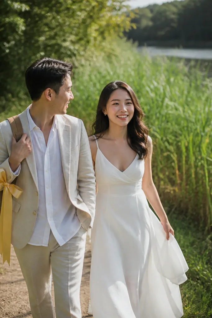
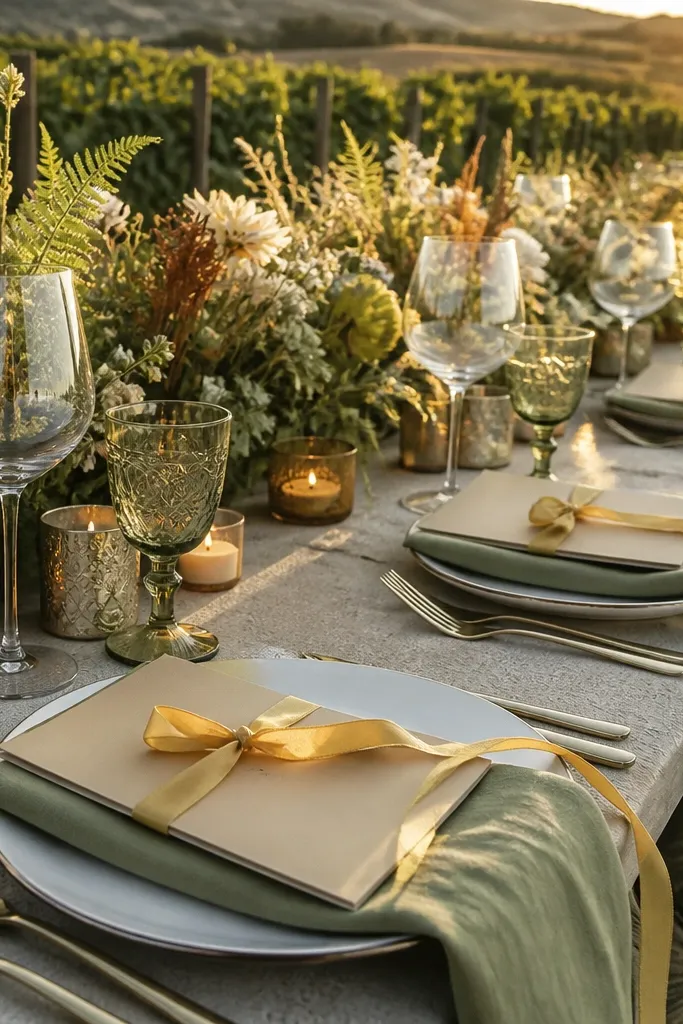
Sage green is calm, but early fall makes it feel fresh instead of wintery. Butter yellow adds warmth without going candy-bright, so the palette feels like it belongs outdoors. This combo is a winner for vineyard settings and garden venues because it echoes leaves while still looking celebratory. In photos, it gives you a gentle contrast — green background energy with a yellow highlight that draws the eye to bouquets and faces.
Start by using sage green for dresses, bridesmaid skirts, or larger floral components like hydrangea or sage-toned foliage. Then add butter yellow through flowers like ranunculus, daffodil-toned blooms, or small ribbon accents. Finally, set the table with cream linens and skip stark white so the whole palette stays warm.
If you’re doing a bouquet, keep yellow to about 20-30% of the blooms so it doesn’t overpower the green.
Skip neon yellow — it looks harsh beside sage.
4. Mocha Brown With Latte Beige
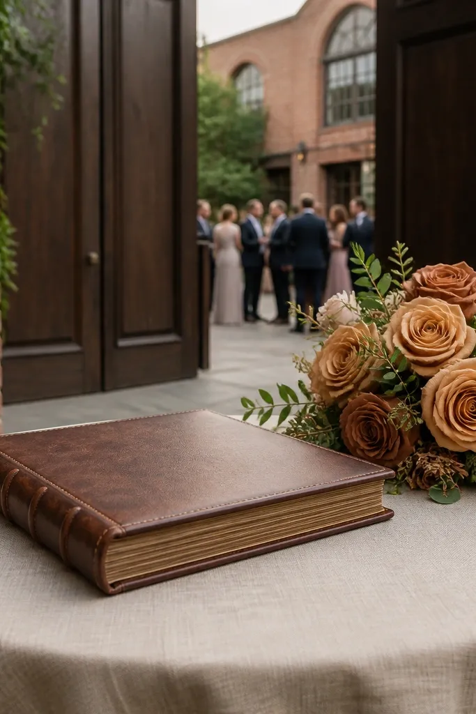
Mocha brown is the early-fall neutral that makes everything look grounded and polished. Pair it with latte beige so the palette stays airy — you’re aiming for softness, not a heavy chocolate mood. This is a great choice for city weddings where you have brick walls, dark wood, or shaded streets. The beige keeps faces bright in photos, while mocha adds that fall warmth without leaning into orange.
Quick tipChoose fabrics with visible weave — linen, wool, or hopsack — because texture reads better than flat color.
Start with mocha in menswear (suits, vests, or suspenders) or as the main floral tone. Then add latte beige for tablecloths, chair sashes, or a textured backdrop like linen. Finally, use small accents in warm gold or caramel leather to bring cohesion.
Skip thisAvoid pure black accents; it can make mocha look dull too early.
5. Burnt Umber With Soft Ivory
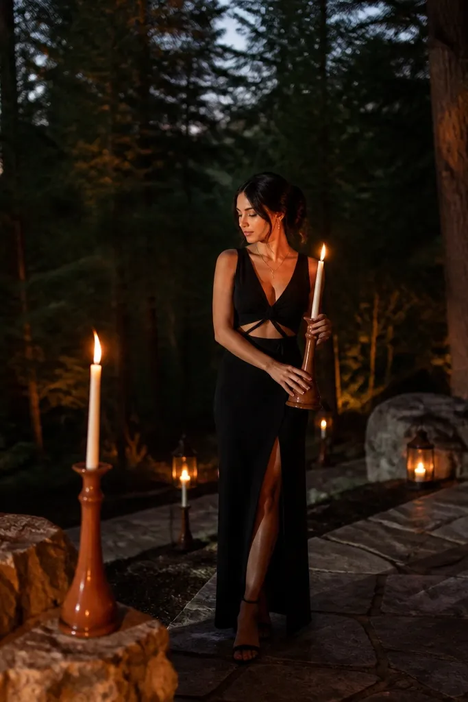
Burnt umber is deeper than terracotta, so it works best when you keep the rest of the palette light. Soft ivory stops it from turning gloomy, and the contrast looks elegant in both daylight and candlelight. This color pairing looks especially good in forest-adjacent venues where darker greens and tree trunks can swallow lighter shades. Umber gives a warm, earthy anchor that still photographs cleanly.
Quick tipIf your venue has lots of dark wood, go 60% ivory to 40% umber max for the table.
Start with burnt umber as a concentrated element: napkins, a ceremony runner, or the outer petals of floral clusters. Then use soft ivory for linens, plates, and dress underlayers so the palette stays bright. Finally, place amber candlelight in the scene — it makes umber look richer without adding new colors.
Skip thisSkip dark burgundy with umber early in the season; it can feel too wintry.
6. Deep Teal With Champagne Cream
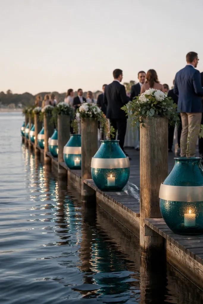
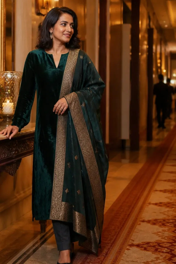
Deep teal is a standout fall wedding color because it’s cool-toned but still feels rich and warm when paired right. Champagne cream keeps the teal from looking like winter navy, and it brightens skin tones in photos. Use this palette when your venue has water, glass, or lots of natural light — it makes teal pop without looking harsh. It also works well for evening celebrations, since teal holds up under warmer indoor lighting.
Quick tipBring a small swatch of teal fabric to your florist; teal flowers vary wildly in undertone.
Start with deep teal for dresses, bridesmaid outfits, or the main floral greenery tinted with teal tones. Then add champagne cream in satin ribbons, table linens, or a bridal bouquet base. Finally, keep metals in champagne gold and avoid silver so the whole scene stays warm.
Skip thisAvoid pairing teal with icy white; it makes the teal look blue-gray.
7. Dusty Lavender With Oatmeal Linen
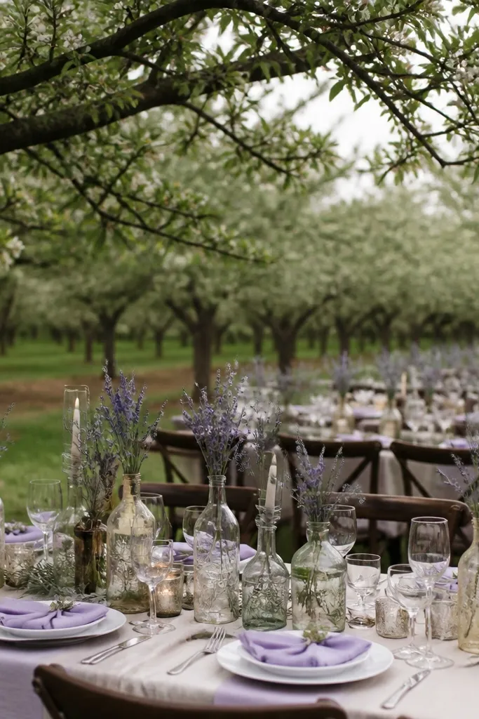
Dusty lavender gives fall wedding colors a softer twist that still reads seasonal. The key is oatmeal linen — it’s the warm neutral that keeps lavender from going cold. This palette is gorgeous for outdoor ceremonies when the background has muted greens and browns, like orchards or low-branch gardens. In photos, lavender adds a romantic haze, and oatmeal makes it feel grounded, not pastel-candy.
Quick tipIf you’re using lavender in bouquets, pair it with textured blooms like scabiosa or dried lavender heads for visual depth.
Start by choosing dusty lavender for smaller wedding elements like bridesmaid tops, a sign color, or accent flowers. Then build the table with oatmeal linen so the palette looks cohesive. Finally, keep other colors minimal — warm cream and soft gray are enough — and avoid bright pink.
Skip thisSkip bright lilac — it reads too springy against fall light.
8. Olive Branch Green With Warm White
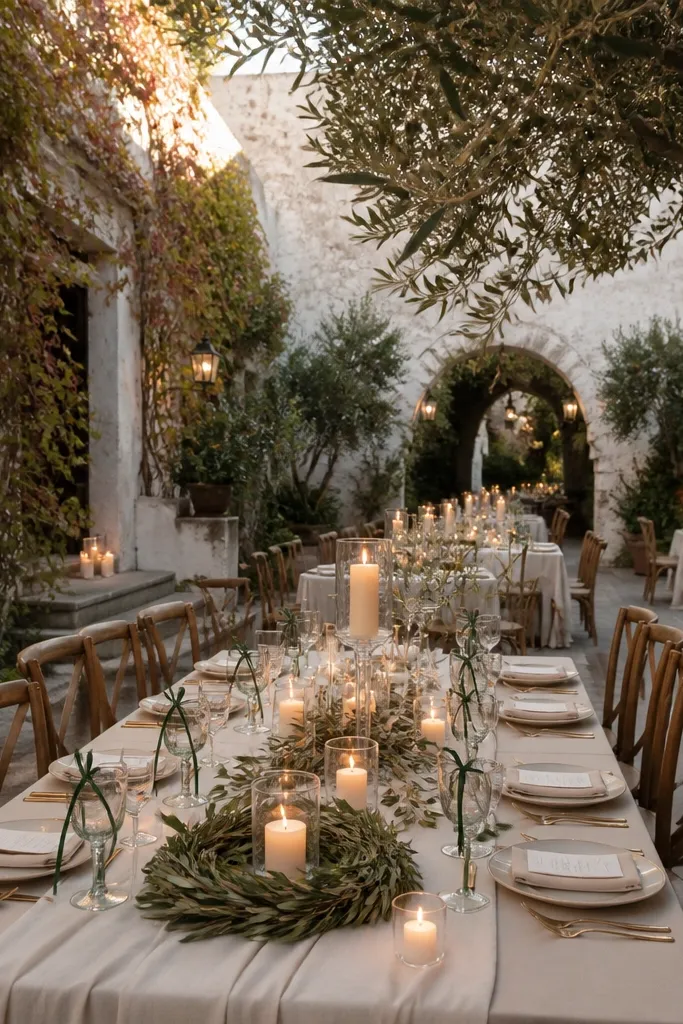
Olive branch green is understated, but it photographs beautifully because it harmonizes with almost every early-fall background. Warm white keeps it from looking drab, so you still get that soft elegant warmth. This is the palette I’d pick for destination weddings where you want the decor to look cohesive across different lighting conditions. Olive also pairs well with natural wood, stone, and terracotta — so you can mix venue textures without clashing.
Start with olive green for napkins, table runners, or ceremony arch fabric. Then use warm white for plates, candles, and dress accents. Finally, bring in a small amount of lemon-gold through flowers or ribbon to keep the palette from going flat.
Use olive branches or olive-leaf garlands as texture — the leaf shape reads better than printed patterns.
Avoid neon greens; they look artificial in outdoor shade.
9. Apricot Peaches With Soft Graphite
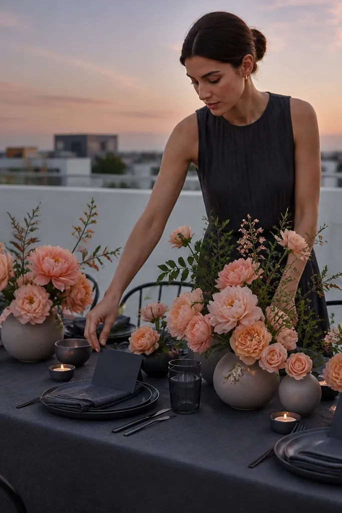
Apricot peach is early fall’s friendliest warm orange — it reads softer than terracotta and feels romantic. Soft graphite gives just enough contrast to sharpen the look without making it harsh. This palette works well for modern venues with clean lines: white walls, minimalist halls, or rooftop terraces. In photos, apricot warms up skin tones, while graphite keeps the scene from looking washed out.
Start with apricot as the base for bridesmaid dresses or a large floral element. Then use soft graphite for menswear, chair frames, or signage text. Finally, keep the rest in off-white and add a touch of warm metal — brushed gold looks better than shiny chrome.
If you’re renting, request matte chair frames; shiny finishes reflect light and can blow apricot tones.
Skip bright orange or orange-red; it turns harsh under evening light.
10. Caramel Spice With Creamy Vanilla
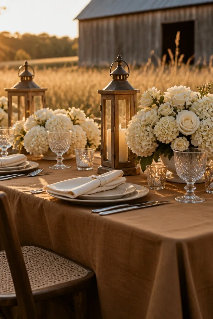
Caramel spice is warm, cozy, and still elegant when you pair it with creamy vanilla. The trick is to keep it sandy and smooth rather than burnt and dark. This palette shines in places with golden hour light: open fields, rustic barns, and light-stone churches. In photos, caramel looks like soft leather and vanilla keeps the whole scene from feeling heavy.
Quick tipUse caramel-brown ribbon with a slight sheen; matte ribbon can look flat next to vanilla blooms.
Start by using caramel in linens, a ceremony backdrop, or the base of floral arrangements. Then add creamy vanilla for bouquets, table centerpieces, and candle color. Finally, keep accents in warm wood tones and avoid cool gray fabrics that fight the palette.
Skip thisAvoid smoky charcoal with caramel early in the season; it drags the warmth down.
11. Raspberry Wine With Rose Quartz Cream
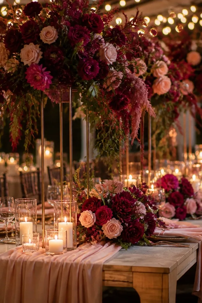
Raspberry wine brings fall energy without going totally dark. Rose quartz cream keeps it romantic and soft, so the color reads luxurious instead of clubby. This palette is a good pick when your venue has lots of greenery and you want the florals to stand out. In photos, raspberry wine adds depth to bouquets and signage, while rose quartz keeps faces bright.
Quick tipTest the wine shade against your venue lighting; some raspberry fabrics pull purple under shade.
Start with raspberry wine as a small but clear accent — napkins, a sash, or a ribbon around the arch. Then use rose quartz cream for the majority of florals and linens. Finally, keep metals in antique gold and use dark brown shoes instead of black for a softer contrast.
12. Cinnamon Stick With Soft Oat Milk
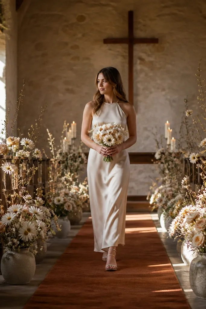
Cinnamon stick is a warm brown with a reddish edge, and it looks like spices in fall sunlight. Soft oat milk keeps it gentle and modern, so it doesn’t tip into “spooky” territory. This color combo is ideal for weddings that want a warm, cozy look without heavy reds. It’s especially photogenic in rustic venues where wood and straw are already in the background.
Quick tipPrint place cards in a matte ink finish; glossy paper catches light and can look cheap in fall sun.
Start by selecting cinnamon stick for stationery, place cards, or a ceremony sign frame. Then build the floral and table in oat milk tones — think cream, light beige, and soft blush. Finally, add one warm texture element like woven baskets or linen napkins so the palette looks intentional.
Skip thisSkip dark red wine with cinnamon stick; it makes the palette feel late-fall heavy.
13. Forest Moss With Warm Sand
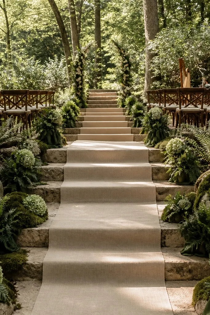
Forest moss is deeper than sage, but it stays elegant when you pair it with warm sand. The sand is what keeps the palette airy, so it looks like early autumn outdoors instead of a winter cabin. This works best for ceremonies in wooded areas, botanical gardens, and places with stone paths. In photos, moss adds serious depth to greenery-heavy backgrounds, and sand keeps the scene from looking too dark.
Start with forest moss as a fabric accent: table runners, ceremony drape, or bridesmaid skirts. Then choose warm sand for linens, invitations, and bouquet bases. Finally, keep floral mix light with cream and pale peach blooms so the moss doesn’t swallow everything.
Avoid too many dark green flowers; use moss as a tone, then let cream blooms carry the bouquet shape.
Avoid bright white décor; it makes moss look dirty in outdoor shade.
14. Goldenrod With Creamy Champagne
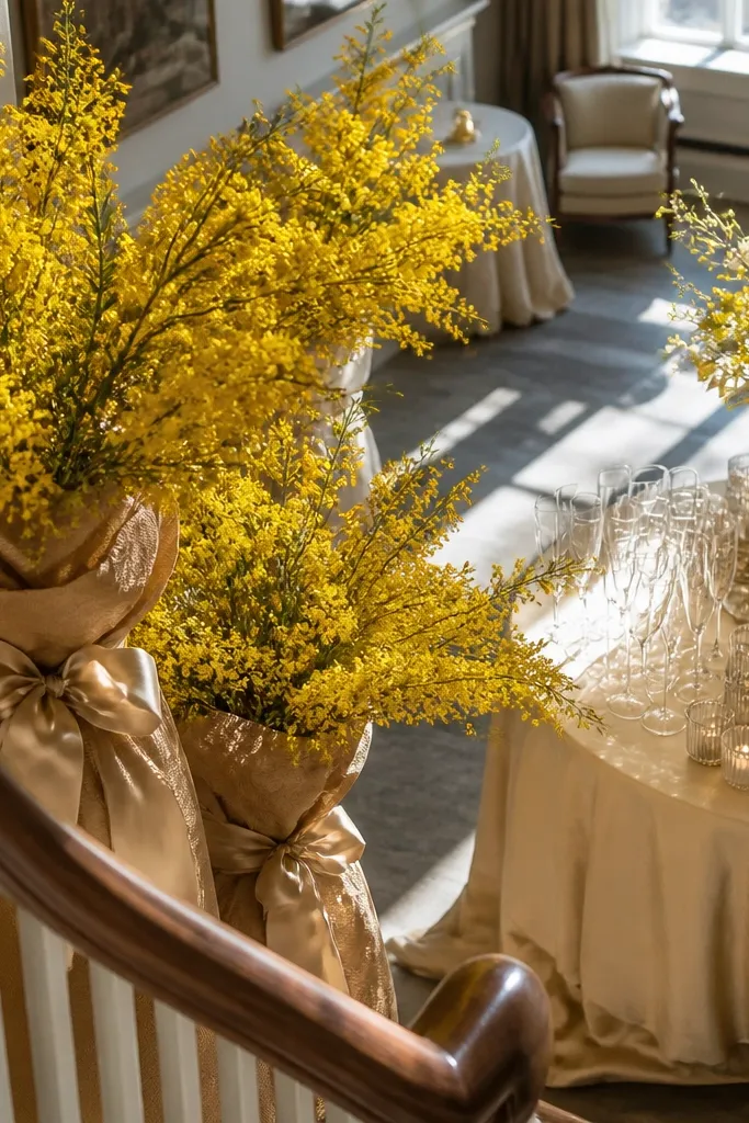
Goldenrod brings that early-fall brightness that looks like sunlight caught in fabric. Pair it with creamy champagne so it feels celebratory, not loud. This palette is perfect for late-afternoon outdoor weddings where you want the color to echo the sky glow. In photos, goldenrod adds a high-impact pop around bouquets and centerpieces while champagne neutrals keep everything classy.
Quick tipUse goldenrod in matte fabric or matte florals; glossy satin can reflect too much and blow highlights.
Start with goldenrod in one place you’ll photograph a lot — bridal bouquet, ceremony floral wall, or centerpieces. Then use creamy champagne for tablecloths, candles, and signage. Finally, add warm gold metal accents sparingly so the palette stays soft rather than glittery.
Skip thisSkip primary yellow; it looks harsh beside champagne cream.
15. Brick Rust With Soft Ivory Lace
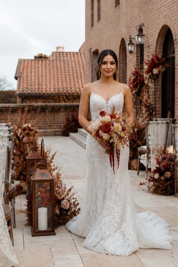
Brick rust is a more muted cousin of orange, and it looks gorgeous against early-fall architecture like brick buildings and terracotta roofs. Soft ivory lace keeps the romantic feel, so the palette looks bridal even in a rustic setting. This works when you want warmth without going full “pumpkin patch.” In photos, rust adds depth to skin and greenery, while ivory lace gives visual softness and movement.
Quick tipIf you’re renting lace table overlays, choose a slightly oversized drape so it catches light gently.
Start by picking brick rust for dresses, bridesmaid skirts, or a patterned ribbon accent. Then use soft ivory lace elements in the bouquet wrap, table runners, or chair sashes. Finally, keep florals in cream and pale peach so rust reads warm and not muddy.
Skip thisAvoid pairing brick rust with icy blue; the contrast reads wrong in fall light.
16. Dusty Teal With Warm Beige
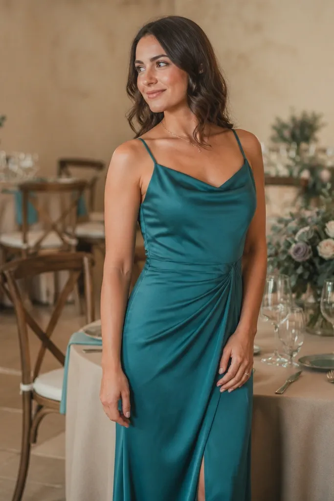
Dusty teal is calmer than deep teal, so it feels more “early fall” and less formal-night. Warm beige brings the soft elegant warmth you want, especially if your venue has neutral walls or sandy tones. This palette is photogenic in both indoor receptions and outdoor ceremonies because dusty teal doesn’t fight warm lighting. It gives you a stylish, grown-up feel without turning into a dark winter palette.
Start with dusty teal for bridesmaid dresses or a ceremony backdrop fabric. Then choose warm beige for linens, table skirting, and invitation paper. Finally, add small accents in antique gold and keep greenery light so teal stays the star.
Order a fabric swatch before you commit; dusty teal shades vary from greenish to bluish fast.
Skip gray-beige; it can make dusty teal look flat and lifeless.
17. Pale Peach With Blush Smoke Gray

Pale peach is the easiest color to make fall wedding photos look soft, especially in early October. Blush smoke gray sounds odd, but it works because it cools the palette just enough to feel modern. Use this when your venue has lots of neutral concrete, metal railings, or minimalist interiors. In photos, pale peach gives warmth to skin, while smoke gray adds definition to centerpieces and signage.
Quick tipUse smoke gray only in small areas; too much gray makes peach look pale.
Start with pale peach as a floral and linen tone. Then add blush smoke gray in table runners, chair sashes, or a secondary napkin color. Finally, keep the rest in cream so the gray doesn’t dominate and turn the palette cold.
18. Champagne Blush With Cocoa Brown
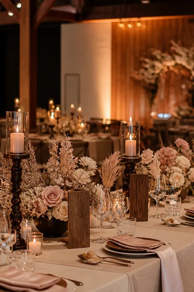
Champagne blush sits between rose and nude, which makes it incredibly flattering for fall wedding photos. Cocoa brown adds warmth and depth without going as dark as espresso. This palette works beautifully for weddings that want “soft elegance” more than “rustic.” It’s especially good for venues with warm wood, beige walls, or outdoor shade where you need colors that don’t go gray.
Start by choosing champagne blush for your bouquet base and bridesmaid dresses. Then add cocoa brown through leather details, chair frames, or a ribbon around the ceremony arch. Finally, keep tableware in cream and add warm candlelight so the palette reads cohesive.
If you’re doing a photo backdrop, use textured fabric in champagne blush instead of smooth satin to avoid glare.
Avoid pairing blush with stark black; it makes champagne tones look washed out.
19. Rose Clay With Burnished Bronze
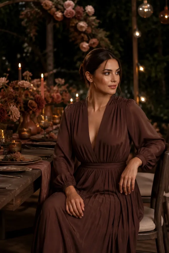
Rose clay is a hybrid color that looks like dried rose petals warmed by sun. Burnished bronze adds a subtle metallic glow that feels autumn without turning into glitter. This palette is made for evening weddings because bronze looks great under candlelight and warm indoor lighting. In photos, rose clay brings softness while bronze outlines details like flatware, candle holders, and signage.
Quick tipUse burnished finishes, not mirror-polished bronze; mirror shine blows highlights in fall light.
Start with rose clay for dresses or a large floral mass like dahlias and roses in dusty tones. Then choose burnished bronze for metal accents — candle cups, signage foil, or utensil handles. Finally, keep your linens in cream or off-white so the metallic stays warm, not yellow.
Skip thisSkip cool silver metals; they make rose clay look dull.
20. Amber Honey With Ivory Cream
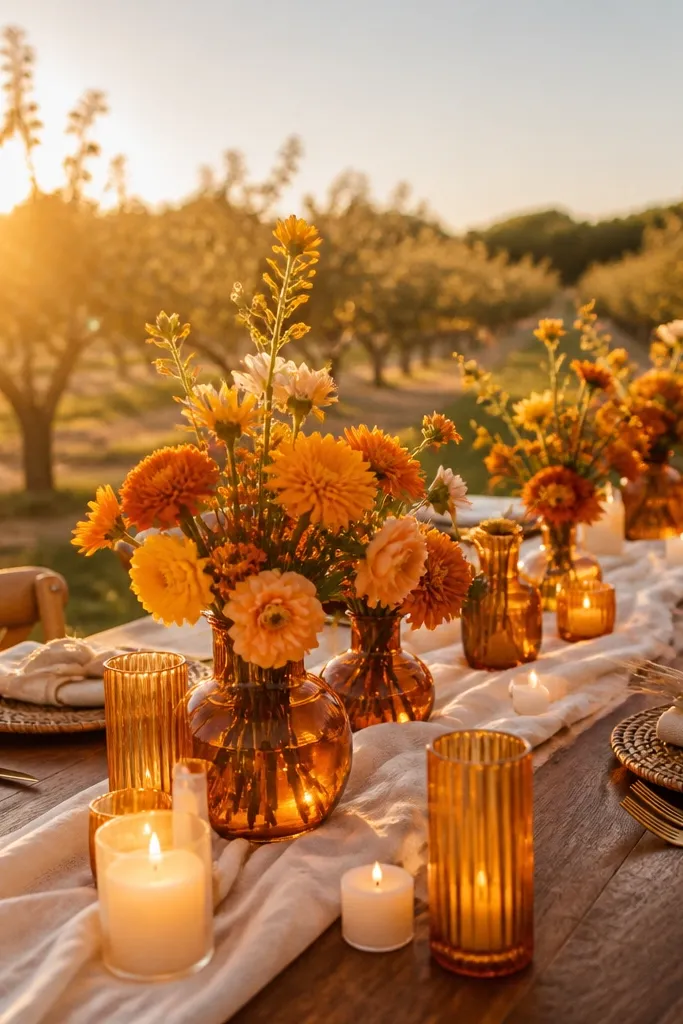
Amber honey is one of the most photogenic early fall colors when it’s paired with ivory cream. It reads like warm light, so it flatters skin and makes centerpieces look radiant instead of heavy. This palette is ideal for outdoor venues with fields, orchards, or any space where the background is already warm. In photos, amber honey draws the eye to the bouquet and table focal points while ivory keeps the overall look airy.
Quick tipIf you’re using amber glass candles, place them slightly higher on tables so they glow above the bouquet line.
Start by using amber honey in flowers or candle colors — think marigold-toned blooms and amber glass. Then set linens and tableware in ivory cream to keep it soft. Finally, add greenery in muted olive so the honey doesn’t turn into pure orange.
Skip thisAvoid pairing amber honey with icy blue; it makes the palette feel like a fall festival costume.