1. Persimmon + Charcoal + Warm Ivory
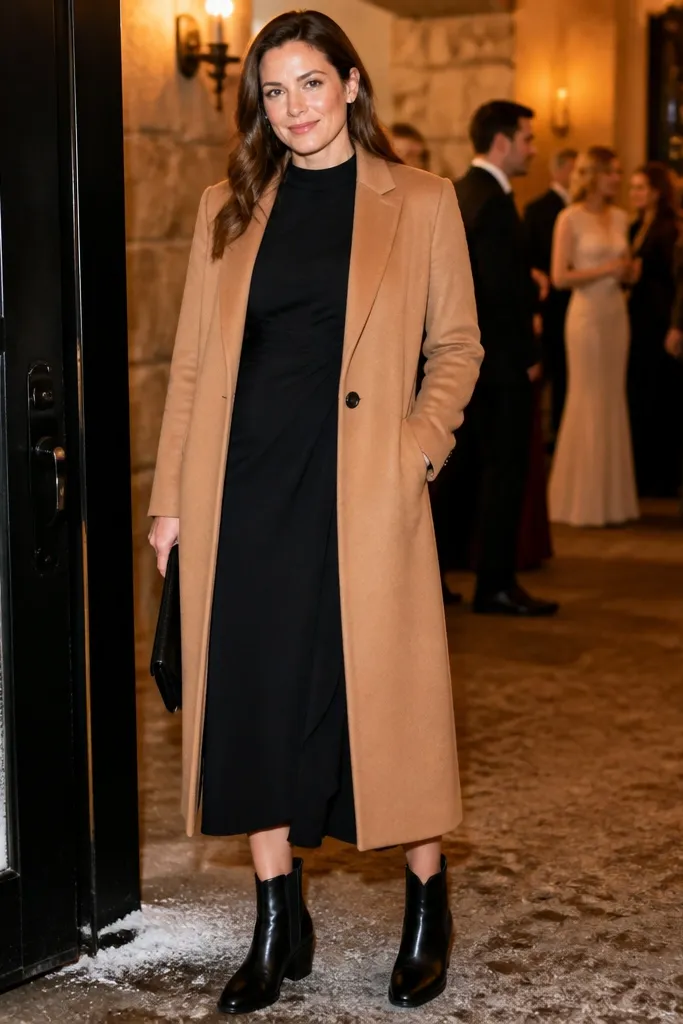
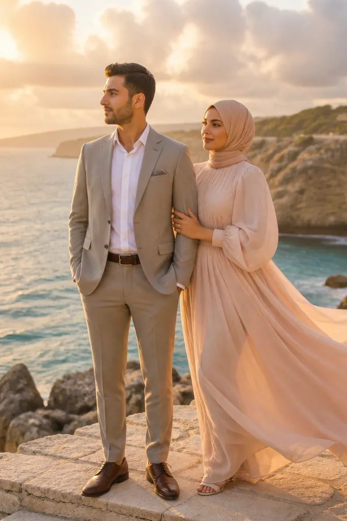
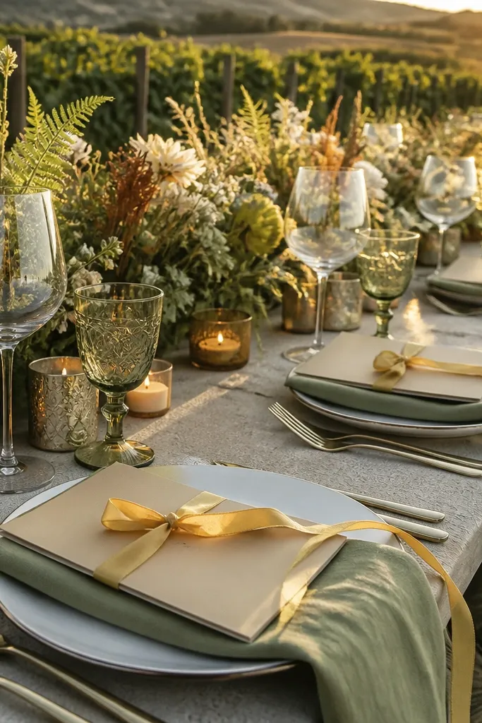
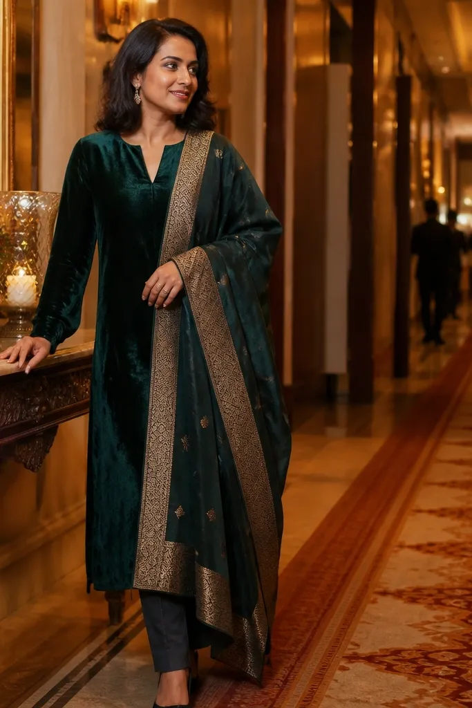
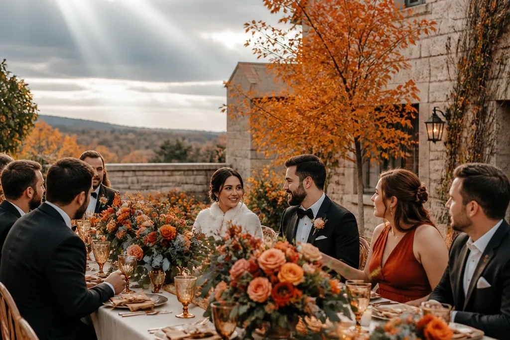
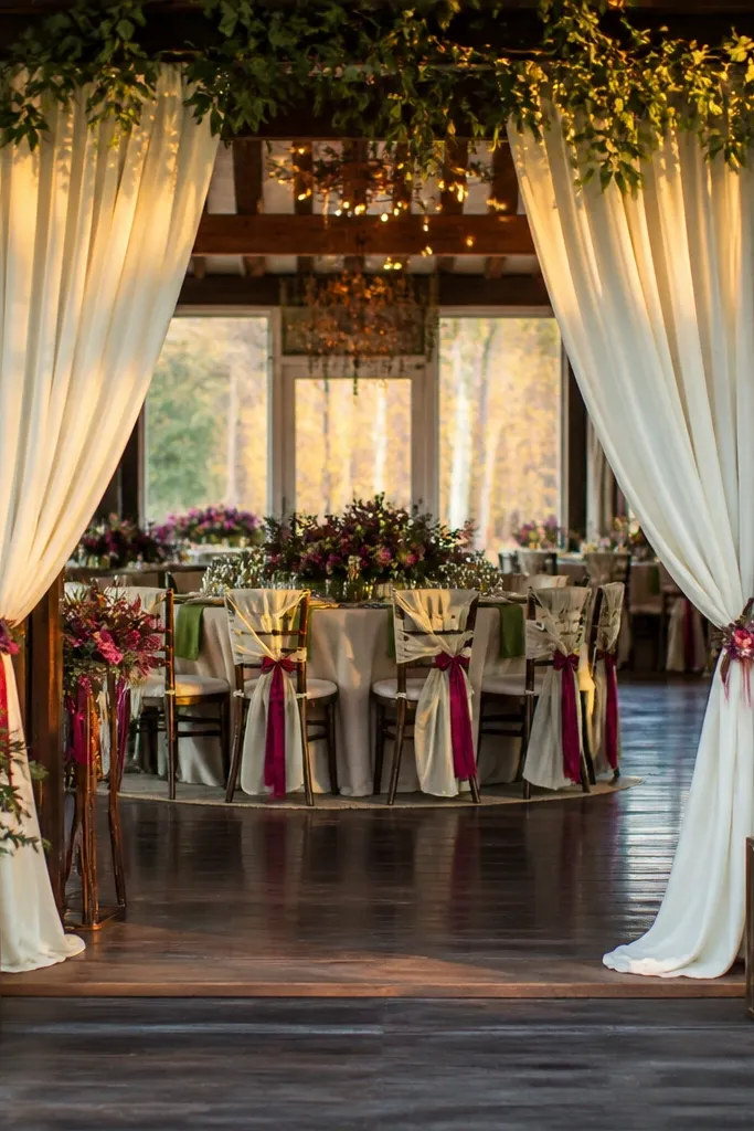
Start with persimmon as your main color in dresses or a statement accent like napkins. Then anchor the rest with charcoal — think suit fabric, groomwear, or a charcoal table runner. Finally, keep the base fabrics warm ivory (not icy white) so shadows look soft instead of gray. Transportation tip: pack bouquet greenery in a breathable wrap and keep it cool; orange blooms bruise faster than you expect. Budget tip: if you’re saving, spend on the persimmon fabric pieces and keep florals simpler with fewer flower varieties.
Persimmon is one of the few October fall colors that stays bright without looking like summer orange. Pair it with charcoal so the warmth has structure, and keep linens warm ivory so skin tones don’t get washed out. This palette looks especially good in photos with textured backgrounds like maple leaves or stone walls because persimmon catches the light first. For bouquets, mix persimmon-toned blooms with dark foliage and a few creamy flowers to avoid a flat orange block. It’s a strong choice if you want bold but still classic fall energy.
Skip thisAvoid dusty terracotta with charcoal; it reads muddy next to October foliage.
Quick tipUse warm ivory linens with persimmon — icy white makes the orange look harsher in October light.
2. Teal + Rusted Gold + Cream
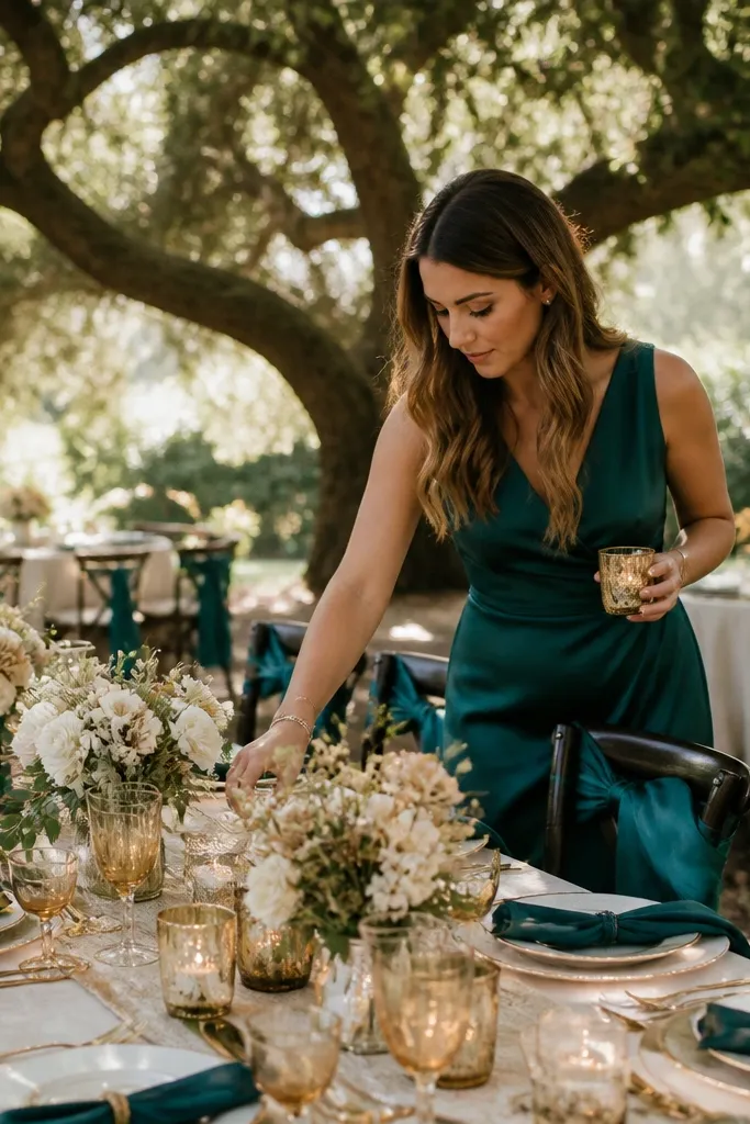
Start by choosing teal as an accent you can repeat — bridesmaid dresses, a ceremony backdrop, or ribbon on bouquets. Then add rusted gold through candle flames, metallic stationery, or warm gold frames. Finally, keep tablecloths cream and use teal napkins or runners so the palette shows up in wide shots. Getting there and around tip: if you’re bringing candles, use sturdy holders and transport them in a separate bag so nothing gets knocked. Cost control: teal fabric is cheaper than teal specialty decor, so buy fabric first and build decor around it.
Deep teal gives you that fall-appropriate jewel tone that still looks fresh in gray skies. Rusted gold adds warmth without turning the whole palette into “orange everything,” and cream keeps the contrast from feeling too dark. This is a great palette for outdoor ceremonies where you’ll have tree shade because teal holds color in shade better than lighter blues. For florals, combine teal ribbons or dried teal-toned accents with rust-gold candleholders and creamy blooms. The result looks styled, not costume-y.
Skip thisSkip bright, icy aqua; it clashes with rust tones and looks off in warm indoor light.
Quick tipOrder teal ribbon in two widths so you can use one for bouquets and one for chair ties without extra dyeing.
3. Emerald + Burnt Orange + Oat Milk
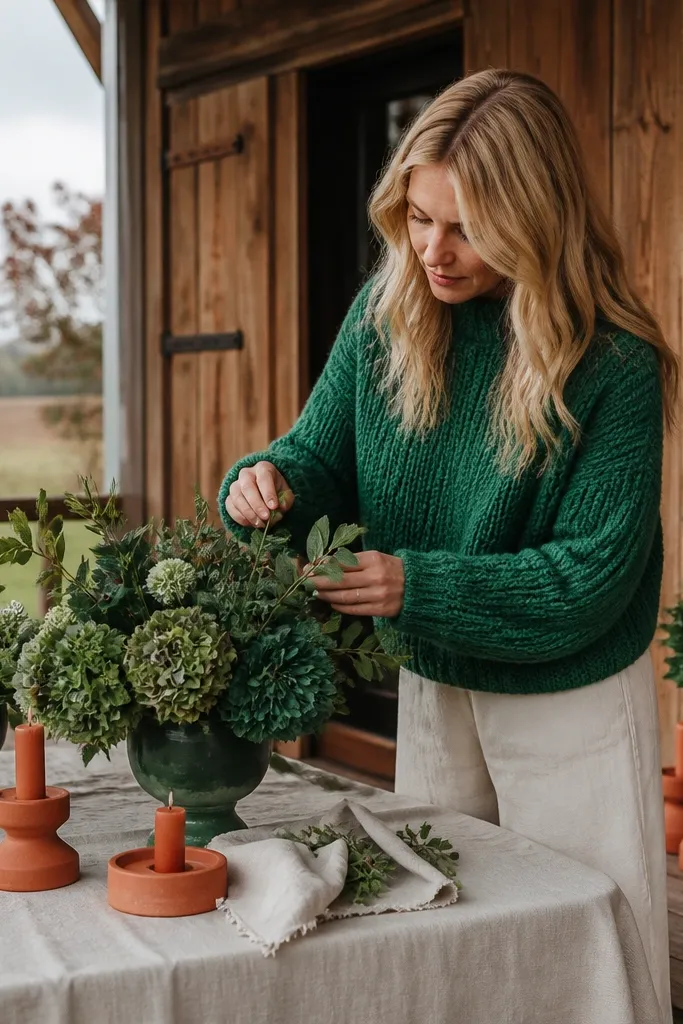
Start by picking emerald for the largest area you control — dresses, a table runner, or a ceremony arch. Then add burnt orange as the secondary color through bouquets, signage ink, or napkins. Finally, use oat milk linens and wood-toned decor so the contrast stays smooth. Logistics tip: if you’re doing an outdoor ceremony, bring an extra layer of cloth for signage because ink can smear with morning moisture. Booking tip: lock in your florals early; emerald-forward bouquets are harder to source late.
Emerald is bold in October without needing a “dark and moody” vibe. Burnt orange adds the fall warmth, and oat milk keeps everything creamy and flattering. This palette photographs well because emerald gives strong color definition while orange adds warmth in highlights. It’s also forgiving for venues with lots of wood — emerald doesn’t get swallowed. Use it for a wedding that wants fall drama but still feels bright and modern.
Skip thisDon’t go with pale peach next to emerald; it mutes the contrast you paid for.
Quick tipUse oat milk instead of white — it prevents emerald from looking too neon on camera.
4. Sapphire + Tangerine + Ivory Lace
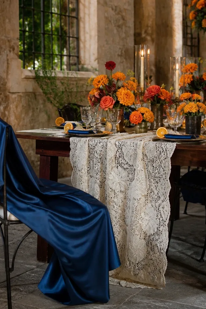
Sapphire is a clean, jewel-cool blue that reads rich in October photos. Tangerine brings brightness that feels seasonal without being dull, and ivory lace gives you that soft romantic base that doesn’t fight the color pop. This palette works best when you have strong fall textures behind you — think dark wood, stone, or a stand of bare branches. It also looks great in both indoor and outdoor settings because sapphire holds its tone in shade. If you want bright, not brown, this is the one.
Start with sapphire as your anchor — suits, groomsmen ties, or the main backdrop fabric. Then add tangerine through bouquets and small details like signage accents or napkins. Finally, choose ivory lace or embroidered textures for base linens to keep the palette airy. Travel tip: if you’re bringing lace decor, roll it gently and pack it flat in a garment bag to prevent wrinkles. Cost tip: you can fake the “lace look” with a lace table runner instead of buying lace for everything.
Use matte sapphire fabric, not shiny satin, so it doesn’t glare in direct sun.
Avoid mixing sapphire with gray-toned purples; it makes the whole scene look washed.
5. Hot Pink + Deep Plum + Cream
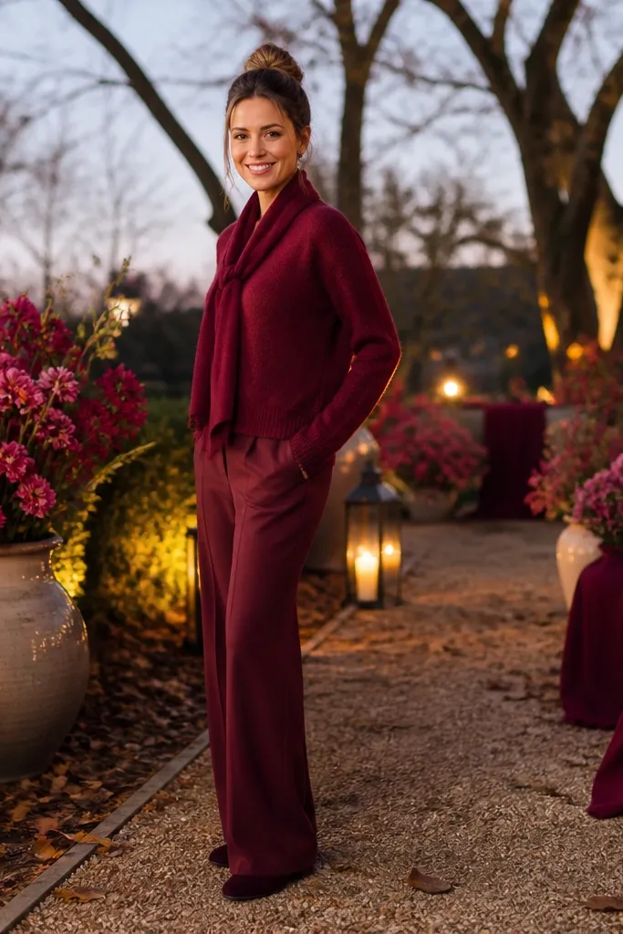
Start by picking hot pink for a controlled surface — dresses or a statement photo backdrop. Then use deep plum in tablecloths, napkins, or a runner so the scene looks grounded. Finally, keep everything else cream so skin tones and candlelight stay flattering. Getting there tip: if you’re doing outdoor photos near leaves, plan a backup indoor spot with cream walls to prevent color glare. Budget tip: hot pink is easier to source in fabric than in matching florals, so build with ribbon and paper first.
Hot pink sounds like it shouldn’t work in fall, but October light makes it look surprisingly modern and festive. Deep plum gives you the fall backbone, while cream keeps the palette from being too harsh. This is a strong choice for couples who want bright color without going full “Halloween red.” In photos, hot pink shows up clearly against dark foliage and neutral venues. For florals, use plum-toned berries or dark purple flowers and keep hot pink in smaller, intentional hits like ribbon, bridesmaid dresses, or escort cards.
Skip thisDon’t pair hot pink with dusty rose; it turns the palette into a muted blur.
Quick tipKeep hot pink matte — glossy fabrics can reflect overhead lighting and look blown out.
6. Tomato Red + Blackened Navy + Warm Sand
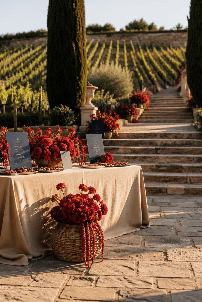
Start with tomato red as your highlight — ceremony florals, napkins, or a bold runner. Then add blackened navy through suits, tableware, or stationery ink. Finally, choose warm sand for tablecloths and larger textures so the reds don’t look too intense. Logistics tip: pack table settings in separate boxes by color so you don’t mix navy and black pieces in a rush. Cost control: use tomato red paper goods to get big color impact without expensive fabric coverage.
Tomato red is brighter and cleaner than classic burgundy, which can look brown in October shade. Blackened navy adds depth without turning the palette into heavy winter. Warm sand linens soften the contrast and keep the whole look sunlit. This palette is great for vineyards, stone courtyards, and any venue with dark surfaces — tomato red pops instantly in photos. It also works well for day weddings because the color reads fresh rather than “evening-only.”
Skip thisSkip maroon if you want bright — it reads flat in cool October shade.
Quick tipTest tomato red under indoor lighting; if it leans too orange, adjust with a slightly cooler navy.
7. Sunflower Yellow + Deep Olive + Oat Milk
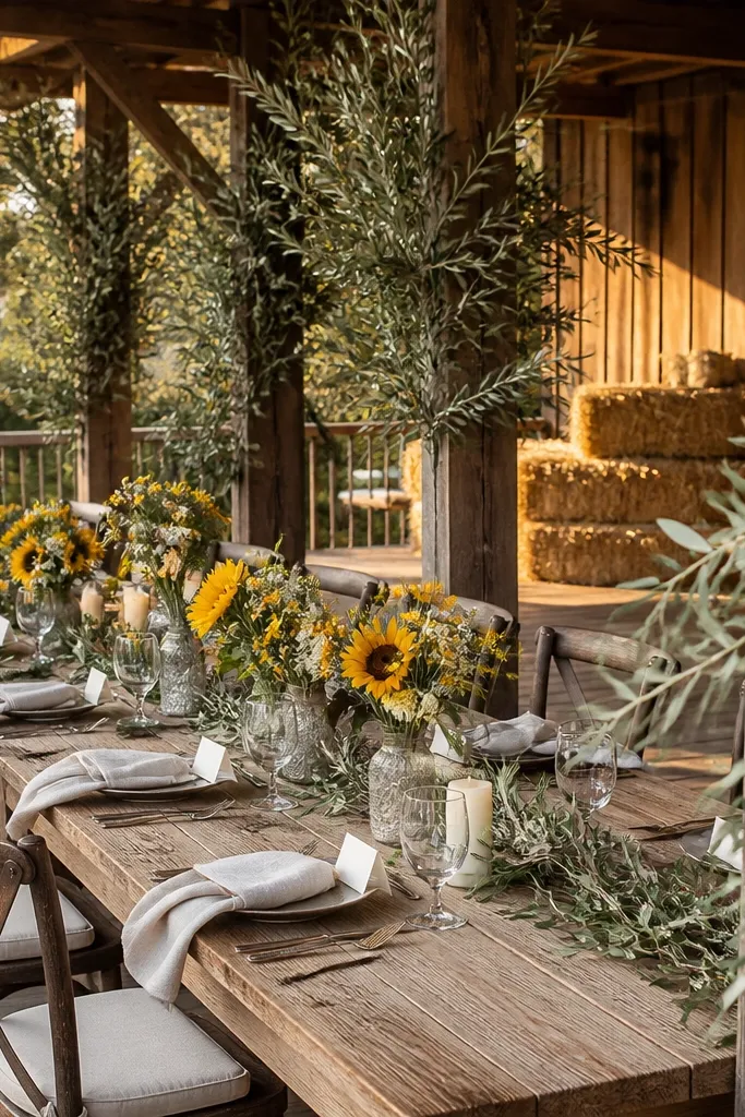
Start by choosing sunflower yellow for one visible element — bouquets, signage, or chair ribbon. Then use deep olive for the bulk of greenery and table styling so the palette has structure. Finally, keep linens oat milk and add small touches of cream in glassware and candles. Travel tip: protect bouquet stems — keep them upright and use a cooler bag if you’re moving between locations. Booking tip: reserve a florist early if you want real sunflowers; late-season supply can run short.
Sunflower yellow gives you that bold, fall-bright pop that still feels grounded when it’s paired correctly. Deep olive provides the leafy contrast and keeps the palette from looking like a summer party. Oat milk linens make the yellow look buttery, not harsh. This is an excellent palette for rustic venues and outdoor ceremonies because it harmonizes with leaves and wood tones. For florals, use sunflowers or yellow daisies sparingly and lean on olive greenery for volume. The look stays photogenic even when the sky turns gray.
Skip thisAvoid pairing bright yellow with pure white; it makes the yellow look washed and high-contrast in bad ways.
Quick tipUse yellow in matte textures (cotton ribbon, paper, matte ceramics) to avoid glare.
8. Copper + Teal + Ivory Gauze
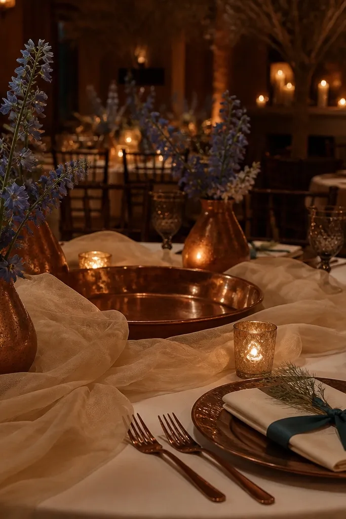
Copper brings that fall glow, but it needs a cool counterweight to look intentional. Teal does the job, giving the palette depth and keeping it from turning into orange-brown mush. Ivory gauze or sheer fabrics keep the whole look airy, so photos don’t feel heavy. This palette is ideal for indoor venues with warm lighting because copper reflects light beautifully while teal keeps the scene balanced. It also works for evening weddings where you’ll have candlelight — copper and teal make that glow feel designed.
Start with copper as a visible metallic — candleholders, chargers, or foil on invitations. Then add teal through napkins, table runners, or bridesmaid dresses. Finally, use ivory gauze draping on chairs or the backdrop so the palette has movement. Logistics tip: bring spare teal napkins because stains show up faster on dark teal than on lighter colors. Cost tip: buy copper accents in smaller pieces; you don’t need copper everywhere to get the glow.
Keep copper pieces consistent in tone — don’t mix rose-gold with copper unless you want a deliberate mismatch.
Skip bronze if you want bright — it can read too brown next to teal.
9. Berry Magenta + Emerald Green + Soft Linen
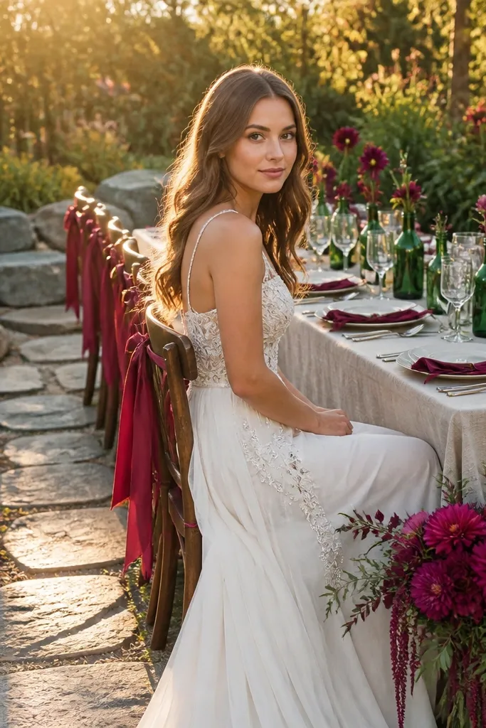
Berry magenta is one of the most photogenic “bright fall” colors because it has enough saturation to look alive in shade. Emerald green adds a jewel contrast that feels seasonal without turning gloomy. Soft linen keeps the palette human and warm, especially for outdoor shots where the light shifts. This palette works when you want a romantic look but still want strong color definition. In bouquets, use magenta flowers with deep green leaves and a few lighter cream blooms to keep the shape airy.
Start by selecting berry magenta for your main floral or bridesmaid dresses. Then use emerald green for the greenery base and a small number of table accents like napkins or signage lines. Finally, choose soft linen in a warm tone so the magenta doesn’t look too loud. Travel tip: if you’re doing a destination wedding, pack a small stain kit; berry dyes can transfer if fabrics rub together. Booking tip: confirm your florist can source berry magenta flowers before finalizing the date.
Use magenta with cream accents to prevent it from looking like a single flat block of color.
Don’t pair berry magenta with gray; it kills the richness in October light.
10. Bright Orange + Black + Ivory Marble Details
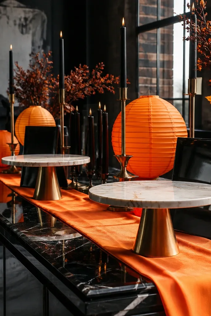
Start with bright orange as the statement — table linens, napkins, or a ceremony arch fabric. Then add black through place cards, candleholders, or suit details. Finally, bring in ivory marble elements through signage design or tabletop ceramics so the palette looks polished. Getting there tip: avoid carrying loose confetti or paper decor in windy weather; use weighted items or keep them indoors until close to ceremony. Cost control: you can get the marble look with printed paper and ceramic touches instead of expensive decor.
Bright orange is the antidote to the “too-brown fall” problem. When you pair it with black, the orange looks crisp and intentional instead of messy. Ivory marble-style details give you a clean, upscale base that photographs well and keeps the look modern. This palette is perfect for couples who want bold fashion energy and a graphic look. It also works in venues that are visually simple because the color contrast does the heavy lifting. For flowers, use orange blooms and keep greenery dark and minimal so the palette stays sharp.
Skip thisSkip charcoal-gray; it looks smoky and dull next to bright orange.
Quick tipUse black in small, high-contrast areas; too much black makes orange look neon.
11. Gold Mustard + Deep Burgundy + Soft White
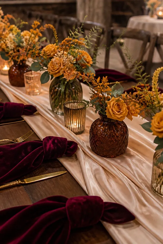
Gold mustard gives you that fall warmth without drifting into muted beige. Deep burgundy adds the classic autumn depth, but soft white keeps it from turning heavy. This palette is a strong choice for indoor receptions where you want cozy color without looking like you’re wearing “holiday dinner” colors. It photographs well because mustard stays luminous while burgundy adds contrast. For bouquets, use mustard-toned blooms with burgundy accents and a few white flowers to keep the lightness.
Start with gold mustard as the main color in florals or bridesmaid attire. Then add deep burgundy in napkins, ribbon, or a secondary bouquet layer. Finally, use soft white for linens and tableware so the palette reads bright, not dark. Logistics tip: if you’re using mustard fabric, steam it before transport because creases show up more on yellow tones. Budget tip: mustard is easier to source in fabric than in matching flowers, so build florals with what’s available and tint ribbons accordingly.
Choose soft white, not bright white — it keeps mustard from looking too yellow-green.
Avoid dusty mauve with mustard; it makes the burgundy look flat.
12. Cranberry + Teal + Warm Limestone
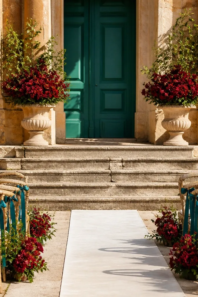
Cranberry is brighter than most “fall red” choices but still reads seasonal. Teal adds contrast that feels modern, and warm limestone tones keep the whole palette grounded. This works well for October because cranberry holds up in cooler light while teal keeps the scene from feeling like all reds. It’s also good for venues with neutral walls and bright window light — the palette looks intentional rather than shadowy. In florals, use cranberry blooms with teal ribbon or teal-toned dried elements, then add creamy neutrals to soften the edges.
Start with cranberry as your highlight color in bouquets or a statement table runner. Then add teal in smaller repeated places like napkins, escort card accents, or chair ties. Finally, use warm limestone linens or light wood tones as your base. Travel tip: keep teal fabrics wrapped separately to avoid color transfer from damp greenery. Booking tip: confirm the timeline for dyeing or tinting any dried elements so nothing arrives late.
Use cranberry in matte finishes; glossy red table pieces can glare in afternoon sun.
Skip maroon instead of cranberry if you want brightness in October photos.
13. Lilac Gray + Saffron + Cream
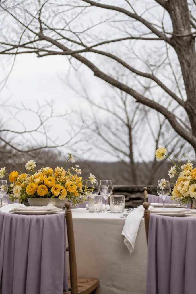
Lilac gray is a clever way to get a fall palette that doesn’t turn brown. Saffron adds the bright seasonal pop, and cream keeps it soft and camera-friendly. This palette is great for couples who want something “fall” but not traditional rust and burgundy. In October, lilac gray looks clean against bare branches and indoor window light, while saffron keeps the whole scene from looking dull. Use cream and pale greenery to keep bouquets airy.
Start with lilac gray as a neutral base — bridesmaid dresses or ceremony drape color. Then add saffron through florals, candle labels, or stationery details. Finally, use cream linens and glassware so the palette stays bright. Logistics tip: if you’re doing a destination wedding, pack saffron ribbons separately and label them by width so you don’t grab the wrong roll later. Cost control: buy cream linens once and reuse them across events; saffron can be added with cheaper paper and ribbon.
Choose saffron with a warm golden lean, not yellow-green, for better skin tone photos.
Avoid pairing lilac gray with cool silver accents; it can feel harsh and holiday-like.
14. Cobalt + Orange Blossom + Warm Linen
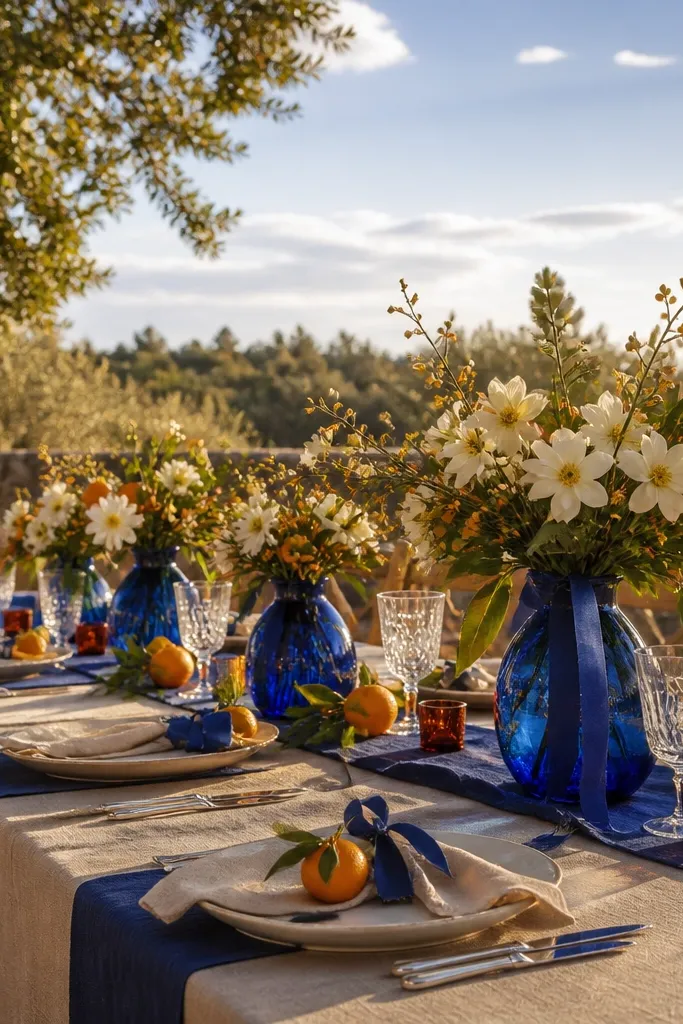
Start by using cobalt as your repeated accent — table runners, chair ribbon, or stationery. Then add orange blossom through your main floral arrangement and smaller details like menu cards. Finally, use warm linen in napkins or tablecloths to keep the color from feeling too graphic. Getting there tip: keep florals in a cool area during travel so the orange blooms stay saturated. Booking tip: reserve cobalt fabric swatches early because deep blues can vary a lot by dye lot.
Cobalt is a strong blue that reads clean in fall photos, especially when you have sky or open outdoor space behind you. Orange blossom gives you that bright, almost sunset-like warmth that works in October without looking like “pumpkin spice.” Warm linen keeps the palette natural and soft, so the contrast doesn’t feel too sharp. This is ideal for modern weddings that still want seasonal warmth. Use cobalt in signage ink or table decor, and let orange blossoms be the floral highlight.
Skip thisSkip teal if you already have lots of green foliage; cobalt gives cleaner contrast.
Quick tipPick cobalt with a slightly warm undertone so it flatters skin in late-day light.
15. Marigold + Deep Chocolate + Ivory
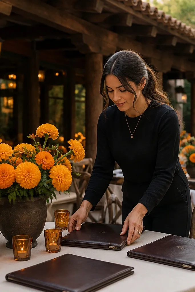
Marigold brings a bright, sunny fall energy that doesn’t look like summer. Deep chocolate adds depth, but you balance it with ivory so the palette stays bright in photos. This works well for rustic venues because chocolate works with wood and leather textures, while marigold keeps it festive. In October, marigold also looks great against dark skies and shaded areas. For bouquets, use marigold tones with chocolate-brown stems or dark leaves so the arrangement feels cohesive.
Start with marigold as the main floral color or bridesmaid accent. Then use deep chocolate for table runners, leather-like accessories, or chocolate-toned stationery. Finally, choose ivory linens so the yellow doesn’t disappear. Logistics tip: if you’re using dried marigold-like elements, store them in a sealed bag — fall humidity can make them brittle. Cost control: you can keep the chocolate base simple and spend on marigold florals where the photos will show.
Use ivory, not off-white-gray, to keep chocolate from looking dull and washed.
Avoid pairing marigold with taupe; it makes the palette look beige and flat.
16. Peach Nectar + Teal Petal + Cream
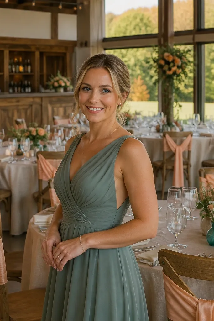
Peach nectar is bright enough for October but softer than orange, so it reads flattering in portraits. Teal petal adds a crisp contrast that keeps the palette from becoming too pastel. Cream ties it all together and makes the colors look clean in both indoor and outdoor light. This palette is a good pick for couples who want fall color without heavy reds or browns. It also looks great in photos where you have warm sunlight — peach glows, while teal keeps the background contrast from swallowing it.
Start with peach nectar in dresses or a large fabric element like table runners. Then add teal petal through florals, ribbon, or small decor accents. Finally, use cream linens and candlelight to keep everything bright and soft. Travel tip: peach fabrics show lint — pack a small lint roller so you can fix it before photos. Booking tip: confirm teal flower availability early because teal-forward florals can be limited late in the season.
Keep teal to smaller areas; too much teal makes the palette feel cool and wintery.
Avoid pairing peach with gray-green; it makes both colors look dusty.
17. Violet Ink + Gold Leaf + Warm Sand
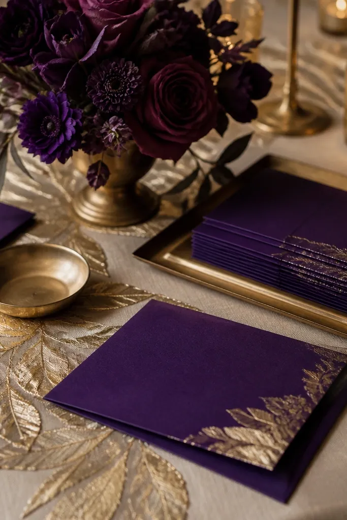
Violet ink is a deep, bright purple that looks dramatic without being dark-brown. Gold leaf adds sparkle in a way that reads festive in October, and warm sand gives the palette a grounded neutral base. This is a great choice if you want the wedding to look stylish even when florals are simple. In photos, violet ink stands out against wood, stone, and fall foliage, and gold catches window light. Use violets and purple-toned blooms sparingly, then let paper and decor do the heavy lifting for the bold look.
Start by choosing violet ink for stationery and signage — it’s the fastest way to lock the palette. Then add gold leaf accents through candleholders, frames, or foil menus. Finally, use warm sand linens so the purple doesn’t overpower skin tones. Logistics tip: if you’re printing foil, order extra samples and check color in the venue’s lighting because violet can shift. Cost control: focus spend on paper and a few gold pieces instead of trying to make every floral match the ink shade.
Use matte gold for candles and glossy gold only for paper highlights; mixed finishes look intentional.
Skip lavender-blue; it turns violet ink into a washed watercolor look.
18. Blackberry + Citrus Lime + Oat Milk
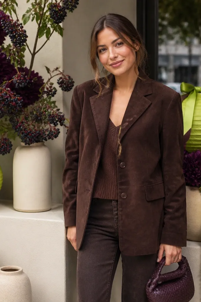
Start by using blackberry as the base floral and main color in bouquets. Then add citrus lime in small repeated accents like napkin ties, escort cards, or a runner edge. Finally, keep linens oat milk and add cream glassware so the lime stays bright but not overpowering. Travel tip: lime fabric stains show; pack a spare linen napkin and a mini stain remover. Budget tip: citrus lime is cheaper in ribbon and paper than in flowers, so build it there.
Blackberry purple is a fall-friendly berry tone, and citrus lime is the bright twist that makes it feel bold instead of moody. Oat milk keeps the palette from looking neon or harsh. This combo works when you want a color story that feels modern and a little playful, even in a formal setting. It photographs especially well when the venue has neutral walls or beige stone because lime pops cleanly. For florals, use blackberry tones with lime accents in ribbon or small citrus-inspired elements.
Skip thisAvoid lime-green that leans too neon; it can make blackberry look dull.
Quick tipKeep lime to 10-20% of the palette; more makes it look like a summer party theme.
19. Red Currant + Warm Rust + Dark Olive
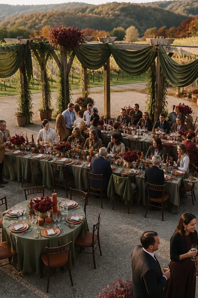
Red currant gives you a brighter berry-red that still reads fall. Warm rust supports the theme, and dark olive keeps everything grounded so the palette looks natural next to leaves. This is a solid choice for outdoor weddings where you want the colors to blend with the environment but still look punchy. It also works for indoor venues with natural wood and earthy textures. The key is using dark olive to deepen shadows and prevent the rust and red from looking flat.
Start with red currant as your main color in florals or bridesmaid dresses. Then use warm rust in table runners, candle labels, or signage accents. Finally, bring in dark olive through greenery, garlands, and smaller decor touches to add depth. Logistics tip: if you’re using dried garlands, store them flat and away from humidity so they don’t shed. Cost control: buy greenery in bulk and use fewer flower types — it still looks full because olive carries volume visually.
Choose rust that leans warm and saturated, not dusty; it reads brighter in photos.
Don’t pair red currant with gray-blue; it makes the palette look cold and less fall-like.
20. Sage Smoke + Tangerine + Creamy White
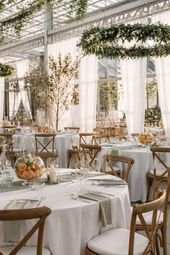
Start with sage smoke as your base — greenery-heavy bouquets and ceremony decor. Then add tangerine in a controlled way: napkins, a small floral focal point, or signage accents. Finally, use creamy white linens and glassware to keep the look bright. Travel tip: if you’re flying, pack greenery decor in a way that prevents crushing; crushed sage looks tired in photos. Booking tip: plan your ceremony time so you’re not stuck in the darkest late shade for the main portraits.
Sage smoke is a muted green that still feels fresh, especially for October when the world turns dusty. Tangerine brings the brightness you need for a bold look, and creamy white keeps the palette from getting too earthy. This palette is perfect for couples who want a soft, modern fall vibe without going beige-only. In photos, sage smoke frames the tangerine and makes it look intentional instead of random. Use sage-forward greenery in bouquets and let tangerine show up in a ribbon or a few standout blooms.
Skip thisAvoid pairing tangerine with olive-drab; it makes everything look like camouflage.
Quick tipUse creamy white instead of pure white for a warmer, more flattering contrast.
21. Bright Lilac + Cinnamon + Black Tie Navy
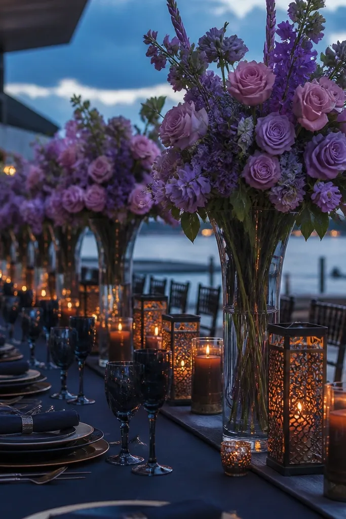
Bright lilac is a standout fall color because it reads playful but still stylish under cloudy October skies. Cinnamon gives you warmth that feels seasonal, and black tie navy adds crisp structure. This palette is great if you want to look bold in photos without using red. It also works well for weddings with modern lines — think clean table settings and minimal decor. Keep lilac in visible areas like chair ties, bridesmaid dresses, or a bold floral wall section, then ground it with cinnamon and navy.
Start with bright lilac as a main visible element — dresses or a large fabric backdrop. Then add cinnamon through candles, paper textures, or a warm-toned runner. Finally, bring in black tie navy in suits or tableware details so the palette has contrast. Getting there and around tip: bring extra chair tie material; if it gets tangled in transit, it can ruin your photo plan. Cost control: cinnamon accents can be done with paper and candle labels, saving money versus matching every floral stem.
Choose navy that reads blue, not black; it keeps the lilac from looking flat.
Skip dusty lavender; it looks gray in October light.
22. Orange Soda + Emerald + Espresso Brown
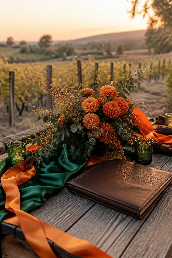
Orange soda is louder than classic orange, but October makes it feel like a party color instead of a summer one. Emerald keeps it jewel-bright, while espresso brown gives you depth and helps the oranges look rich, not washed. This is a high-impact palette for couples who want photos that look like a fashion editorial. It’s also great for venues with darker interiors because orange pops immediately against espresso tones. For florals, use emerald leaves and orange blooms, then keep the rest minimal so the colors stay clean.
Start with orange soda for a statement — table linens or a ceremony backdrop panel. Then add emerald through greenery and small repeated details like napkins. Finally, use espresso brown in place cards, candle holders, or suit details to anchor the look. Logistics tip: orange fabrics can stain easily; pack them separately and keep a small stain remover on hand. Booking tip: if you’re using orange blooms, confirm availability in early October; late-season supply can vary.
Keep the espresso brown consistent — mix-and-match brown tones makes orange look muddy.
Avoid pairing orange soda with taupe; it kills the bold contrast.
23. Teak Brown + Bright Coral + Soft White
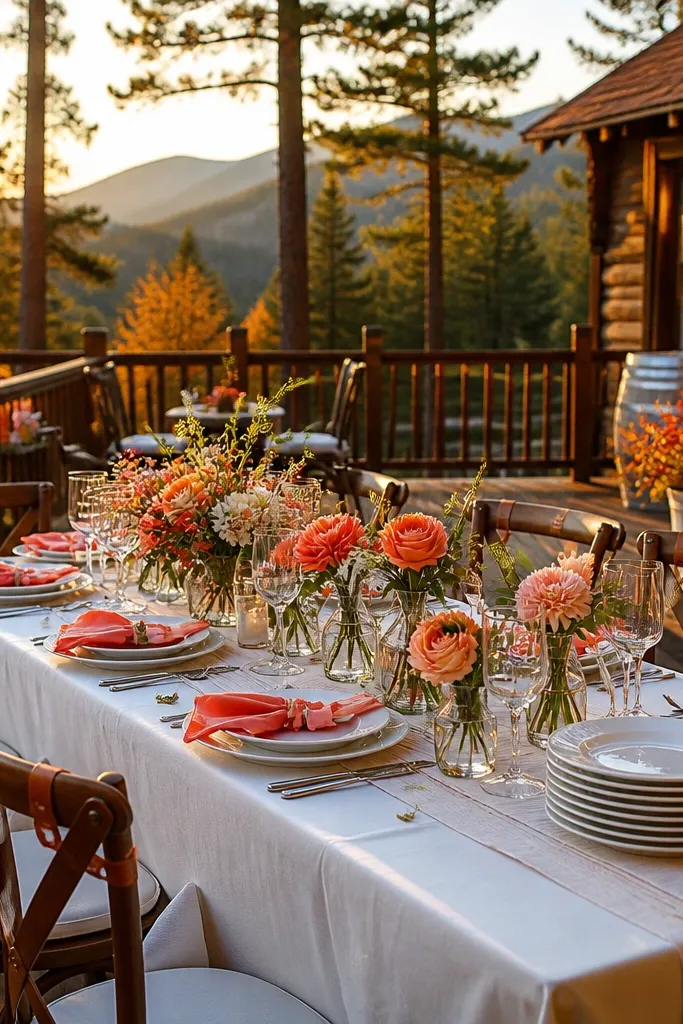
Teak brown is warmer than standard chocolate and plays nicely with fall wood tones. Bright coral brings the “bold celebration” brightness, and soft white keeps everything from feeling heavy. This palette is perfect for outdoor weddings with lots of wood — decks, barns, and cabins — because it matches the environment instead of fighting it. In photos, coral looks lively in both sun and shade, while teak provides a cohesive backdrop. Use coral-forward florals and keep white linens clean so the scene reads crisp.
Start with bright coral in bouquets, bridesmaid dresses, or a ceremony floral section. Then use teak brown for tableware, sign frames, or chair backs so the palette ties into the venue. Finally, choose soft white linens and candlelight for a bright base. Travel tip: protect coral fabrics from direct sun in transit — they can fade faster than you’d think. Cost control: teak is easy to match with wood elements you already have; spend on coral where it’s most visible.
Use soft white tablecloths with bright coral to avoid that dull orange-brown look.
Skip rust-orange with teak; it blends too much and loses the pop.
24. Sea Glass Blue + Persimmon + Warm Gray
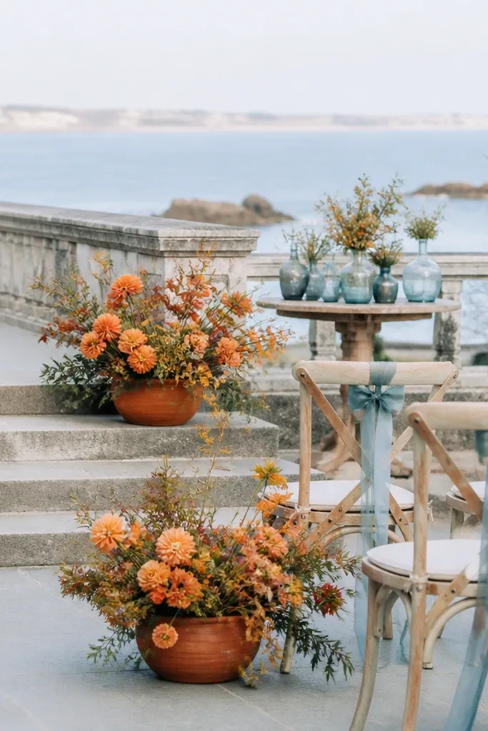
Sea glass blue is lighter than teal but still saturated enough to read in October light. Persimmon gives you that bold warmth, and warm gray adds structure without going muddy. This palette is great for ceremonies where you want something bright but not neon. It also photographs well in venues with stone steps or neutral walls because sea glass stays clean and persimmon adds warmth. Keep warm gray in smaller areas like napkins or signage so the bright colors remain the focus.
Start with persimmon as your highlight in florals or napkins. Then add sea glass blue through chair ties, stationery ink, or a small ceremony accent fabric. Finally, use warm gray as a secondary neutral for table runners and signage boards. Logistics tip: warm gray can show scuffs, so pack table decor in padded sleeves. Budget tip: sea glass blue can be done with ribbon and paper; you don’t need a full set of matching florals to make it look cohesive.
Warm gray should be matte — shiny gray reflects light and can look streaky in photos.
Avoid icy blue; it makes persimmon look too orange and harsh.
25. Dusty Rose Red + Bright Gold + Olive Leaf
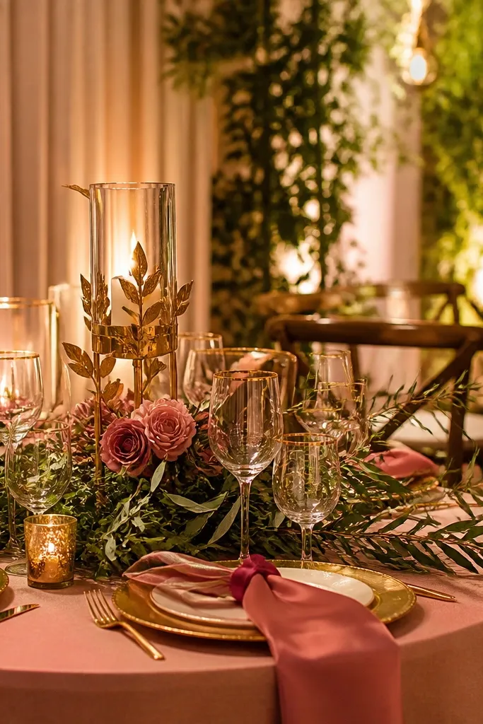
Dusty rose red is a tricky color, but when it’s paired with bright gold and olive leaf, it reads fall and still looks bold. The gold gives the palette that celebratory sparkle, and the olive adds depth so the rose doesn’t look washed. This palette is best for couples who want something romantic and slightly vintage but still camera-ready. In photos, rose-red gives flattering tones for skin, while gold catches light in a way that makes the whole scene feel festive. Use olive leaf greenery to create volume and keep the arrangement from looking sparse.
Start with dusty rose red as your main floral tone or bridesmaid fabric color. Then add bright gold through candleholders, frames, or foil details on menus and place cards. Finally, use olive leaf as the greenery base and table decor accent. Travel tip: gold accents scratch easily — wrap frames and candleholders in tissue and keep them in separate compartments. Cost control: focus gold on paper and small decor; full gold table settings get expensive fast.
Keep olive leaf dark — light sage makes dusty rose red look pink and flat.
Avoid pairing dusty rose red with silver; it makes the palette look wintery and off.