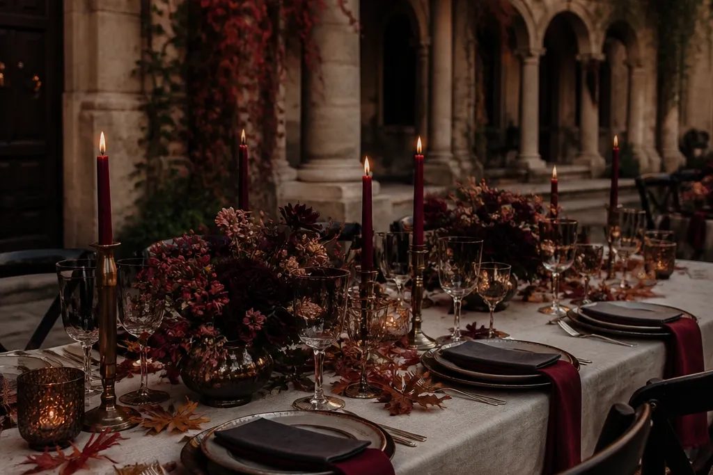
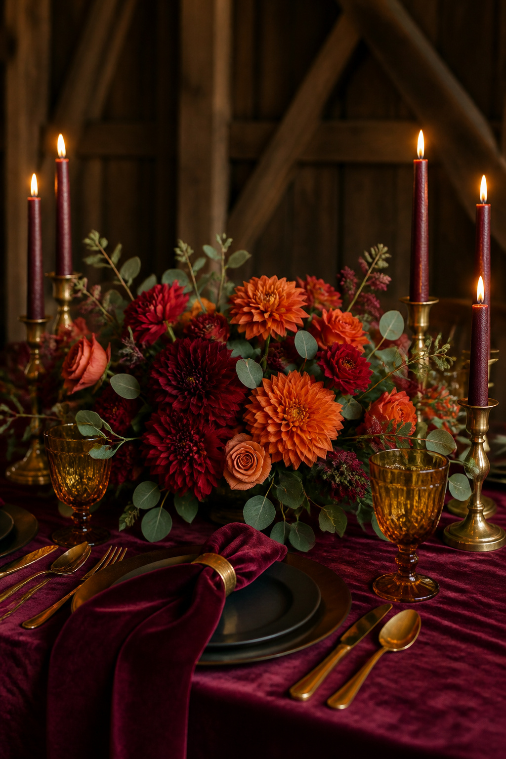
1. Oxblood + Warm Ivory + Antique Brass
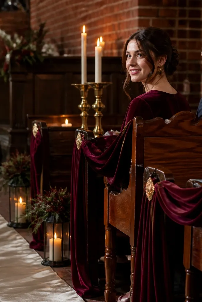
This palette looks expensive in November because oxblood has that wine depth that doesn’t turn pink in cooler light. Warm ivory keeps it soft, especially against dark wood venues and brick walls. Antique brass adds a gentle glow without looking shiny or modern. It’s a great fit for fall gardens, historic buildings, and any venue with lots of texture because the colors cling to surfaces and show up clearly in photos.
Start by picking oxblood for the biggest visual area — bridesmaid dresses or a statement table runner. Then use warm ivory for napkins, flower petals, and signage paper so everything stays readable. Finally, add antique brass in candle holders, frames, or cutlery accents; keep metals consistent across the room.
If your venue has cool floors or gray walls, choose a warmer ivory with a faint cream tone, not bright white.
Skip true burgundy that leans blue — it can look muddy next to brick and dark wood.
2. Forest Green + Cognac + Cream
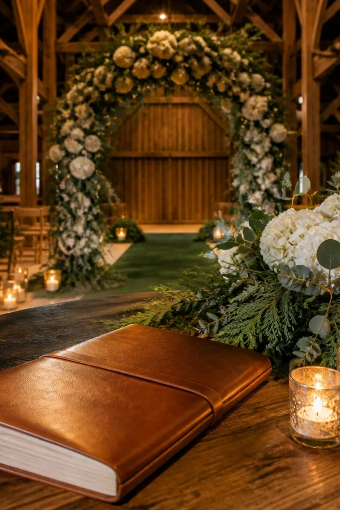
Forest green feels cozy without turning into “rust-and-leaves” overload. Cognac brings warmth and a slightly rugged vibe that photographs beautifully with candlelight. Cream ties it together so the palette doesn’t look heavy. This combo suits woodland ceremonies, rustic barns, and venues with evergreen landscaping because the green echoes the outdoors while cognac keeps it human and warm.
Start with forest green in linens or ceremony draping, then anchor centerpieces with cream flowers like garden roses or dahlias. Add cognac as the texture layer — leather menu covers, wooden trays with a cognac stain, or warm-toned ceramic vases. Keep the cream limited to the brightest items so the green stays the lead.
Use cream napkins with a matte finish; satin catches flash and can look too glossy.
Don’t pair forest green with icy silver — it makes the whole palette feel colder than it should.
3. Rust + Charcoal + Caramel Leather
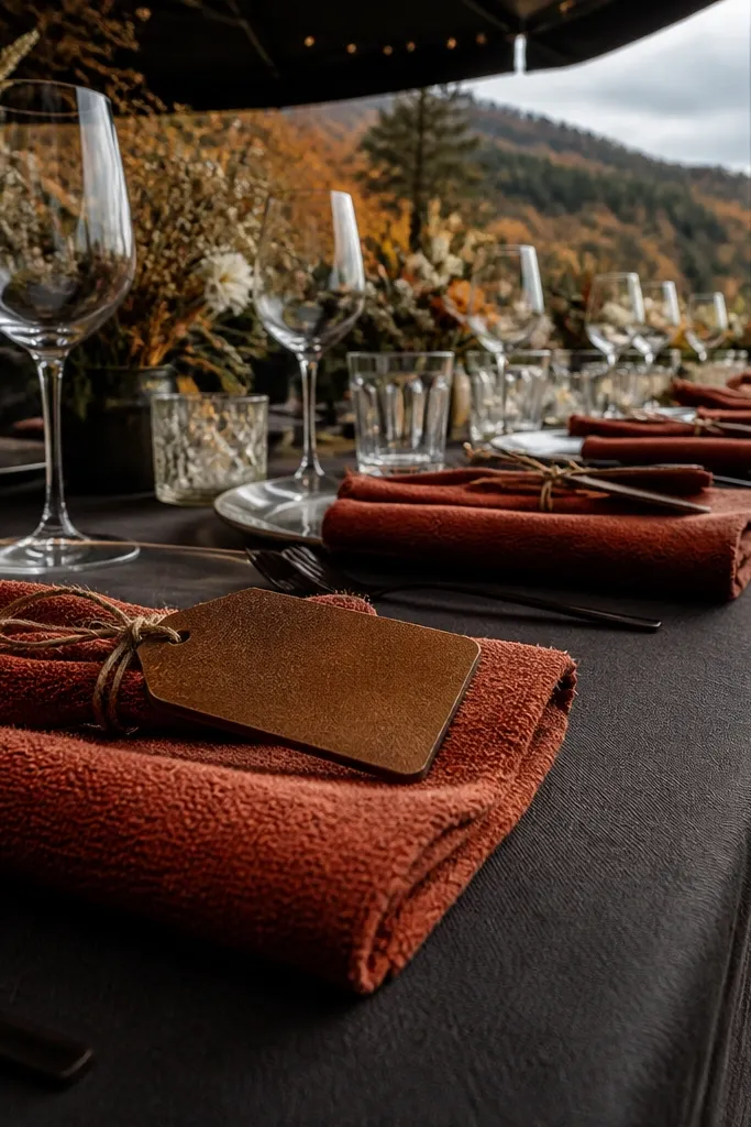
Start by choosing rust for bouquets and at least one large textile element like a runner or drape. Then bring in charcoal through place settings, chair covers, or a darker floral base. Add caramel leather in place cards, book covers, or small accessories; keep it to details so it doesn’t overpower the flowers.
Rust gives you that October-to-November warmth, but charcoal stops it from looking like a pumpkin patch. Caramel leather adds a grounded, tactile look that reads well in close-up photos. This palette is perfect when you want bold color but not loud brightness. It works especially well for outdoor ceremonies that may start sunny and end in darker evening light.
Skip thisAvoid bright tangerine — it turns neon under stadium-style lighting and looks off in skin tones.
Quick tipPick rust tones that are slightly muted (more terracotta than bright orange).
4. Deep Navy + Terracotta + Warm Sand
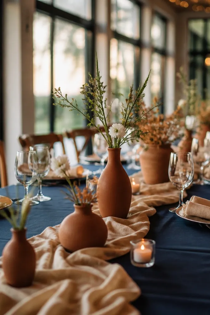
Start with deep navy in suits, bridesmaid dresses, or a ceremony backdrop panel. Then use terracotta in florals, pumpkin-shaped candle holders, or patterned napkins with a muted print. Finish with warm sand in table linens and stationery; aim for an oatmeal or beige tone, not gray-beige.
Deep navy is a clean, modern anchor that still feels fall because terracotta warms it up. Warm sand keeps everything soft and prevents the palette from feeling too dark. This combo photographs well because navy holds contrast, while terracotta adds the cozy warmth people expect in November. It suits venues with lots of natural stone, outdoor terraces, and even city locations where you want the look to feel intentional.
Skip thisSkip cool gray sand — it makes navy look heavier and the palette loses its cozy warmth.
Quick tipIf terracotta looks too orange in photos, swap to a more clay-brown version.
5. Smoked Plum + Oatmeal + Bronze
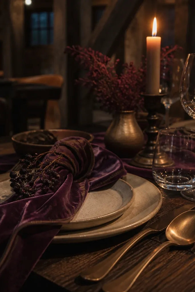
Smoked plum is the “cozy moody” color that doesn’t scream Halloween. It flatters skin tones and looks dramatic against dark venues, plus it holds up under low indoor lighting. Oatmeal keeps it soft and slightly vintage-looking. Bronze adds warmth and a gentle antique feel, which makes the whole palette look styled instead of random.
Start with smoked plum as the main color in velvet bridesmaid dresses or a plum table runner. Then use oatmeal for napkins, menus, and any large paper elements. Add bronze through candle sticks, frame trims, or flatware so the palette stays cohesive across details.
Choose oatmeal that’s slightly creamy so it doesn’t read gray on camera.
Don’t add bright magenta — it makes plum look harsher and less moody.
6. Chocolate Espresso + Blush Rosewood + Cream
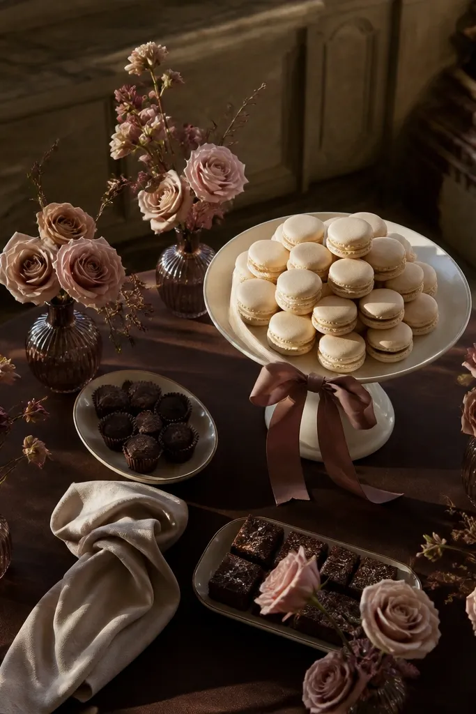
Start by using chocolate espresso in table linens or chair ties, then build centerpieces with rosewood flowers like dusty pink dahlias or smoky roses. Add cream in candles and napkins so the scene stays light at the top. Keep the flower palette limited to rosewood and cream so you don’t end up with a confused mix.
Chocolate espresso gives you depth and a clean backdrop for florals, and it’s one of the easiest ways to look cohesive without many colors. Blush rosewood adds a romantic fall tone that still reads “November” because it’s muted and dusty. Cream keeps everything bright enough for photos so the palette doesn’t become gloomy. This works great for indoor receptions with warm lighting, especially when you want a classy, not-candy, fall look.
Skip thisAvoid mixing chocolate with pure white — it looks stark and breaks the warmth.
Quick tipUse matte cream candles or candle covers; shiny wax can create glare in flash photos.
7. Sage Smoke + Mushroom Beige + Antique Gold
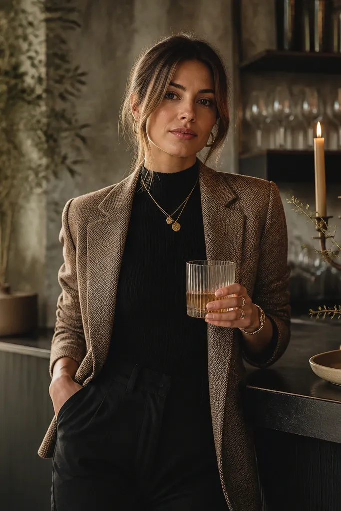
Sage smoke is muted enough for November but still feels fresh, not heavy. Mushroom beige adds an earthy softness, and antique gold gives a gentle, warm sheen that doesn’t look flashy. This palette is a smart choice if you want cozy moody style without going dark-dark. It’s especially good for modern venues, minimal barns, and ceremonies with lots of greenery.
Start with sage smoke linens or bridesmaid dresses, then choose mushroom beige in florals and table accents. Add antique gold through signage frames, place card holders, and candle trays. Keep the contrast moderate: the goal is creamy softness, not high-contrast drama.
If your sage reads too gray, pick a slightly greener sage with a warmer undertone.
Skip bright white linens — they fight the beige and make the palette look unfinished.
8. Terracotta Clay + Black Tea + Warm Linen
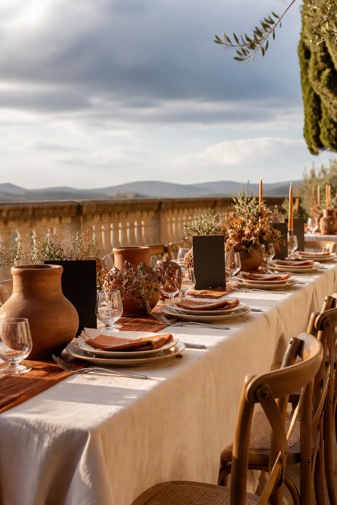
Start with terracotta in a large textile — runner, ceremony arch accents, or bridesmaid dresses. Then use black tea in candle holders, tableware, and sign lettering. Finish with warm linen napkins and menus so the palette stays readable in both shade and sun.
Terracotta clay is the cozy hero, but black tea tones keep it from going orange. Warm linen makes the palette look lived-in and photo-friendly, especially in outdoor settings where the light changes fast. This is a strong choice for November because it reads autumn without leaning into Halloween vibes. Use it when you want warm earth tones that still feel modern and styled.
Skip thisDon’t add bright copper — it can clash with black tea and make the palette look messy.
Quick tipChoose terracotta that’s more clay than brick; brick can look too saturated in photos.
9. Charcoal + Dusty Rose + Soft Gold
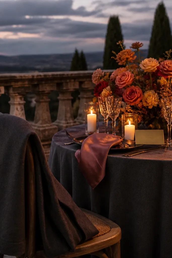
Charcoal gives you instant moody drama, and dusty rose keeps it romantic instead of goth. Soft gold adds warmth without the high shine of bright yellow gold. This combo is a reliable pick for November because it works in both indoor receptions and outdoor dinners where the evening light gets dim. It also looks great in photos because charcoal and rose create clear contrast without being loud.
Start by choosing charcoal for tablecloths, chair ties, or a big backdrop element. Then use dusty rose florals as your hero color — bouquet petals and centerpiece blooms should match. Add soft gold in candle holders, small frames, or cutlery details; keep gold limited to accents to keep it classy.
Use dusty rose with a muted, grayish undertone — it photographs better than hot pink rose.
Avoid pairing charcoal with neon pink — it looks like a party palette under warm candlelight.
10. Oat Cream + Cocoa Brown + Burnt Orange Bitters
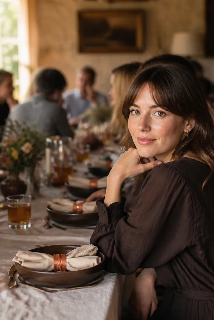
This palette is for people who want cozy fall warmth but hate the look of bright orange. Oat cream keeps the color story airy and elegant, cocoa brown adds depth, and burnt orange accents give you just enough fall energy. It’s photogenic because the contrast is controlled — light base, dark anchor, warm pop. It’s a great choice for November weddings where you want a gentle look rather than heavy darkness.
Start with oat cream for linens and stationery. Then use cocoa brown in florals and table styling, like dark stems, textured runners, or cocoa-toned vases. Add burnt orange in small doses — ribbon on napkins, a few flowers, or a limited number of candle sleeves.
If you’re renting decor, prioritize oat cream napkins and cocoa-toned candles; they do the most visual work.
Skip full-room burnt orange — it overwhelms and makes the palette look unbalanced.
11. Deep Teal + Amber + Warm Ivory
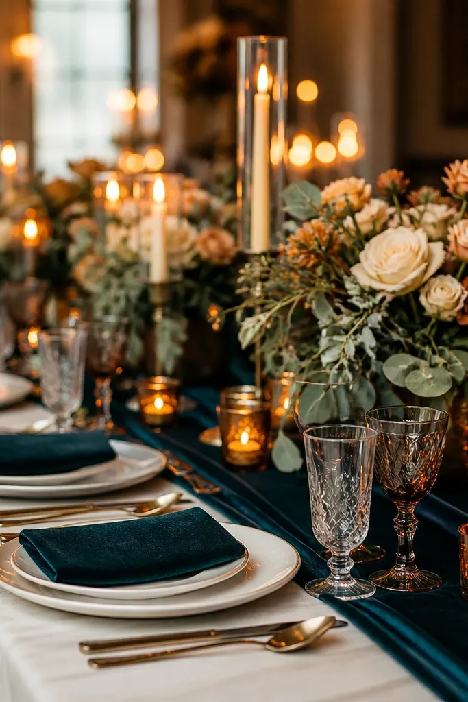
Deep teal is underrated for fall because it reads rich, not summery, and it pairs beautifully with amber light. Amber adds that candlelit glow people associate with cozy November nights. Warm ivory keeps it bright enough for photos so teal doesn’t swallow the scene. This palette is best for indoor receptions, especially where you have string lights, chandeliers, or a fireplace — the amber will bounce nicely.
Start with deep teal in the biggest elements — bridesmaid dresses, table runners, or a ceremony backdrop. Then add amber through candle glass, warm-toned chargers, or small glassware. Use warm ivory for napkins, florals, and signage so it stays cohesive and not too dark.
Choose amber glassware with a slightly smoky tone, not bright yellow.
Don’t add icy teal or silver accents; it shifts the palette from cozy to cold.
12. Pine Green + Copper + Creamy Butter
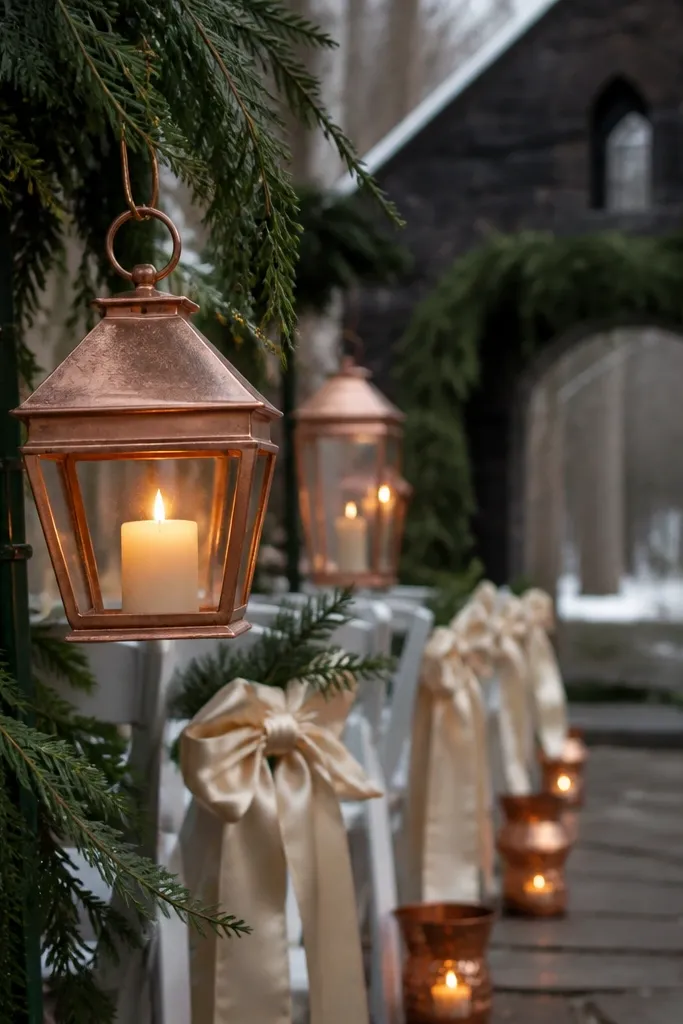
Pine green plus copper gives you that “winter woods” feel without going gray. Creamy butter is warmer than beige and keeps the look soft on camera. Copper adds a romantic glow and makes greenery feel intentional. This palette works well for November because pine reads seasonal and copper looks great in low light. It’s perfect for ceremonies with lots of greenery, hanging arrangements, or evergreen centerpieces.
Start with pine green as your base — greenery-heavy bouquets or table garlands. Then use creamy butter linens and paper goods to keep it warm. Add copper through candle holders, bud vases, or small decorative trays; keep copper consistent across all accents.
If copper looks too orange in photos, swap to antique copper with darker patina.
Avoid pairing pine green with bright white — it makes the setup look sterile.
13. Muted Coral + Charcoal + Warm Taupe
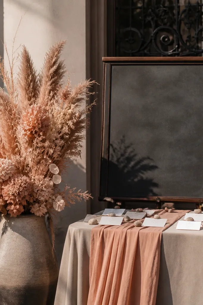
Start with charcoal for table runners or chair ties. Then use muted coral flowers as your hero — keep the coral toned down and dusty, not neon. Add warm taupe for napkins and table signs so the palette stays balanced and not too contrasty.
Muted coral is a softer alternative to rust, and it still brings that fall warmth without screaming orange. Charcoal keeps everything grounded, and warm taupe adds a calm middle so the palette feels cohesive. This combination is great if you want color but don’t want to go too dark. It photographs beautifully with candlelight because taupe and charcoal create a stable backdrop for coral petals.
Skip thisSkip bright orange-coral — it can look too beachy next to charcoal.
Quick tipUse coral with a touch of beige undertone; it looks more November than summer coral.
14. Berry Plum + Espresso + Champagne Cream
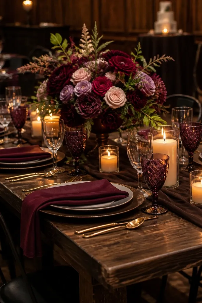
Berry plum is punchy but still moody, especially paired with espresso brown. Champagne cream makes the berry color look richer instead of flat. This palette is excellent for November because it reads like late fall berries and evening warmth. It’s a strong choice for receptions with dark wood tables, black metal chairs, or venues that already have a moody feel.
Start with espresso brown as your anchor — tablecloths, signage backing, or chair accents. Then add berry plum in florals, napkin overlays, or bridesmaid dresses. Finish with champagne cream for candle sleeves and linens so the palette has a bright center that shows up in photos.
Use champagne cream glassware or candle holders; it adds glow without adding another color.
Don’t add bright red — it fights berry plum and makes the palette look inconsistent.
15. Smoky Teal + Mocha + Oat Milk
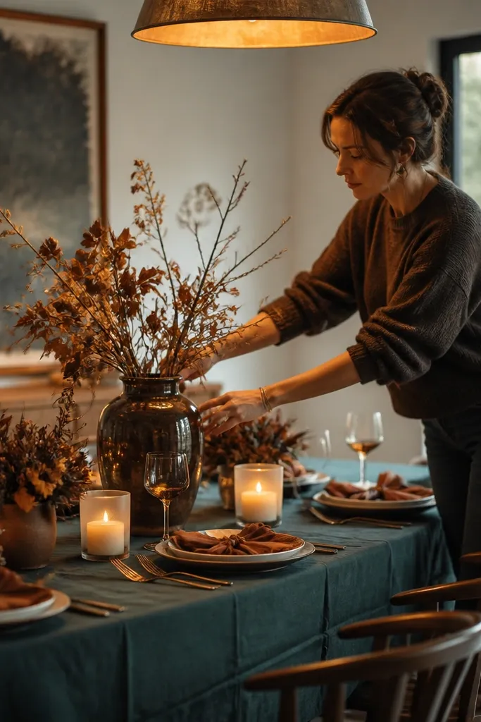
Start by choosing smoky teal for centerpieces or a ceremony drape. Then use mocha tones in candle holders, menus, and any wood accents. Finish with oat milk linens and stationery so the palette stays bright at the edges of photos.
Smoky teal is fall-friendly because it’s darker and more muted than classic teal. Mocha gives you a warm brown anchor, and oat milk keeps the palette creamy and photo-ready. Together, they create a soft moody look that still feels modern. This option is great for couples who want a calm, cozy palette without going fully dark.
Skip thisAvoid white napkins — oat milk is the difference between cozy and stark.
Quick tipIf your teal looks too blue on camera, swap to a deeper green-teal rather than a pure teal.
16. Burgundy Rose + Espresso + Antique Silver
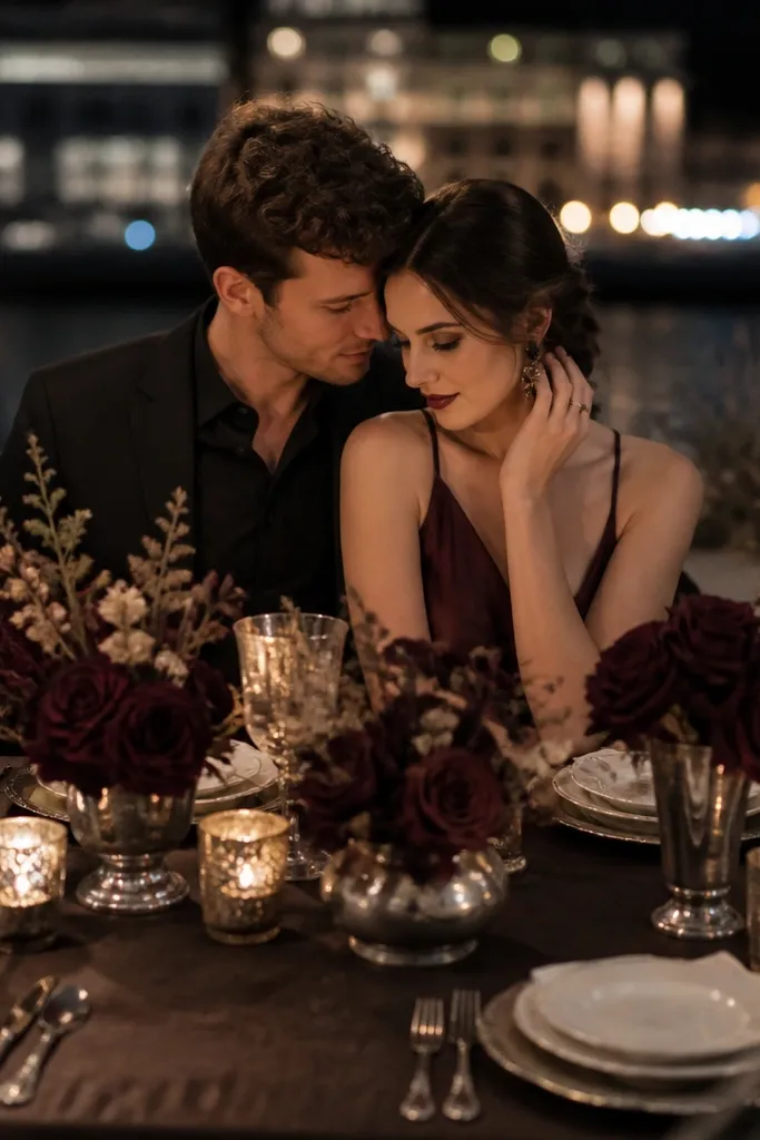
Burgundy rose gives you a romantic fall color that reads like dried flowers, not a holiday gimmick. Espresso makes it grounded and keeps the mood. Antique silver adds a cool contrast that can work beautifully in November if your venue has cool stone or lots of metal. This palette fits best when you want moody romance with a slightly modern edge.
Start with burgundy rose florals as the hero — use dried-looking petals and deep-toned blooms. Then anchor tables with espresso linens or runners. Add antique silver in cutlery, candle trays, or frame trims; keep the silver toned so it doesn’t look shiny and out of place.
Let burgundy be the only saturated color; keep everything else neutral to avoid visual noise.
Skip bright metallic chrome — it can look harsh next to burgundy.
17. Camel + Olive + Dark Walnut
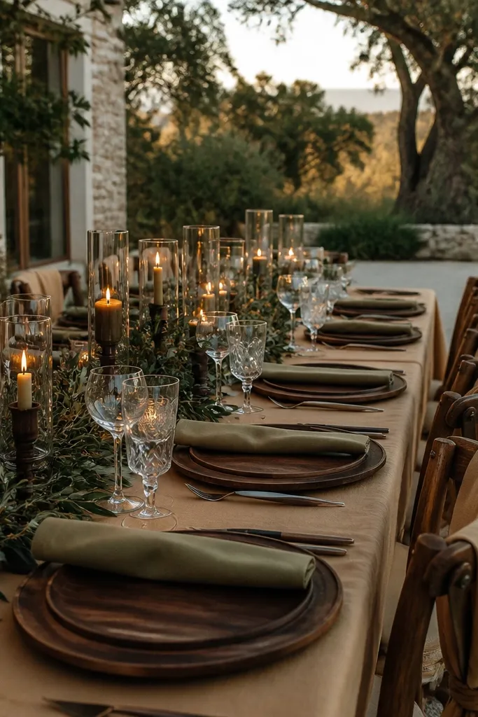
Start with camel linens or table runners as your light base. Then build greenery and florals with olive tones, and add dark walnut through vases, trays, and signage frames. Keep other accents minimal — one warm metal finish or none at all — so the wood tones lead.
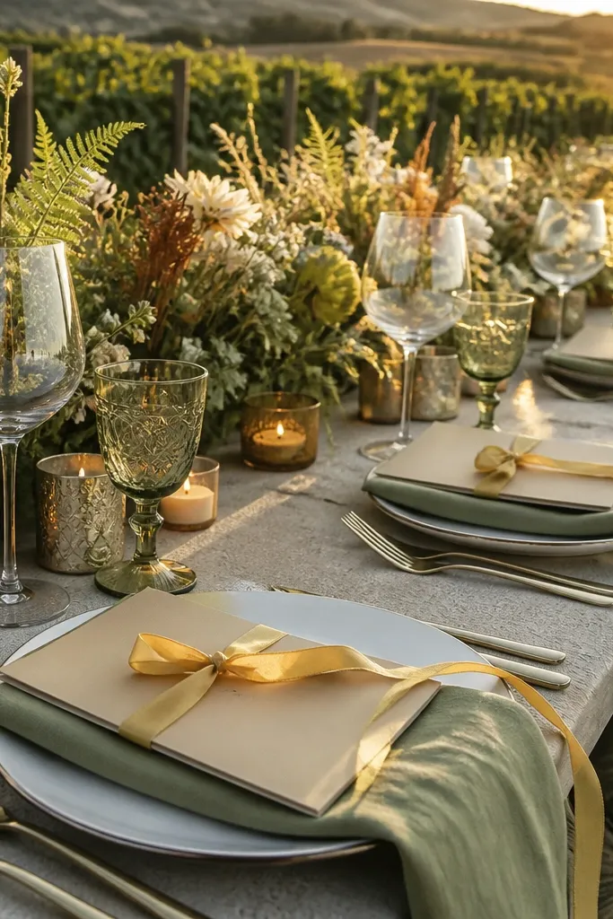
Camel and olive make a fall palette that feels natural and outdoorsy, and dark walnut ties it to the moody side of November. This is a great choice if you want neutral colors that still look styled. It also photographs beautifully because the warm camel and green create depth without needing bright accents. Use this for vineyard weddings, garden venues, and rustic indoor receptions with wood beams.
Skip thisAvoid pairing camel with cool gray — it makes the whole palette feel unfinished.
Quick tipChoose olive with a muted, dusty look; neon olive reads weird in November photos.
18. Black Cherry + Oatmeal + Warm Copper
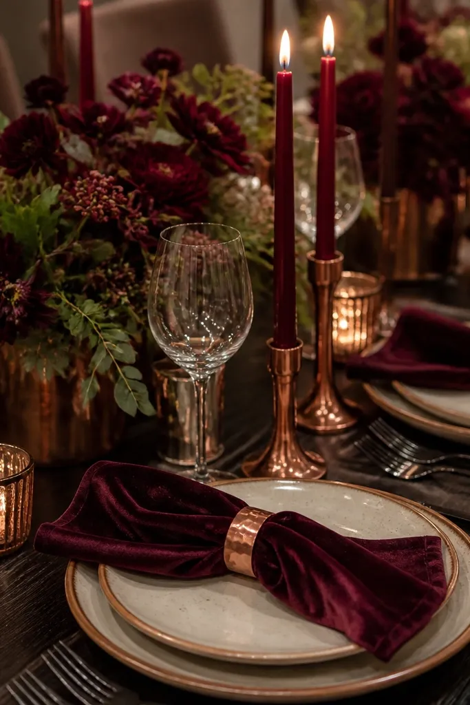
Start with black cherry in velvet or satin textiles — table overlays or napkin ties. Then use oatmeal for napkins and stationery so the deep color doesn’t swallow the scene. Add warm copper through candle holders, small trays, and any metal signage accents.
Black cherry is one of the most photogenic moody colors for November because it reads deep and glossy without being pure black. Oatmeal keeps it soft and gives the palette a cozy, vintage feel. Warm copper adds that late-evening glow that makes candles look richer. This palette is perfect for indoor receptions, especially if you have low lighting or warm bulbs.
Skip thisSkip deep maroon reds that look flat and chalky — black cherry should look like it has depth.
Quick tipUse oatmeal with a slightly warm undertone so it doesn’t look gray beside black cherry.
19. Moody Lavender + Charcoal + Creamy Vanilla
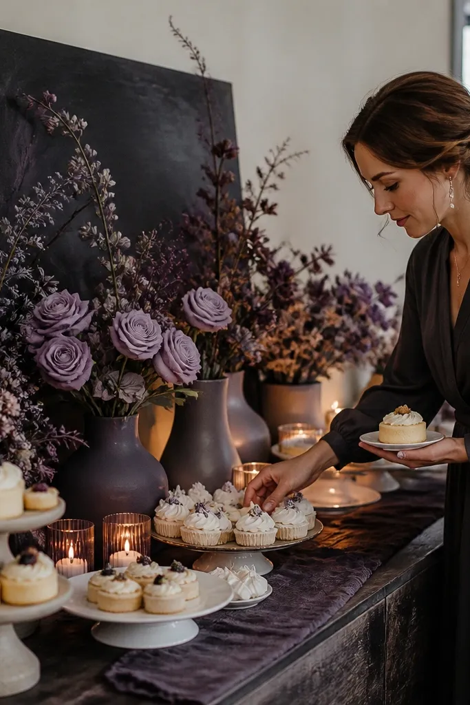
Start with charcoal as your anchor — linens, chair ties, or a dark backdrop panel. Then choose moody lavender for bouquets and small decor accents like ribbon or napkin overlays. Add creamy vanilla for candles and paper goods; keep vanilla matte rather than glossy to reduce glare.
Moody lavender is a fall color when it’s muted and smoky, not lilac-bright. Charcoal grounds it so it reads cozy and not springy. Creamy vanilla makes the palette feel warm and keeps skin tones flattering in photos. This is a smart option for winter-leaning November dates when you want something romantic but different from the usual rust and green.
Skip thisDon’t add bright white to “lighten” the palette — it kills the cozy mood.
Quick tipIf lavender looks too purple in daylight, choose a more gray-lavender shade rather than a pink-lavender.
20. Smoke Grey + Oat Gold + Cranberry Velvet
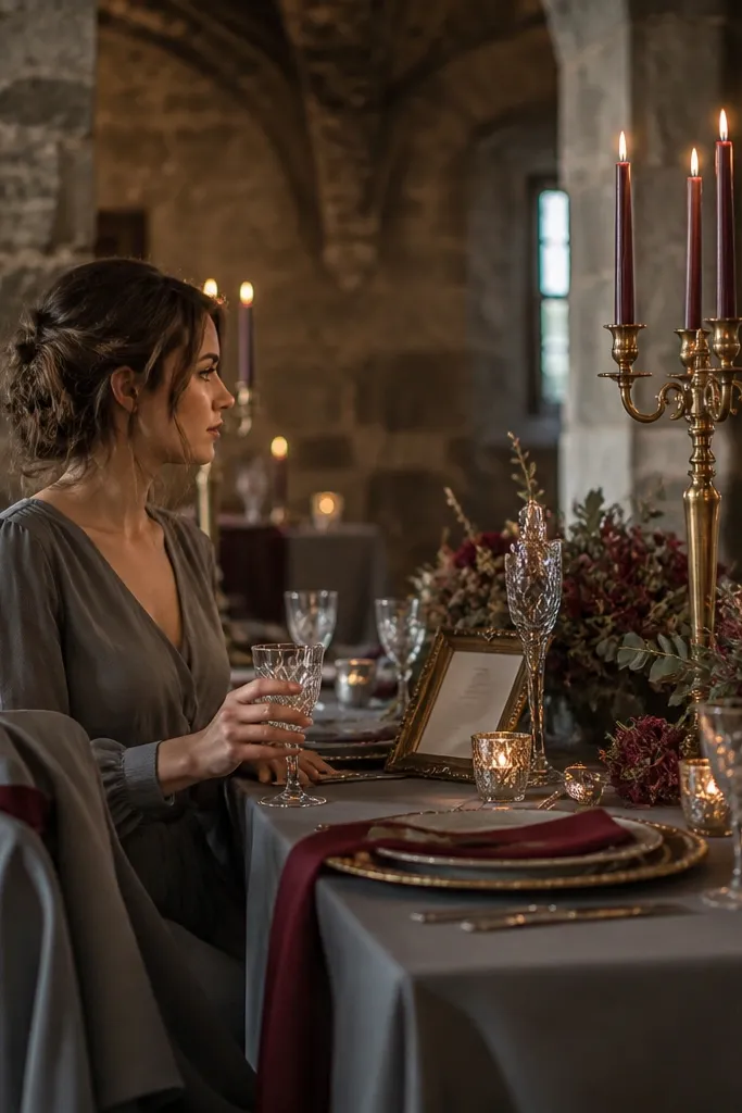
This palette reads like late-autumn light hitting old stone — cool smoke grey, warm oat gold, and cranberry velvet for that wedding “wow” without going bright. The grey keeps everything calm in November photos, the oat gold warms skin tones, and the cranberry gives you that cozy, romantic punch you want for fall wedding ideas colors. It’s especially flattering for couples who want moody photos but still want a warm, inviting room. If you’re planning for a November wedding, this combo looks best in venues with dark wood, stone fireplaces, or heavy drapes — the colors cling to the textures in a way bright palettes don’t. It’s also a strong choice for portraits because grey backgrounds make cranberry flowers and gold candles pop hard.
Step 1 — pick your base tones and materials. Use smoke grey linens or a slate-toned table runner, then add oat gold through taper candles, flatware, or matte gold frames around menus and signs. Cranberry should show up as velvet accents and statement florals, like ranunculus or dahlias in a deep wine-leaning red. Step 2 — plan the venue lighting so the gold looks warm, not yellow-green. Choose warm bulbs around 2700K for indoor spaces, and place candles at different heights so the cranberry looks dimensional in photos. Step 3 — travel timing and spend. For a November wedding, book lodging and your venue-related travel 8-10 weeks ahead when weather is shifting and hotel rates tighten, especially for cold-weather destinations with limited inventory. Spend 3 nights if you’re doing a small ceremony weekend with photos the day before, and 2 nights if you’re keeping it tight with only ceremony-day portraits.
Bring one “crash-proof” visual element — cranberry velvet ribbons or a small runner — so even if the flowers don’t arrive perfectly, the color story still looks intentional.
Skip bright red with this palette. It clashes with smoke grey and makes the whole room feel harsher than cozy.