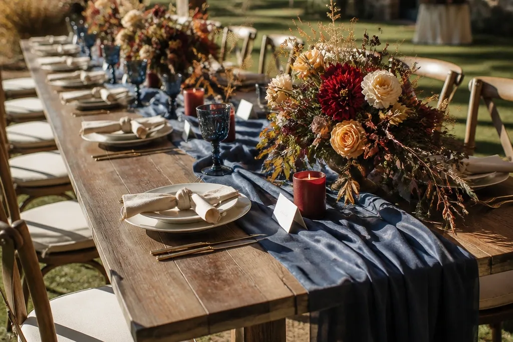
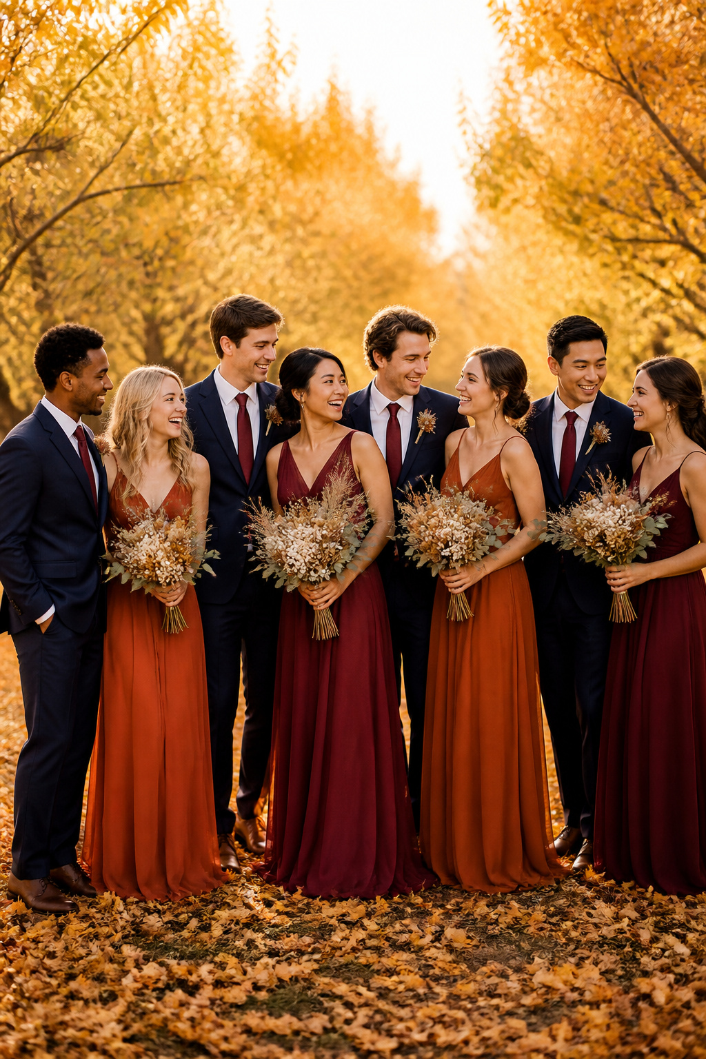
1. Deep Navy + Cream (Classic September Cool)
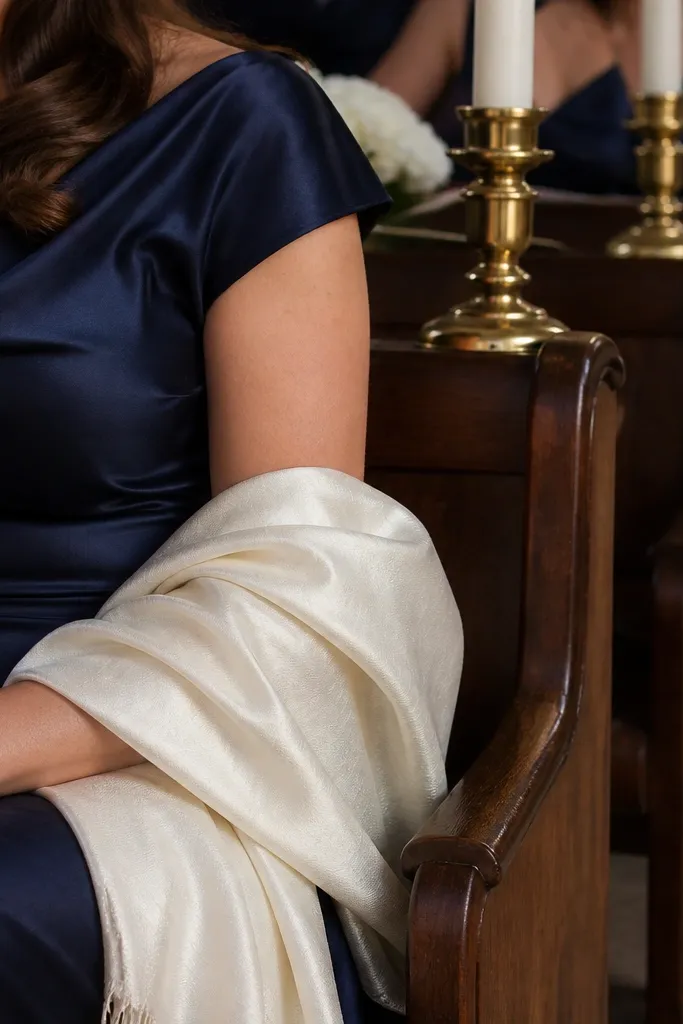
This combo stays crisp in September because deep navy holds its color under daylight while cream keeps everything bright without turning orange. It looks clean on skin tones that run warm or neutral, and it photographs well in both shaded ceremony spots and sunny receptions. For party styling, navy works for long satin or matte chiffon, and cream looks expensive in silk ribbon and garden roses. If you want a fall wedding that still feels polished instead of rustic, this is the lane.
Start by picking navy as the bigger surface color for bridesmaids or the main suit/tux option for groomsmen. Then choose cream for bouquets and table accents like votive labels, napkins, or cake florals. Book your dresses and ties early because navy shades sell out fast once people start planning for September. For travel logistics, pack a steamer and hang garments away from each other to prevent color transfer from darker fabric.
Use off-white bouquets with a mix of cream roses and seeded eucalyptus so the cream reads warm, not gray.
Avoid pairing navy with icy silver-gray — it makes skin look washed out in September light.
2. Burgundy + Espresso (Velvet Wedding Mood)
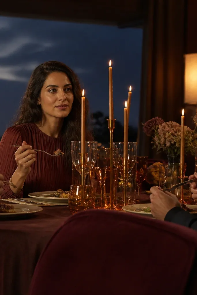
Burgundy gives you that fall depth without going orange-brown, and espresso anchors the palette so the whole look feels grounded. This pairing is especially flattering for people with olive or deeper skin tones because burgundy adds warmth without turning orange. It also looks incredible with candlelit tables and evening receptions — the colors deepen instead of dulling. If your venue has wood beams, stone, or outdoor patios, this palette will blend into the setting instead of fighting it.
Choose burgundy for dresses and for the main floral mass (like burgundy dahlias or roses). Then add espresso in accessories and menswear — ties, belts, shoes, and stationery accents. Plan hair and makeup with warm tones since burgundy and espresso pull better with gold or bronze highlights than cool pinks. For travel, bring shoe covers or foldable garment bags because espresso leather scuffs easily in transit.
Quick tipMatch metal tones: go bronze or antique gold, not bright chrome, to keep the palette cohesive.
Skip thisSkip pairing burgundy with bright tomato red — it turns the palette into two competing reds.
3. Forest Green + Warm Ivory (Garden-Ready September)
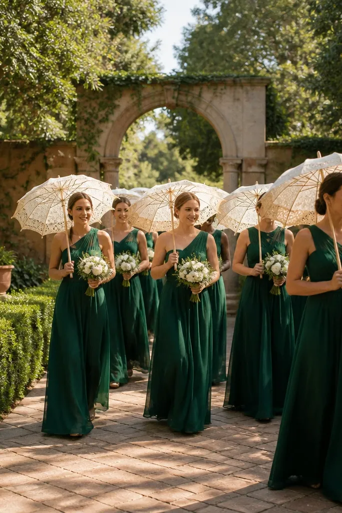
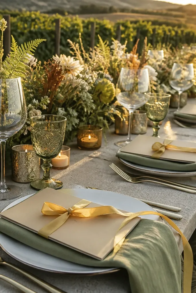
Forest green looks rich in September because it behaves like a “neutral” in photos — it reads deep, stable, and calm. Warm ivory keeps the palette bright and soft, so you don’t end up with a heavy, dark-only look. This combination is perfect for outdoor ceremonies, especially with trees, hedges, or courtyard gardens. It also pairs beautifully with greenery-heavy florals, giving you that full, lush look without needing loud colors.
Use forest green as the dominant color for dresses or suits, then add warm ivory through bouquets, tablecloths, and chair ribbons. Keep greenery consistent — eucalyptus and seeded greens help the palette look intentional instead of random. If you’re traveling, plan to pick up florals locally within 24 hours of the event so the greens stay crisp. For timing, schedule the bridal party photo block right after the ceremony when light is still flattering.
Pick ivory with a beige undertone, not pure white, so it doesn’t clash with green’s yellow base.
Avoid pairing forest green with bright cobalt blue — it makes the palette feel summer, not fall.
4. Terracotta + Sage (Soft Earth, Photogenic Calm)
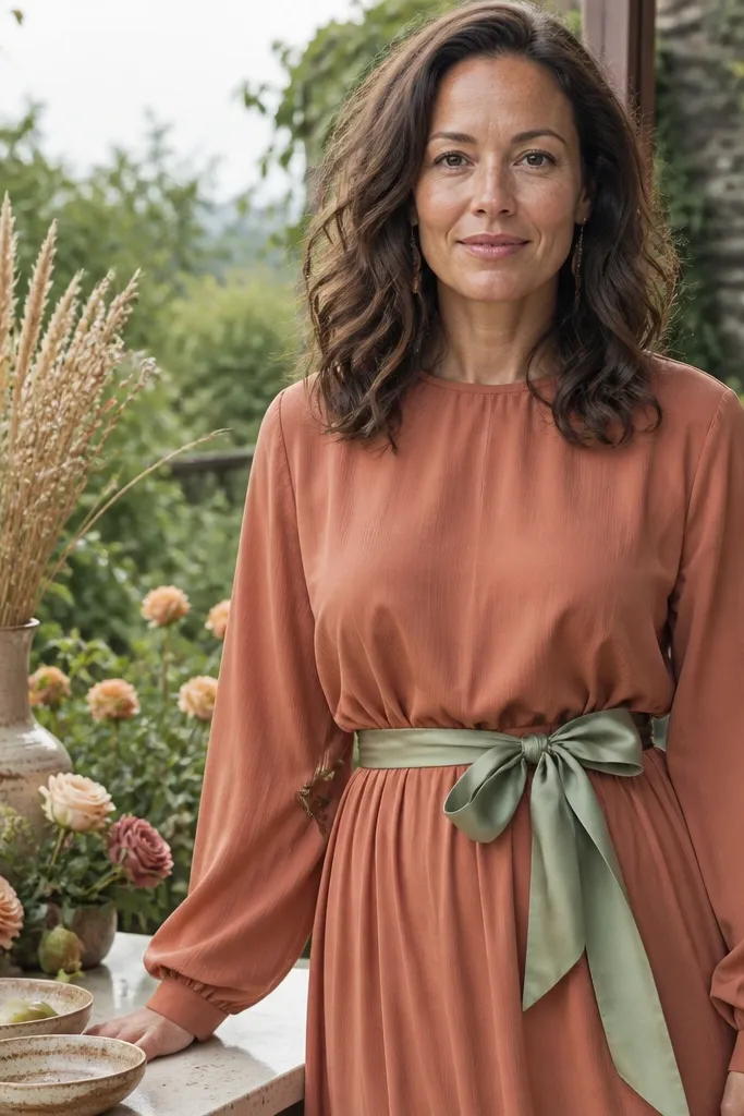
Terracotta and sage give you an earthy palette that still looks light and modern in September. Sage cools terracotta down, so the orange doesn’t go dusty and flat. This pairing works best when you want a warm, lived-in vibe that still looks styled — think dried grasses, garden roses, and ceramic tableware. It’s also friendly for mixed skin tones because it’s less harsh than deep reds.
Start with terracotta as the main color for bridesmaids or accent pieces like sashes. Add sage in smaller areas — greenery in bouquets, napkin bands, or groomsmen tie shades. Choose fabrics that hold color well, like satin, crepe, or structured chiffon — airy lace can wash out in midday sun. Pack a small lint roller and color-safe stain wipes because terracotta shows lint more than dark tones.
Quick tipUse sage as a secondary color in florals, not as a dominant background color on linens.
Skip thisSkip pairing terracotta with gray that’s too cool — it makes the whole palette look dirty.
5. Rust + Camel (Desert Fall, Warm and Clean)
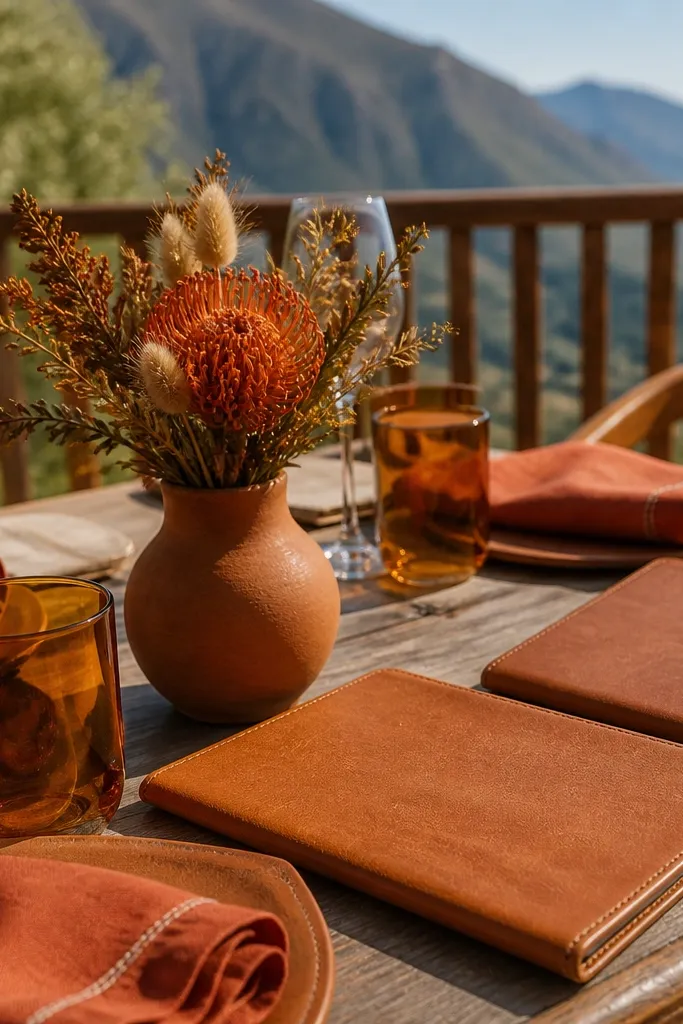
Rust and camel feel like fall without tipping into “Halloween orange.” The key is camel’s warmth — it keeps the palette cohesive and makes skin look healthy in photos. This works especially well for venues with sand-colored stone, outdoor terraces, or warm wood. If you want a travel-friendly, easy-to-style palette, this one plays nicely with leather textures and gold accents. It also photographs well for sunset portraits because the warm tones glow.
Pick rust for the dresses or for one side of the menswear color plan, like ties and pocket squares. Add camel through wraps, shoes, table runners, or signage ink. Keep the third color neutral — cream, warm white, or dark chocolate — so the palette doesn’t scatter. For travel, plan to bring a garment steamer because rust fabrics show wrinkles quickly under warm indoor lighting.
Choose camel shoes in a smooth finish so they look polished in close-up photos.
Avoid pairing rust with bright fuchsia — it reads too loud and breaks the fall mood.
6. Marigold + Dark Teal (Bright Fall That Still Reads Elegant)
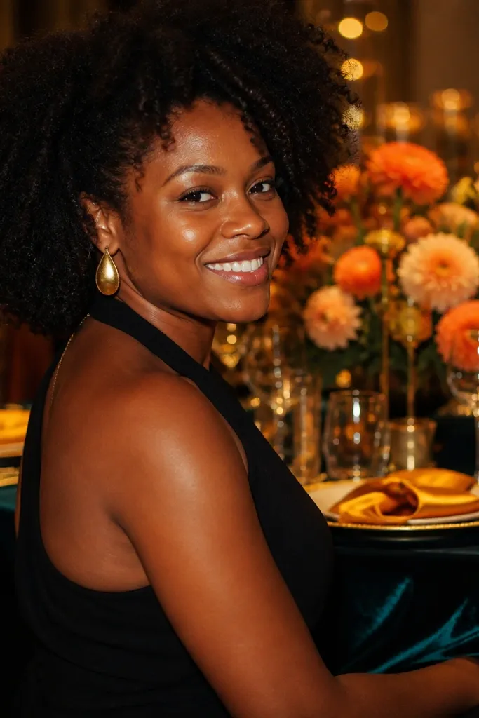
Marigold gives you that September energy, but it needs dark teal to keep it from turning candy-bright. Teal adds depth and makes marigold look intentional, not random. This pairing is a great choice if you want fall color that still feels fun and modern. It also looks excellent in evening photos because teal holds contrast and marigold stays warm instead of dulling. If your venue has lots of greenery, this combo pops without needing heavy dark decor.
Use marigold for the bridesmaids or for accent florals like orange-gold blooms. Then add dark teal in menswear ties, table napkins, or chair ribbon. Keep the rest of the palette neutral — cream, charcoal, or deep brown — so the bright colors don’t fight. When you pack, separate marigold fabrics from dark teal items to prevent dye transfer during travel.
For bouquets, mix marigold-forward flowers with cream blooms so the yellows don’t dominate every photo.
Skip marigold with black — it can look harsh and strip the warmth from the flowers.
7. Plum + Soft Taupe (Romantic, Not Too Sweet)
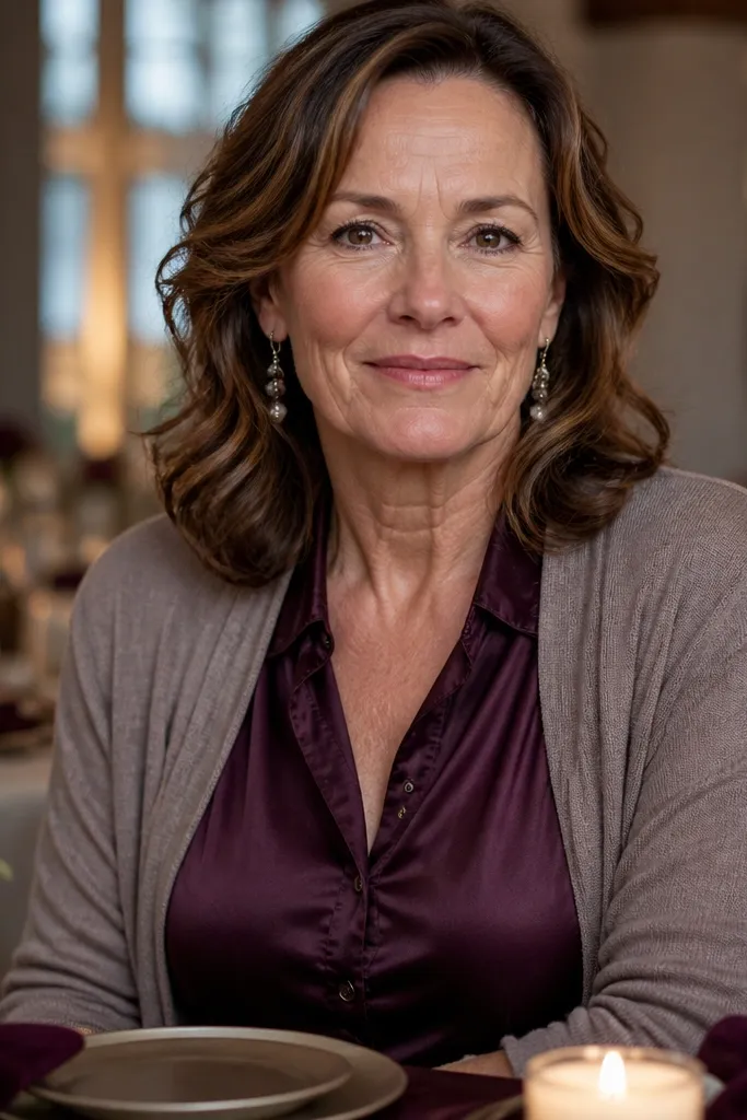
Plum is a fall color that reads romantic without going “grape juice.” Pairing it with soft taupe keeps it grounded and gives you a smoother, more grown-up look for photos. This palette is especially good for indoor receptions where light is controlled — it stays rich without turning muddy. Plum also flatters a wide range of skin tones, because it has both warm and cool depth. If you want a color story that looks expensive and not overly themed, this is a strong pick.
Start with plum dresses or plum suit accents, then choose taupe for bouquets, table linens, and signage. Use mauve or soft berry flowers sparingly so you don’t end up with multiple overlapping purples. For travel, plan to steam plum fabric carefully because it shows creases more than navy or charcoal. Schedule photos during softer light — just after sunset or in shaded garden areas.
Quick tipPick taupe with a pink-beige undertone, not gray — gray taupe can make plum look flat.
Skip thisAvoid pairing plum with bright magenta — it turns the palette into two competing berry tones.
8. Chocolate Brown + Blush Cream (Warm Wedding Dessert Look)
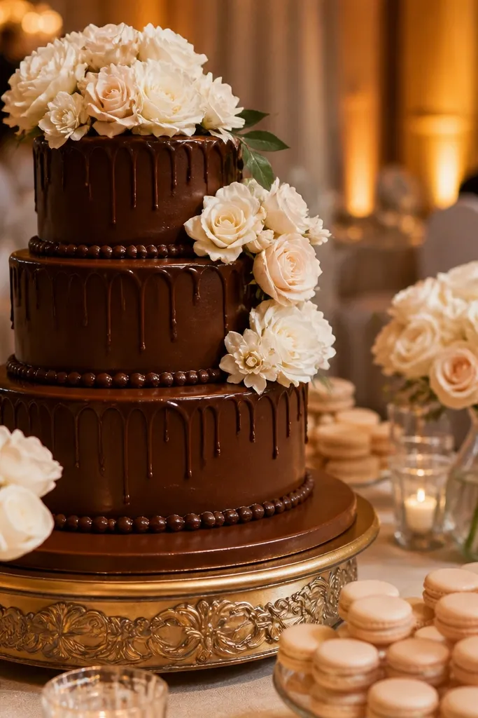
Chocolate brown gives you a grounded, cozy vibe, and blush cream keeps it romantic instead of heavy. This palette is great for weddings that feel more intimate or vintage, especially with soft florals and warm venue lighting. It photographs well because the brown adds contrast while blush cream keeps faces looking bright. If your venue has neutral walls or tan stone, this combo looks like it was planned from the start. It also works for both day and evening events.
Choose chocolate for menswear and anchor neutrals, then add blush cream for bridesmaids and key floral tones. Keep table accents in cream and add small brown details like cocoa-colored ribbon or dark wood elements. For the fastest execution, order one “main” fabric color for dresses and then match ties and stationery to chocolate. When you travel, protect light fabrics from makeup transfer by packing a lint roller and a small powder for touch-ups.
Quick tipUse warm blush, not cool pink — cool blush reads too icy next to chocolate.
Skip thisSkip pairing chocolate with cool white — it makes the whole palette look sterile.
9. Deep Teal + Terracotta Accents (Modern Coastal Fall)
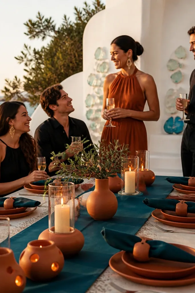
Deep teal feels autumnal without losing contrast, and terracotta accents keep the palette warm. This is a smart choice if you want “fall colors” but your venue leans coastal, modern, or beachy. Teal holds up in shade and in direct sun, so photos stay crisp. Terracotta adds warmth to the skin tones of the people wearing it as a tie, ribbon, or small floral. Use this palette when you want fall color with a cleaner, less rustic read.
Start by choosing deep teal as the dominant color for dresses or suits. Then add terracotta in smaller doses — pocket squares, ribbon bands, or a few terracotta-toned flowers in bouquets. Keep the neutral base as cream or warm white so teal stays the star. For travel, pack ribbon separately in a zip bag so it doesn’t snag on other items.
Quick tipIf the venue has blue walls or ocean views, teal will blend nicely — just keep terracotta limited to accents.
Skip thisAvoid using terracotta as the main background color for everything — it can overpower teal and flatten the palette.
10. Charcoal + Olive Green (City Fall, Photo-Proof)
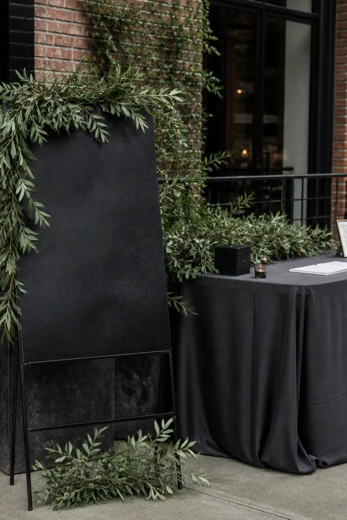
Charcoal is the antidote to messy fall color palettes because it keeps contrast steady in photos. Olive green brings that fall earthiness without going orange-brown. This combo is great for weddings in urban venues, industrial spaces, or modern barns where you want fall color but not “farmhouse.” It also flatters people in a wide range of skin undertones because charcoal is neutral and olive is soft. If you’re worried about September light turning things dull, charcoal helps.
Choose charcoal for suits, jackets, or the table base colors, then add olive through dresses, greenery, and centerpieces. Keep one bright neutral like cream so the palette doesn’t look too dark in daytime. For travel, plan to steam charcoal carefully and use garment bags to prevent lint from sticking to dark fabric. For logistics, assign a “color check” moment before photos — look at everyone standing together under the same lighting.
Use olive with texture — crepe, velvet, or satin — texture helps it read richer on camera.
Skip olive with beige that’s too yellow — it can make the palette look sickly in direct sun.
11. Soft Ochre + Chocolate (Golden Hour Without the Orange Mess)
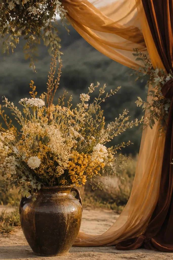
Soft ochre gives you that golden fall glow, but it stays wearable when paired with chocolate brown. This palette looks especially good for late-afternoon portraits because the ochre reads warm and natural instead of neon. Chocolate adds depth and keeps the color story from feeling too light or candy. It also works well with dried florals, wheat tones, and warm metallic details. If you want fall colors that look intentional in both daytime and evening, this pairing is a reliable choice.
Pick ochre for bridesmaids or for the main floral petals, then add chocolate through menswear ties, cake accents, and table runner shades. Keep your third color cream so ochre stays soft and doesn’t go dusty. Order ochre fabrics with a solid color block — avoid overly sheer or heavily patterned fabrics that can shift under flash. For travel, keep chocolate accessories in a separate pouch so they don’t pick up color from ochre items.
Quick tipChoose ochre that leans slightly muted, not bright yellow — muted ochre photos cleaner.
Skip thisAvoid pairing ochre with gray-lavender — it makes the warmth disappear.
12. Moss + Butter Cream (Lush, Light, and Modern)
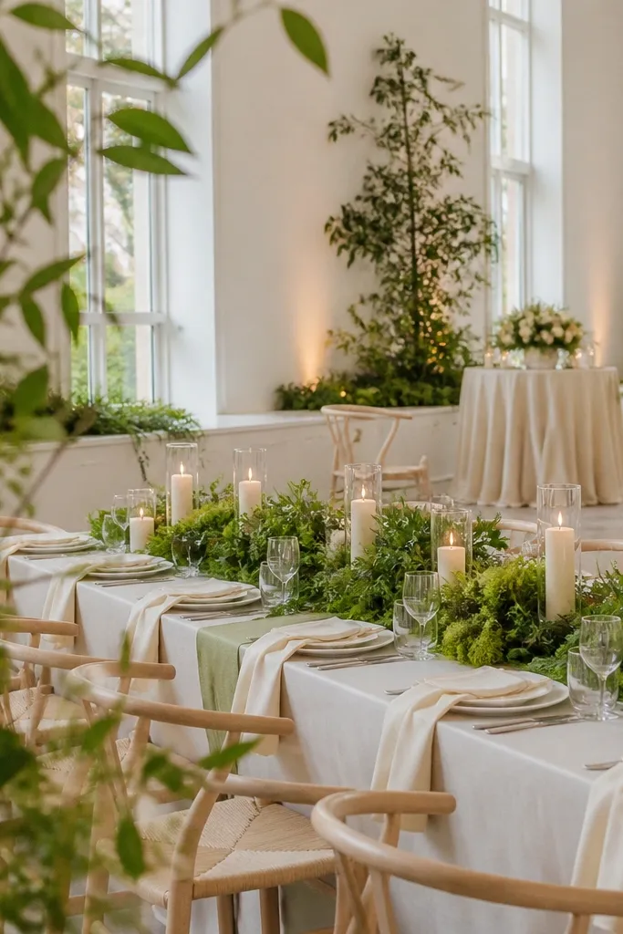
Moss green is softer than forest green, so it reads fresh in September without feeling heavy. Butter cream keeps the palette light and creamy, which helps people look bright in photos. This combo is great for venues with lots of plants, outdoor patios, or modern white interiors where you need color that doesn’t scream. Moss also works with both fresh and dried florals, so you can build a look that feels like it belongs in fall but still clean. If you’re aiming for a modern garden vibe, this is a strong option.
Use moss green as a dominant color for dresses or suit accents, then add butter cream through linens, bouquets, and candles. Choose floral textures with movement — olive branches, seeded eucalyptus, and soft roses — so the palette looks alive in photos. Keep the rest of your styling in white or cream so moss stays readable. When you travel, pack candles and glassware separately and bring extra tissue paper for delicate stems and ribbon.
Quick tipGo for moss fabrics with a slight sheen — matte moss can look flat next to cream in harsh midday light.
Skip thisSkip pairing moss with bright red — it looks too holiday and breaks the calm garden mood.
13. Sapphire + Warm White (Jewel Tone September Win)
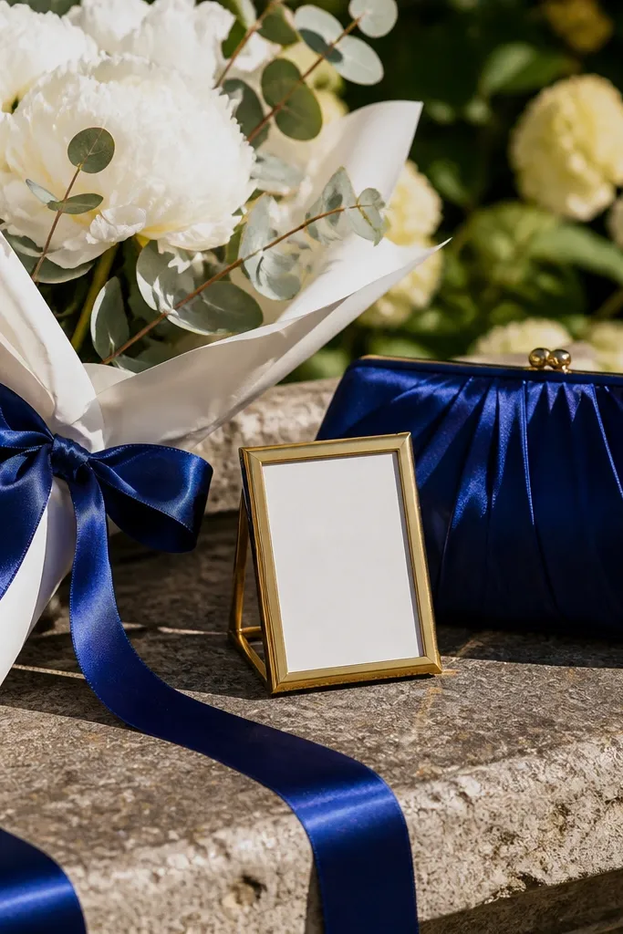
Sapphire is the jewel tone that survives September daylight. It stays saturated, so your photos don’t turn it into a dull blue. Warm white prevents sapphire from feeling too cold, and it keeps the bouquet looking bright and clean. This palette is a favorite for people who want bold fall color without relying on rust or orange. It also pairs beautifully with gold jewelry and candlelight, which makes evening photos look rich.
Start by choosing sapphire for bridesmaids or for the menswear tie color plan. Then add warm white through bouquets, table linens, and cake florals. Keep metals in gold or antique gold to match sapphire’s cool depth. For travel, plan a “no-crease” strategy for the sapphire outfits — hang in a steamy bathroom before the ceremony if needed.
Quick tipUse warm white flowers like garden roses or ranunculus, not stark white blooms that look icy.
Skip thisAvoid sapphire with steel gray — it makes the palette look industrial and less romantic.
14. Rosewood + Creamy Beige (Soft Romance for Daytime Photos)
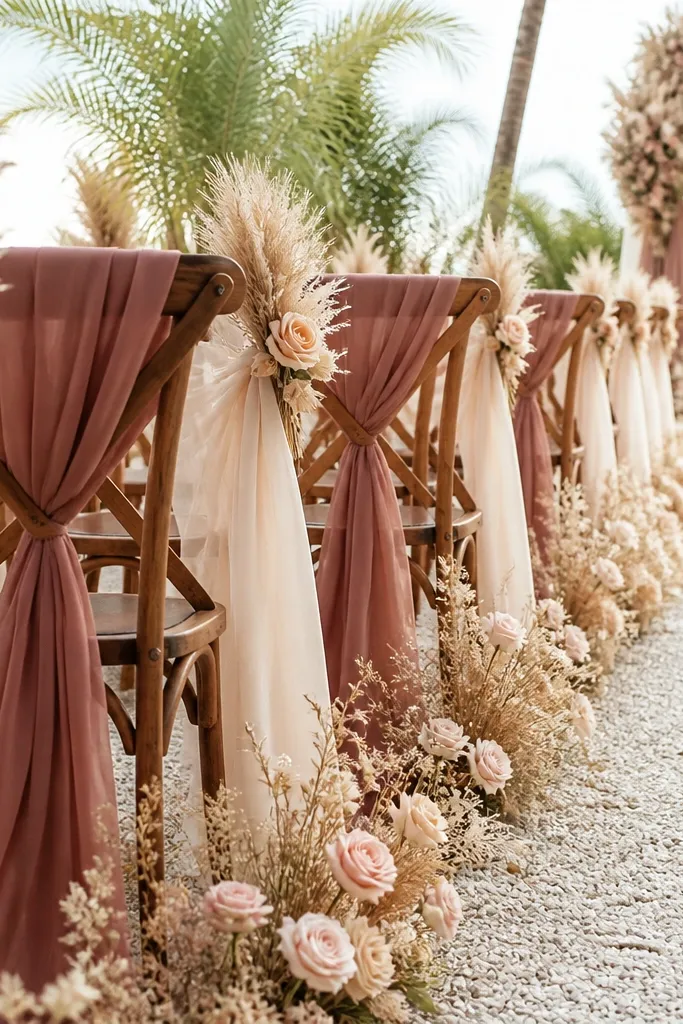
Rosewood is a muted fall pink that reads romantic without turning into dusty mauve overload. Paired with creamy beige, it looks warm, classy, and easy to style across outfits and florals. This palette works best for daytime ceremonies because it doesn’t darken faces the way deep plum or espresso can. It also creates a smooth, cohesive look in wide venue shots — the colors blend like fabric, not like competing themes. If your wedding has light walls or outdoor greenery, rosewood and beige will look calm and intentional.
Choose rosewood for bridesmaids dresses and for accent flowers like rosewood-toned blooms. Then use creamy beige in table linens, chair ribbons, and menswear shoe color or tie shades. Keep contrast manageable — add dark chocolate or deep brown only as tiny accents if you need depth. For travel, protect rosewood fabrics from makeup smudges by packing a small makeup wipe and keeping sleeves or hems covered in transit.
Pick beige that reads creamy, not gray-beige, so it stays warm next to rosewood.
Skip rosewood with neon orange — it makes the palette look accidental.
15. Mauve Plum + Deep Olive (Moody but Still Natural)
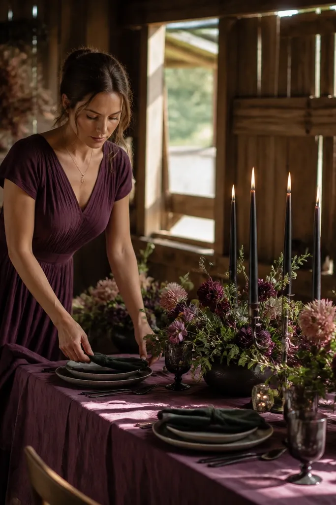
This pairing is for people who want moody fall photos without going full dark. Mauve plum brings the romantic purple tone, and deep olive keeps it earthy and natural. Under September light, this combo looks controlled instead of muddy because olive absorbs harsh glare. It’s also a strong pick for venues with wood, stone, or terracotta architecture. If you want a palette that looks good in both close-ups and wide shots, this one stays readable.
Use mauve plum as the main color for dresses or suits, then add deep olive through greenery-heavy centerpieces and tie accents. Keep a neutral base like warm ivory so faces stay bright. For florals, mix mauve-toned blooms with olive branches and soft grasses for texture. Travel tip: bring a small fabric brush for mauve plum since it shows lint and pilling more than darker colors.
Add one tiny pop of cream in bouquets so the mauve plum doesn’t look flat in shade.
Avoid mauve plum with cool slate blue — the palette can look like winter instead of fall.
16. Copper + Charcoal (Industrial Fall, Clean Photos)
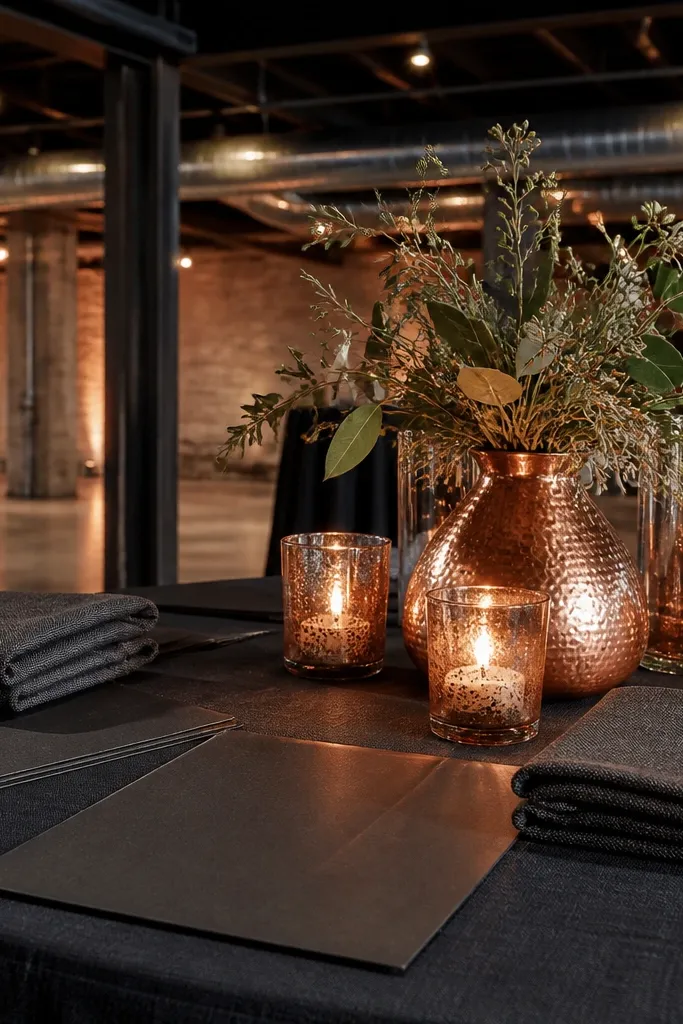
Copper is the warm metallic fall color that makes details look expensive, and charcoal keeps it modern. This palette reads great for industrial venues because charcoal matches the space and copper adds warmth. In photos, copper reflects light in a flattering way, especially when paired with matte charcoal so the contrast stays crisp. It also works well with bronze candles, copper-toned signage ink, and warm wood elements. If you want fall colors that look sharp, not rustic, go copper and charcoal.
Start by choosing copper as an accent-heavy color — dresses, or copper ribbon and jewelry — and use charcoal for suits and table bases. Then add bronze or copper metal accents in stationery and decor. Keep copper fabrics in solid color blocks; avoid heavy sparkle that can blow out in flash. For travel, pack copper accessories in tissue-lined pouches so they don’t scratch or tarnish from friction.
Quick tipUse matte charcoal table linens so copper doesn’t look too shiny in overhead lighting.
Skip thisSkip copper with bright white — it can look like a holiday metallic instead of fall.
17. Deep Red + Cream + Olive (The "True Fall" Balanced Trio)
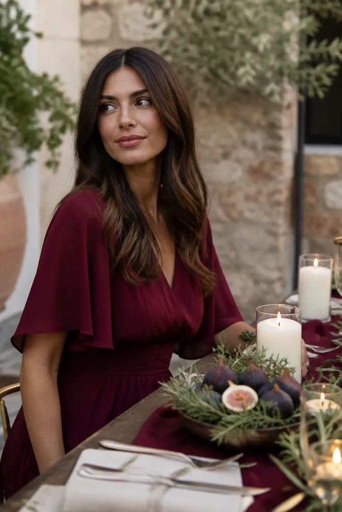
Deep red gives you the classic fall drama, and cream makes it wearable in September daylight. Olive is the secret stabilizer that stops the palette from becoming too red-heavy. This trio looks best when you want strong color in photos but still want skin tones to look natural. It’s also the easiest palette to translate across bridesmaids, groomsmen, and florals because each color has a clear job. If your venue has lots of greenery, olive will blend the whole look together.
Use deep red for bridesmaids or as the main suit tie color, then choose cream for bouquets, tablecloths, and cake accents. Add olive through greenery, stems, and small decor details so the palette feels grounded. Keep dark neutrals like espresso for shoes and signage so everything reads cohesive. When traveling, schedule your dress steaming early and keep cream fabrics separate to avoid transfer from deep red dye.
Quick tipAsk your florist for a “cream balance” in bouquets — too little cream makes deep red look heavy in daylight.
Skip thisAvoid deep red with only warm orange — it becomes one-note and loses contrast.
18. Peacock Blue + Gold Ochre (Statement Color for Parties)
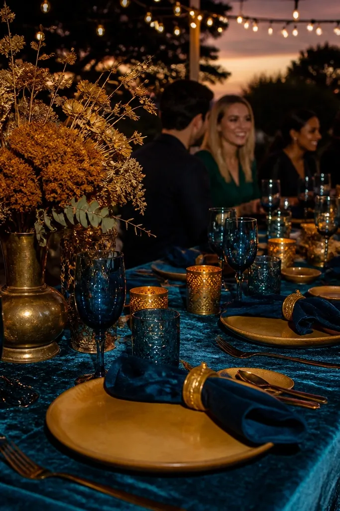
Peacock blue is a richer, more dramatic cousin to sapphire, and it photographs like jewelry in September. Gold ochre adds warmth and keeps the blue from looking too cool. This palette is made for people who want the party to look like a color moment, not just “fall-ish.” It also pairs well with gold metal accents and floral textures like marigold tones and warm grasses. If your venue lighting is a little dim, this combo still holds because the blue stays saturated and the ochre adds glow.
Choose peacock blue for the bridesmaids dresses or a bold menswear tie plan. Then use gold ochre in florals, ribbon, and small decor accents so the palette doesn’t overwhelm. Keep neutrals minimal but present — warm ivory and espresso help the statement colors read clean. For travel, bring a small stain remover for blue fabric — peacock tones show smudges faster than darker neutrals.
Use antique gold (not bright yellow gold) so it matches peacock blue’s depth.
Skip peacock blue with cool lavender — the palette turns confused and less fall-leaning.
19. Ivory + Saddle Brown (Soft Neutral That Still Looks Fall)
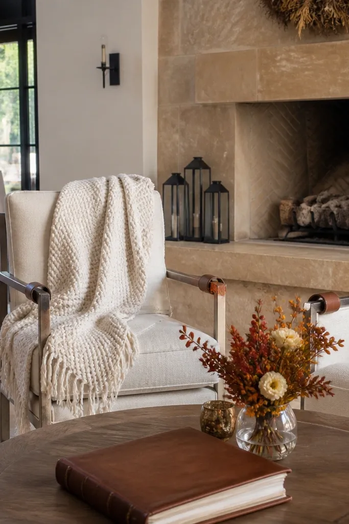
Ivory plus saddle brown is a clean, travel-friendly palette that still reads fall because saddle brown has that warm leather tone. It’s a great pick if you’re worried about bold colors feeling too much for September. This combo looks good in both bright outdoor light and indoor receptions, and it keeps photos bright without looking plain. It also works with many wedding styles — modern, rustic, and even city venues with neutral stone. If you want a palette that won’t fight your venue, this is one of the safest bets.
Pick ivory for dresses and table linens, then add saddle brown through menswear shoes, belts, chair ties, and stationery. Add small greenery accents so the palette looks seasonal and not beige-on-beige. Keep the florals in warm whites and creams, then add one warm brown or caramel-toned flower for depth. For travel, pack a neutral umbrella or cover for ivory garments, since September sun can be harsh during photos.
Quick tipUse textured ivory fabrics like crepe or satin so the ivory doesn’t look flat in photos.
Skip thisAvoid pairing ivory with pure black — it can look too stark for September.
20. Blackberry + Honey Gold (Late-September Berry Glow)
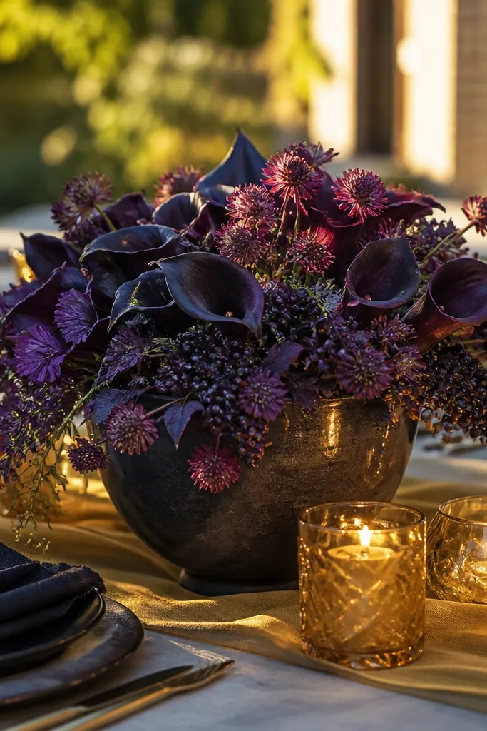
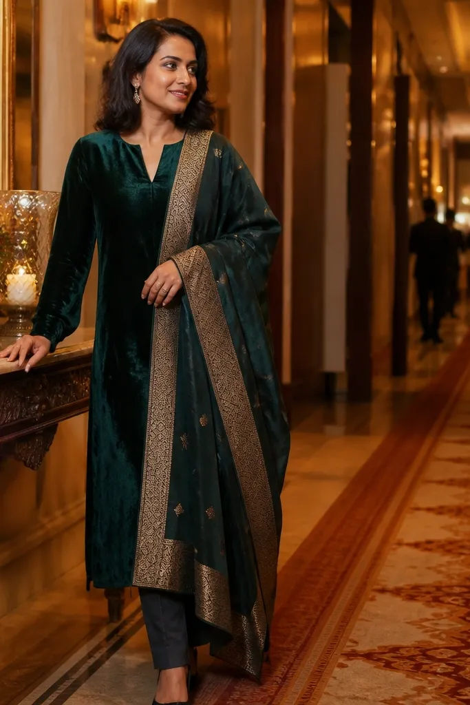
This combo looks like late-September light hitting dark fruit. Blackberry reads romantic on skin because it has blue undertones, and Honey Gold keeps it from going gloomy with a warm, buttery glow. It photographs well in both indoor venues and outdoor patios because the gold gives the frame a bright anchor. If you want something that still feels autumn but not “orange pumpkin season,” this is the one. It suits moody gardens, vineyard tasting rooms, and city lofts where you want rich color without fighting harsh daylight.
Start with blackberry as the main tone — think satin or velvet bridesmaid dresses in a deep, cool purple, then add honey gold through bouquets, table runners, and small accents like ribbons. For getting there, pick a venue with warm lighting or natural shade — look for places with string lights, candle-friendly layouts, or covered terraces. Plan on 2-3 hours on-site for photos and portraits, and book your florals 4-6 weeks out so the gold tones stay consistent as flowers open. Budget-friendly shortcut: use honey gold through dried elements like wheat, pampas tails, or dried marigold tones, then add fresh blackberry flowers only where they show up most in close-up shots.
Ask your venue coordinator if you can turn off overhead fluorescents during portraits. Warm candle or string-light scenes make the blackberry look expensive instead of flat.
Avoid mixing blackberry with icy silver — it makes the purple look gray instead of juicy.