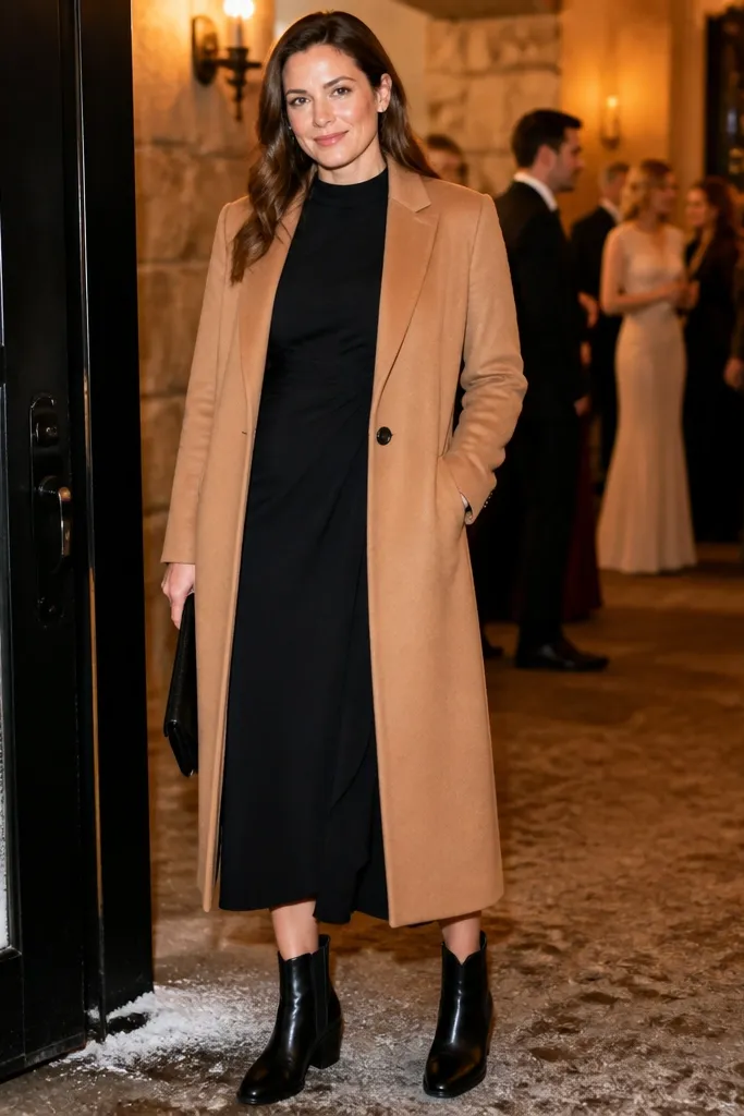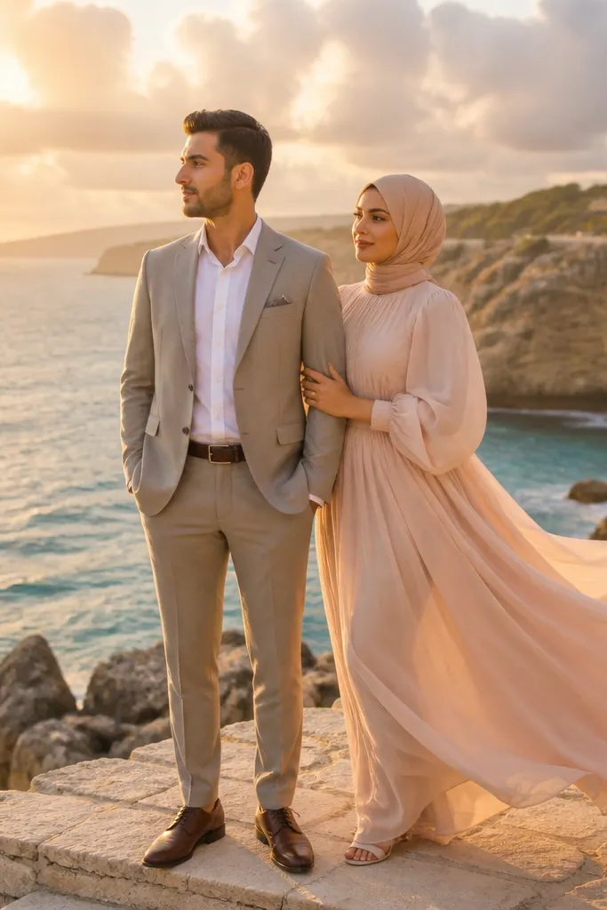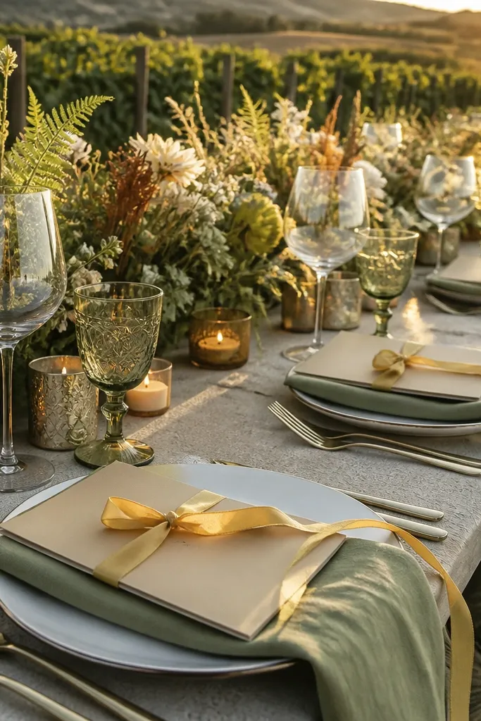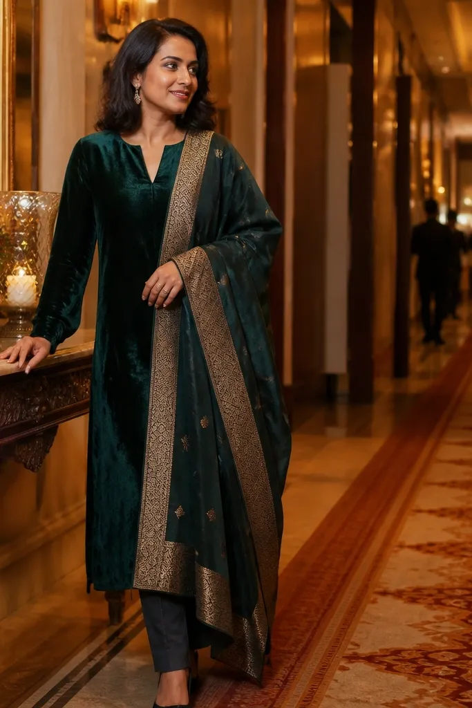
1. Blackberry Plum + Antique Gold
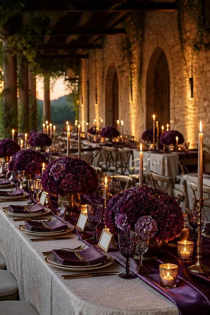
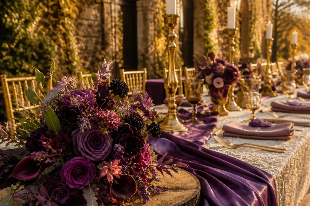
This pairing reads rich without turning heavy. Blackberry plum is deep enough to stay saturated after sunset, and antique gold adds warmth that keeps skin tones looking alive. It works especially well for evening ceremonies, where purple can otherwise go “inky” and flatten details. Add cream textiles so the gold doesn’t overpower and so your photos keep that soft, romantic contrast.
Start by choosing blackberry plum as your dominant color for bouquets or dresses, then add antique gold through candles, flatware, or metallic ink on paper. Pack or rent cream linens and napkins so the palette has a light anchor. Finally, plan your main photo window for 30-60 minutes before dark so the gold catches warm light and the plum stays glossy.
Use gold with a dull finish (antique or brushed), not bright chrome, or the whole look turns harsh.
Skipping a light neutral makes plum look like a single dark wall in photos.
2. Plum Wine + Rust Terracotta
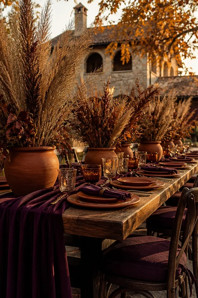
Pick plum wine for the main floral color or bridesmaid dresses, then bring in rust through terracotta planters, napkins, or a ribbon wrap. Choose warm brown paper goods so the colors feel cohesive instead of mixed. When you set tables, place rust accents in clusters (three to five items) so the palette looks designed, not scattered.
Plum wine brings a sophisticated, grown-up purple, while rust terracotta gives that fall warmth people actually notice in pictures. The combo looks especially good in outdoor venues because the earth tones mirror leaves and bark. It’s also forgiving year-round because rust reads warm even in cooler months. Keep the purple closer to wine than lavender so it doesn’t fade in spring daylight.
Skip thisUsing light lilac with rust can look muddy; keep the purple deeper.
Quick tipIf you’re using real flowers, ask for plum-toned blooms plus terracotta-toned dried elements for texture.
3. Soft Lilac + Sage Green + Cream
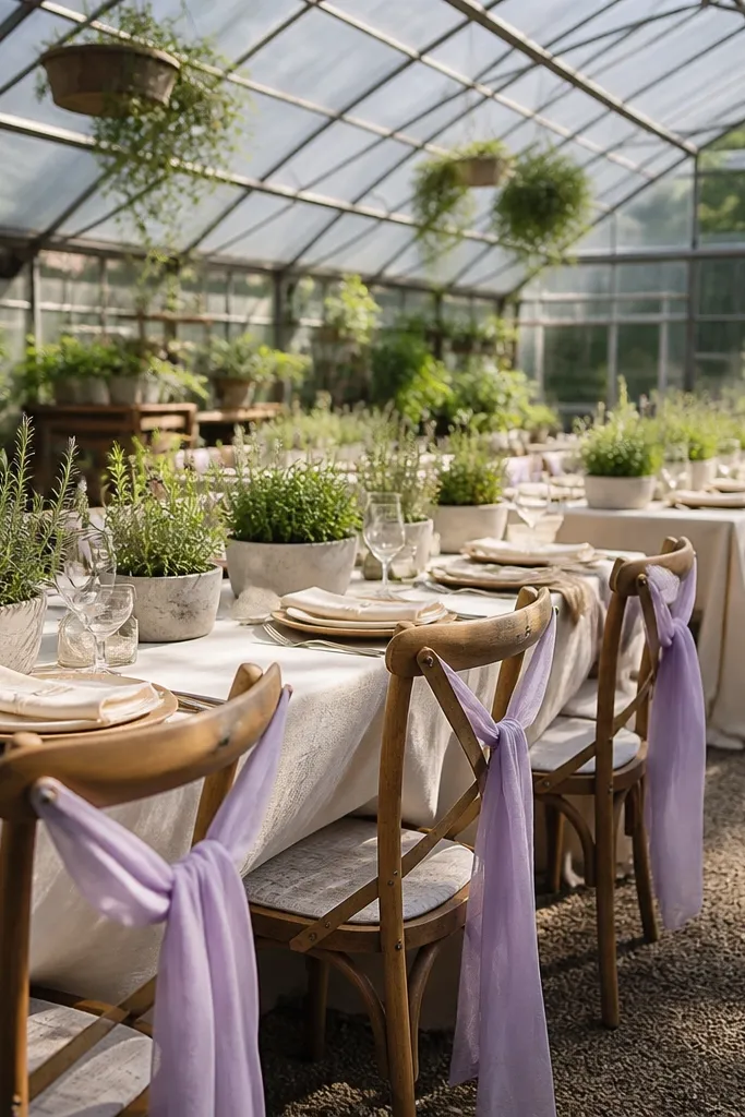
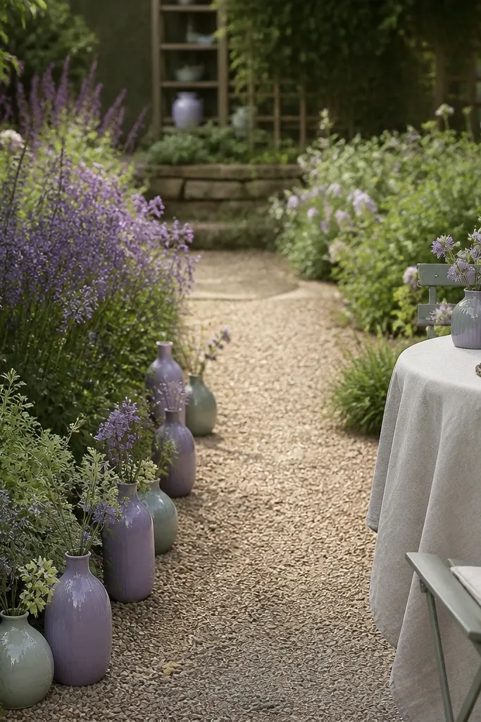
This is the “year-round” version of purple that still feels fall-ready. Soft lilac stays airy in spring and still looks romantic in October when paired with sage’s muted green. Cream ties it together and prevents the palette from looking like a candy shop. For photos, this one shines in daylight — think garden paths, verandas, and window-lit reception halls.
Choose soft lilac as your accent color for signage, bridesmaid dresses, or ribbon, then add sage green through eucalyptus garlands and table greenery. Use cream for table linens and any foam board or backdrop fabric. For travel logistics, bring a small sample of lilac ribbon and sage greenery to match before you finalize rentals.
Use sage in matte textures (leaves, cotton, linen) and keep lilac in satin only if you want a brighter look.
Pairing lilac with bright neon greens makes the purple look dull.
4. Violet + Charcoal + White Chalk
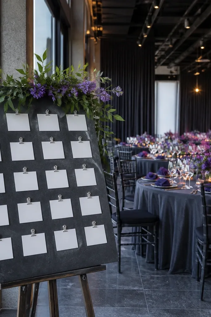
This palette looks modern and clean, and it photographs well in both cool and warm seasons. Violet stays vivid against charcoal, and white chalk tones stop it from looking too dark. It’s a strong pick if your venue is minimal, has gray stone, or has lots of overhead lighting. The contrast also makes signage and place cards crisp even in evening photos.
Start with violet as the accent — napkins, bridesmaid dresses, or a backdrop drape — then choose charcoal for table runners, chair sashes, or suit details. Add white chalk elements through florals, candles, or paper textures. If you’re planning a photo shoot, position the couple near a light wall so violet doesn’t get swallowed by dark backgrounds.
Use textured charcoal fabric (like twill or matte satin) so photos don’t show flat color blocks.
Going full black and full violet can erase detail; keep some chalk white in every major photo area.
5. Periwinkle + Dusty Rose + Taupe
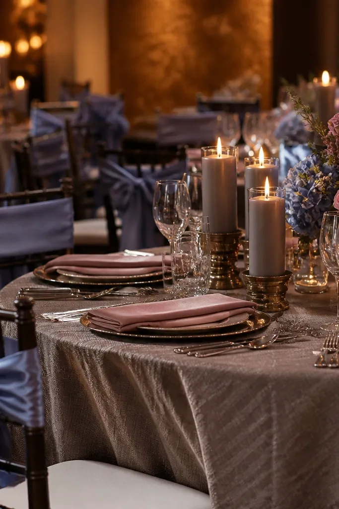
Periwinkle is a cool-toned purple that can look fresh in spring and still feels elegant for fall when you pair it with dusty rose. The taupe neutral keeps the palette grounded so it doesn’t skew “baby shower.” This one works well for indoor venues because periwinkle stays flattering under warm bulbs when taupe is present. It also looks great in portraits against neutral walls and wood paneling.
Pick periwinkle for larger surfaces like dresses or a ceremony arch panel, then add dusty rose through floral clusters or table overlays. Choose taupe linens and stationery to keep everything soft. To make travel planning easy, pack a taupe scarf or fabric swatch so you can match the neutral to your rental venue’s carpet and wall tones.
If your venue has cool floors (gray tile), add more taupe than you think you need.
Using bright fuchsia with periwinkle makes the palette clash in photos.
6. Plum + Olive Green + Espresso
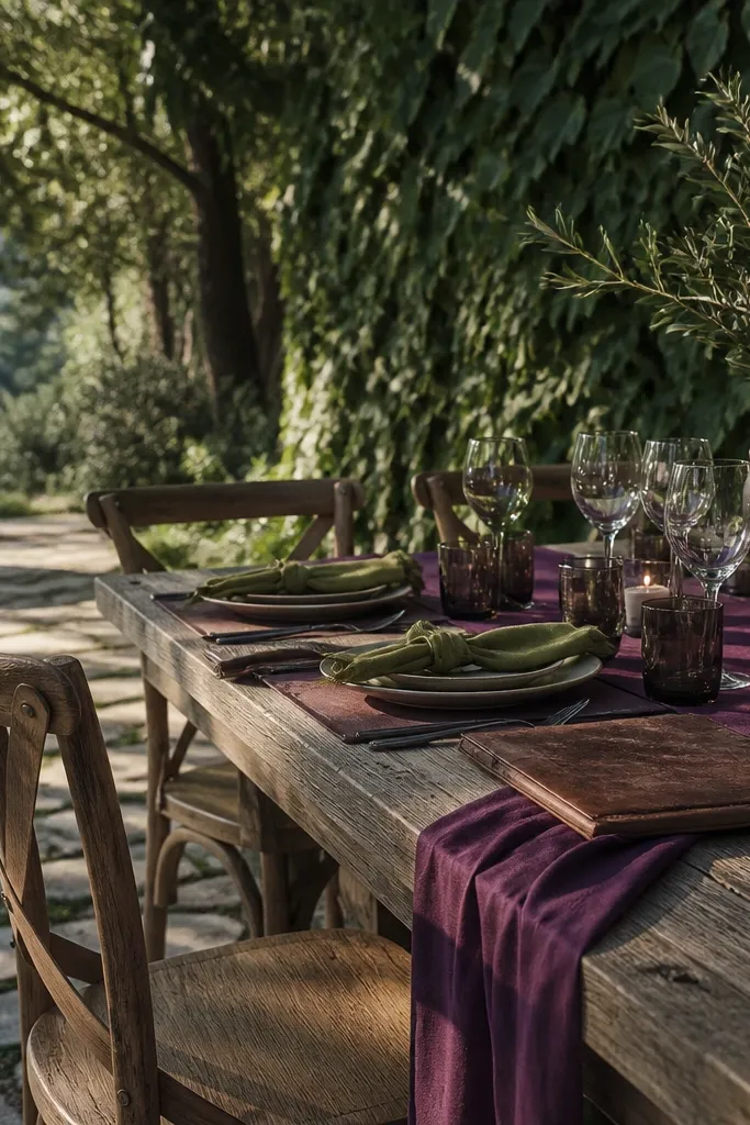
Use plum as your main purple — bouquets, bridesmaid dresses, or a ceremony backdrop — then bring in olive through greenery and wreaths. Add espresso brown in wood signage, leather-bound menus, or tableware. For travel weekends, plan your photo location near greenery so olive looks intentional instead of like a separate accent.
Olive green makes purple feel grounded and outdoorsy, and espresso brown adds depth without going fully dark. This palette is photo-friendly because it looks “natural” next to trees, stone paths, and rustic walls. It’s also a smart choice for year-round use since olive doesn’t fade into gray the way some greens do. If you want a fall wedding that still feels clean in late winter, this is the direction.
Skip thisUsing neon lime green with plum — it makes the purple look tired.
Quick tipGo heavy on olive texture (olive leaves, rosemary sprigs) so the palette reads layered, not flat.
7. Amethyst + Cream + Blush
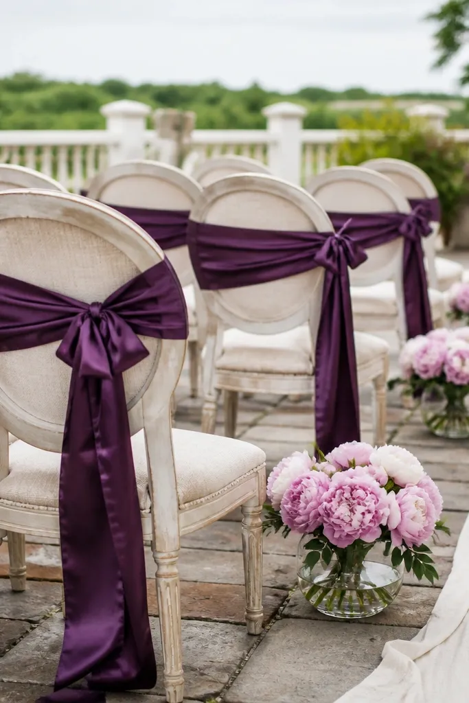
Amethyst is a saturated, jewel-like purple that photographs beautifully in both bright daylight and evening light. Cream and blush soften it so you get romance without a dark mood. This is a great palette for venues with lots of white trim, because the purple pops while the rest stays airy. It also works well for spring-fall transitions where you want purple but not full-on autumn heaviness.
Choose amethyst for the hero element — usually napkins, a ceremony backdrop, or bridesmaid dresses. Add cream linens and blush florals so the purple doesn’t dominate every frame. When you plan travel logistics, schedule photos during late afternoon when skin tones and blush look flattering.
Keep blush in matte florals; shiny blush satin can look too pink next to amethyst.
Pairing amethyst with icy white can look sterile; use cream instead.
8. Eggplant + Smoky Gray + Silver
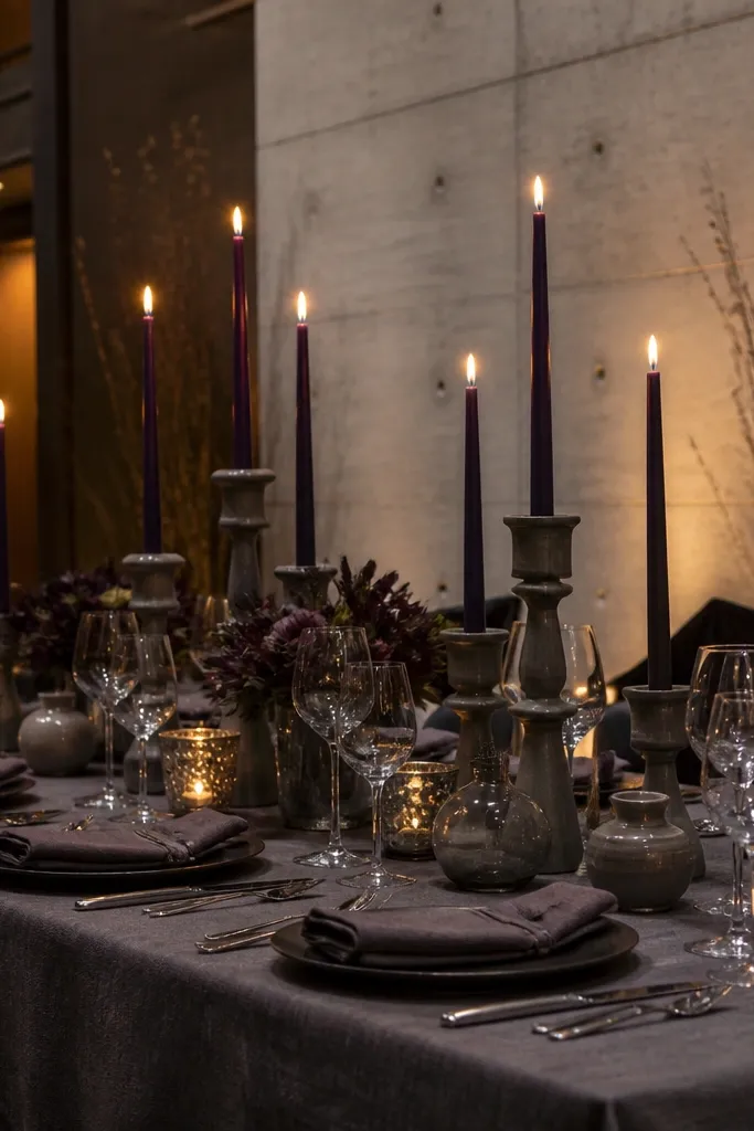
Start with eggplant for napkins, table overlays, or centerpieces, then layer smoky gray through table runners or chair details. Add silver through candleholders, metallic balloons, or reflective accents in signage. For getting around, bring a lint roller and a soft brush for eggplant fabrics — darker tones show fuzz and lint more than you expect.
Eggplant is a purple that leans dark and smoky, and it pairs cleanly with gray tones. Silver adds brightness in a controlled way, so the palette stays elegant rather than gloomy. This is a strong pick for indoor venues, especially where the room has gray stone or modern concrete. If you want a purple wedding that looks sharp in winter photos, this is one of the safest choices.
Skip thisUsing bright gold with smoky eggplant can look mismatched; stick to silver or antique gold depending on the venue light.
Quick tipUse silver sparingly in clusters near the couple so it reads intentional on camera.
9. Plum Rose + Dusty Plum + Champagne
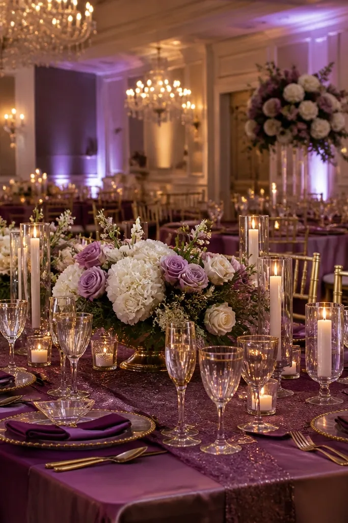
This is a tonal purple palette that looks expensive because it’s controlled. Plum rose is slightly lighter and more romantic, while dusty plum adds depth so the tables don’t look flat. Champagne brings warmth and sparkle without forcing a gold theme. It’s ideal for weddings where you want purple in everything but still want photos to feel light and celebratory.
Choose plum rose as the lighter purple for florals or bridesmaid dresses, then deepen it with dusty plum in ribbons, paper, or secondary blooms. Use champagne as the metallic — glassware, candle cups, or foil on invitations. Book your photographer for golden-hour portraits because champagne highlights look best with warm backlight.
Foil details should be champagne foil, not bright yellow gold, for a softer look.
Keeping all florals the same shade — tonal palettes need at least two depths of purple.
10. Grape Purple + Teal + Oyster
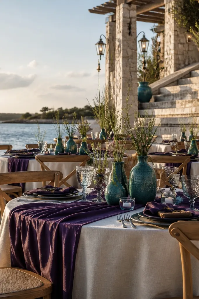
Grape purple is bold, and teal gives it a modern pop that still reads fall-friendly when you choose muted teal. Oyster is your neutral that keeps everything from looking too loud. This palette looks stunning in photos with water, textured stone, or coastal backdrops. It also works year-round because teal doesn’t disappear in winter light the way some greens do.
Use grape purple as the dominant accent for bouquets or ceremony fabric, then add teal through napkins, small flower clusters, or a sign border. Choose oyster linens and stationery so the colors feel cohesive. For travel planning, pack one teal element you can reuse across weekends — a ribbon roll or a runner works well.
Keep teal muted (think deep sea glass), not bright turquoise, or it clashes with purple undertones.
Mixing grape purple with neon colors that overpower the camera.
11. Burgundy + Lavender + Warm Linen
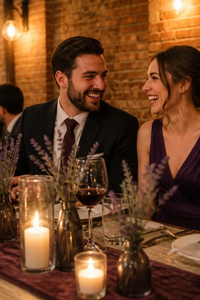
Burgundy does the heavy lifting for fall, while lavender adds softness so the look doesn’t feel too formal. Warm linen ties it together so the purple stays flattering and not overly cool. This palette is excellent for weddings in older buildings, where the lighting can be warm and the walls are dark. In photos, the lavender detail shows up as gentle highlights instead of a second dominant color.
Select burgundy for the main floral tone or table linens, then add lavender in smaller areas like escort cards, ribbon, or a few bouquet sprigs. Use warm linen for everything white — tablecloths, menus, and candles — so colors don’t skew gray. If you’re arranging travel logistics, do a test photo in the venue with your actual linen color before you commit to rentals.
Use lavender only in matte textures for a softer look against burgundy’s depth.
Overusing lavender; too much light purple next to burgundy can look washed out.
12. Lilac + Black + Gold-Leaf Details
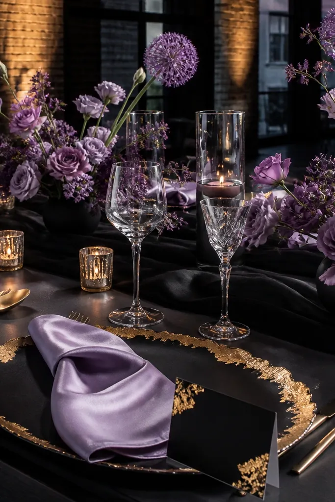
Start by choosing lilac for the main decorative color like table runners, signage, or small ceremony drapes. Add black through table runners, chair backs, or guest book covers, then finish with gold-leaf details on stationery or candle cups. For travel, carry black napkin rings or a black fabric strip so you can adjust color balance on arrival.
This combo is dramatic in a good way. Lilac stays pretty, black adds contrast, and gold-leaf details bring crisp shine. It’s perfect for city venues, modern halls, and any place where you want purple to look styled rather than seasonal. In photos, black improves definition — you’ll see cleaner edges on signage, place cards, and floral stems.
Skip thisChoosing glossy black satin everywhere; it shows hotspots under overhead lights.
Quick tipGold-leaf should be irregular or matte-finish, not mirror-bright, to keep the look soft.
13. Violet + Camel + Deep Greenery
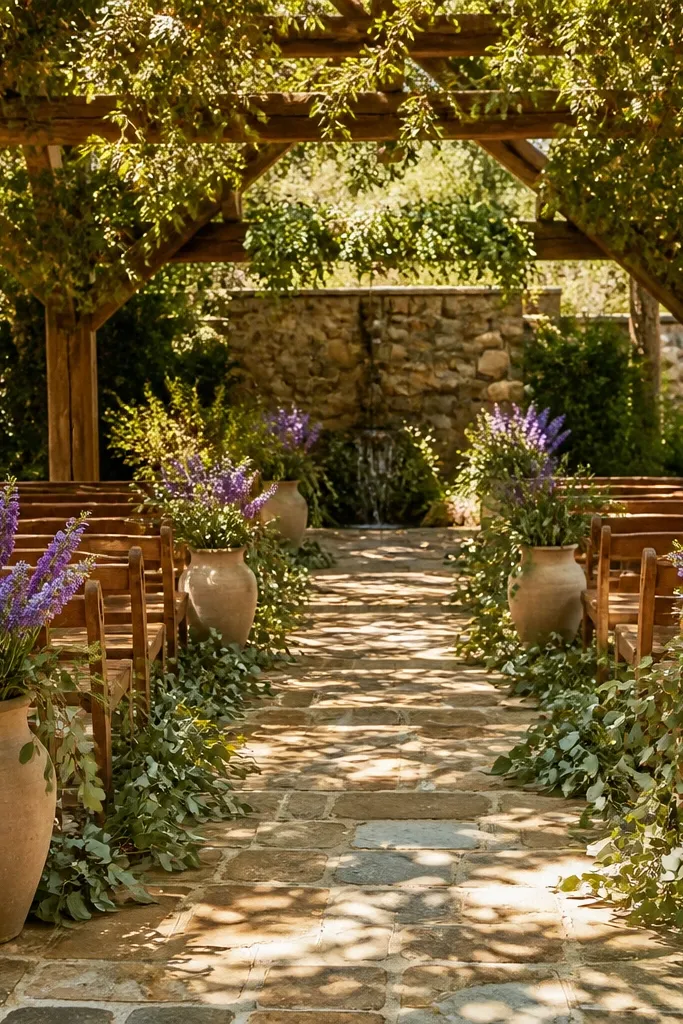
Violet plus camel is the color pairing that makes purple look expensive without getting too dark. Deep greenery adds texture and keeps it fall-coded, even if the wedding date is in late summer. This palette works well for outdoor ceremonies and rustic venues where wood tones already exist. Photos look warm and polished because camel reflects light more gently than stark white.
Use violet as a ribbon or bridesmaid color, then bring in camel through table linens, signage paper, and guest favors. Add deep greenery — magnolia leaves, olive, or dark eucalyptus — so the purple doesn’t look floating. For travel logistics, pack camel-colored ribbon or fabric so you can match your venue’s wood undertone and avoid clashing beige.
Camel looks best in matte fabrics; satin camel can look too yellow on camera.
Pairing violet with cool gray neutrals; it turns the palette lifeless.
14. Plum + Cocoa Brown + Creamy Ivory
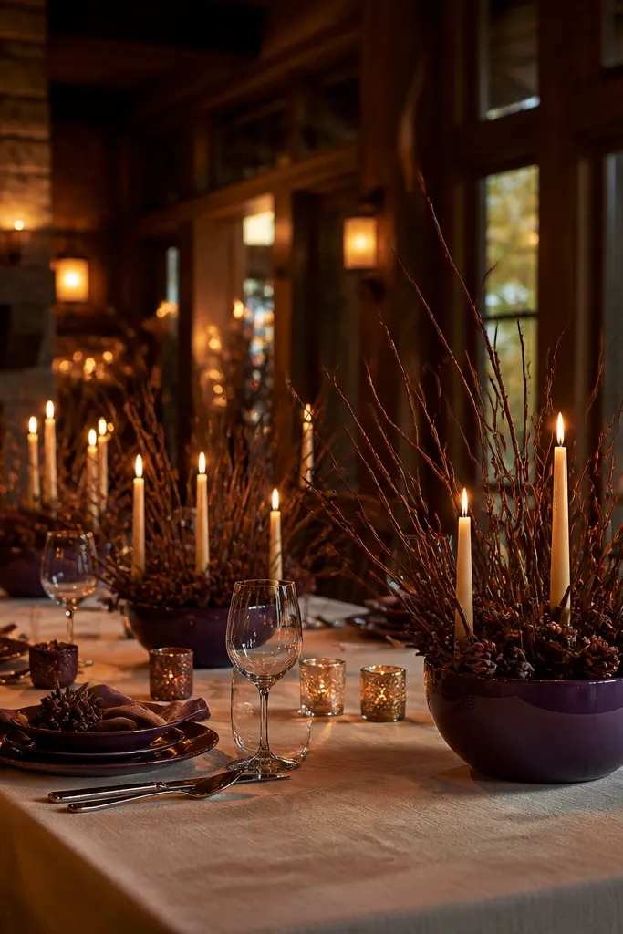
Pick plum for centerpieces or bridesmaid dresses, then add cocoa brown in wood elements, chocolate-brown candles, or leather-bound menus. Use creamy ivory table linens and napkins so the purple shows clearly. Plan your timeline so portraits happen in a lighter area — ivory helps, but only if you avoid direct overhead light.
This is a cozy, classic palette that photographs like autumn without needing strong metallics. Plum gives the purple effect, cocoa brown adds warmth, and creamy ivory keeps the tables bright. It’s a smart option for reception venues with warm wood and amber lighting. The softness makes it easy to coordinate everything — from menus to cake styling — without the look feeling busy.
Skip thisUsing stark white; it makes plum look harsher and less flattering.
Quick tipIf your venue has honey-colored walls, lean more cocoa than you think for harmony.
15. Amethyst + Olive + Antique Brass
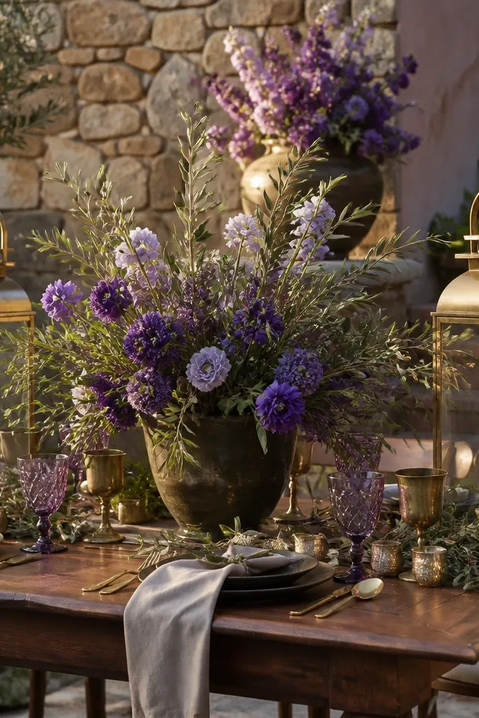
Amethyst is the purple that looks like jewelry, and olive keeps it grounded so it doesn’t feel too party-like. Antique brass adds a warm glow that works in both late fall and early spring. This palette suits garden ceremonies, courtyards, and venues with stone or brick. In photos, the brass highlights look gold-adjacent but softer than bright gold, so skin tones stay natural.
Choose amethyst for the main floral tone or a statement backdrop panel. Add olive greenery for texture and fill, then use antique brass through candleholders, frames, or cutlery details. For travel planning, bring a small brass sample or photo of your chosen brass finish so it matches your venue’s existing hardware.
Keep brass accents low and close to the table so the glow looks intentional, not flashy.
Using bright brass with amethyst; the contrast can feel too sharp.
16. Blackberry + Sage + Smoky White
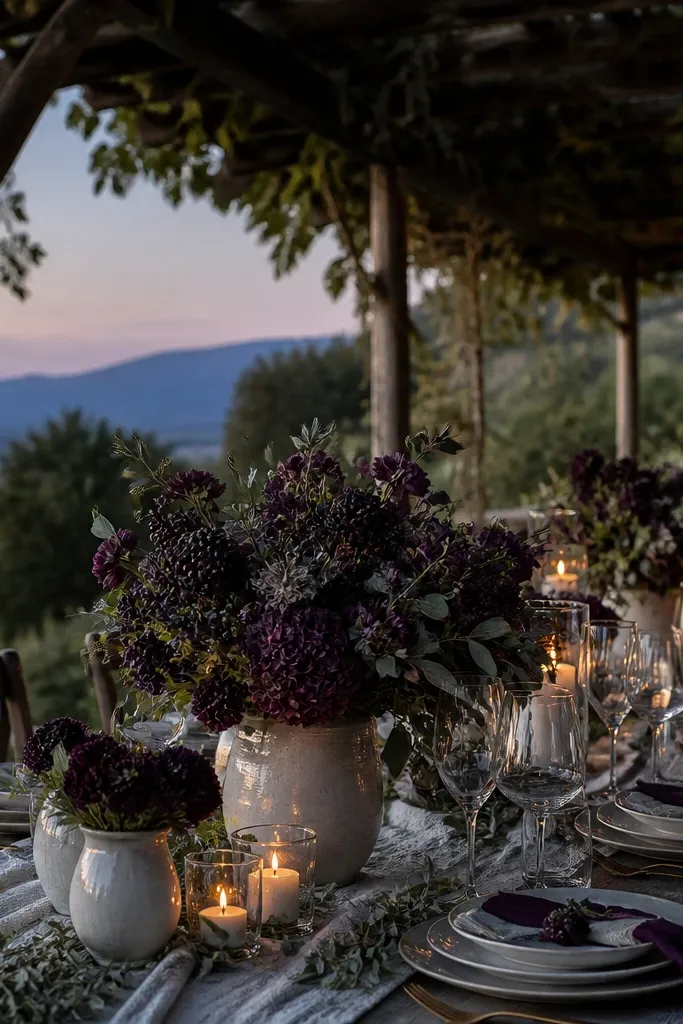
Start with blackberry as the primary purple in bouquets or table florals. Add sage through garlands, eucalyptus, and greenery-filled vases, then use smoky white for linens and paper. Arrange your tables so greenery sits higher than the candles; it gives the photos depth and keeps purple from looking like a flat block.
This palette is moody but clean, and it’s one of the best “fall wedding colors purple” options when you want a modern look. Blackberry stays deep enough for evening photos, sage gives a natural break, and smoky white keeps the palette from turning heavy. It works well for venues with lots of greenery or outdoor shade, where blackberry looks saturated. If your goal is a wedding that feels styled without being overly dark, this hits it.
Skip thisPairing blackberry with pure bright white; it can look stark and harsh under warm lighting.
Quick tipUse smoky white that leans warm gray, not blue-gray, or blackberry can look too cold.
17. Lilac + Cinnamon + Soft Charcoal
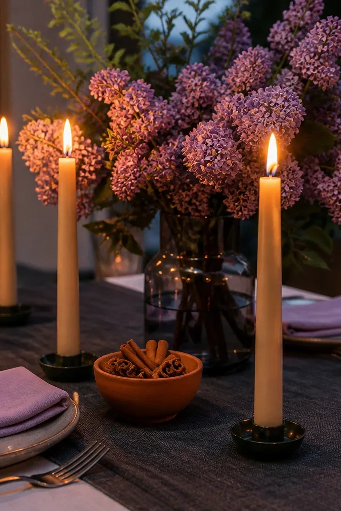
Choose lilac for smaller accents like place cards, napkin rings, or a ceremony floral ribbon. Add cinnamon through terracotta candles, brown leather menus, or wood decor. Finish with soft charcoal runners or chair details, then plan portraits in shaded outdoor areas where lilac doesn’t wash out.
This is a warm, sensory purple palette. Lilac gives the color story, cinnamon adds that fall bakery warmth, and soft charcoal grounds the look so it doesn’t feel too sweet. It’s especially photogenic for receptions with candles and low lighting because charcoal absorbs glare. In spring, it still works because cinnamon and charcoal are neutral enough to keep the mood from feeling seasonal-only.
Skip thisOverdoing lilac; keep it as a highlight against charcoal so the palette stays intentional.
Quick tipUse cinnamon in matte finishes; glossy terracotta can look too orange on camera.
18. Plum + Navy + Antique Pearl
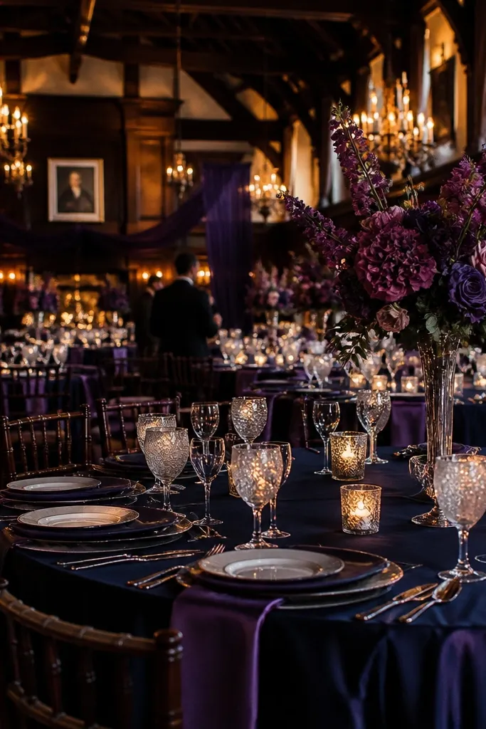
Use plum as the main purple in florals or bridesmaid dresses, then add navy in napkins, table runners, or groom party details. Bring in antique pearl through candle holders, beaded details, or pearl-toned stationery accents. Travel tip: pack navy ribbon or a fabric swatch so you can match it to venue walls before you lock in rentals.
Plum and navy are a smart alternative to purple + black. Navy deepens the palette without making it look like a goth theme, and antique pearl adds a soft glow that reads classy in photos. This pairing works for fall weddings because navy plays well with dark evenings and cooler air. It also holds up year-round because navy is stable — it doesn’t swing too warm or too cool under mixed lighting.
Skip thisUsing bright cobalt navy; it fights plum undertones in evening photos.
Quick tipAntique pearl should be more warm than icy; icy pearl makes plum look flat.
19. Grape Jam + Moss + Copper
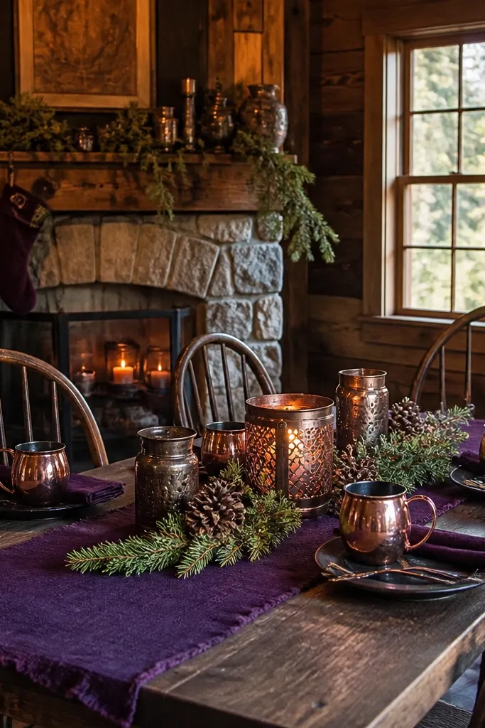
Start with grape jam as the dominant purple — bouquets or table centerpieces. Add moss through greenery, moss-covered items, or textured garlands, then bring in copper through candleholders, small metal trays, or foil accents. For getting there, store copper pieces in tissue paper or a soft bag to avoid scuffs that show up under flash.
Grape jam is a deep, slightly red-leaning purple that looks delicious in fall photos. Moss green adds a forest feel without going too dark, and copper warms up the whole scene. This palette is ideal for rustic venues, cabins, and outdoor ceremonies where you want purple to feel natural rather than formal. Copper also photographs well at night because it catches light in a soft, flattering way.
Skip thisPairing grape jam with silver-heavy decor; it can make the palette look cold.
Quick tipKeep copper finishes consistent; mix-and-match copper can look different in every photo.
20. Cranberry Purple + Copper Rose + Oat Linen
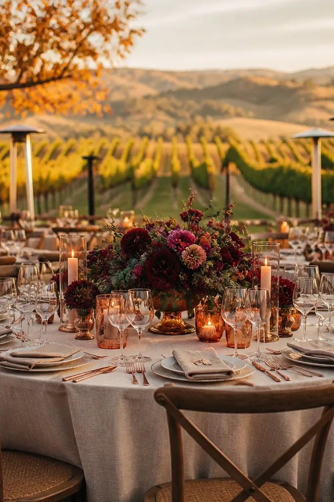
This palette looks like fall light hitting wine glass — cranberry purple first, then copper rose warmth, then oat linen to keep everything soft and wearable in photos. It works especially well for outdoor venues with trees or vineyard rows because the copper tones echo the rust in leaves while the oat tones keep the scene from turning too dark. If you want a wedding color story that feels romantic without looking like a Halloween costume, this is the move. It also photographs cleanly across skin tones because oat linen acts like a neutral buffer. Use it for late September through November when the air has that crisp, golden cast that makes purple look intentional instead of flat.
Step 1 — Build the look: start with cranberry purple for bridesmaid dresses or the main tablecloth, then add copper rose through candle holders, flatware, or a metallic ribbon on bouquets. Finish with oat linen in napkins, menus, or reception signage so the palette has breathing room. Step 2 — Choose a venue that gives you texture: gardens, vineyards, historic courtyards, or any place with warm stone and autumn foliage. Step 3 — Getting there and around: pick the nearest parking or drop-off point for your ceremony and keep a short shuttle plan if your venue is on a hill or has limited access; plan for 10-15 minutes of buffer time for loading florals and rentals. Step 4 — Rough cost and timing: budget mid-range for rentals because metallic candle holders and linens add up, and book florists and paper goods 3-5 months ahead for fall weekends. Step 5 — How long to spend: plan one full day for setup and a half-day for relaxed photo time before sunset, since copper accents look best in late light.
Rent copper candle holders and glassware in one order from the same provider to avoid mismatched finishes that show up in every photo.
Don’t skip the oat linen neutral — cranberry purple alone makes the whole reception look heavy and muddy.