1. Periwinkle Wind
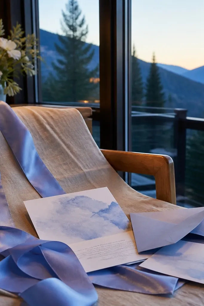
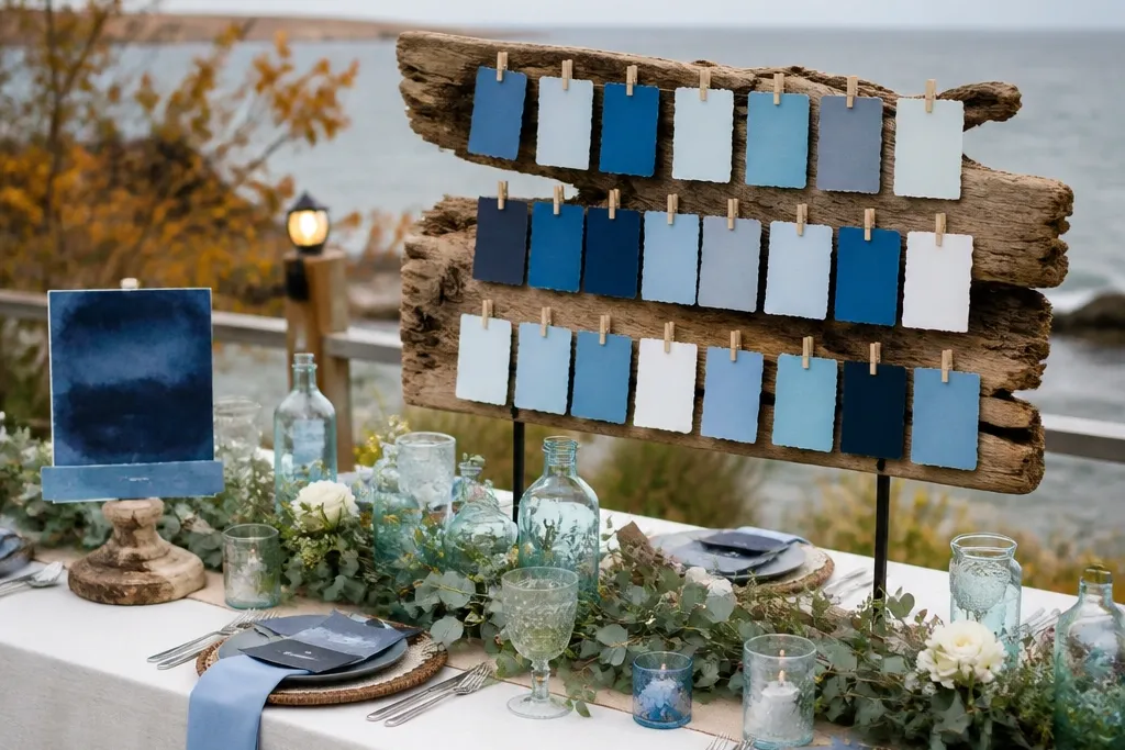
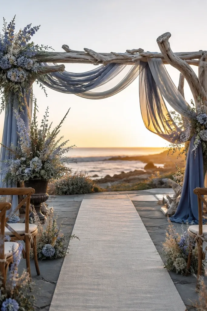
Periwinkle Wind is the softest way to keep aesthetic Fall Blue Wedding Colors looking airy when the air turns crisp. It reads like sky-blue in early evening, especially in photos with natural window light or open shade. This shade works best for dress colors, bridesmaid satin ribbons, and invitation backgrounds because it doesn’t swallow highlights. Pair it with pale sand and pearl so it stays coastal and romantic instead of childish. It’s a great choice for beach venues where you want the color to feel like the day is still bright.
Start by using Periwinkle Wind as your “main blue” for 60% of the palette — think napkins, a table runner, or the invitation card base. Then pair it with sand or oat in 30% — linen tablecloth, folded kraft menu cards, or warm cream candles. Finally add 10% accents in brushed silver and pearl for the coastal shine. For printing, request a matte stock and use a slightly darker ink tone for text so the blue doesn’t fade in daylight.
Quick tipIf you’re testing fabric, view it next to a white wall in late afternoon — periwinkle can shift toward gray fast.
Skip thisDon’t pair periwinkle with stark black; it makes the whole palette look wintery.
2. Sea-Glass Mist
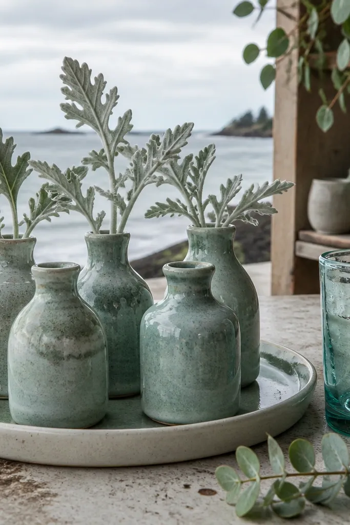
Sea-Glass Mist gives you that coastal “found on the shore” look while staying flattering in fall. It has a green-gray undertone, so it plays nicely with eucalyptus and dusty miller. In photos, it keeps skin tones looking warm without making the whole wedding feel like winter blue. Use it for ceramic accents, glassware, or even a soft watercolor wash on stationery. This shade shines with textures like linen, raffia, and natural wood because it looks best when it’s not too glossy.
Start by choosing Sea-Glass Mist for table styling — ceramic plates, a vase color, or a table runner in washed cotton. Then layer warm neutrals in 30% — oat napkins, ivory candles, and driftwood-toned wood chargers. Finally add coastal pop accents in 10% like coral blush or peachy shells for color that still reads breezy. To keep it photogenic, keep the sea-glass items mostly matte and let the reflective pieces be the glass votives.
For signage, use sea-glass ink on cream paper instead of sea-glass paper; it photographs cleaner.
Skip neon coral with sea-glass; it fights the muted coastal vibe.
3. Stormy Slate Blue
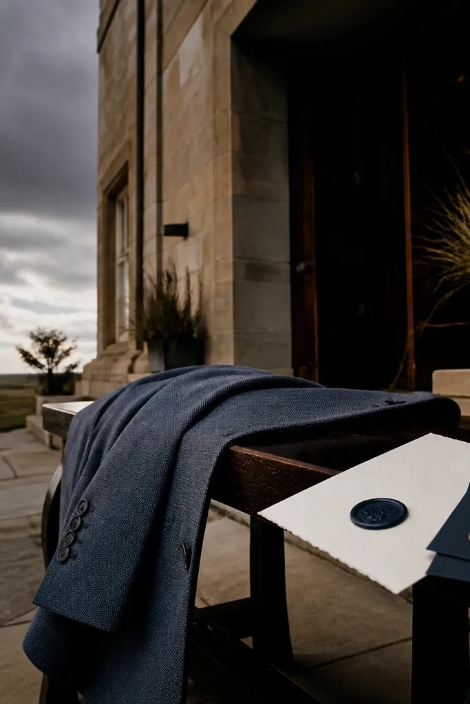
Stormy Slate Blue is the fall answer when you still want aesthetic Fall Blue Wedding Colors but the sky is already moody. It reads sophisticated and grounded, and it looks incredible against sand-colored venues and dark wood. This shade is best for menswear, guest styling cues, and bold stationery elements like monograms. It also makes florals look richer — especially blue-gray hydrangea, thistle, and dark green foliage. If you want your wedding photos to look like a fashion editorial without going too formal, slate is the move.
Start by using Stormy Slate Blue for 60% of the “dark” elements — suit jackets, groomsmen ties, or the main text color on invites. Then add 30% warm light neutrals like camel, oat, or cream to keep it from feeling heavy. Finish with 10% cool highlights like silver, pearl, or clear glass so it still feels coastal. For a beach setting, plan your slate pieces in matte fabrics, not shiny satin.
Quick tipIf you’re matching across multiple vendors, ask for a fabric swatch in slate and compare it under the same venue lighting.
Skip thisAvoid pairing slate with pure white; go for cream or warm ivory.
4. Powder Perimeter
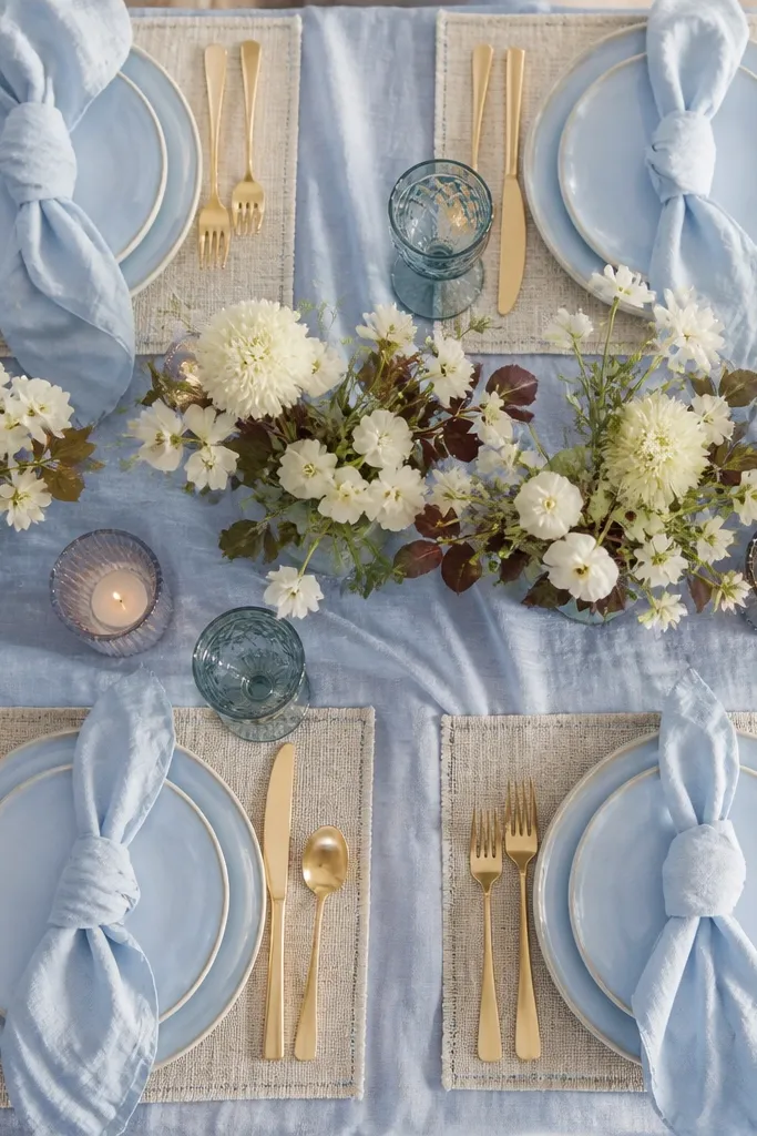
Powder Perimeter is a light powder blue that stays sweet without turning childish. It’s ideal for fall beach weddings when you want the palette to look gentle even with darker foliage and autumn florals. In daylight, it keeps a clean, airy vibe and makes beige and gold tones look intentional. Use it on table linens, reception backdrops, or as a soft wash behind signage. This color also works well with white flowers that aren’t too stark, like creamy garden roses or anemones.
Start by choosing Powder Perimeter for the largest visual area — tablecloths, chair sashes, or the backdrop panel. Then build 30% warm neutral around it: wheat gold, tan, or oat. Add 10% accents in a coastal pop like dusty peach or muted coral, plus silver or clear glass. For photos, keep the powder blue pieces in matte cotton or linen so they don’t reflect harsh highlights.
Quick tipUse powder blue for big surfaces and keep text in a slightly darker blue to prevent blur in phone photos.
Skip thisSkip pairing powder blue with bright red; it makes the palette feel off-season.
5. Denim Harbor
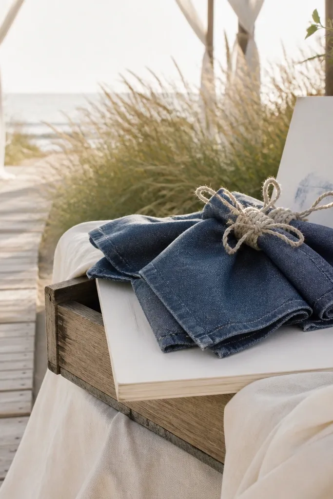
Denim Harbor brings a casual beach energy to aesthetic Fall Blue Wedding Colors while still reading elevated. It’s a deeper indigo with a slightly worn look, so it photographs well with natural wood, rope details, and cream linens. This shade is great for ceremony arch fabric, napkins, and guestbook backgrounds. It pairs beautifully with dried grasses and thistle, which are common in fall and look perfect against a denim-toned backdrop. If you want “breezy” to feel real, denim is the way.
Start by using Denim Harbor on smaller high-impact items first — napkins, a runner, or the arch drape — so it doesn’t overwhelm. Then add 30% warm cream and tan to keep the denim from looking too dark. Finally add 10% coastal pops like seaweed green or warm shell pink. When you order, request a fabric with a visible weave or washed finish; smooth satin denim-tones can look plasticky in photos.
For a beach look, pair denim blues with rope-textured elements like raffia ties or jute twine around vases.
Don’t match denim with black everything; use dark brown leather or brushed metal instead.
6. Seaweed Teal Mist
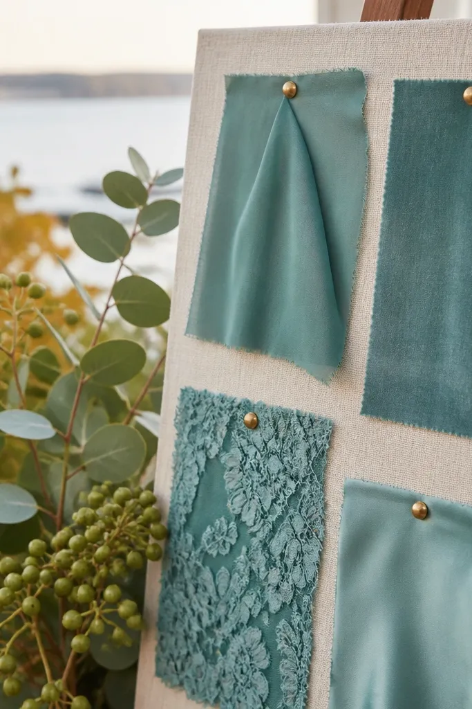
Seaweed Teal Mist is for when you want blue that feels coastal but not overly “sky.” It has green energy, so it looks lush next to eucalyptus and sea grapes. In fall, this shade keeps the palette from turning gray because the undertone pulls warmth from the foliage. It’s a strong choice for bridesmaid dresses, cocktail napkins, or a reception lounge accent wall. Pair it with oat, creamy white, and a muted peach so the teal stays breezy, not moody.
Start by assigning Seaweed Teal Mist to 60% of your green-leaning elements: bridesmaid dresses, signage accent bars, or table runner. Then bring in 30% warm neutrals like oat and cream to balance the green undertone. Finish with 10% peach blush or shell pink plus brushed brass or clear glass. Keep the teal in matte fabrics and avoid high-gloss vinyl signage; it reflects harsh light on the coast.
Quick tipTest teal fabric against eucalyptus in daylight — if it looks too green, shift toward a more blue-leaning teal.
Skip thisAvoid pairing teal with cool gray stone; it makes the palette feel like a winter cabin.
7. Coastal Turquoise Shard
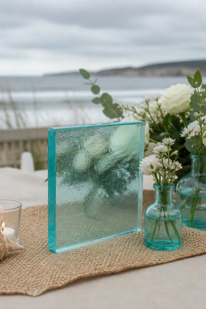
Coastal Turquoise Shard is bright enough to read beachy, but tempered so it still works in fall. Use it as a pop color, not the main blue, because turquoise can take over in photos if you go too large. It looks gorgeous with white blooms, sea-salt textures, and warm sand tones. This shade is especially photogenic for welcome signs, escort cards, and drink labels. If your fall venue has gray sand or weathered wood, turquoise gives you that “wave” feeling without needing summer colors.
Start by choosing a main base color in a softer blue family — periwinkle or sea-glass — and use Turquoise Shard as your 10% pop. Then place it on high-contrast items: welcome sign lettering, napkin rings, or a bar cart accent cloth. Add 30% warm neutrals like sand and cream so turquoise doesn’t look neon. For printing, go with ink on matte cream paper; the matte finish keeps turquoise from looking harsh.
Quick tipUse turquoise only on flat surfaces you can photograph straight-on — it reads cleaner than fabric with folds.
Skip thisDon’t pair turquoise with bright magenta; the colors clash in fall light.
8. Blue-Gray Hydrangea
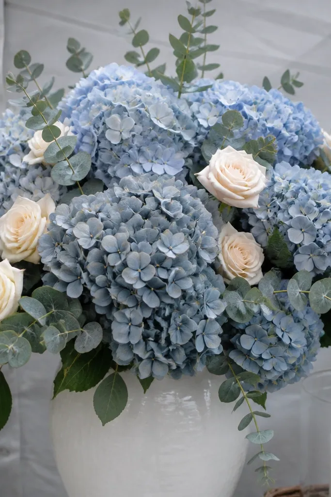
Blue-Gray Hydrangea is the floral color that makes aesthetic Fall Blue Wedding Colors look intentional. It has that soft, cloudy look that sits between slate and periwinkle, so it flatters almost every warm neutral. Hydrangea in this tone also photographs well because it’s not too saturated and it spreads color across the bouquet. It works for bridal bouquets, aisle arrangements, and even ceremony backdrop clusters. Pair it with creamy whites and dusty sage so the blues look like a foggy shoreline, not a painted wall.
Start by basing your floral palette on this blue-gray — it should show up in the bridal bouquet and at least one large installation. Then add 30% warm cream roses or ivory lisianthus so the hydrangea doesn’t look too cool. Finish with 10% accent greenery like eucalyptus or seeded eucalyptus for texture. When ordering, ask your florist for stems that lean “blue-gray, not purple” and request a mock bouquet in daylight if possible.
If you’re doing a fall beach ceremony, keep hydrangea stems hydrated and shade them; wilt shows fast in coastal wind.
Avoid pairing blue-gray hydrangea with icy white snowflake tones — it looks sterile.
9. Dusty Miller Pearl
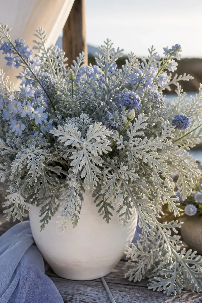
Dusty Miller Pearl is a foliage-led way to get aesthetic Fall Blue Wedding Colors without committing to a single saturated dye. The silvery leaves act like a soft neutral that bounces light, making nearby blues look more airy. It also works beautifully with coastal styling because the texture mimics sea mist. Use it in bouquets, table centerpieces, and aisle garlands to create a breezy look that still feels fall-appropriate. Pair it with sea-glass or powder blue accents for a light, photo-friendly palette.
Start by using Dusty Miller as the “bridge” between blues and warm neutrals — it should cover the majority of your greenery volume. Then add 30% warm cream and sand tones in candles, linen, and shells. Finish with 10% blue accents in ribbon, small florals, or glassware. For arrangements, keep dusty miller toward the outer edges so the silvery leaves frame the blues in photos.
Use dusty miller in clusters of odd numbers for a more natural, shoreline look in pictures.
Skip pairing dusty miller with shiny metallic confetti; it makes the foliage look dull.
10. Driftwood Sand Navy
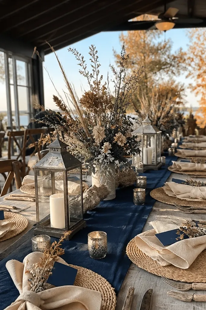
Driftwood Sand Navy is your “grown-up coastal” option for fall when you want depth but not darkness. Navy looks clean in photos, and when you pair it with driftwood sand and oat, it reads beachy instead of formal. This is a strong choice for table runners, ceremony signage, and groomsmen looks. It also helps other fall colors like rust and caramel show up without turning the palette messy. If you want the palette to look cohesive across day-to-night photos, navy is dependable.
Start by making navy your main dark blue at 60% — runner fabric, chair sashes, or a large sign background. Then add 30% driftwood sand or oat in linens and florals. Keep 10% warm rust or caramel in small details like candle holders or shell accents. For best results, choose navy matte textiles and avoid glossy satin that reflects beach glare.
Quick tipUse navy ink for stationery on cream paper; it stays readable in bright afternoon light.
Skip thisDon’t use navy with cool gray only; add warm sand tones so it doesn’t go icy.
11. Periwinkle Lace Ribbon
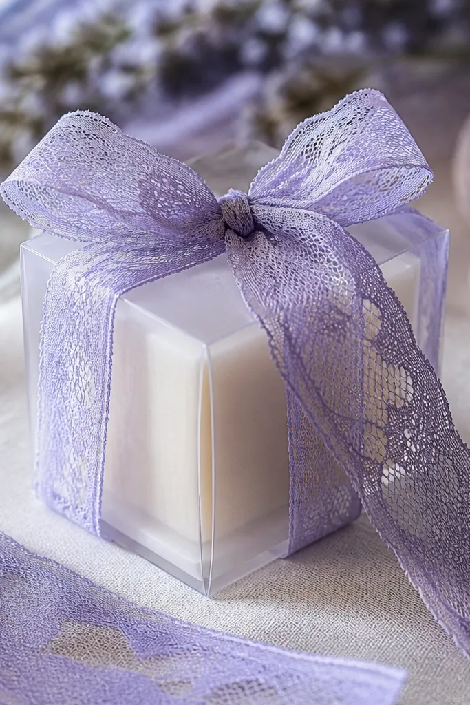
Periwinkle Lace Ribbon is an aesthetic approach to Fall Blue that looks romantic in close-ups. The key is the lace texture, which gives depth even when the color is light. Use it for bottle labels, napkin tying, chair bows, or wrapping around small favors like soaps or mini bottles. In fall beach photos, lace reads soft against weathered wood and natural ceramics. Pair it with warm cream and pearl to keep the palette delicate without losing contrast.
Start by choosing a light periwinkle ribbon and using it in small repeated spots — tie at least 3-5 places so it feels intentional. Then build the rest of the palette with warm cream and sand for 30% neutral. Finally add 10% pearl or brushed silver in candle lids, cutlery accents, or signage hardware. Keep the ribbon matte and avoid shiny ribbon; shine makes lace look cheap in daylight.
Quick tipTie ribbon with consistent loops and trim ends at an angle for a cleaner look in photos.
Skip thisSkip mixing too many blue shades with lace; keep to one periwinkle and one darker blue.
12. Aqua Coastline Coral
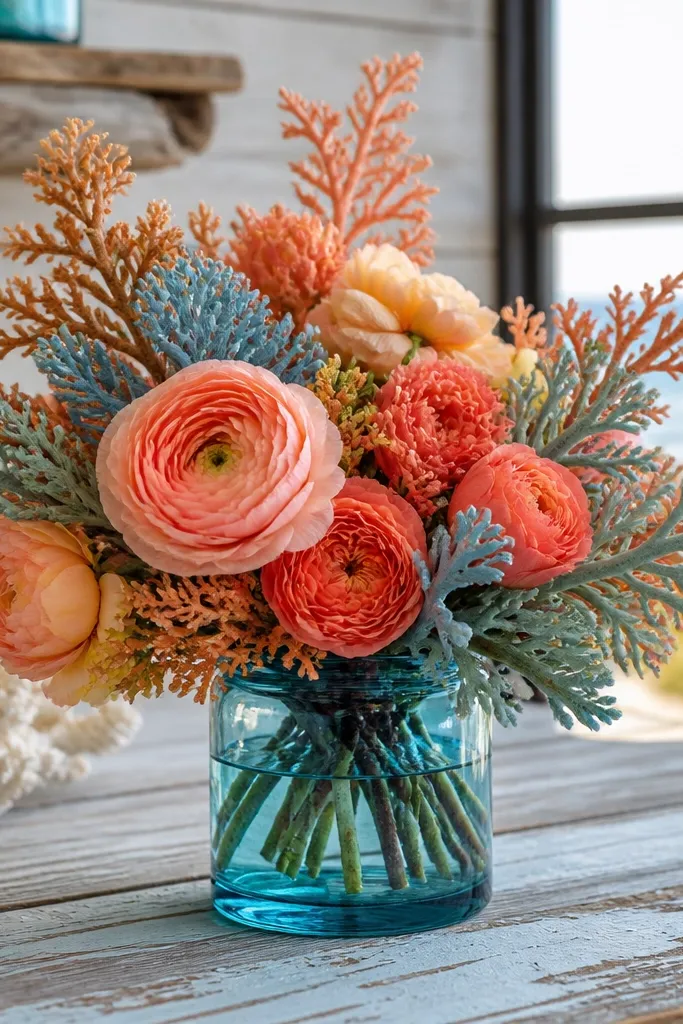
Aqua Coastline Coral is the “breezy pop” that keeps aesthetic Fall Blue Wedding Colors from feeling flat. Coral blush warms up blue and makes the whole palette look like late-summer light still survived into fall. Use it sparingly so the palette stays coastal, not loud. This color shines in florals like peachy ranunculus, coral spray roses, or dried coral-toned elements. Pair it with sea-glass or powder blue so you get the wave effect on camera.
Start by picking a main blue base in sea-glass, periwinkle, or powder blue for 60%. Then add coral blush for 10% — small floral clusters, acrylic acrylic menu lettering, or drink stirrers. Use oat and cream for 30% neutral so the coral doesn’t compete. For bouquets, keep coral toward the center or as a few focal stems rather than filling the entire arrangement.
Quick tipIf your venue is windy, choose coral elements that hold shape well like spray roses or ranunculus, not delicate petals.
Skip thisAvoid bright orange-coral; it reads tropical and can clash with fall foliage tones.
13. Cobalt Tide Ink
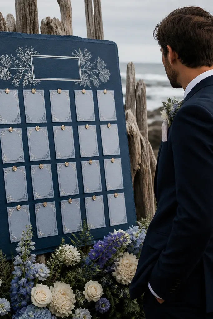
Cobalt Tide Ink is for people who want aesthetic Fall Blue Wedding Colors to look crisp and high-contrast in stationery and signage. Cobalt is saturated, so it reads bold even in overcast coastal light. Use it on invitation typography, welcome board lettering, and escort card borders. This shade also looks great with white florals and warm neutrals because it anchors the lighter blues. If you want your photos to pop without adding extra colors, cobalt is the shortcut.
Start by choosing cobalt ink for text and outlines on cream or warm ivory paper. Then keep the rest of the palette in 60% lighter blues and 30% warm neutrals — you’re using cobalt as the 10% high-contrast. Finish with silver foil accents for a clean coastal shine. Order matte paper and matte ink impressions; gloss can create glare in beach daylight.
Quick tipRun a test print with the exact paper you plan to use; cobalt can shift on textured stock.
Skip thisDon’t use cobalt on large fabric areas; it can look too intense compared to fall florals.
14. Indigo Woven Rope
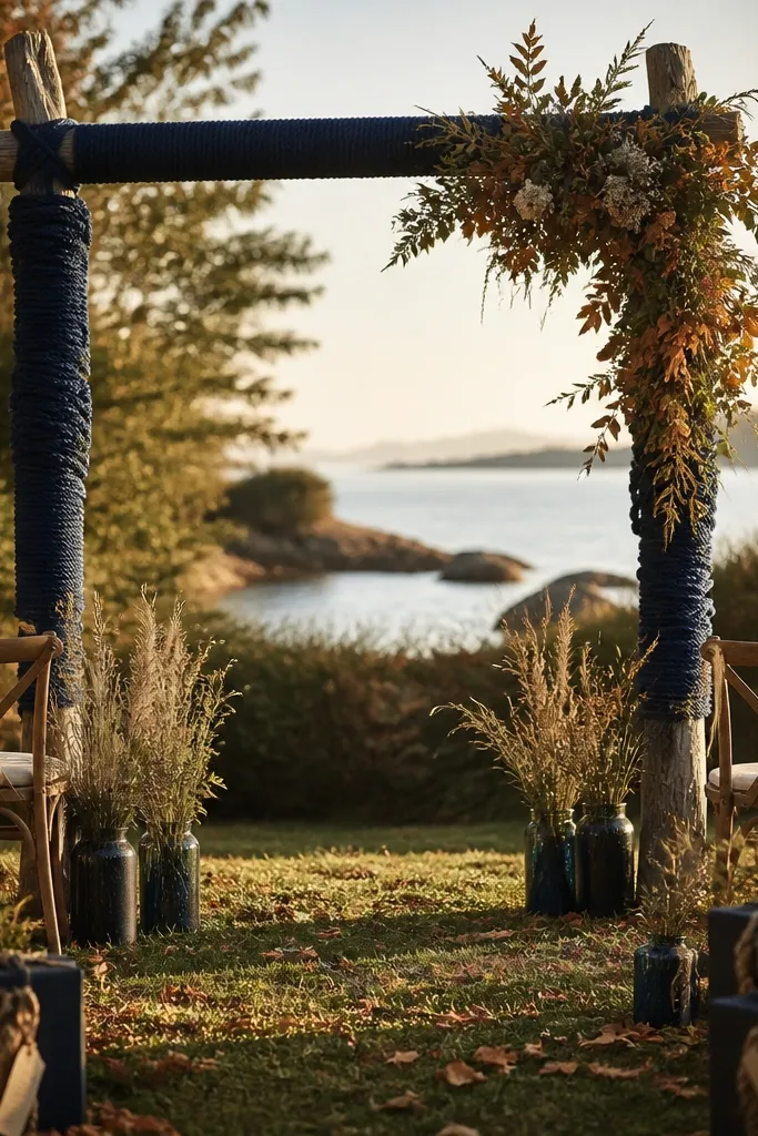
Indigo Woven Rope is a color you get through styling, not dye — it’s the deep blue you see in natural rope with a worn finish. This is the most “beach craft” way to bring aesthetic Fall Blue Wedding Colors into your decor. It looks great on ceremony arches, gift wrap, and tying around glass cylinders. The rope texture also gives your photos depth, which is what makes coastal palettes feel real. Pair it with cream, driftwood, and eucalyptus so it doesn’t turn into a nautical theme that feels costume-y.
Start by selecting natural rope that has an indigo tone and a visible weave. Then use it in repeated tying spots: around vases, wrapped around candle holders, or used as a backdrop trim. Add 30% warm neutrals like cream linen and sand-toned wood. Finally add 10% blue from another shade like sea-glass to connect the look across the decor.
For knots, keep ends short and tuck them behind the loop; messy rope ends show in close-ups.
Skip bright navy ribbon if you’re using indigo rope; it makes the texture look inconsistent.
15. Bluebell Coastal Bloom
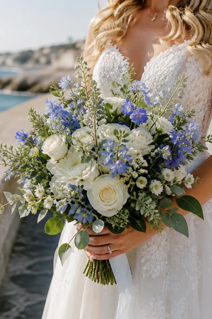
Bluebell Coastal Bloom is a fresh, slightly violet-leaning blue that looks sweet in fall arrangements. It’s photogenic in small doses, especially when scattered through white florals or mixed with silver foliage. Use it for mini bouquets, aisle clusters, or as accent stems in the bridal bouquet. In a beach setting, the slight purple note keeps the blue from feeling like straight sky color. Pair it with creamy whites and muted sage for a soft, coastal fall look.
Start by keeping Bluebell Coastal Bloom to 10-20% of the floral mix so it stays like a wave accent. Then use white flowers and eucalyptus as 80-90% of the bouquet volume. Add 30% warm neutral in linens and candle tones so the blue looks intentional. When choosing stems, ask for blooms that read “powdered blue-violet” rather than deep purple.
Use smaller flower heads in windy locations; they handle gusts better than tall spires.
Avoid mixing bluebell with heavy burgundy; it turns the palette into a fall winery mood.
16. Sea Salt Pearl Gray

Sea Salt Pearl Gray is the neutral that makes aesthetic Fall Blue Wedding Colors look expensive. It’s not a pure gray — it has a soft pearl undertone that keeps your blues from turning dirty. Use it as a background for table settings, photo backdrops, and ceremony signage. This shade is also perfect for fall beach weddings because it matches weathered stone and driftwood naturally. Pair it with powder blue and warm sand so the look stays breezy and light.
Start by using Sea Salt Pearl Gray for the largest neutral surfaces — table runner, backdrop panel, or signage boards. Then choose one main blue at 60% and let pearl gray take 30% as the neutral anchor. Finish with 10% warm sand or caramel details like wood chargers, tan leather menu holders, or amber glass votives. Keep the pearl gray fabric matte so it doesn’t glare in sunlight.
Quick tipIf you’re renting linens, request swatches in the exact venue lighting; pearl gray can go warmer or cooler fast.
Skip thisSkip steel-gray with bright icy blues; the combo can look harsh in fall beach photos.
17. Cyan Wave Glass
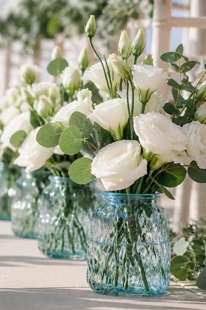
Cyan Wave Glass is about the glass color itself. This shade turns otherwise simple white arrangements into something that looks like coastal art — the cyan tint makes flowers look fresh and bright. It’s especially good for vases, cocktail dispensers, and bud vases along the aisle. In fall beach light, cyan glass adds a cool shimmer without needing saturated blue fabric. Pair it with cream florals and warm neutrals so the glass tint does the heavy lifting.
Start by sourcing cyan-tinted glass vases or using rental glassware with a visible blue tint. Then keep the florals mostly white or cream, so the glass color stays the focal point. Add 30% warm neutral through linens and wood elements. Finally include 10% seaweed green or eucalyptus for a coastal, not sterile, finish. Plan to place glass items where they catch light — near the aisle path or table edges.
Quick tipClean glass thoroughly the day before; fingerprints ruin the tint in photos.
Skip thisAvoid placing cyan glass in deep shade; it turns into plain gray.
18. Blue-Backed Navy Seashell
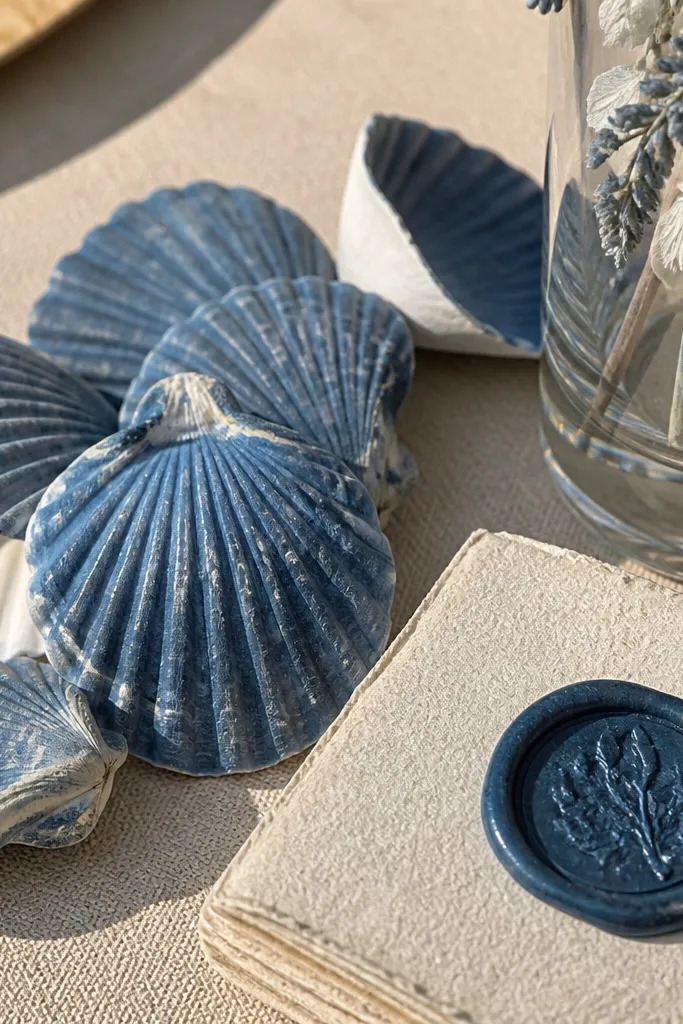
Blue-Backed Navy Seashell is a color idea that comes from coastal finds, and it photographs like a designer palette. The blue is deeper than periwinkle but not as dark as slate, so it sits neatly between your warm neutrals and your lighter blues. Use it as a styling reference for shell accents, wax seals, and dark blue ribbon. It also pairs well with driftwood browns and sea-glass greens. If your venue has lots of natural sand and weathered wood, this shade helps everything look pulled together.
Start by choosing a dark-but-not-black navy for your ribbon, wax seal color, or napkin tone. Then add 30% driftwood and cream so the palette stays warm and beachy. Finally sprinkle 10% sea-glass green or coral blush through small shell accents, menu cards, or floral picks. For a cohesive look, keep all navy elements in the same finish — matte ribbon or matte ink, not mixed glossy and matte.
Quick tipUse shells as accents, not centerpieces by themselves; pair them with greenery so they don’t look like decor only.
Skip thisAvoid combining this navy with lots of bright white; it can look too stark against sand.
19. Periwinkle Sky Backdrop
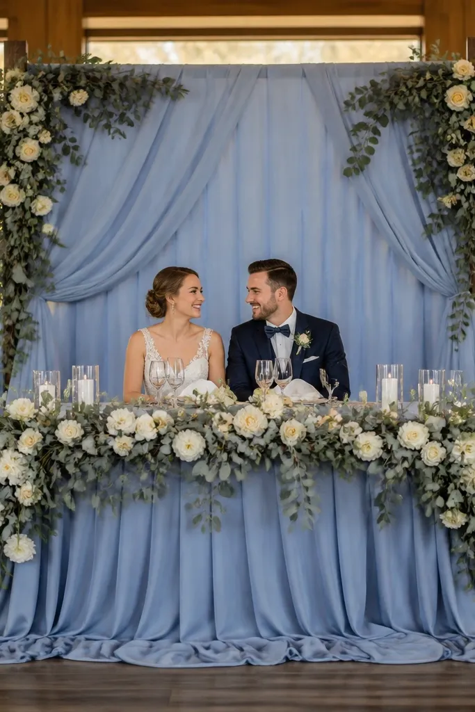
Periwinkle Sky Backdrop is the “photo moment” color for your ceremony or sweetheart table. It looks like open sky in fall photos, especially when you frame it with eucalyptus and cream blooms. This shade is flattering for guests because it doesn’t overpower skin tones, and it keeps the whole scene light even when the sun is low. Use it on draping, a step-and-repeat wall, or a large fabric panel behind the couple. Pair it with warm sand, clear glass, and soft silver so the backdrop feels breezy rather than staged.
Start by choosing a periwinkle drape fabric in matte chiffon, cotton voile, or lightweight linen so it falls naturally. Then build a warm neutral base around it — cream chair ties, oat tablecloths, and sand-toned signage. Add 10% silver or clear glass in candle holders and tableware for shine. Plan your backdrop placement so it faces open sky or bright shade; backlighting can wash out periwinkle fast.
Quick tipHang the fabric slightly higher than you think; it lifts the frame and reduces the “low ceiling” look in photos.
Skip thisDon’t put periwinkle backdrop behind dark wood without neutral buffers; it can look muddy.
20. Arctic Coastal Mist
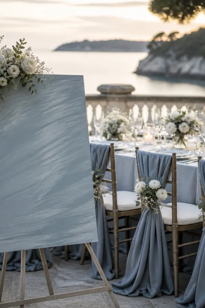
Arctic Coastal Mist is a cool, pale blue that reads like sea air in fall. It’s not icy — it’s softer, with a gray-blue cast that still feels airy. This color is best for bridesmaid dresses, table overlays, and airy signage panels where you want a clean, calm look. Pair it with crisp white flowers and silver accents to keep it bright. If you’re working with a beach venue that has lots of dark elements like weathered docks or black railings, arctic mist helps balance the scene.
Start by using Arctic Coastal Mist for 60% of the light blue areas: dress tones, table overlays, or a backdrop wash. Then add 30% warm neutrals like cream and oat so it doesn’t go fully cold. Finish with 10% silver and clear glass — choose brushed metal finishes for a softer shine. For photos, keep this shade in matte or lightly textured fabrics; smooth satin can glare in sun.
Pair arctic mist with cream, not bright white, to avoid a harsh clinical look.
Skip charcoal-heavy palettes; arctic mist needs warmth around it.