1. Pumpkin Spice + Dark Chocolate + Burnished Gold
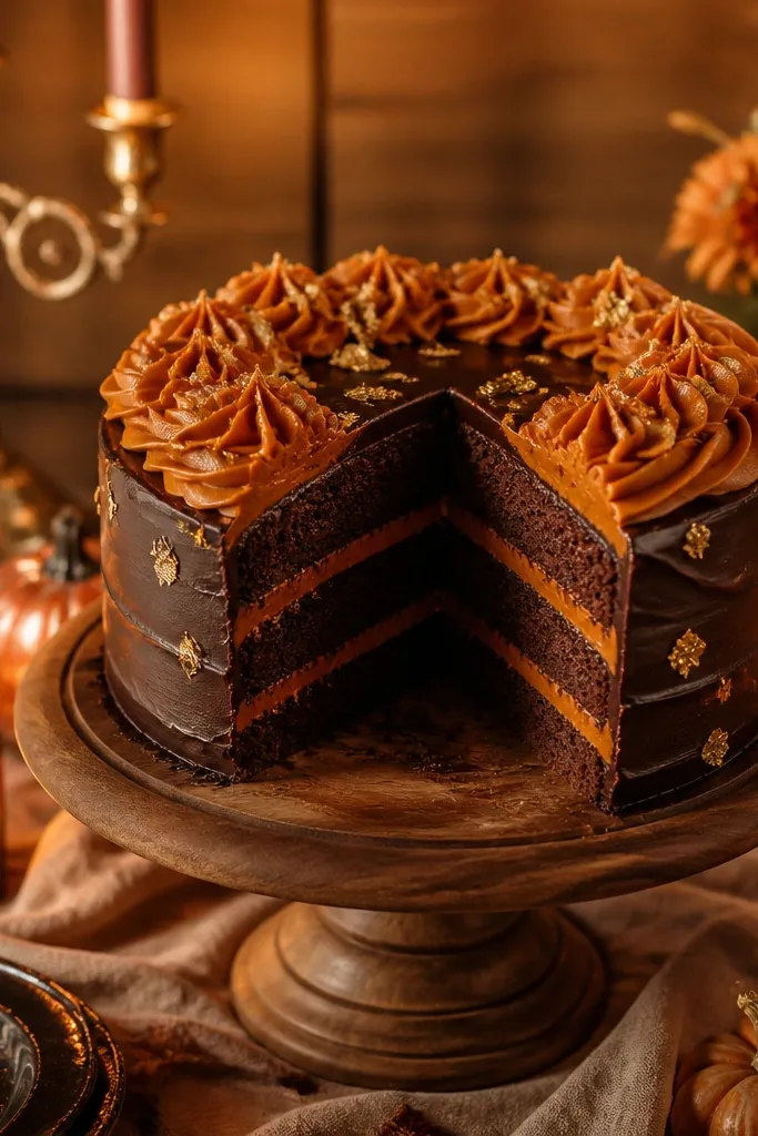
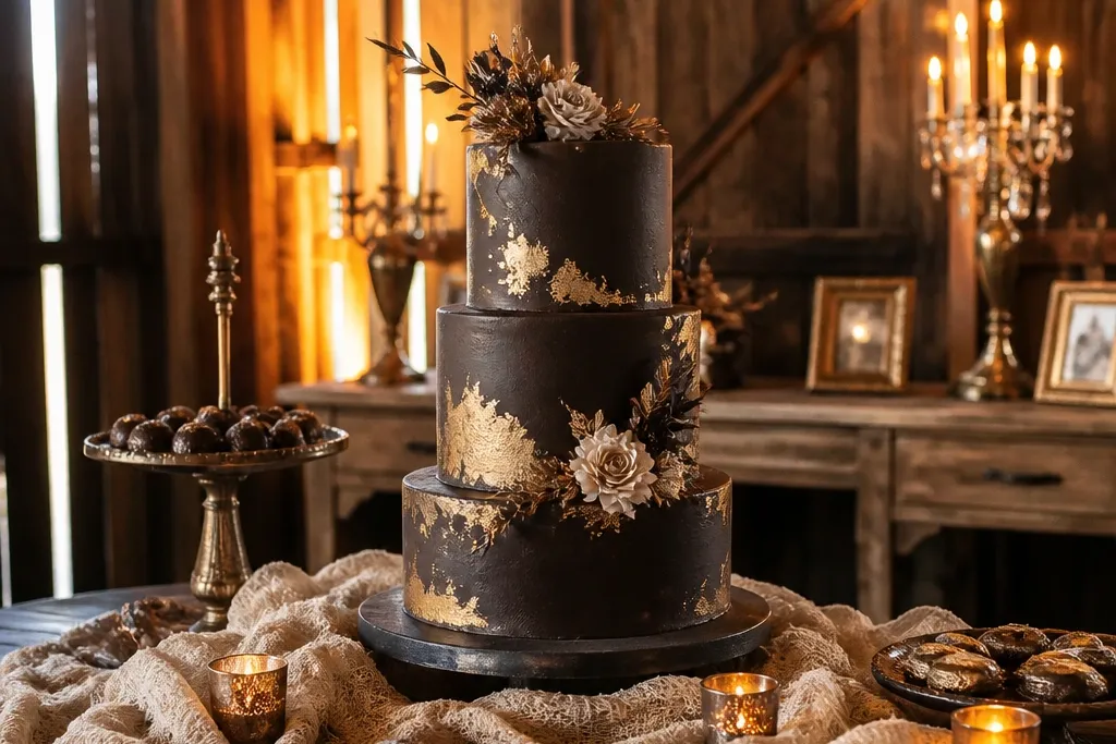
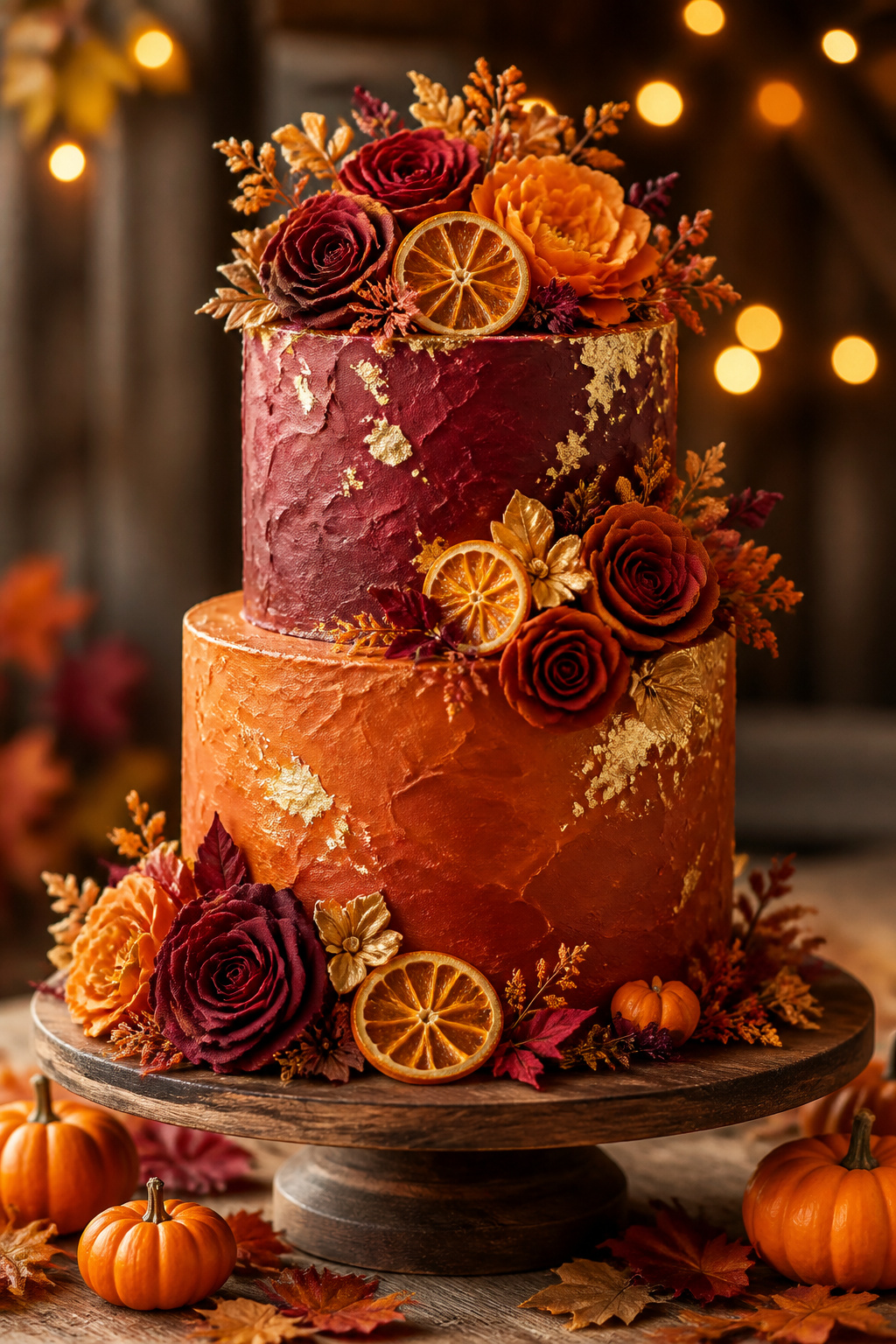
This combo makes October feel obvious without looking like a theme party. Pumpkin spice orange looks rich against deep chocolate brown, and the burnished gold keeps it from turning flat. It’s especially photogenic for cake tables with warm wood, tan linens, or amber uplighting. If your florals lean toward orange-brown tones, this palette locks the whole scene together. It also works well with a simple centerpiece because the color contrast does the heavy lifting.
Start by choosing a pumpkin spice orange for the top tier and a chocolate brown for the base tier. Then add burnished gold accents in three places: a thin gold brush on cake sides, edible gold leaf on one tier, and gold-toned sugar pearls around the bottom. Keep the neutral consistent across the table with either cream or warm beige for napkins and plates. For ordering, ask your baker for color-matched buttercream or ganache tones so the orange stays saturated. Spend about 2-3 weeks before the wedding doing a small color test with your venue’s lighting if you can.
Bring one photo of your venue’s lighting (even a quick phone shot) to your baker so the orange doesn’t go muddy.
Skip bright neon orange — it reads Halloween instead of wedding in October.
2. Cranberry + Espresso + Copper Glaze
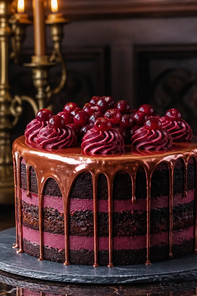
Cranberry brings the “fall fruit” vibe that looks expensive on camera. Espresso brown gives structure and keeps the red from looking too candy-like. Copper glaze ties in perfectly with autumn metal decor like candelabras and antique frames. This is a strong pick for venues with dark wood, burgundy bridesmaid dresses, or moody floral arrangements. It also pairs well with blackberries and pomegranate garnishes, which look great as edible pops.
Quick tipUse a satin-finish copper (not shiny foil) so it looks warm and smooth under overhead lights.
Start by frosting the middle tier cranberry and the bottom tier espresso brown. Then make copper the accent, not the main color: add a copper glaze drip on the cranberry tier and a copper dust on the espresso tier edges. Place 1-2 copper elements in the rest of the dessert lineup, like copper foil cupcakes liners or copper sugar crystals on cookies. Get your cranberry shade right by asking for a red with a slight purple undertone, not a pure cherry red. Book tastings early because cranberry shades can vary a lot between brands.
Skip thisDon’t add too much black — espresso plus cranberry already gives the drama.
3. Burnt Sienna + Oat Cream + Dark Bronze
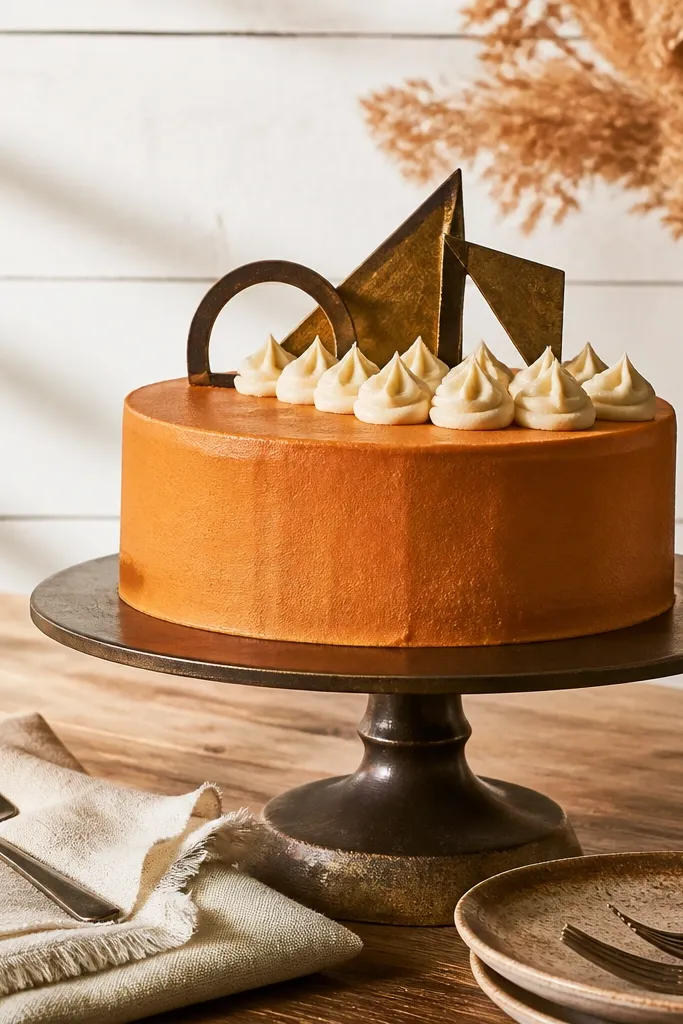
Burnt sienna is the underrated October color that makes everything feel grounded. Oat cream keeps it soft and wedding-appropriate, and dark bronze adds depth without going loud. This palette shines in minimalist or “modern farmhouse” setups where you want fall color but not heavy contrast. It also flatters skin tones in photos and looks calm next to neutral tableware. If your bouquet has dried grasses or olive greens, this combo will look like it belongs.
Start with oat cream as your base neutral for tiers or filling, then use burnt sienna for the main frosting color. Add dark bronze as a thin line detail: bronze outline on cake drips, bronze leaf on one tier, and bronze dusting on macarons. Keep the rest of your palette neutral — warm white, oat, or light tan — so the sienna stays the star. For travel planning, pack a small vial of bronze edible dust if you’re doing any DIY touchups day-of. Build the dessert table around one fabric color (oat or cream) so the cake colors look intentional.
Ask for a “slightly matte” buttercream if you want the bronze to read sophisticated, not glittery.
Skip cool gray neutrals — they fight the warm sienna and make the palette look off.
4. Fig Jam + Vanilla Bean + Antique Gold
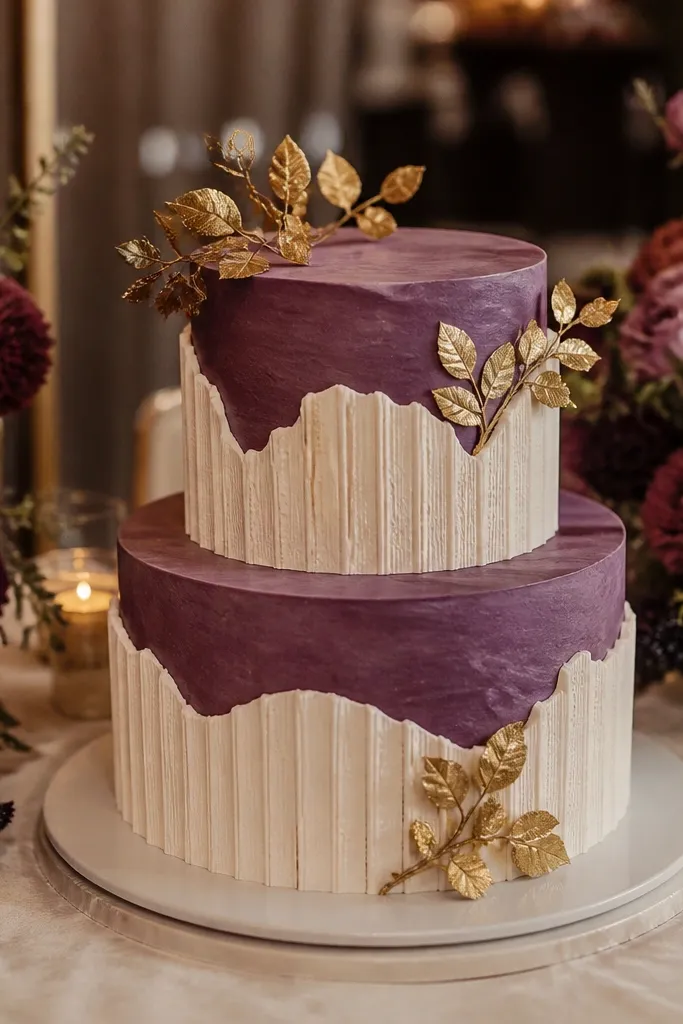
Fig jam color — that deep purple-brown — looks lush and grown-up. Vanilla bean keeps it light enough for a dessert table that still feels airy. Antique gold makes fig look rich instead of heavy, especially under warm venue lighting. This palette is perfect if your flowers include plum, mauve, or dark burgundy blooms. It also works when your wedding style is more upscale and less rustic.
Start by making fig jam the main frosting for the top tier, with vanilla bean on the bottom tier. Then add antique gold in small, repeated details: gold leaf on one edge, gold sugar pearls on the center tier, and a thin gold brush on cake sides. Keep your fillings visible by using a vanilla bean mousse or buttercream filling so the cross-section looks clean. When you test colors, ask your baker to show fig jam in daylight and in warm indoor light. If you’re ordering premade decorations, match the gold tone first because gold shifts the whole palette.
Choose fig jam shades that lean slightly red — it reads more flattering in photos than purely purple.
Don’t pair fig with bright orange — it makes the fig look muddy.
5. Forest Green + Maple Cream + Champagne Gold
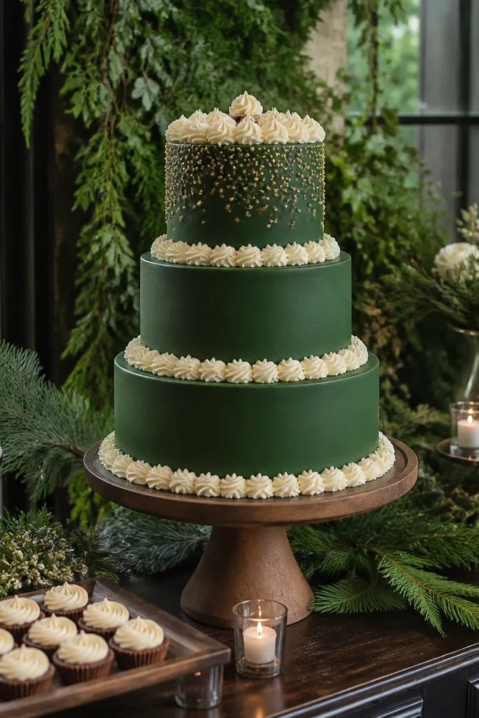
This is the palette for October weddings that still feel like late-summer greenery. Forest green looks crisp against maple cream, and champagne gold gives that celebratory shine. It’s a standout choice if your venue has greenery walls, evergreen garlands, or lots of dark furniture. The color contrast reads clean in photos, which is exactly what you want on a dessert table with multiple items. It also makes edible leaves and chocolate bark look like they belong.
Quick tipKeep forest green slightly muted; neon green turns plasticky fast in warm rooms.
Start by frosting one tier forest green and keep another tier maple cream or vanilla with a warm caramel tint. Add champagne gold using edible spray or a light brush over textured piping, then sprinkle crushed gold sugar over one tier edge. For a cohesive look, use maple cream as the neutral across cookies and small desserts. If your baker can’t match maple cream, use a caramel-vanilla base and reduce the sweetness with a pinch of salt in the recipe. Plan to do one pre-wedding photo check: take a shot of the cake mockup in the venue lighting.
Skip thisSkip bright white frosting — it can look too harsh next to deep greens.
6. Saffron + Warm White + Antique Brass
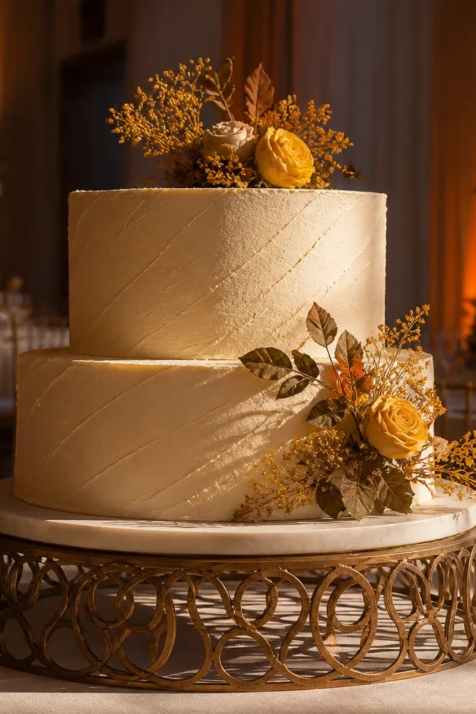
Saffron is fall’s answer to “golden hour,” and it photographs beautifully when you pair it with warm white. The color is sunny without being bright like school supplies, so it works for October when the light is already golden. Antique brass adds a grounded metallic tone, not flashy. This palette looks stunning with dried florals like marigolds, wheat, and goldenrod, plus cream-colored linens. It also makes fruit desserts like pears and figs look more polished.
Start with warm white for the base tier and saffron for the top tier or middle tier. Add antique brass accents as thin lines and small leaf shapes on one side of each tier so it looks styled, not scattered. If you’re adding macarons, use warm white shells with saffron filling for a clean color rhythm. Ask your baker for a saffron shade that’s closer to muted mustard than bright yellow. For travel logistics, transport any brass edible decorations in a sealed container so they don’t pick up humidity.
Use saffron in a textured piping style; smooth frosting can show streaks more easily.
Avoid chartreuse tones; they turn sickly under warm lights.
7. Pomegranate + Mocha + Rose Gold Dust
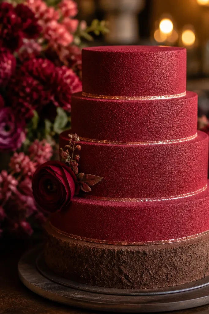
Pomegranate red is deep enough for October but still lively, and it reads romantic on dessert tables. Mocha brown keeps the red from looking too sharp, and rose gold dust adds a soft glow without turning glittery. This palette is best when your florals include burgundy, rose, or deep pink tones. It also works well in venues with pinkish uplighting or warm candle setups. If you want a cake that looks like a jewelry box, this is it.
Start by frosting the main tier pomegranate and keep the other tier mocha for contrast. Add rose gold dust to piping ridges, then add a few dusted berries or chocolate curls on top. Repeat the rose gold once more on the dessert table with rose gold sugar pearls or a dusted cookie. For color accuracy, ask for pomegranate with a slight berry undertone so it doesn’t go orange. Build your table with at least one neutral — cream or warm beige — so the red and brown stay balanced.
Do a quick test print or sample photo with rose gold dust in your venue lighting so you don’t get surprise orange-brown tones.
Don’t add too much bright pink — it competes with pomegranate.
8. Smoked Peach + Vanilla Bean + Copper Sprinkles
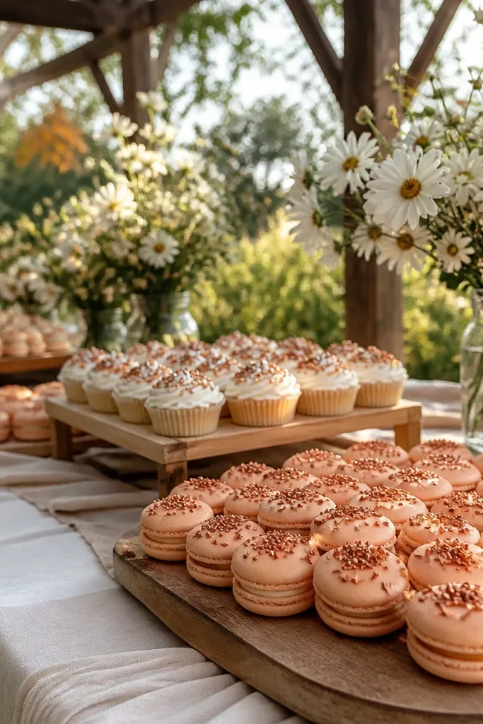
Smoked peach gives you fall warmth without going full orange. Vanilla bean keeps it bridal, and copper sprinkles add the sparkle that makes desserts look celebratory. This palette is great for October weddings that want softness — think garden venues, light wood tables, and airy floral designs. It also looks good with caramel apples, peach macarons, or cinnamon cookies. The trick is keeping the peach muted so it stays sophisticated on camera.
Quick tipChoose peach that matches dried peach tones in florals; fresh bright peach will look off.
Start with vanilla bean as your base and use smoked peach on the outer tier or as a gradient. Then add copper sprinkles only at the edges or as a light scatter on the top — keep it controlled. Use copper again on one accessory like copper-toned cake toppers or a copper ribbon tied around a dessert stand. Ask your baker to mix peach with a touch of brown or mauve so it reads “smoked,” not pastel. If you’re doing a tiered display, keep the peach only on the top tier for a cleaner look.
Skip thisSkip white-on-white peach gradients; they can look washed out under warm lighting.
9. Smoked Plum + Cream Cheese Frosting + Black Cocoa
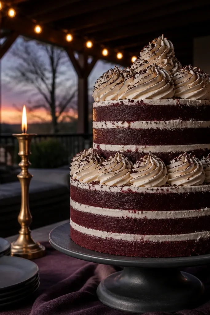
Smoked plum is moody and flattering, and it pairs perfectly with cream cheese frosting for a tangy, balanced flavor profile. Black cocoa dust adds depth and makes the plum look richer. This palette is ideal for October evenings when you want the dessert table to look dramatic but still elegant. It also works with velvet or textured finishes, because the dark dust hides imperfections. If your venue is a ballroom with dark drapes, this palette pops without needing loud colors.
Quick tipUse cocoa dust on corners and piping ridges; it looks intentional rather than messy.
Start by frosting one tier smoked plum and leave the other tier cream cheese white with a slight warm tint. Dust black cocoa lightly over the plum tier edges and add a few cocoa-stained chocolate shards. Use the same plum color for macarons or mini cakes so the table reads cohesive. Ask for black cocoa dust, not black food coloring; it looks more natural and less harsh. Plan for extra transport care since plum frosting can scuff — pack tiers securely and keep them cool.
Skip thisDon’t use pure black frosting — it makes plum look flat.
10. Teak Brown + Almond Cream + Gold Leaf Flecks
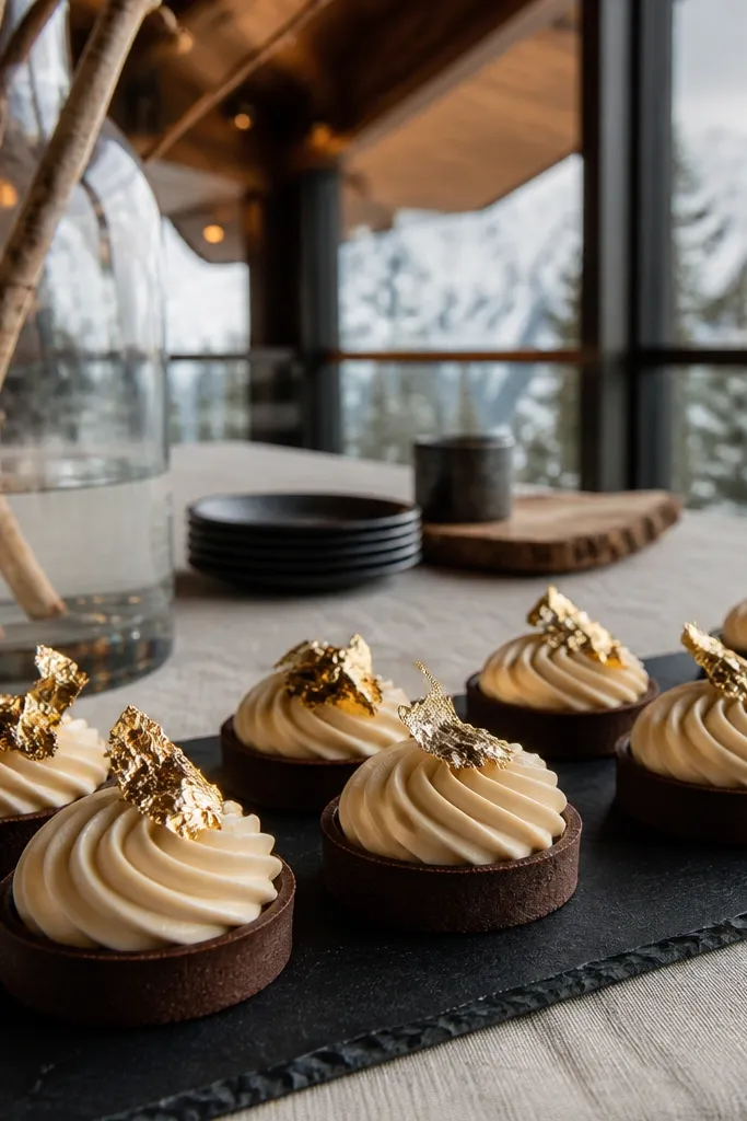
Teak brown is warmer than espresso but darker than caramel, and it looks grounded and modern. Almond cream is the soft counterbalance, which keeps this palette from feeling too heavy. Gold leaf flecks bring fall celebration without needing a full gold layer. This palette suits minimalist dessert tables where you want texture and tone rather than loud color blocks. It also pairs well with cakes that have smooth sides and clean piping.
Start with teak brown on the sides and almond cream on the top tier or filling layers. Add gold leaf flecks in a scattered pattern across the top — keep it to one tier so it doesn’t look random. If you’re using a naked cake style, make sure the cake crumb color matches teak so the exposed layers don’t look pale. For travel and setup, bring a small sheet of parchment for any gold leaf touchups so you don’t contaminate other desserts. Time-wise, do your gold leaf application as close to serving as possible to keep it looking sharp.
If you can only choose one finish, go smooth sides with a textured top — it reads expensive in photos.
Avoid pairing teak brown with cool gray plates; warm tones look cleaner.
11. Red Velvet Berry + Vanilla Rose + Burnished Bronze
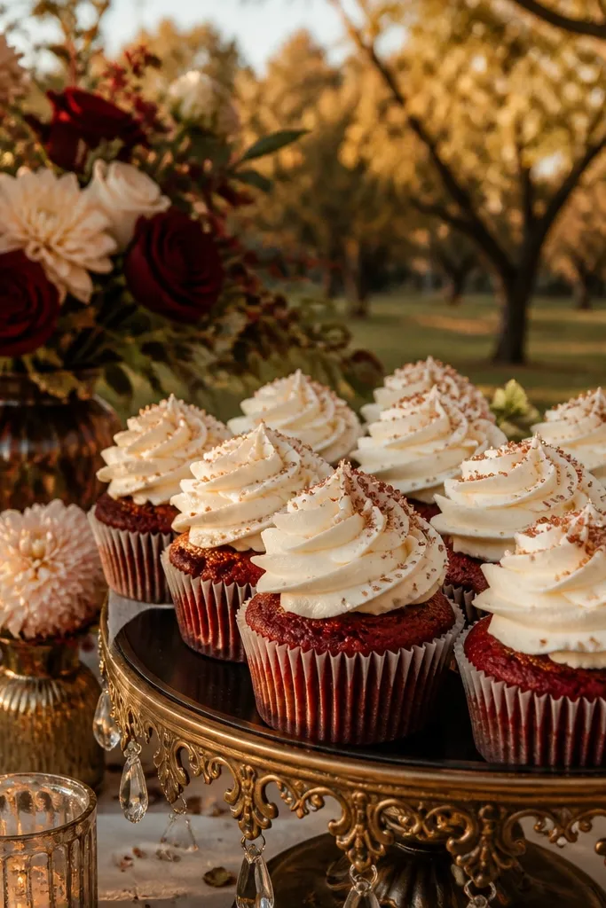
This palette is romantic and photogenic: deep berry red looks rich, vanilla rose keeps it soft, and burnished bronze adds warmth. It’s a great choice when your bouquet has roses, dahlias, or berry-toned blooms. The bronze is what makes it feel October instead of classic winter — it ties into dried stems and antique decor. This palette also helps if your cake table has a lot of greenery, because bronze makes the greens look intentional. It’s a strong pick for dessert tables with layered heights.
Quick tipUse rose glaze only on one dessert type, like cookies, to avoid the table getting too pink.
Start by choosing berry red velvet for one tier and vanilla rose for another tier or filling. Add burnished bronze by dusting the top edges and piping lines, then add one bronze accent cluster near the cake topper. Keep your other desserts in the same color family: berry macarons, vanilla cookies with rose glaze, and chocolate-covered berries. Ask your baker to keep the berry red slightly more purple than orange, so it doesn’t clash with rose tones. Plan to do a color check with your florals — bring a ribbon sample that matches your bouquet.
Skip thisSkip bright red — it looks harsh next to rose and bronze.
12. Caramel Apple Green + Warm Tan + Copper Candy Drips
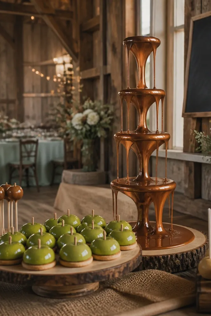
Caramel apple green sounds risky, but it looks amazing when it’s muted like an orchard leaf, not a neon sports color. Warm tan makes it wearable, and copper candy drips give it that fall dessert energy without turning childish. This palette is ideal for rustic venues that still want a styled look — think barn doors, plaid textures, and wood rounds. It also works when your florals include apple greens, sage, or olive. The key is using green as an accent or top tier, not the whole table.
Quick tipChoose a green that matches sage or dried olive tones; it photographs more flattering under warm lighting.
Start with warm tan as your base neutral and use caramel apple green for one tier or as a gradient. Then add copper candy drips on top — keep the drips thin and glossy so they read like caramel. Repeat copper once on the dessert table using copper chocolate curls or copper-colored sugar crunch. For transport, keep the drips protected; glossy caramel drips scuff if tiers rub. Book your cake order early because green gel colors can take extra time to match.
Skip thisDon’t pair green with stark white — it makes the palette look unbalanced.
13. Rust Orange + Creamy White + Blackened Iron Details
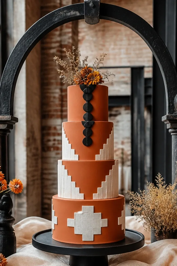
Rust orange is autumn without going full pumpkin. Creamy white keeps it bridal and brightens photos, while blackened iron details add sharp contrast and make the orange look intentional. This palette is especially good for venues with black metal accents — arches, frames, or industrial lighting. It also works when you want a modern-rust look with clean lines. If your dessert table has geometric trays or black candle holders, this palette will match them without extra effort.
Start with creamy white frosting for the base tier and rust orange for the top tier or main color band. Add blackened iron details using edible black cocoa dust on edges or black sugar pearls placed near the cake topper. Keep the black accents limited to one tier and one dessert type so it doesn’t dominate. If you’re doing a drip cake, keep the rust drip thick enough to show texture, not thin like syrup. For cost control, ask for a simple piping pattern rather than heavy fondant — the color contrast does the work.
Use matte black elements on the table; shiny black can look plasticky in warm rooms.
Avoid mixing rust orange with bright yellow — it clashes under October lighting.
14. Dried Rose Mauve + Oat Bisque + Rose Champagne
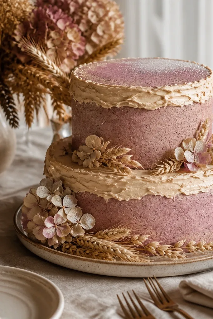
Dried rose mauve is fall-forward without turning into a Halloween orange. Oat bisque keeps it warm and soft, and rose champagne shimmer makes it feel celebratory. This palette is perfect when your florals are more blush, mauve, or dusty pink, with late-season textures like dried hydrangea and wheat. It also photographs beautifully on cream linens and neutral tableware. Choose this if you want October colors that look romantic and not overly bold.
Quick tipMatch the mauve to your dried florals; if your bouquet is more pink, go slightly lighter mauve for consistency.
Start by frosting the top tier dried rose mauve and keep the bottom tier oat bisque or vanilla tinted to a warm cream. Add rose champagne shimmer as a light dust on piping ridges and a few shimmer dots on the top. Repeat the mauve color in macarons or a cookie glaze so the table looks connected. Ask for shimmer dust that reads rose-gold, not glitter — glitter catches harsh highlights. Plan your dessert table layout so the shimmer hits light from one direction, like near a window or candle line.
Skip thisSkip cool gray undertones; they make mauve look tired.
15. Chocolate Hazelnut + Caramel Toffee + Dark Gold Leaf
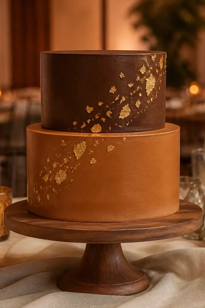
Chocolate hazelnut and caramel toffee make a fall dessert table look instantly cozy and expensive. Add dark gold leaf, not bright yellow gold, and you get a warm glow that pairs with nearly every fall floral color. This palette is great for venues with amber lighting, wood tones, and neutral linens. It also gives you flexibility: you can add nuts, chocolate shards, or caramel apples without breaking the color story. If you want a cake that looks good even from across the room, this is the combo.
Quick tipToast the hazelnut crumbs lightly; the nut color looks more golden under warm light.
Start by frosting one tier chocolate hazelnut and another tier caramel toffee, then keep the filling visible with a swirled layer. Add dark gold leaf sparingly — one tier top and a few flakes on the side — so it reads styled. Use toasted hazelnut crumbs as a texture layer on the base tier for visual depth. Ask your baker for toffee that’s closer to deep caramel than pale butterscotch so it stays rich. For travel, keep caramel elements in sealed containers and assemble the gold leaf only after the cake is in place.
Skip thisDon’t overdo caramel color — too much orange caramel makes the whole table look greasy.