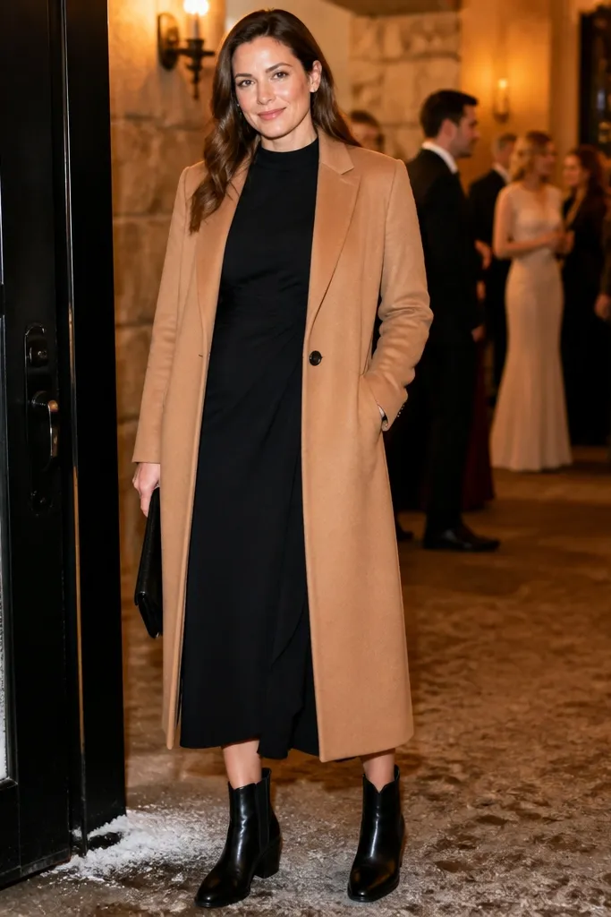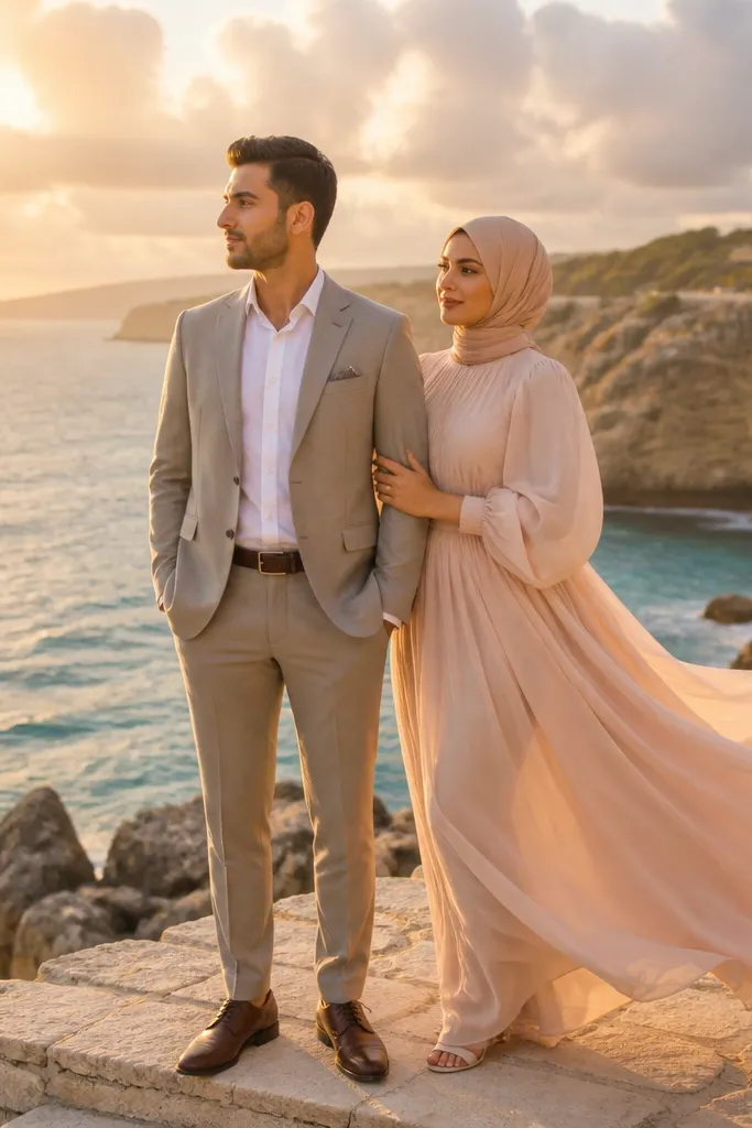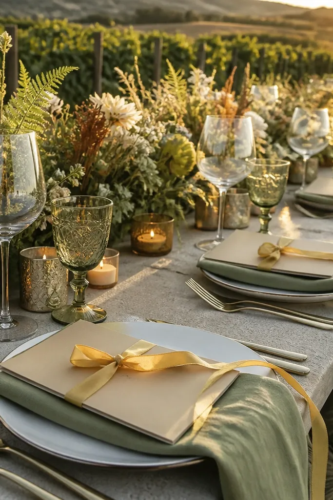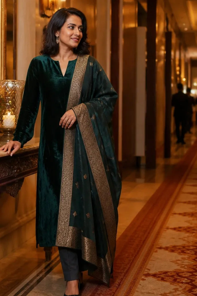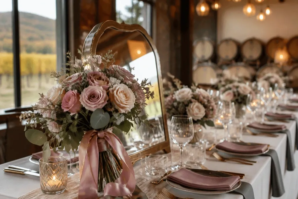
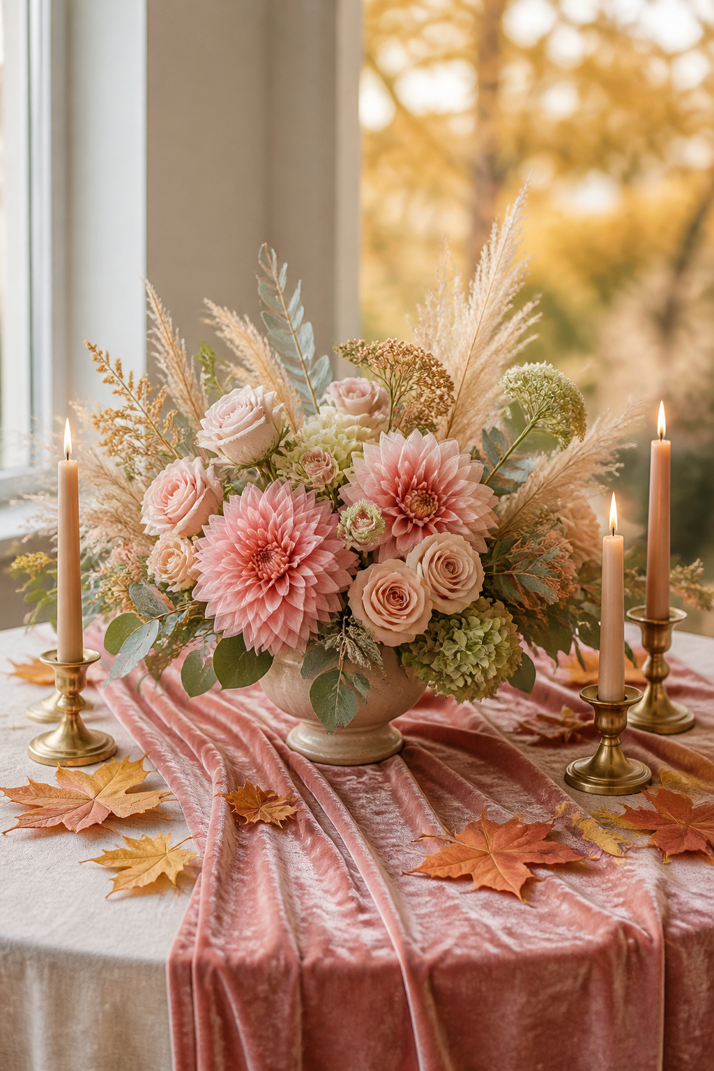
1. Dusty Rose + Espresso Brown + Antique Gold
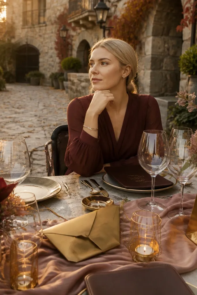
This is the fall pastel color combo that always looks expensive because it has true contrast. Dusty rose stays soft without fading into the background, and espresso brown gives the palette structure against wood, stone, and outdoor foliage. Antique gold adds that warm glow without turning the whole design yellow. This works especially well for evening ceremonies and venues with amber lighting, because the rose doesn’t fight the warmth and the gold catches it.
Start by choosing dusty rose as your hero color in bouquets and bridesmaid dresses. Then set your anchor with espresso brown for table runners or chair ties and pick antique gold for candle holders, frames, or flatware accents. Finally, keep signage simple: espresso ink on cream cardstock with a small antique gold foil seal. For flowers, look for dusty rose peonies, garden roses, and ranunculus, and add greenery that leans gray-green so it doesn’t brighten the palette too much.
Quick tipBring a sample swatch of your dusty rose to the venue daylight at the same time you’ll do photos, then adjust if it looks too pink or too gray.
Skip thisAvoid bright fuchsia or hot magenta accessories; they’ll overpower the pastel softness.
2. Sage Gray + Soft Ivory + Brushed Copper
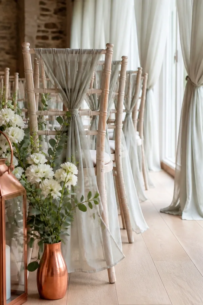
Sage gray is the most photogenic fall pastel because it reads natural next to leaves and still looks clean indoors. Pairing it with soft ivory keeps everything airy, while brushed copper adds a warm highlight that matches fall sunsets. This palette looks especially good for daytime ceremonies and indoor venues with white walls, because the ivory brightens the frame and the copper keeps it from looking sterile. It also photographs well in wide shots where you want the design to feel calm and intentional.
Start with sage as your base by using sage linens, napkins, or floral foam-free greenery installations. Then add soft ivory through tablecloths, invites, and any fabric draping so the palette has breathing room. Finally, choose brushed copper for small details like bud vases, escort card stands, or candle holders. For flowers, build with sage-toned eucalyptus, dusty-white dahlias, and pale cream roses so the whole mix stays muted.
Quick tipIf your venue is very warm-toned, choose copper that’s more brushed and less shiny to avoid harsh reflections.
Skip thisSkip bright white and icy gray at the same time; it makes the design look accidental.
3. Apricot Peach + Charcoal + Warm Gold
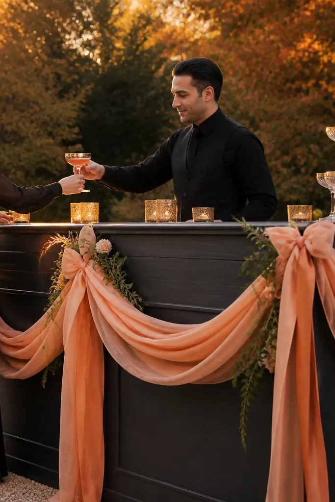
Apricot peach is the fall pastel that looks alive instead of washed out. Charcoal gives it real contrast, so the peach stays readable in photos even when the background is busy with trees or wood beams. Warm gold ties the look to fall lighting without going full glam. This works best for garden-to-cocktail transitions where you’ll take both daylight and evening photos.
Pick apricot peach as the hero by using it in your main bouquet and in bridesmaid dresses or groomsmen boutonnieres. Then use charcoal as your anchor across signage, table runners, and chair tie ribbons. Add warm gold through candle stems, frame accents, or a thin gold rule line on paper goods. For floral variety, combine peach-toned ranunculus with dusty orange dahlias and cream spray roses to keep the palette layered.
Use charcoal on printed pieces, not on everything; too much dark fabric can make the event feel heavy.
Don’t pair apricot with pure black; it looks too stark and kills the pastel softness.
4. Periwinkle Blue + Mushroom Taupe + Antique Silver
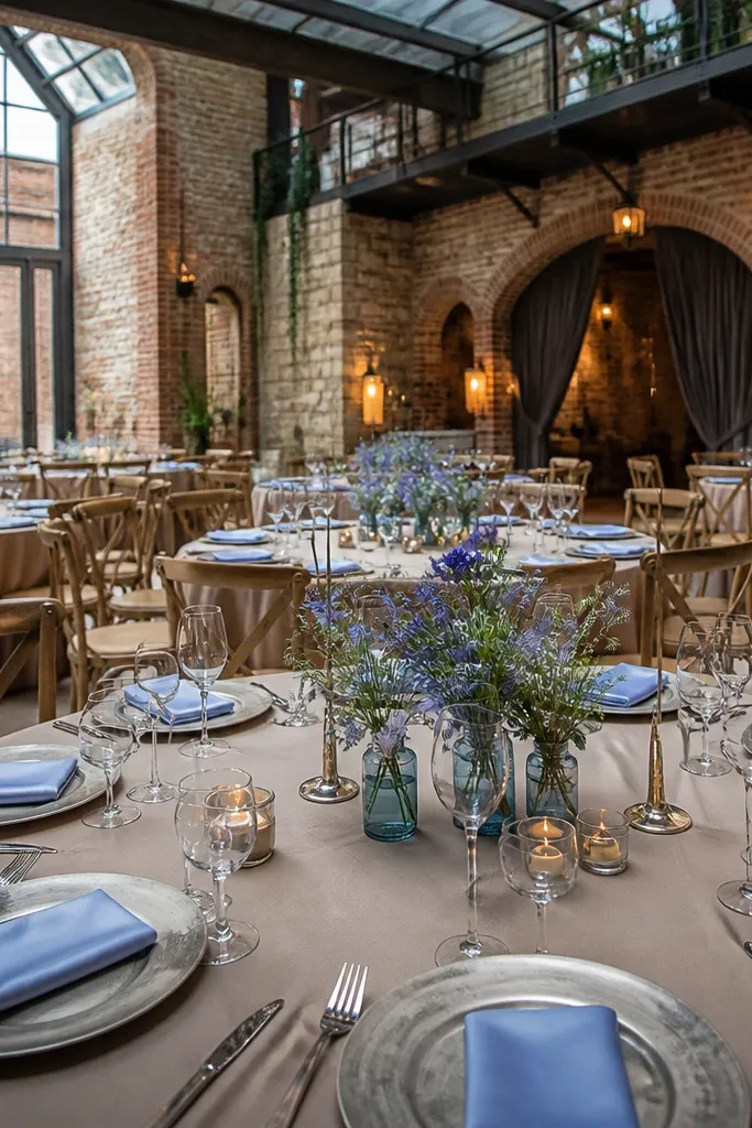
Periwinkle blue is a cool pastel that stays flattering in fall because it leans slightly gray instead of icy. Mushroom taupe grounds it, so the blue doesn’t look like spring. Antique silver adds a soft metallic that doesn’t fight with cool tones. This palette is ideal for venues with lots of stone, brick, or neutral walls, where cool colors can otherwise look washed out.
Start with periwinkle in bouquets, table florals, or bridesmaid dresses. Add mushroom taupe through linens, napkins, or a textured table runner so the palette has warmth without turning orange. Choose antique silver for cutlery accents, frame edges, or small candle holders. Keep paper goods cool: periwinkle ink on warm taupe cardstock, then add a thin silver line border for cohesion.
Quick tipIf your venue has strong yellow lighting, use more taupe and less silver so the blue stays true.
Skip thisAvoid bright white tablecloths; they make periwinkle look too pale on camera.
5. Dusty Lavender + Cocoa Brown + Aged Brass
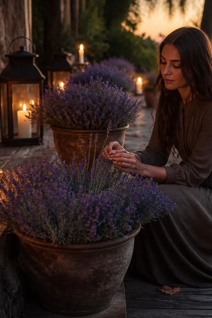
Dusty lavender reads romantic in fall without turning into that winter-violet look. Cocoa brown keeps the palette warm and grounded, and aged brass adds a golden tint that feels like late afternoon. This combo looks great for outdoor venues because lavender sits nicely against wood and leaf textures. It also works for couples who want pastel color but don’t want it to look childish.
Choose dusty lavender as your hero color in flowers and a small amount in paper goods, like envelope liner or menu accents. Then build the anchor with cocoa brown through table runners, escort card backing, and chair tie ribbons. Add aged brass in small hardware details like signage clips, bud vase bases, or candlestick accents. For florals, use lavender-toned stock, pale purple lisianthus, and cream roses so the purple stays soft instead of saturated.
Use lavender sparingly in large areas; it looks best when it’s concentrated in bouquets and focal decor.
Skip neon purple or bright lilac — it will look out of season fast.
6. Soft Peach + Olive Green + Antique Gold
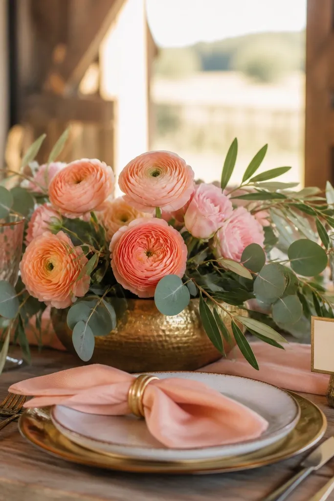
Soft peach and olive green feel like fall produce, and that’s why they photograph so well. Olive brings a natural, slightly muted depth that makes peach look warmer and more flattering. Antique gold then gives you that celebration glow without making the palette too formal. This is a strong pick for rustic venues and farm-style ceremonies where you want the decor to blend with the setting instead of fighting it.
Start with soft peach as the hero by choosing peach flowers with a muted tone like apricot roses or peach spray roses. Then add olive green through eucalyptus, olive branches, or olive-toned napkins and table runners. Use antique gold for candle bases, frame accents, and thin gold foil on invitations. For setup, keep the greenery texture dominant: mix coarse olive leaves with softer eucalyptus so the table looks full without adding more colors.
Quick tipMatch olive shade to your venue wood — if the wood is honey, pick a more muted olive; if the wood is dark, go slightly brighter olive.
Skip thisAvoid pairing peach with bright lime green; it looks like party decor, not wedding decor.
7. Cream + Blush + Charcoal + Black Ink
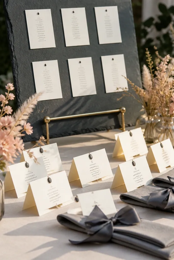
This is the clean, modern pastel fall palette that still feels warm. Cream and blush create softness, charcoal adds contrast, and black ink makes everything readable in photos. It’s especially helpful if you’re doing lots of signage or escort cards, because black type stays crisp in both daylight and evening. This look is great for indoor venues with neutral walls where you want a polished aesthetic without heavy color blocks.
Start with cream as your base by using cream linens and light cream floral elements. Then add blush through napkins, bridesmaid dresses, or the main bouquet. Anchor the palette with charcoal in table runners and choose black ink for all printed materials. Keep metals minimal — if you use any, use matte black or very subtle champagne gold so the design stays graphic.
Quick tipIf your venue is dim, print menus in black ink on cream cardstock instead of mixing pastel inks that can look gray.
Skip thisDon’t replace charcoal with light taupe; you lose contrast and the blush fades.
8. Dusty Teal + Sand Beige + Copper
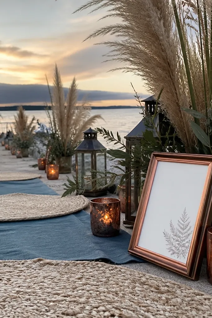
Dusty teal gives you a pastel that feels grown-up in fall. Sand beige keeps it warm and light, and copper adds a cozy metallic that matches candlelight. This palette looks stunning for ceremonies with ocean-adjacent names or venues near water, but it also works in barns because teal plays well with wood tones. The key is choosing dusty teal that leans green-gray rather than bright turquoise.
Pick dusty teal as the hero in flowers like hydrangea varieties that read gray-teal, plus small teal accents in bridesmaid bouquets. Then use sand beige linens and chair ties for the open, airy background. Add copper through bud vases, candle holders, and small signage clips. For paper goods, use teal ink on cream paper, then keep the design layout simple with lots of whitespace.
Quick tipChoose fabrics with texture — linen blends or matte satin — because dusty teal looks better when it’s not glossy.
Skip thisAvoid pairing dusty teal with silver; it makes the palette feel colder than fall.
9. Powder Blue + Warm Taupe + Antique Gold
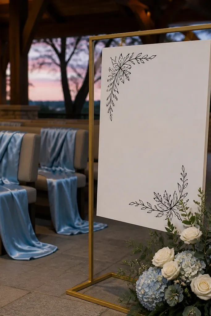
Powder blue can be tricky in fall because it wants to go icy. Warm taupe fixes that by adding warmth, and antique gold keeps the whole wedding from looking like a winter theme. This combination is gorgeous when you want pastel color but still want it to read seasonal. It also photographs well in outdoor settings where you have sky in the background.
Start with powder blue in your main bouquet and in one or two dress accents, like ribbon details or bridesmaid dresses. Then choose warm taupe for table linens, ceremony backdrops, or runner fabric so the blue stays grounded. Add antique gold through candle holders, invitation foil, or small decor hardware. For a cohesive look, repeat taupe in escort card stands and use powder blue ink for menus or place cards.
Use powder blue that leans slightly gray; bright icy blue looks off in fall light.
Don’t use pure white next to powder blue; it makes the blue look harsher.
10. Dusty Rose + Sage Gray + Light Cream
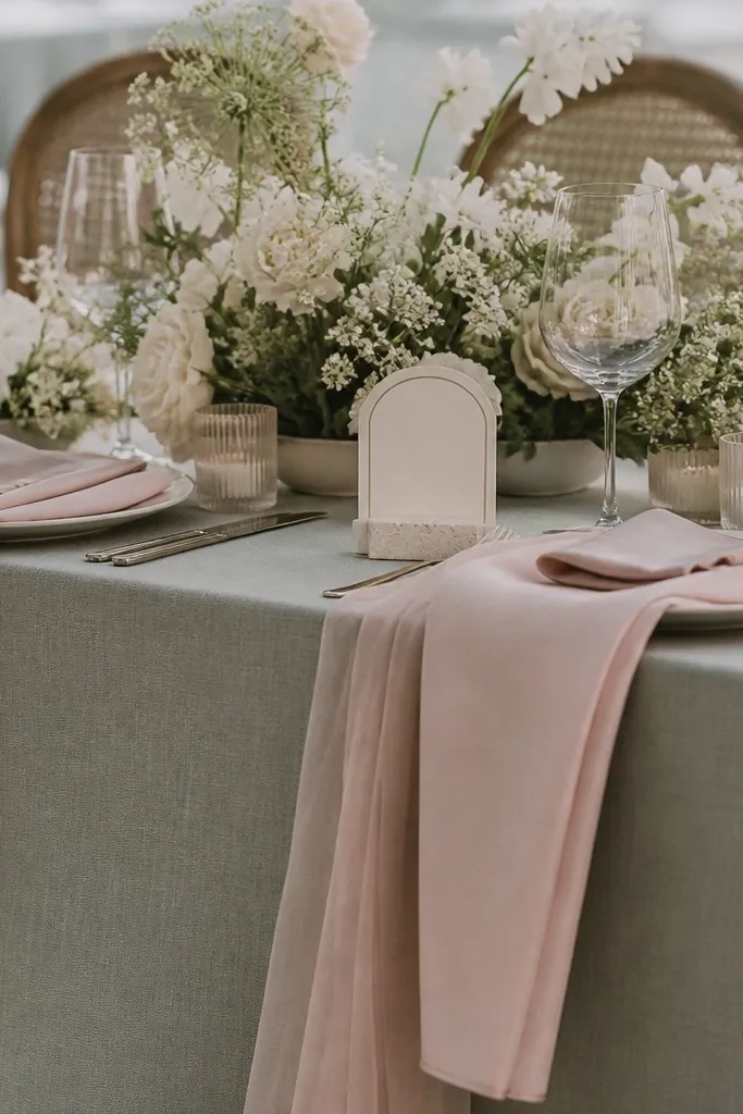
This palette is all about soft layering. Dusty rose gives warmth, sage gray adds calm, and light cream keeps the whole look airy and photo-friendly. It’s one of the best options for couples who want a pastel wedding but don’t want metallics or strong contrast. The result looks natural — like you planned it with intention — especially for daylight ceremonies and garden venues.
Start by building your bouquet with dusty rose as the dominant bloom, then add sage-gray eucalyptus for texture. Keep everything else light cream: tablecloths, napkins, and the background for signage. If you add any metallic, go minimal and choose brushed brass or skip it entirely. For the cleanest look, match the cream tone across paper goods and linens so nothing looks mismatched.
Use sage-gray greenery in both bouquets and aisle decor so the palette feels consistent from start to finish.
Avoid adding a second strong color like teal; it breaks the soft, airy vibe.
11. Blush + Mauve + Charcoal + Champagne
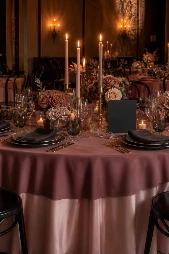
Blush and mauve create a pastel gradient that looks great in wedding photos because it adds depth without going dark. Charcoal keeps it from looking washed out, while champagne-colored accents bring warmth without screaming gold. This palette works well for indoor venues where you want the decor to stand out against neutral walls. It also looks good for late-fall weddings because the colors feel soft but grounded.
Choose blush as your hero and mauve as your support by using mauve in smaller amounts — like the second bouquet layer or table floral clusters. Anchor the palette with charcoal linens, chair ties, or aisle runner fabric. Use champagne accents in candle holders, table numbers, or frame edges. For printing, use charcoal ink on cream card stock, then add a thin champagne foil line for elegance.
Quick tipIf mauve starts reading too purple on camera, swap it for dusty plum in flowers and keep the rest unchanged.
Skip thisSkip bright burgundy; it turns the whole palette into deep fall color, not pastel.
12. Butter Yellow + Dusty White + Cocoa Brown
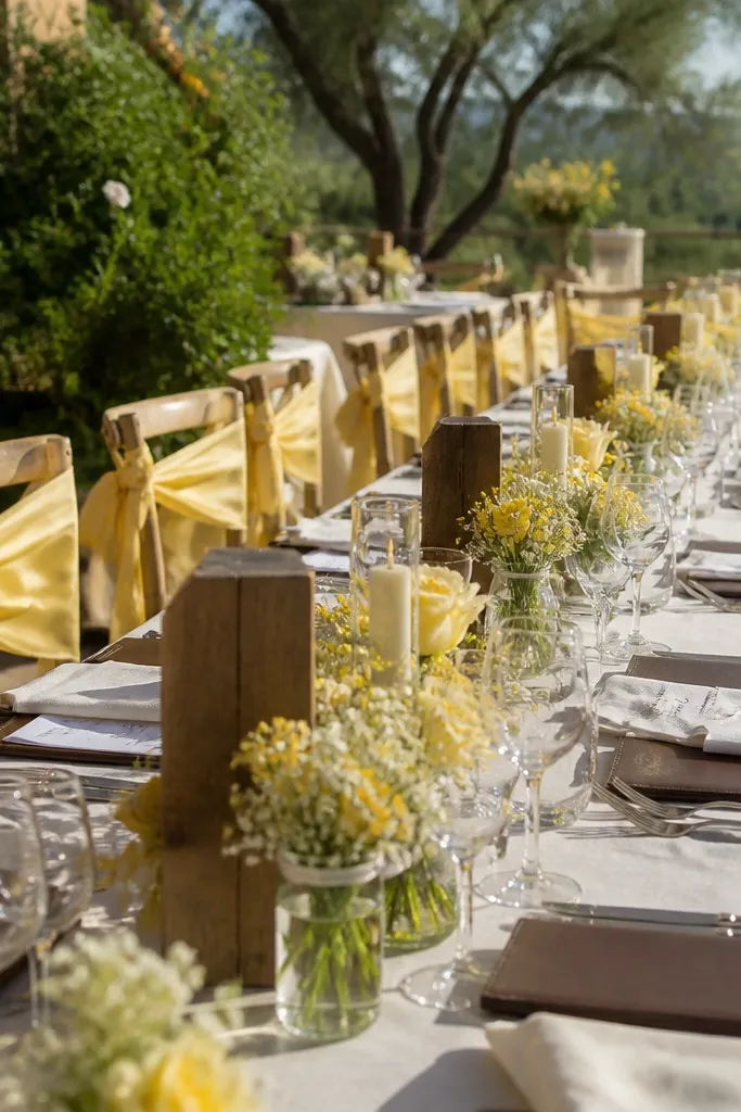
Butter yellow is a pastel that feels sunny even in fall, but it needs restraint. Dusty white keeps it from turning like a school project, and cocoa brown makes it look intentional and warm. This palette is photogenic in both indoor and outdoor venues because the yellow reads bright without being neon. It’s a strong option for couples who want pastel but also want a “fall warmth” vibe.
Start with butter yellow in your main flowers, like butter-toned ranunculus or soft yellow dahlias mixed with cream blooms. Use dusty white for linens and backdrops so the yellow stays gentle. Add cocoa brown to signage and table accents like menus, escort card frames, and napkin rings. For a clean look, keep the yellow to florals and small decor — don’t paint giant backdrops with it.
Test butter yellow under warm venue lights; if it looks too bright, move toward lemon-cream instead.
Avoid neon yellow and bright lemon; they look harsh in fall photos.
13. Pale Mint + Blush Pink + Espresso + Silver
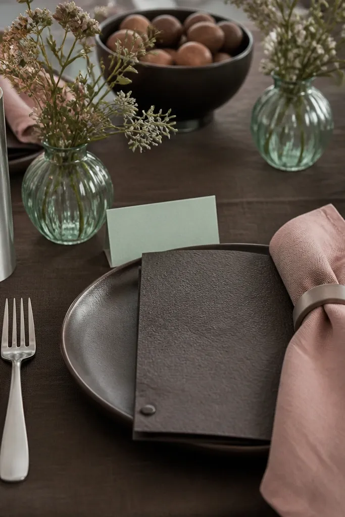
Pale mint is a pastel that feels fresh without looking springy when it’s paired correctly. Blush pink adds warmth, espresso provides contrast, and silver keeps the mint from turning yellow-green. This palette is great for couples who want a cool-toned pastel look but still want it to feel fall-appropriate through darker grounding. It also works nicely for modern venues with clean lines and lots of natural light.
Start by choosing pale mint as the hero — use it in bridesmaid dresses or the main bouquet foliage and blooms. Add blush pink in smaller amounts so it doesn’t fight the mint; think blush napkins or a blush ribbon detail. Use espresso for table linens, signage backing, and chair ties. Add silver through candle holders or frame accents, then keep paper goods in espresso ink on a warm white or cream base.
Quick tipChoose mint that reads gray-green, not bright aqua; the gray-green tone is what keeps it fall-friendly.
Skip thisDon’t pair pale mint with warm gold; it turns the mint yellow in photos.
14. Powder Blue + Dusty Rose + Mushroom Taupe
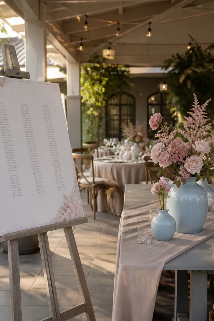
This combo is a crowd-pleaser because it gives you both cool and warm pastels while still looking cohesive. Powder blue supplies softness, dusty rose brings warmth, and mushroom taupe ties them together like a neutral bridge. It’s a smart pick for couples who want a pastel wedding that feels romantic but not overly girly. The taupe also helps the palette look good in fall when daylight shifts from bright to golden.
Start by splitting your color focus: powder blue in bouquets and dusty rose in bridesmaid dresses or vice versa. Then use mushroom taupe across linens and table runners so neither pastel dominates. Keep your metal choice neutral — matte champagne or antique pewter — so it doesn’t pull the palette too warm or too cool. For signage, use taupe cardstock with either rose or blue ink to keep the theme consistent across all printed pieces.
Use one pastel in larger blocks (like a bouquet) and the other in smaller accents so the palette doesn’t look chaotic.
Avoid using both pastels as equal-sized background colors; it makes photos look flat.
15. Blush + Dusty Green + Cream + Charcoal Type
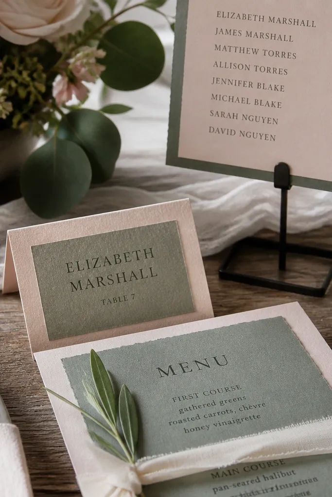
This is the “soft but readable” pastel setup. Blush gives you the romantic feel, dusty green adds fall texture, cream keeps the palette bright, and charcoal type makes everything look intentional in photos. It’s especially good if you plan lots of close-up details like place cards, menus, and seating charts. The result stays photogenic because your typography holds crisp contrast against light backgrounds.
Start with cream linens and build the floral palette using blush blooms plus dusty green foliage. Then anchor with charcoal through printed materials and at least one decor element like a runner or candle sleeves. Add a second texture layer using a matte fabric like linen for napkins or a subtle embroidered runner. For paper goods, keep all text charcoal and use blush as a small accent color in headers or small borders.
If your venue is outdoors, use charcoal ink instead of pastel ink on signage; wind and low contrast ruin pastel paper readability.
Skip glossy acrylic signage; it reflects fall light and blows out pastel colors.