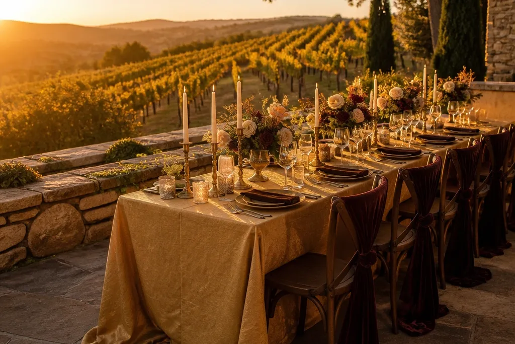
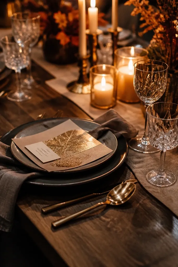
1. Honey Champagne + Cocoa Velvet
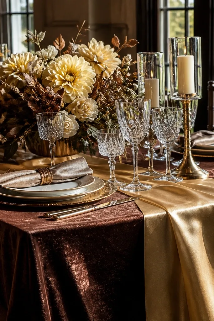
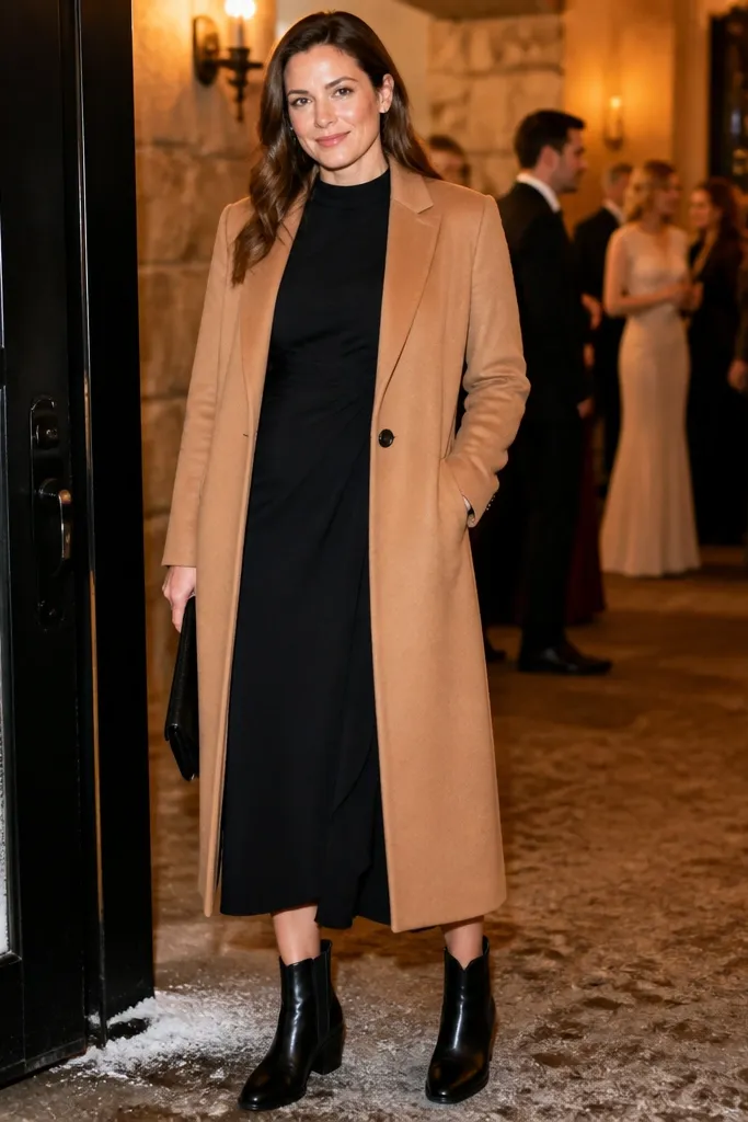
This palette looks expensive because honey champagne reads like soft sunlight, while cocoa velvet adds weight and shadow. It works beautifully in September when the daytime light is warm but the air turns crisp after sunset. For a dreamy autumn look, keep honey champagne in larger areas like table linens, bridesmaid dresses, or ceremony draping. Then add cocoa velvet through boutonnieres, a groom’s tie, or a small number of deep floral elements so the photos have depth instead of looking washed out.
Start by picking honey champagne for the biggest visuals — use it on linens, signage background, or bridesmaids. Then choose cocoa velvet for contrast: velvet ribbon on bouquets, cocoa suits or vests, and deep-toned flowers like chocolate dahlias or dark ranunculus. Finally, add a thin line of gold (leaf-shaped accents, candle holders, or metallic ink) so the palette stays warm without turning orange.
If your venue has light stone floors, cocoa will ground the whole scene fast.
Don’t swap cocoa for black — it makes the warmth disappear in golden-hour photos.
2. Marigold Glow + Burnt Umber + Cream
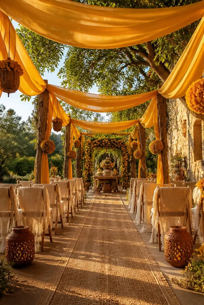
Marigold glow is the September color that actually matches the season. Pair it with burnt umber so the brightness doesn’t feel like a fall festival poster, and add cream to keep everything airy. This combo photographs like golden-hour film: bright highlights from marigold, soft warmth from cream, and anchored shadows from umber. It suits outdoor ceremonies, especially near golden grasses, because the palette blends with the landscape instead of fighting it.
Quick tipUse cream with a warm undertone, not bright white, so it stays cohesive in sunlight.
Begin with marigold as your flower hero — think marigolds, calendula, or warm yellow-orange blooms. Then bring in burnt umber through ribbon, napkins, and menswear accents like ties or pocket squares. Finish with cream for the base layer: tablecloths, invitations, and any draping so marigold doesn’t overwhelm skin tones.
Skip thisAvoid using marigold on every single element; it needs umber to look luxe.
3. Copper Rose + Olive Sage + Ecru
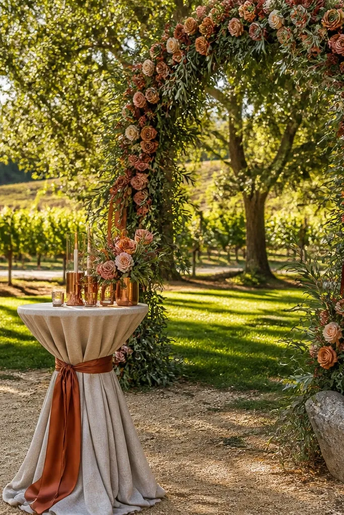
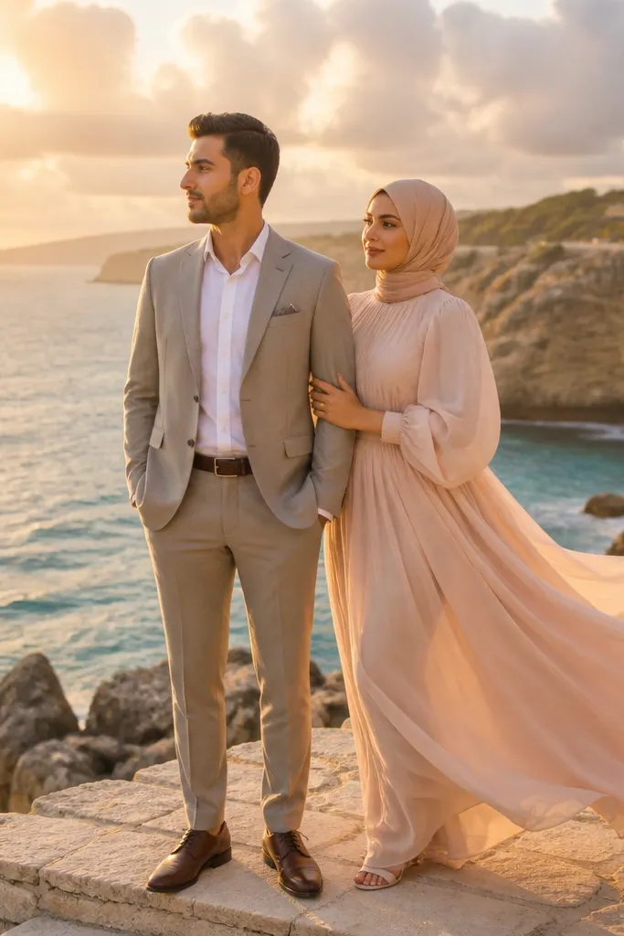
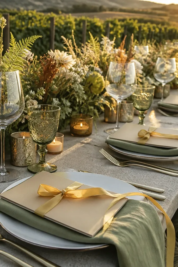
Copper rose is that warm, slightly metallic blush that looks stunning under late-September sun. Olive sage adds a natural, grounded green that keeps the palette from turning too sweet. Ecru keeps it refined and prevents the rose from looking too pink. This is a great choice for gardens, vineyards, and places with lots of greenery because the sage ties everything together without needing heavy dark colors.
Quick tipIf you’re doing a ceremony arch, use sage leaves as the “texture” layer so copper rose can stay clean.
Choose copper rose for bridesmaids or statement floral like roses and ranunculus. Add olive sage through greenery-heavy bouquets, ceremony arch accents, and table runners. Use ecru for invitations and linens, then keep metals in copper or brushed gold so the warm tones match.
Skip thisDon’t use neon green — it clashes with copper rose and ruins the dreamy autumn feel.
4. Dusty Rose + Cognac Leather + Warm White
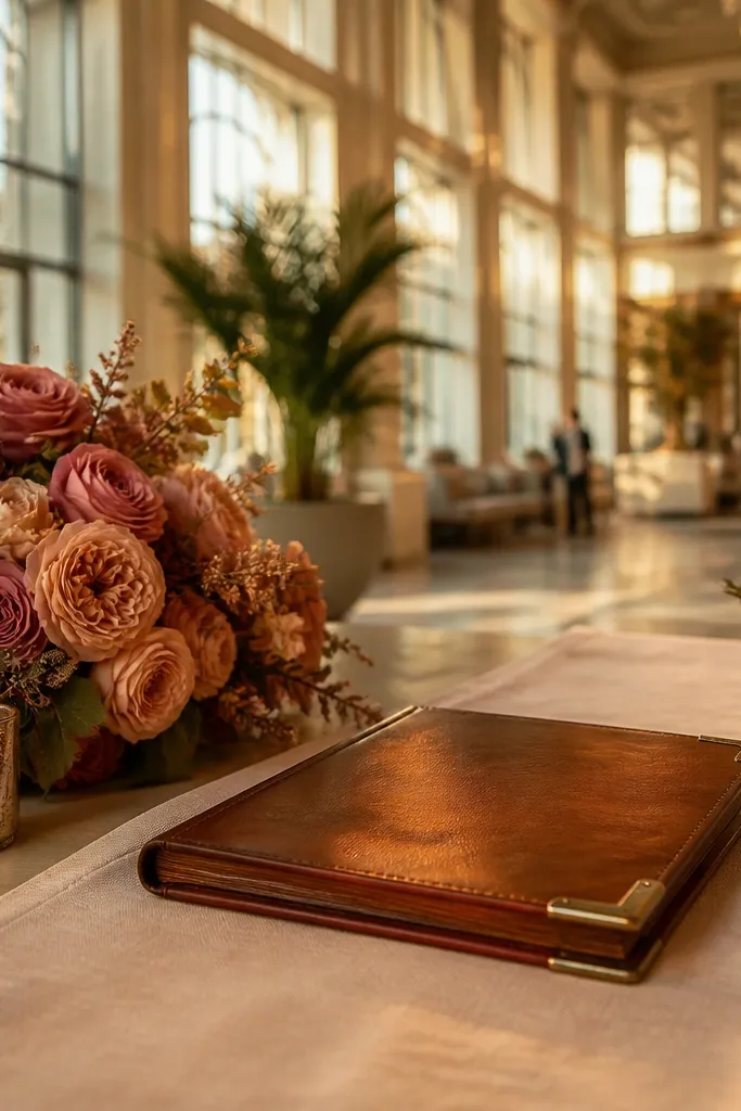
Dusty rose brings romance without looking childish, and cognac leather adds that fall texture people notice in photos. Warm white keeps the whole palette bright and elevated, especially for airy venues with big windows. This combination feels like autumn styling for real-life luxury — not overly dark, not overly orange. It works well for late-day portraits because dusty rose softens skin tones and cognac adds depth.
Quick tipUse matte dusty rose in fabric and add shine only through cognac and small metal accents.
Start with dusty rose as the floral and bridesmaid color story. Then bring in cognac through leather accents: belts, shoes, chair ties, or even stationery details like wax seals. Use warm white for tablecloths and ceremony fabrics, and keep the rest of the palette limited so dusty rose stays the focal point.
Skip thisSkip bright fuchsia — it competes with cognac and shifts the vibe away from September warmth.
5. Burnt Orange + Espresso + Creamy Tan
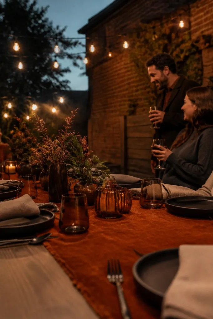
Burnt orange is a September classic, but it needs espresso to look polished. Add creamy tan so the orange feels warm and wearable, not loud. This palette is ideal for photos where you want a bold wedding moment without losing sophistication. It also flatters a wide range of skin tones when you keep the tan base warm and let espresso handle the contrast.
Quick tipIf your venue lighting is cool, add more tan and reduce the orange intensity in flowers.
Pick burnt orange as the hero through bridesmaids or a statement floral wall. Then use espresso for menswear, deep petals in bouquets, and table napkins. Finish with creamy tan linens and stationery so the orange has a soft landing in daylight.
Skip thisAvoid pairing burnt orange with icy gray — it makes the orange look dirty in photos.
6. Burgundy Wine + Gold Leaf + Oatmeal
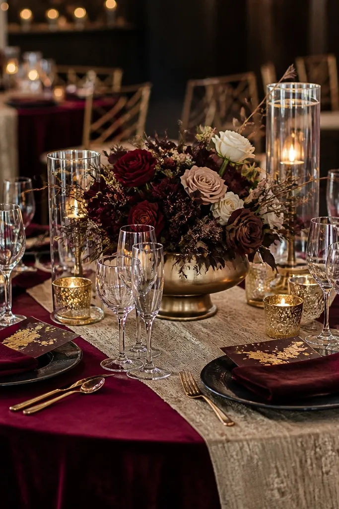
Burgundy wine brings that late-fall richness, and gold leaf makes it feel celebratory without going flashy. Oatmeal tones down the darkness so the palette still reads dreamy, not heavy. This is a strong choice for indoor receptions or venues with warm lighting, because burgundy absorbs light in the best way and gold catches it. It also works for evening portraits where you want deeper color in the background.
Use burgundy as the floral anchor: dahlias, deep roses, and autumn berries. Add gold leaf through candle holders, signage lettering, or thin foil details on invitations. Choose oatmeal for linens and drapery, then keep the rest neutral so burgundy stays the star.
Foil details look best on matte paper — glossy reflects harshly in reception photos.
Don’t pair burgundy with cool silver — it breaks the warmth the palette is built on.
7. Saffron + Camel + Dark Chocolate
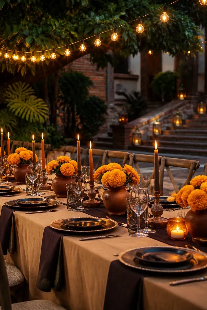
Saffron is brighter than honey but softer than marigold, so it lands perfectly for September 15. Camel keeps the look grounded and warm, while dark chocolate adds that deep, photo-friendly shadow. This palette is gorgeous for outdoor dinners, especially under string lights or near brick and wood. It’s also forgiving for mixed guest wardrobes because camel and chocolate work with lots of fabrics and skin tones.
Start with saffron in bouquets and ceremony florals, then use camel for table runners, chair sashes, and stationery backgrounds. Add dark chocolate through menswear ties, bouquet ribbon, and small accents like candle sleeves. Keep gold jewelry and metallic details minimal so saffron stays warm, not orange.
If guests will wear neutrals, camel is the easiest way to make the palette feel cohesive for everyone.
Avoid going full saffron everywhere; too much brightness makes photos look flat in midday.
8. Rosewood Pink + Taupe + Antique Brass
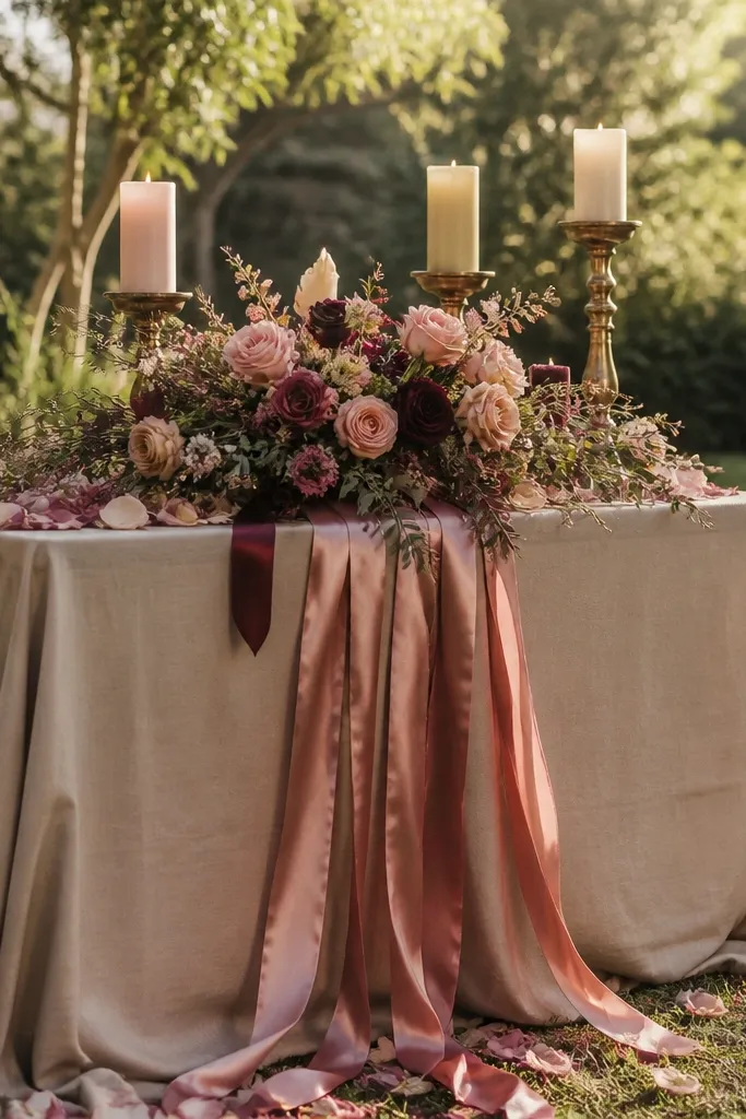
Rosewood pink is a fall-leaning rose that reads romantic but grown-up. Taupe is the secret weapon — it softens the pink and keeps the palette from feeling overly floral or sugary. Antique brass adds a warm metallic that looks beautiful in both daylight and evening indoor shots. This palette suits venues with neutral walls, modern interiors, and places where you want a clean luxury look with warm golden tones.
Choose rosewood pink for bridesmaids, bridesmaid bouquets, or a ceremony floral color block. Then use taupe for linens, rugs, and any fabric draping so the pink has space to breathe. Add antique brass through flatware, candle holders, and bar signage accents; keep metallics consistent across the tables.
Match brass tone to your venue — if the venue has warm lighting, antique brass reads smoother than bright gold.
Don’t use taupe that leans gray — it cools the palette and dulls the rose.
9. Goldenrod + Deep Forest Green + Cream
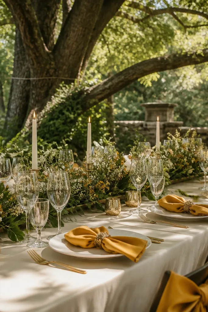
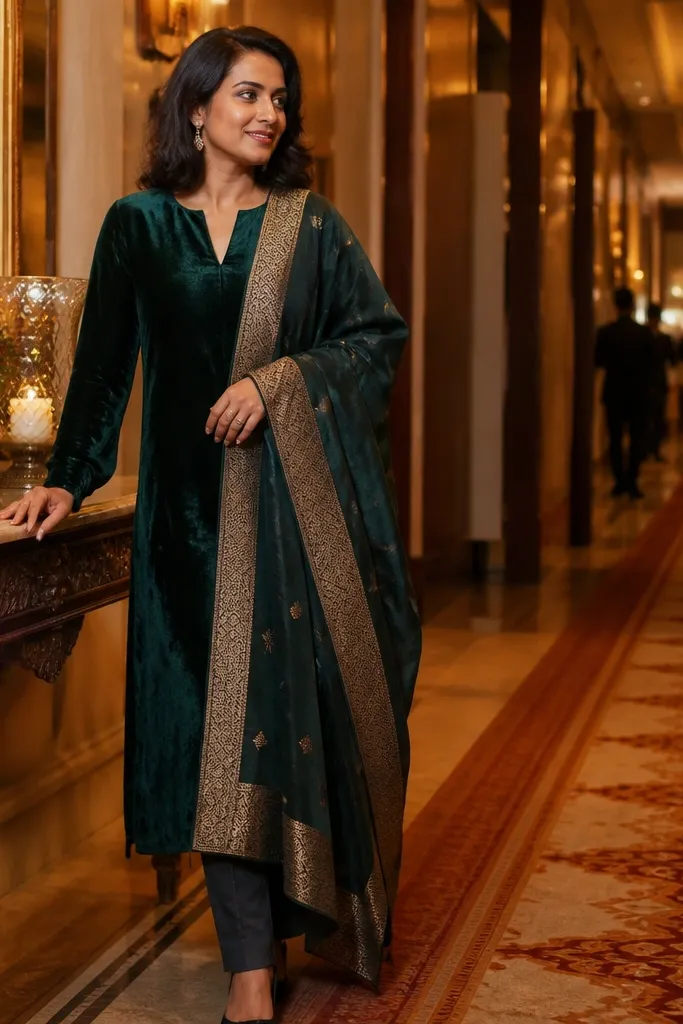
Goldenrod gives you that sunny September feeling, and deep forest green adds drama without turning the palette into winter mode. Cream keeps everything light and dreamy, so the greens don’t overpower. This color story is especially photogenic in outdoor shade — goldenrod pops against dark leaves and forest green brings contrast in shadows. If you want a fall look that still feels airy, this is the balance.
Use goldenrod as the flower hero and add greenery that leans dark, not bright. Then bring in deep forest green through velvet ribbon, table runners, and a groom’s tie. Keep cream as the base for linens and stationery so the goldenrod stays warm and flattering.
Velvet ribbon in forest green looks richer than satin in shade lighting.
Skip bright lime green; it clashes with goldenrod and looks cheap in photos.
10. Dried Apricot + Caramel Stitch Brown + Warm Sand
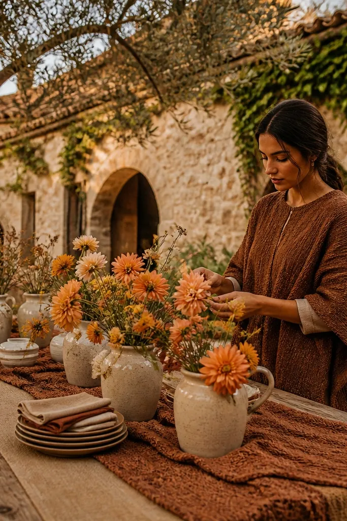
Dried apricot is a softer cousin to burnt orange, with a dusty, romantic feel that reads dreamy under golden light. Caramel stitch brown adds texture and a handcrafted vibe, and warm sand keeps the palette from getting too deep. This is a strong pick for rustic venues that still want a polished look — think farmhouses, outdoor patios, and places with woven textures. It also makes bridesmaids look flattering without needing bold jewelry.
Quick tipBring one woven texture element — like linen napkins or jute runners — to match the caramel-brown tone.
Start with dried apricot in florals like apricot roses, dried-style ranunculus, and warm peaches. Then use caramel stitch brown through ribbon, leather-like chair ties, and menswear accessories. Choose warm sand linens and paper goods as the background layer, and keep accents small so the palette looks intentional.
Skip thisDon’t pair dried apricot with stark white; it makes the apricot look faded.
11. Spiced Teak + Blackened Umber + Creamy Ivory
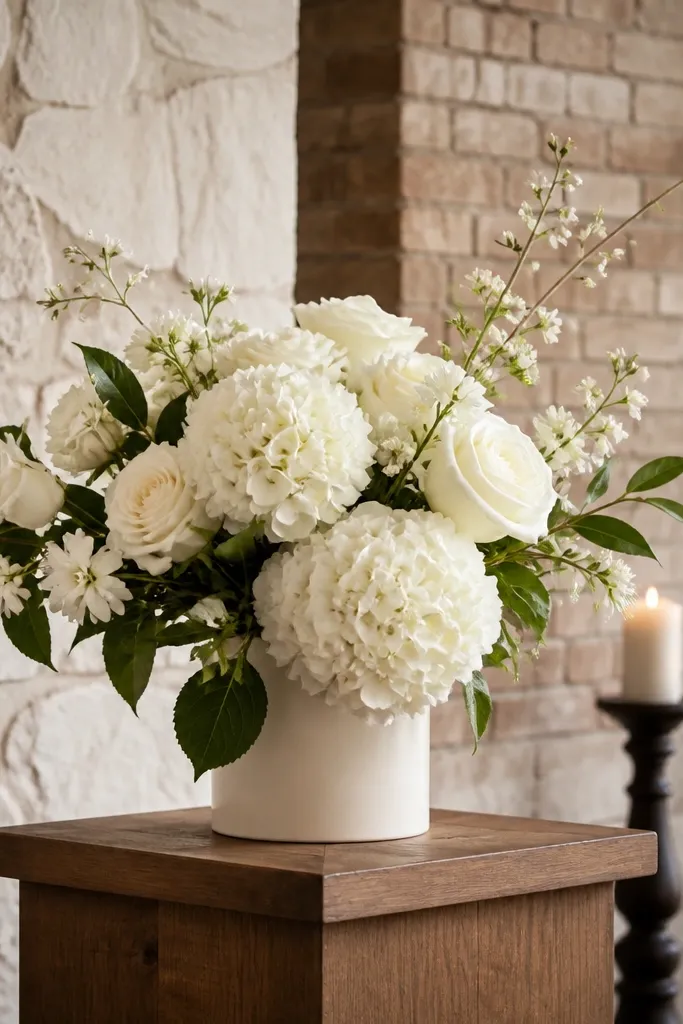
Spiced teak reads like warm wood tones, which makes it look natural in photos and flattering against stone and brick. Blackened umber adds a near-dark depth that still feels warm, not cold. Creamy ivory keeps the whole palette clean and luxury-feeling, especially for minimalist venues. This palette is ideal if you want fall colors that don’t scream “theme,” but still look deliberate and high-end.
Quick tipIf your venue has dark wood, use spiced teak in smaller doses so it doesn’t blend into the background.
Choose spiced teak as your hero through ceremony chairs, groom’s vest, or a warm-toned floral accent wall. Then add blackened umber in bouquets and table napkins for contrast. Use creamy ivory for linens and invitation paper, and keep metallics in brushed gold or skip metallics entirely for a modern look.
Skip thisAvoid pairing blackened umber with cool navy — the warmth gets lost.
12. Amaretto Tan + Maroon Ember + Soft Pearl
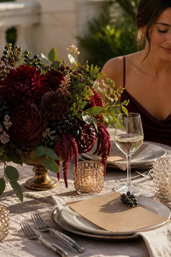
Amaretto tan gives you a cozy base that looks expensive on fabric and paper. Maroon ember brings just enough dark red drama to make the bouquet stand out, and soft pearl keeps the palette from looking too rustic. This is a great choice for September 15 weddings because it reads warm and romantic in daylight and still looks rich after the sun goes down. It also works well when you want guests to wear neutrals — the tan base pulls everything together.
Quick tipPearl-toned candles make the maroon look deeper without adding more red everywhere.
Start with amaretto tan for table linens, ceremony draping, and the main color in stationery. Then bring maroon ember into florals, bouquet ribbon, and a groom’s tie or pocket square. Use soft pearl for smaller details like candle sleeves, glassware accents, and lighter petals so everything doesn’t collapse into one dark tone.
Skip thisDon’t use bright red — maroon ember should feel warmed by gold, not primary.
13. Champagne Gold + Smoky Taupe + Dark Olive
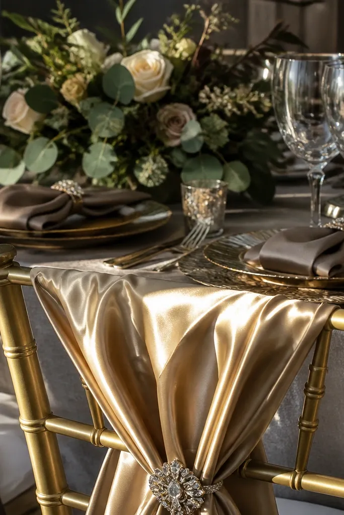
Champagne gold is the luxury highlight color, but it needs smoky taupe to stop it from looking too party-like. Dark olive adds a moody green that supports the gold and makes flowers pop. This palette photographs beautifully in mixed lighting — sunlight hits the champagne, and taupe handles shadows with a soft, flattering gray-brown. It suits weddings with modern decor, clean venues, and anyone who wants fall colors without heavy rust.
Quick tipWhen you use champagne gold, keep it satin or satin-like; matte gold looks flat in photos.
Use champagne gold in satin bridesmaid dresses, table accents, or ceremony lighting reflections. Then choose smoky taupe for linens and signage backgrounds, keeping the tone slightly muted. Add dark olive through greenery, ribbon, and dark stems so the palette has depth without going fully burgundy.
Skip thisAvoid pairing champagne gold with icy grays — it turns the gold dull.
14. Pecan Brown + Marigold Yellow + Golden Wheat
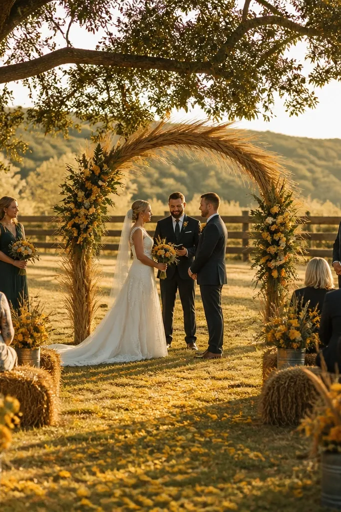
Pecan brown is warm, photo-friendly, and more flattering than straight chocolate for daytime portraits. Marigold yellow brings the September glow, and golden wheat adds a softer, textured neutral that feels like autumn air. This palette is perfect for outdoor ceremonies with natural elements like hay bales, wheat stalks, or stone paths. It’s also a smart choice if you want color variety without turning the wedding into a bright-orange event.
Start with pecan brown as your neutral base in linens, chair ties, and stationery. Then use marigold yellow in bouquets and small statement florals. Add golden wheat through dried grasses, wheat-colored fabric overlays, or light gold accents so the palette stays cohesive and warm across the entire venue.
Use wheat tones in fabric, not just decor — it makes the palette feel designed, not assembled.
Skip pure sunflower yellow — it looks too loud next to pecan brown.
15. Burnished Sienna + Deep Plum + Creamy Oat
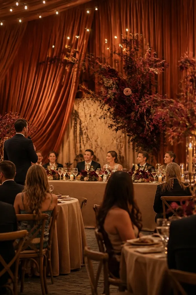
Burnished sienna is a grown-up orange-brown that looks amazing in September light and doesn’t go neon. Deep plum adds a sophisticated berry depth that makes the flowers look fuller in photos. Creamy oat keeps everything soft and dreamy, especially for ceremony draping and table settings. This palette works well for evening receptions because plum holds its color under warmer indoor lighting. It’s also a good option if you want fall warmth without going fully burgundy.
Pick burnished sienna as the main color for bridesmaids or the ceremony floral focus. Then bring in deep plum through bouquet clusters, table napkins, and a groom’s tie or vest. Use creamy oat for linens and paper so the sienna stays warm and not overly saturated, and keep metallic details minimal or in brushed gold.
If your venue has lots of greenery, plum will stand out more than espresso for a richer contrast.
Avoid mixing sienna with bright teal — the palette will read mismatched and harsh.