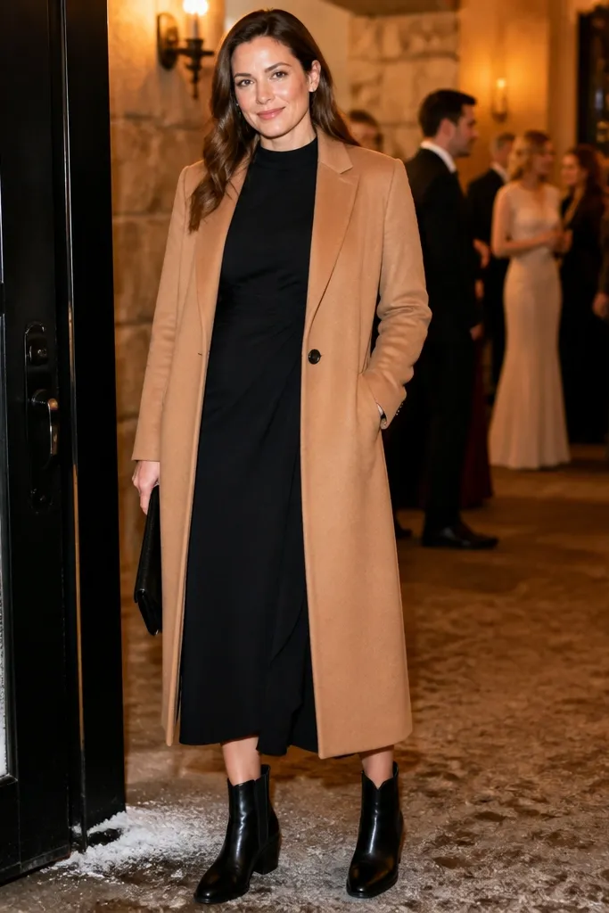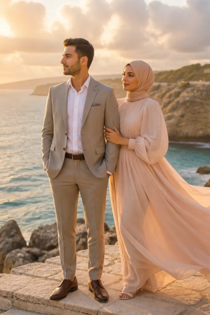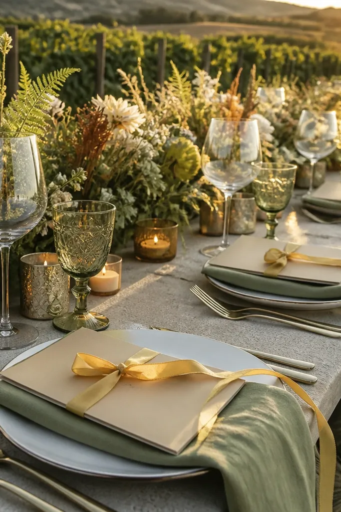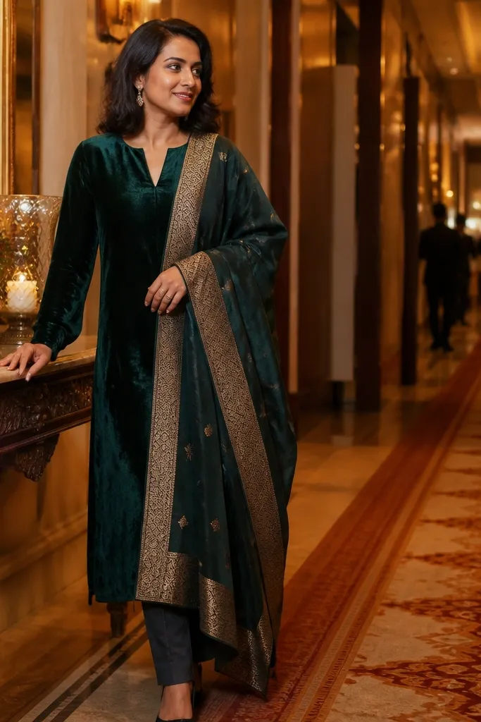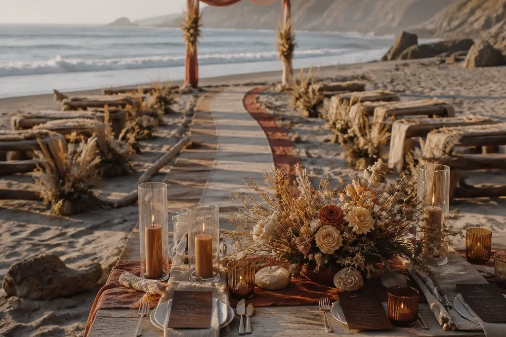
1. Terracotta + Oat Milk + Burnt Sienna
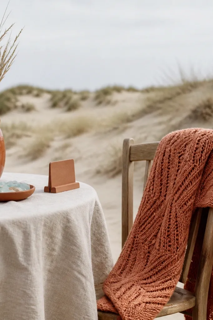
Start by using terracotta for one big visual area: a bridesmaid dress color, a tablecloth tone, or the bouquet wrap. Then pair it with oat milk for the neutral everywhere else — invite paper, napkins, and clothing basics like cardigans or tank tops. Finally, add burnt sienna as the accent through ribbon, candle glass, or a small floral cluster so the look stays focused. For a 3 day itinerary, photograph outfit portraits on arrival day during golden hour, then reuse the same oat neutral in dinner outfits to keep the photos matching.
Terracotta is the fall beach color that reads warm without turning orange-leaning. Oat milk keeps everything soft against pale sand and helps skin look naturally alive in photos. Burnt sienna adds depth in a way that still feels autumn, not Halloween. This palette is great when the forecast shows sun and you want that sun-kissed “golden hour” glow. It also works for couples who want a romantic vibe with earthy texture instead of jewel-tone drama.
Skip thisSkip bright orange — it fights the sand and makes skin look washed out.
Quick tipIf you’re bringing florals, ask for stems wrapped in a terracotta ribbon so the bouquet matches your palette even if flower colors vary.
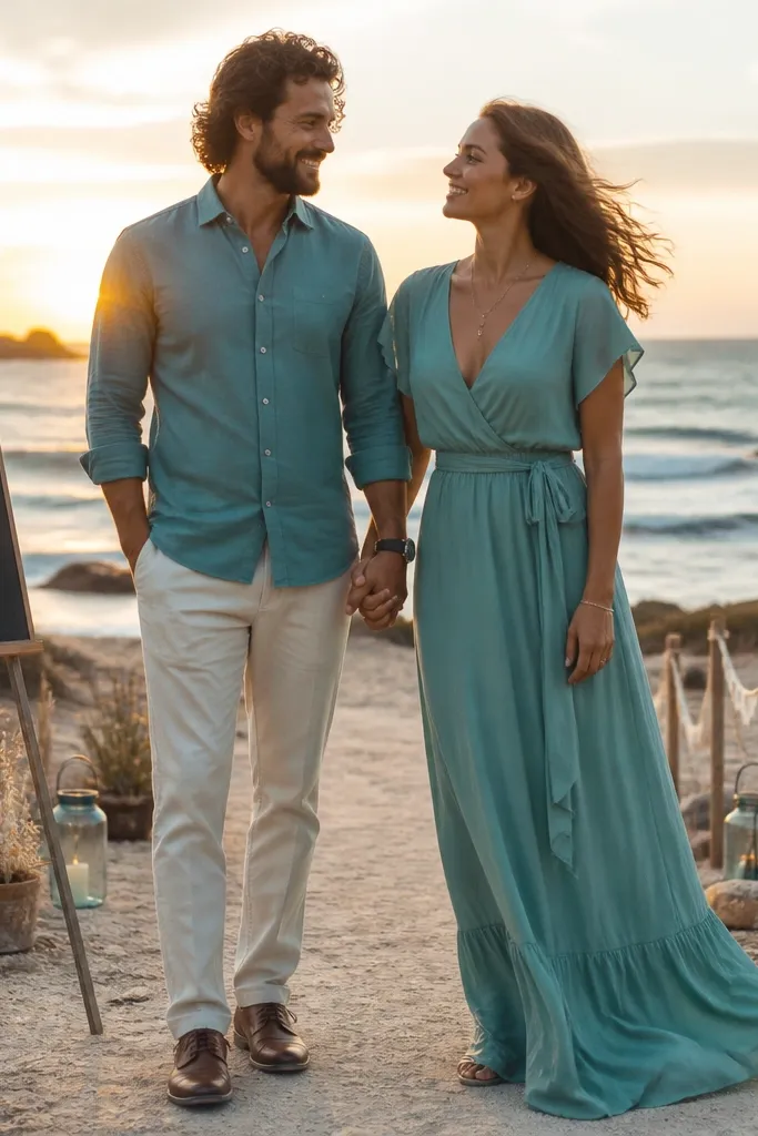
2. Deep Teal + Sea Glass + Warm Sand
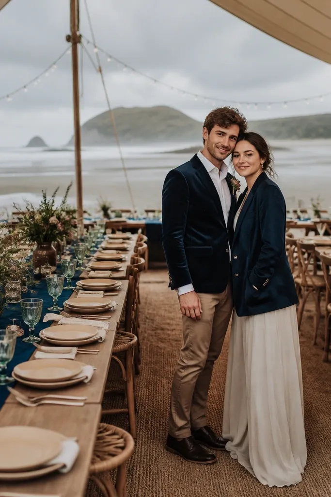
Deep teal brings a coastal feel but still reads distinctly fall. Sea glass is the smart middle tone — it’s light enough to keep photos airy, yet cool enough to balance the warmth of sand. Warm sand acts like a neutral bridge so the palette doesn’t look too “winter.” This is a strong choice when you expect overcast skies because teal holds contrast even when the light flattens. It also looks sharp in both candid beach photos and more formal ceremony shots.
Choose deep teal as the anchor for the most visible item: a suit color, table runner, or ceremony arch drape. Use sea glass as your secondary color in smaller areas — bridesmaid dresses, signage ink, or glassware tint. Add warm sand through linens, chairs, or a neutral textured fabric so the palette looks grounded. For getting around, pack a sea-glass scarf or wrap in your day bag so you can match it to dinner outfits without redoing your whole look.
Bring one tinted glass color (sea glass) to the beach dinner so candlelight looks intentional, not random.
Don’t use pure white with teal; use warm sand or oat instead to avoid harsh contrast.
3. Smoky Plum + Oat Neutral + Dusty Rose
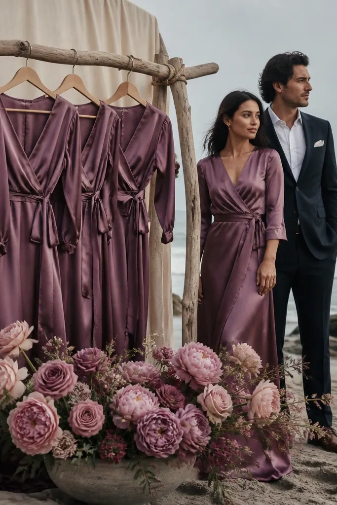
Start with smoky plum as the anchor by picking it for dresses, suits, or a main floral wrap. Use oat neutral for the paper goods and any large fabric areas like tablecloths or chair sashes. Add dusty rose in small doses — bouquet ribbon, a few petals in the arrangement, or napkin accents. For your weekend, schedule your best portrait session earlier in the day so plum stays rich before the light turns flat.
Smoky plum is moody in a way that looks expensive in fall beach photos. It gives you drama without going too dark, which matters because coastal light can wash out heavy colors. Oat neutral keeps the palette flattering and keeps your images from turning into a monochrome purple blot. Dusty rose adds a gentle romantic pop that looks great in close-ups of bouquets and hands. This palette is ideal when the sky is gray or you want a “soft fall romance” instead of bright sunshine energy.
Skip thisSkip hot magenta tones — they look neon next to plum in coastal lighting.
Quick tipIf you’re doing candles, choose frosted glass in dusty rose or plum tint so candlelight stays consistent in photos.
4. Forest Green + Cream Linen + Rusty Clay
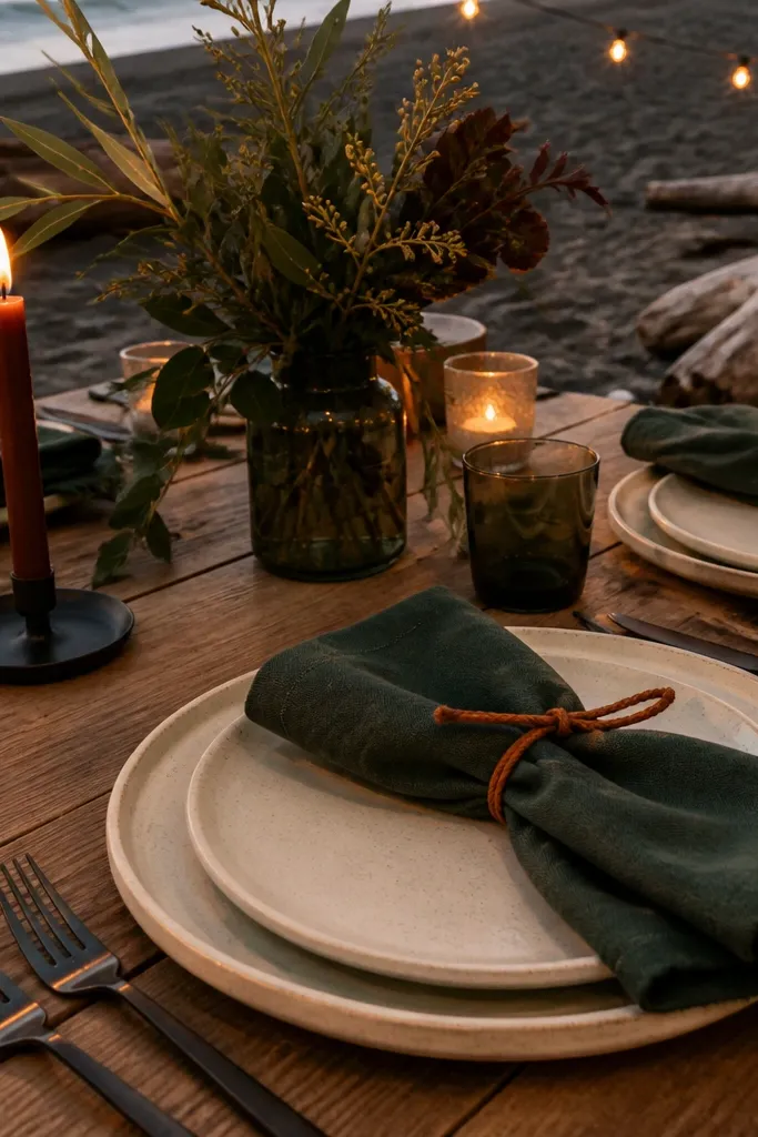
Forest green makes fall beach wedding photos look grounded and editorial. Cream linen is the neutral that keeps the palette warm and prevents the green from looking too formal. Rusty clay adds that fall “touch of fire” that makes the whole scene feel seasonal. This works especially well when the beach has darker sand or lots of driftwood, because the palette echoes the environment instead of fighting it. It’s a strong pick for couples who want a cozy, slightly rustic look with clean styling.
Pick forest green as your anchor for the biggest visual — table runner, ceremony backdrop fabric, or suit color. Use cream linen for linens, paper, and any base layer clothing so the look stays soft. Add rusty clay as the accent through ribbon, small floral clusters, or a few terracotta-toned candles. For logistics on a 3 day itinerary, pack a cream scarf or shawl for portraits so you have a neutral backdrop against both sand and sky.
Driftwood and pine textures photograph well with this palette — bring one simple wood-toned element for signage or a photo prop.
Avoid black as a base; it kills the soft coastal vibe and makes green look harsher.
5. Caramel + Buttercream + Espresso
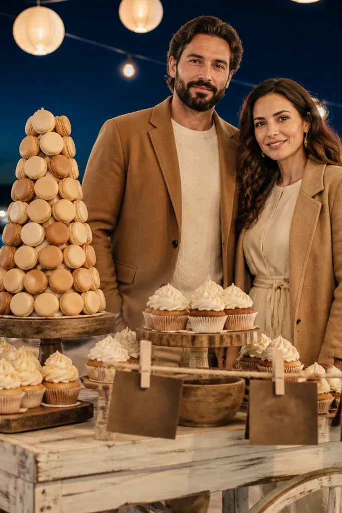
Caramel is the fall beach color that looks warm without turning orange. Buttercream reads sweet and keeps your palette from feeling too heavy at the coast. Espresso gives you depth in photos, especially at night or under string lights. This palette is gorgeous when you want “cozy autumn dessert” vibes — think cinnamon buns, toasted nuts, and warm candlelight. It’s also forgiving for mixed weather because caramel and buttercream keep skin looking natural.
Use caramel as your anchor in clothing or florals, then keep buttercream as your neutral across paper goods and linens. Add espresso as the accent in small structured items — candle holders, frames, or ink color on signage. For your weekend, plan one set of photos in late afternoon when caramel glows and another during dinner when espresso reads rich. Keep your shoes and belt tones in espresso so portraits look consistent even if you change outfits.
For beach dinners, use espresso-toned tableware or ink so the candlelight doesn’t look gray in photos.
Skip cool taupe neutrals; they make caramel look flat and a little tired.
6. Seafoam + Mist Gray + Charcoal
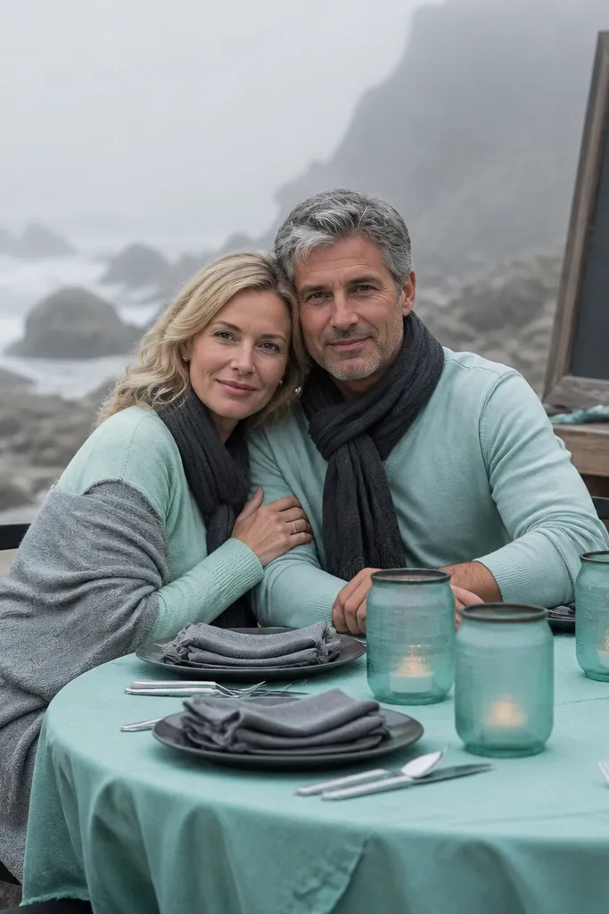
Seafoam gives you the beach identity without going “springy.” Mist gray keeps everything soft and helps the palette look cohesive in foggy coastal light. Charcoal adds structure and keeps photos from looking washed out when the sky is overcast. This is the best choice if you expect cloud cover, because the cool tones stay crisp even when the sun disappears. It also looks modern and clean for couples who want a sleek, not rustic, fall wedding.
Start by choosing seafoam for the anchor — dresses, a ceremony color block, or a large floral wrap. Use mist gray for the neutral — table linens, suit shades, and invite paper. Add charcoal as the accent for contrast: signage, candle glass edges, or groomsmen ties. For a 3 day itinerary, do your “fog-friendly” portraits on day one, then keep the charcoal accent consistent for day two dinner photos.
Bring a small charcoal fabric swatch for touch-ups; coastal wind can wrinkle lighter neutrals fast.
Don’t pair seafoam with bright white; it looks too stark against sand and gray sky.
7. Burnished Gold + Deep Navy + Cream
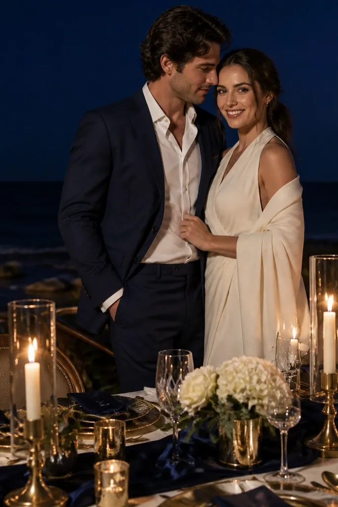
Burnished gold looks expensive in fall beach photos because it catches light without screaming “party.” Deep navy gives you the contrast that keeps the palette from feeling pale in coastal haze. Cream ties everything together and keeps it romantic instead of formal. This combo is excellent for a couple who wants a more classic wedding look but still feels seasonal. It also photographs beautifully with candlelight because navy stays rich and gold stays warm.
Use deep navy as the anchor for clothing or large fabric areas like napkins and chair sashes. Then add cream as your neutral base — tablecloth, signage paper, and soft textures in florals. Finally, sprinkle burnished gold in small reflective details: candle holders, flatware tone, or a thin ribbon on bouquets. For logistics, pick one gold detail you can reuse across the weekend so your photos match from ceremony to dinner.
Choose burnished gold over bright metallic — it reads warmer and hides dust better on outdoor surfaces.
Avoid silver accents; gold and silver together look messy in mixed coastal lighting.
8. Rust + Oat + Soft Black (Graphite)
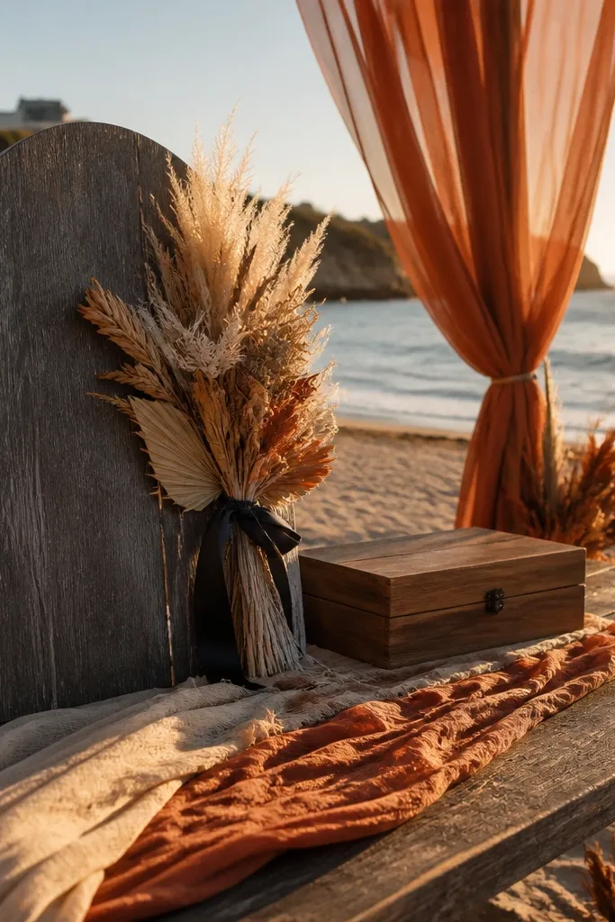
Rust is the fall beach color that feels like a sweater, not a costume. Oat keeps it creamy and flattering against sand tones. Soft black in the form of graphite adds definition for signage and details without making the whole palette look heavy. This is a great choice when you want bold warmth but still need clean lines for modern photos. It also works for couples who want a “color-forward” wedding without going too dark.
Pick rust as your anchor for dresses, bouquet wraps, or a ceremony backdrop fabric. Use oat as the neutral base for paper goods and table linens so the rust doesn’t overpower everything. Add graphite for contrast in small amounts — ink color, frames, or the edging on menus. For your 3 day itinerary, plan to do close-up detail photos on day one so rust textures show before the light changes.
If you’re using rust florals, add oat ribbon so the bouquet still reads warm even if flower shades vary.
Skip true black; it makes outdoor photos look harsher and separates the palette.
9. Rose Clay + Warm Sand + Olive Leaf
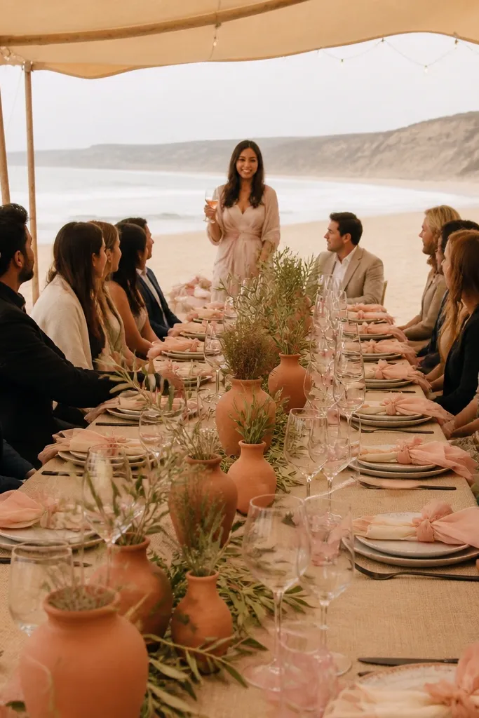
Rose clay sits between blush and terracotta, so it looks romantic but still fall. Warm sand neutral keeps the palette airy and photo-friendly against the actual beach. Olive leaf adds depth and a little “garden” feel that still fits coastal scenery. This is a strong option if you want something softer than plum but more interesting than plain blush. It’s also great for couples doing an intimate ceremony with lots of close-range photos.
Start with rose clay as your anchor through the bouquet, bridesmaid dresses, or a table runner. Use warm sand as the neutral in linens and paper so your photos don’t turn pink-heavy. Add olive leaf as accent in stems, signage greenery, or small floral clusters. For the weekend, bring a spare olive ribbon for day two touch-ups — it’s the easiest way to keep the palette consistent after wind and travel.
Use olive leaf in the smallest areas first (signage and florals) so it doesn’t dominate the pink tones.
Avoid cool lavender tones; they fight the rose clay warmth.
10. Sage Green + Cream + Soft Gold
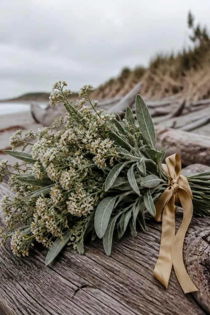
Sage green is the calmest fall beach green — it reads natural next to dunes and driftwood. Cream keeps it bright and flattering, even in softer light. Soft gold adds just enough warmth to make sage look intentional instead of muted. This palette is ideal for morning ceremonies or overcast days because the colors stay gentle and cohesive. It also looks beautiful in photos where the background is busy — sage and cream give you visual breathing room.
Choose sage green as your anchor for dresses or the ceremony fabric drape. Keep cream as your neutral everywhere large — table linens, invite paper, and base layers. Add soft gold in small reflective pieces like candle glass, menu foil, or hair accessories. For a 3 day itinerary, photograph your bouquet and signage on arrival day so you can reuse the same cream and gold look for dinner.
If you’re doing satin dresses, pack a lint roller — coastal sand shows on fabric fast.
Don’t go too gray with sage; it can look dirty next to sand.
11. Smoked Teal + Warm Beige + Sandstone
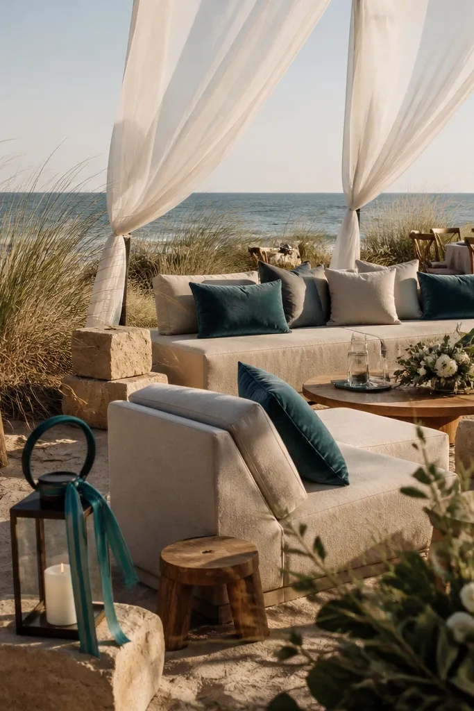
Use smoked teal as the anchor in clothing, table runners, or a main floral wrap. Add warm beige for linens and paper so the palette doesn’t get too dark. Finish with sandstone as your accent through ribbon, napkin folds, or candle glass. For weekend planning, do portraits at two times: earlier for smoked teal contrast and later for sandstone warmth during sunset.
Smoked teal gives you that deep coastal mood without turning black. Warm beige is the neutral that makes the palette look cohesive in both bright and muted light. Sandstone is the secret — it ties your wedding colors to the beach itself, so the photos look like they belong to the location. This palette is best when you want a modern, moody look that still feels warm and autumnal. It’s especially flattering for couples who want fewer bright colors and more texture.
Skip thisSkip stark white; warm beige keeps the beach light from washing everything out.
Quick tipBring one sandstone-colored fabric swatch to match florals when flower shades shift after travel.
12. Cinnamon + Oat + Pewter Gray
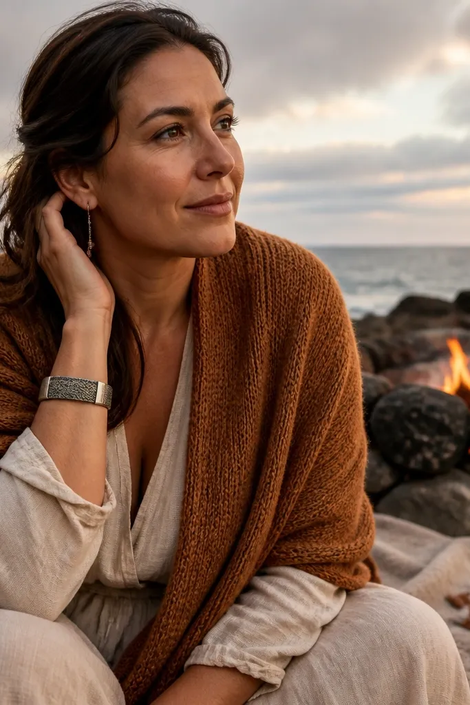
Choose cinnamon as your anchor for the most visible color element — bridesmaid dresses, ceremony fabric, or a floral ribbon. Use oat for neutrals across paper and linens so skin tones look warm, not orange. Add pewter gray in small doses for contrast: candle glass tint, signage ink, or menu accents. For your 3 day itinerary, photograph flat-lay details (rings, menus, candles) on day one so the textures show clearly before the light changes.
Cinnamon is a fall color that reads cozy and photo-friendly, especially in late afternoon light. Oat keeps it soft and prevents the palette from looking too “spice rack.” Pewter gray adds a cool counterbalance that keeps cinnamon from going flat in overcast weather. This palette is perfect for couples who want warm fall tones but still need structure and contrast. It also looks great with textured fabrics like linen and suede-toned accessories.
Skip thisAvoid bright coral; it clashes with cinnamon and makes photos look uneven.
Quick tipUse pewter gray for metal accents; it photographs cleaner than bright chrome outdoors.
13. Navy Ink + Terracotta + Creamy Sand
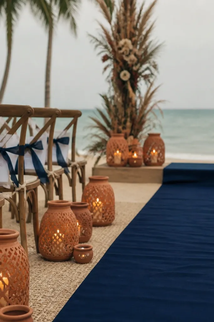
Navy ink is the most reliable dark color for fall beach weddings because it stays readable in both sun and shade. Terracotta adds the fall warmth, while creamy sand neutral keeps the palette from feeling too contrast-heavy. This combo creates depth without losing softness — your photos look crisp, not harsh. It’s a strong choice for couples who want a classic wedding feel with a beach twist. You’ll also get great contrast for portraits against pale sand and light sky.
Start by choosing navy ink for suits or ceremony backdrop elements so the dark tone anchors the look. Then add terracotta as the warm fall accent through florals, bridesmaid dresses, or a ribbon across signage. Finish with creamy sand for linens and paper so the palette looks cohesive and not too “two-tone.” For a 3 day itinerary, plan a portrait session right after arrival so terracotta reads warm while the light is still flattering.
If your venue has lots of wood, use creamy sand neutrals to prevent navy from looking brownish in photos.
Don’t pair navy ink with icy pink; it turns the palette into two separate themes.
14. Olive Drab + Sandstone + Buttermilk
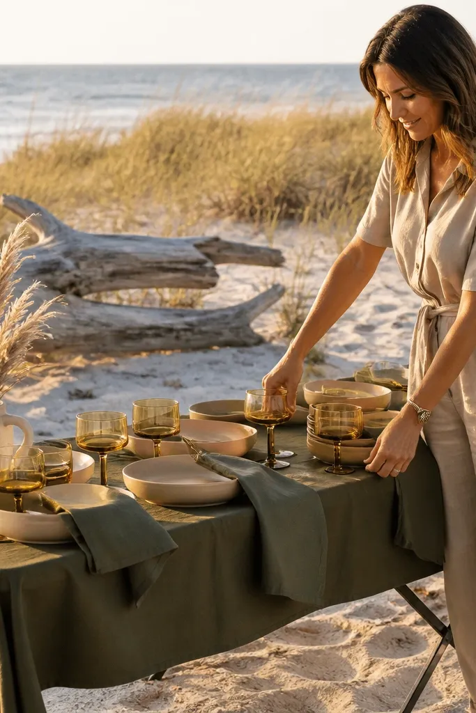
Olive drab gives you a grounded, outdoorsy fall look that still photographs cleanly when you keep the rest light. Sandstone connects your palette to the beach itself, so the scene looks like it was designed for that exact shoreline. Buttermilk is your bright neutral — it keeps olive from looking heavy and helps skin tones stay flattering. This palette is excellent for couples who want a more natural, slightly rugged aesthetic without going full rustic. It also works well with greenery-forward florals and textured ceramics.
Use olive drab for the anchor in dresses, suit details, or ceremony draping. Add sandstone as the secondary color in ribbon, napkins, or small accents so you echo the beach. Keep buttermilk as the neutral across table linens, signage paper, and base layers. For your weekend, do a midday “texture walk” photo session where olive and sandstone show depth against sand and sea — then keep buttermilk items for dinner photos.
Bring buttermilk-colored fabric for chair covers; wind wrinkles look less obvious on lighter neutrals.
Avoid pairing olive drab with bright white; it makes the olive look sickly in coastal light.
15. Sea Salt Blue + Blush Beige + Deep Burgundy
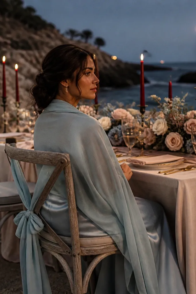
Pick sea salt blue as the anchor for one main element, like bridesmaid dresses or a ceremony color panel. Use blush beige as your neutral across linens, paper goods, and any larger clothing pieces. Add deep burgundy as the accent through ribbon, bouquet wrap, or candle glass. For your 3 day itinerary, schedule one portrait block at sunset so burgundy shows its depth and the sea salt blue stays calm rather than gray.
Sea salt blue keeps the beach identity but feels fall because it’s muted, not bright. Blush beige adds softness and helps the palette stay romantic, not too cool. Deep burgundy is the dramatic accent that makes the whole wedding feel seasonal without turning into a dark winter palette. This is ideal when you want contrast for portraits — sea salt blue against sand reads clean and flattering. It also looks stunning in evening lighting when burgundy deepens and stays rich.
Skip thisSkip bright sky blue; it looks out of season next to fall sand tones.
Quick tipUse burgundy only in small areas — it’s powerful, and too much can make photos look heavy in a beach setting.