1. Pressed Flower Frame with Matte Black Type
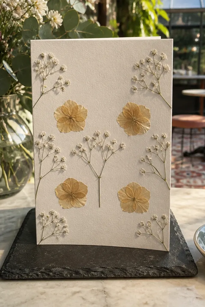
This card looks like a magazine page because the pressed flowers create natural texture while the typography stays clean. Use a single flower variety so it doesn’t look like a messy bouquet; think tiny baby’s breath sprigs or a few flat petals arranged symmetrically. The matte black text keeps it modern and readable against the soft colors of the petals. It suits bridesmaids who like calm, artsy details and it photographs beautifully on light wood tables or linen backgrounds.
Start by drying small flowers between book pages for about 1-2 weeks so they stay flat. Cut a window in a cream 300-350 gsm card (or use a frame sticker) and place the petals behind it, then add a matte black “Will you be my bridesmaid?” line centered. Finish by matching the envelope to the card stock (cream or ecru) and sealing it with a small round sticker that repeats your flower color. If you’re mailing, keep the petals behind a clear adhesive film so nothing lifts in transit.
Spray the final dried petals with a tiny amount of clear fixative only if your local craft store recommends it for paper flowers.
Avoid mixing multiple flower types with different sizes — it turns into a collage instead of a frame.
2. Vintage Postcard Ask with Faux Postmark
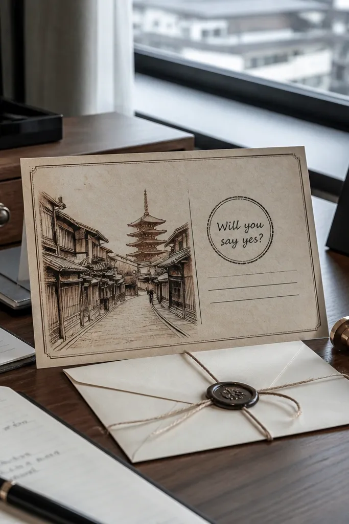
A postcard format looks instantly intentional because it has built-in structure: front image, message area, and a “stamp” zone. Pick a border illustration that fits your wedding vibe — coastal waves, old city streets, or botanical line art. The ask line should sit where the stamp would go, so her eye lands on it first. This works great for destination weddings because it feels like part of the trip story, not a random note.
Choose a 4x6 postcard size card so it feels like a real travel keepsake. Add a printed border and a small “postmark” circle graphic in muted ink tones, then write the ask in a script or serif font in the upper-right stamp area. Put a short personal message on the back panel and include a date line like “You’re invited to the bridesmaid weekend.” To keep costs down, print the front design at home and use a heavier cardstock backer so it doesn’t look flimsy.
Use aged paper colors (tan, sage, faded blue) so the design reads vintage without looking washed out.
Don’t use bright neon colors — they kill the postcard mood and look off in photos.
3. Monochrome Ribbon Banner with Initials
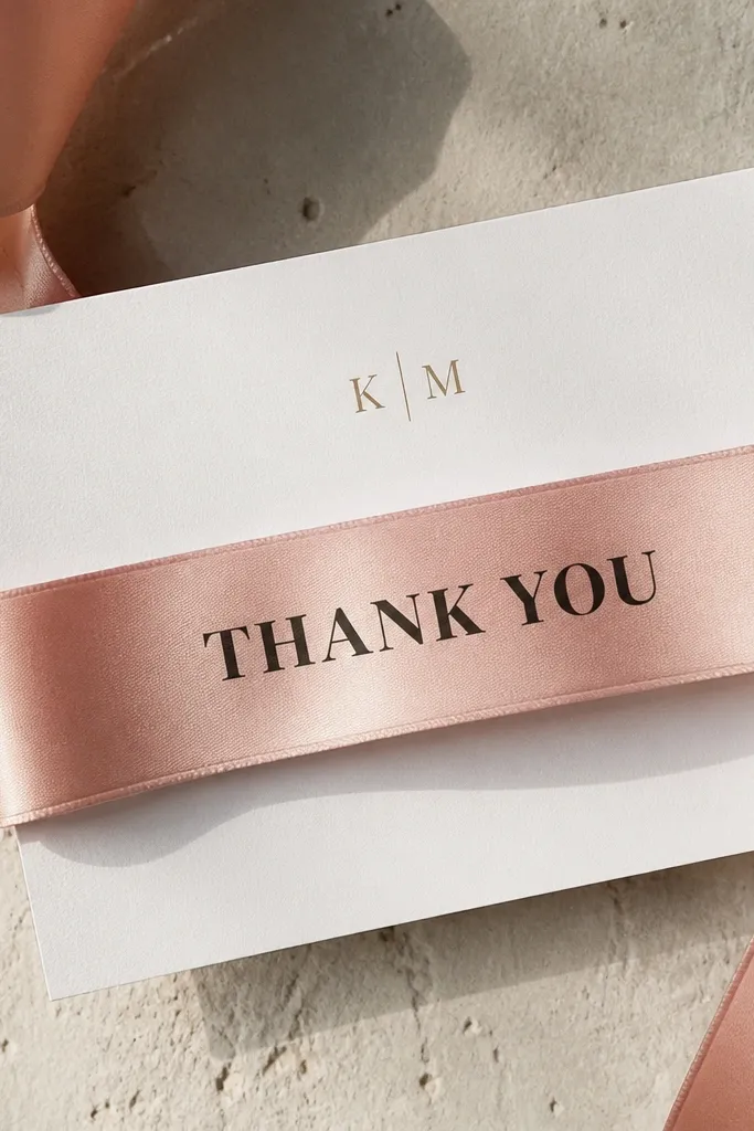
Ribbon banners photograph clean because they create a strong diagonal line across the card. Keep it monochrome: one ribbon color, one ink color, one font family. Add her initials in small caps near the bottom so the card feels personal without clutter. This is a strong choice for bridesmaids who love minimal design, and it looks sharp in both indoor and outdoor light.
Pick a matte ribbon width around 1/2 inch and cut it long enough to form a gentle V over the card. Adhere it with double-sided tape behind the ribbon ends, then print the banner text in a bold sans font in the center. Add her initials in a small type size under the ask, then mount the card on a slightly larger base so the ribbon has breathing room. If you’re mailing, use a flat ribbon finish (no velvet pile) so it doesn’t catch on sorting machines.
Quick tipChoose a ribbon with a matte finish to avoid glare when she takes a photo.
Skip thisDon’t knot the ribbon — the bulk makes the card look uneven and delays delivery.
4. Aerial City Map Silhouette with Gold Foil Dot
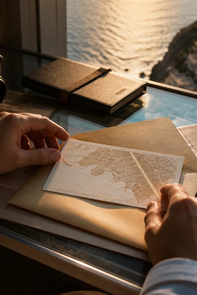
This one looks expensive because map silhouettes give meaning and the gold foil dot acts like a spotlight. Use a simplified outline of your city or venue area, not a detailed street map. The gold dot should land right next to the phrase “Will you say yes?” so the design has a clear focal point. It’s perfect when your wedding has a clear location and you want the ask to feel tied to where you’re going.
Print or laser-cut a map silhouette on a light background card, then layer it slightly offset so it has dimension. Place a single gold foil sticker (or a small foil circle printed element) near the center and write the ask text in dark gray or black. Keep the message short, then add a matching envelope color like soft stone or warm white. If you’re sending by mail, avoid thick layers that exceed standard envelope thickness.
Use one city silhouette only — two maps makes it look like a travel collage, not a designed card.
Skip full street-map detail; it looks muddy at card size.
5. Terracotta and Cream Geometric Blocks
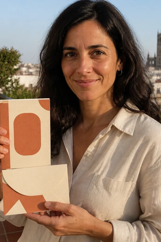
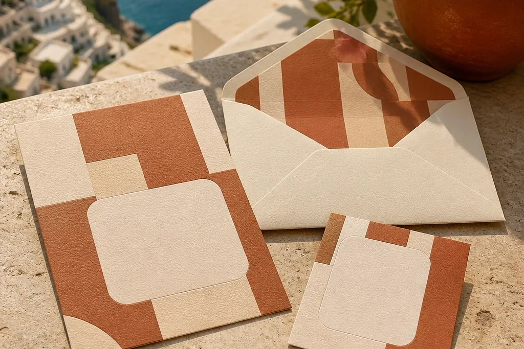
Geometric blocks are the easiest way to get an aesthetic look that still reads fast. Terracotta and cream feel warm and photo-friendly, especially in natural light. Use one block shape for the ask zone — like a rounded rectangle — and keep the rest as supporting shapes. This suits bridesmaids who like modern design and it matches a lot of wedding palettes without clashing.
Start with a cream card base and add 2-3 geometric shapes in terracotta using printed adhesive paper or cut vinyl. Put the ask text inside one larger rounded block and keep the font size big enough to read from across a table. Add a small checkmark icon next to the yes option and leave a blank line for her name. Mail-friendly tip: use flat adhesive shapes and skip raised stickers.
Quick tipUse terracotta that leans slightly orange, not pink, so it looks warm on camera.
Skip thisDon’t use more than two accent colors — three makes it feel like a craft kit.
6. Watercolor Coastline Fold-Out
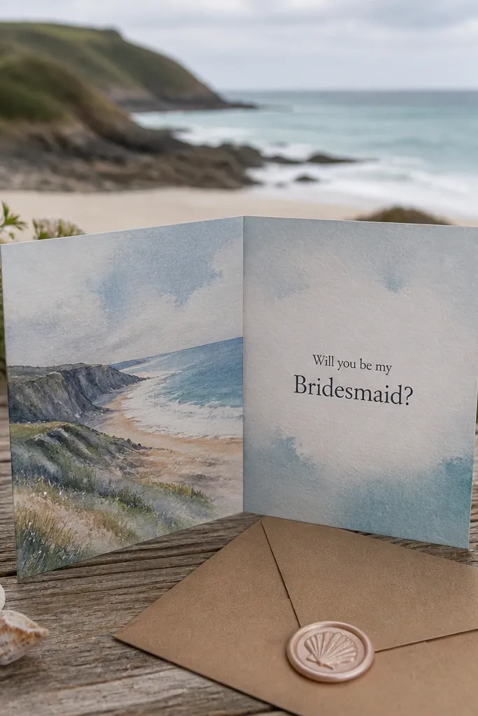
A fold-out card adds drama because it creates a reveal. The watercolor coastline gives movement and soft color bleeding that looks great in photos, especially with a pale envelope. The key is to keep the ask text on the inside panel so it stays crisp and readable against the watercolor. This works best for beachy destination weddings and for bridesmaids who love soft, artsy visuals.
Pick a watercolor coastline design and print it on light cotton-textured paper if you can, or use a high-quality matte photo paper. Create a tri-fold card so the front shows the horizon line and the inside shows the full message. Add a small ribbon belly band in a sand color to hold it closed for shipping. For timing, assemble a test piece first because fold alignment matters for readability.
Use matte watercolor paper so colors don’t glare under flash.
Avoid busy waves behind the text; keep the text area cleaner.
7. Glow-in-the-Dark Night Sky with Constellation Line
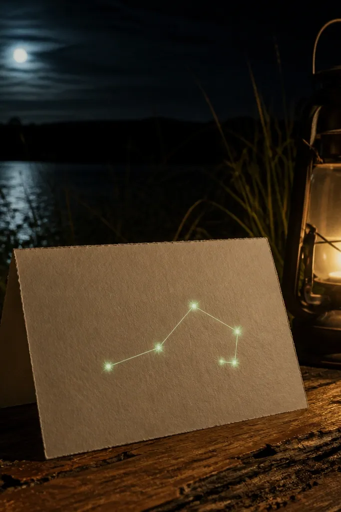
A night sky card is dramatic and photogenic because it creates contrast: dark background, bright constellation lines, and a clear message. Use a thin constellation line that connects 5-7 “stars” so it looks like a deliberate pattern. The ask can be printed in a soft glow color so it looks like it’s part of the sky. This is a fun fit for weddings with evening events, rooftop asks, or anyone who loves celestial themes.
Use a deep navy or black cardstock base and print the constellation line in white or pale silver. Add star dots with glow-in-the-dark paint pens or stickers, then write “Will you be my bridesmaid?” in a clear area with a readable font. Seal it in a matte black envelope to keep the look cohesive. Before mailing, test glow materials under indoor light so the glow lasts long enough for her first look.
Use flash-friendly colors (white, silver, pale gold) so photos don’t wash out the text.
Don’t put the glow text on a busy background — it becomes unreadable.
8. Paper Cutout Bouquet Silhouette
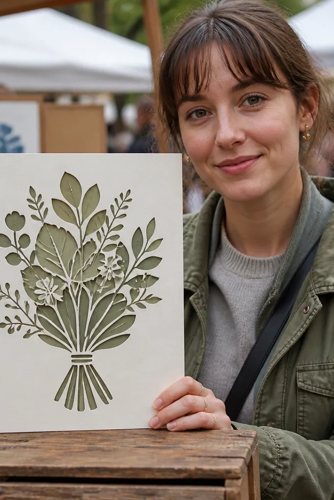
Cutout silhouettes look crisp and modern, not handmade-chaotic. Layer two shades of the same color family (like sage and olive) so the bouquet has depth without looking messy. Place the ask text in negative space around the bouquet so it stays legible. This works for bridesmaids who like graphic design and it photographs well because the edges are sharp.
Cut a bouquet silhouette from colored cardstock (or order a die-cut shape) and layer it onto a contrasting base. Add a small strip at the bottom with her name in a simple serif or sans font. Keep the color palette to two tones plus black or dark gray for text. For delivery, mount the card flat and skip bulky glitter adhesives.
Choose colors that match your wedding florals so the card feels like it belongs to the event.
Don’t add extra tiny cutouts like leaves everywhere — it turns into visual noise.
9. Cream Card with Black and White Photo Strip
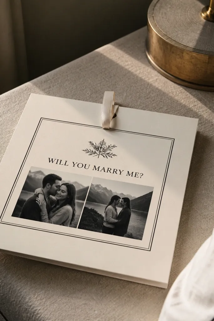
A photo strip makes the card feel personal while still looking clean. Keep it monochrome (black-and-white) so it doesn’t fight your wedding palette. Use one or two photos max, printed small, and place them under the ask so the message stays the hero. This suits bridesmaids you’ve known forever, but the design still looks polished enough for destination trip photos.
Print two small photos in black-and-white and crop them with even margins. Mount the strip on a cream 300-350 gsm card, then add the ask text in bold black above or centered between the photos and the name line. Use a thin black border around the photo strip for structure. Mail-friendly: laminate the photo strip or use matte photo paper so it doesn’t scuff.
Quick tipCrop to faces or hands, not cluttered backgrounds, so the strip reads well at card size.
Skip thisDon’t use color photos — they often clash with envelope colors in pictures.
10. Terrarium Frame with Tiny Botanical Sprigs
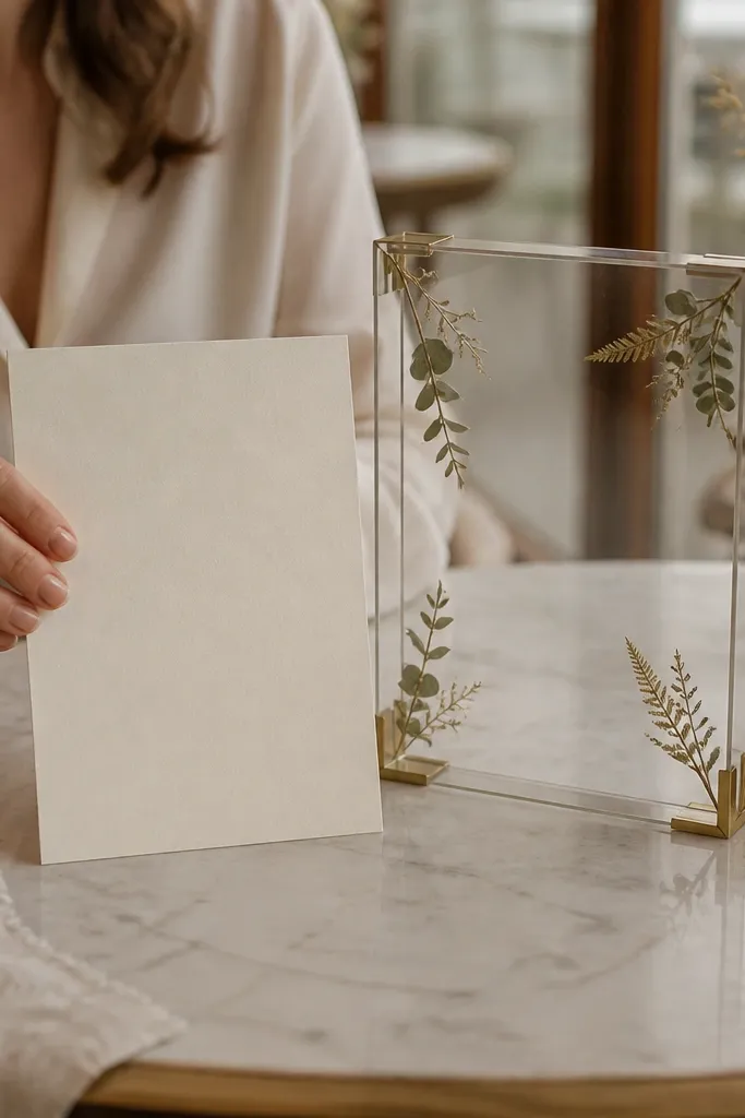
Terrarium frames look like a mini scene, which is why they photograph so well. The illustration gives structure while the tiny sprigs add realistic texture. Keep the sprigs small and sparse — one or two per corner — so the card stays elegant. This is a great pick for spring asks and for bridesmaids who like nature without full-on pressed flowers.
Start with a printed terrarium frame on thick cream cardstock. Place tiny sprigs behind a clear adhesive window or use a frame sticker that holds them flat. Add the ask text in a clean font inside the “glass” area, then include her name in a slightly larger size. Choose a sage envelope or natural kraft envelope so the colors match without extra work.
Use sprigs with thin stems so they lie flat after you place them.
Avoid heavy greenery clusters — they look stuffed and hide the text.
11. Monogram Wax Seal Sticker with Simple Tag
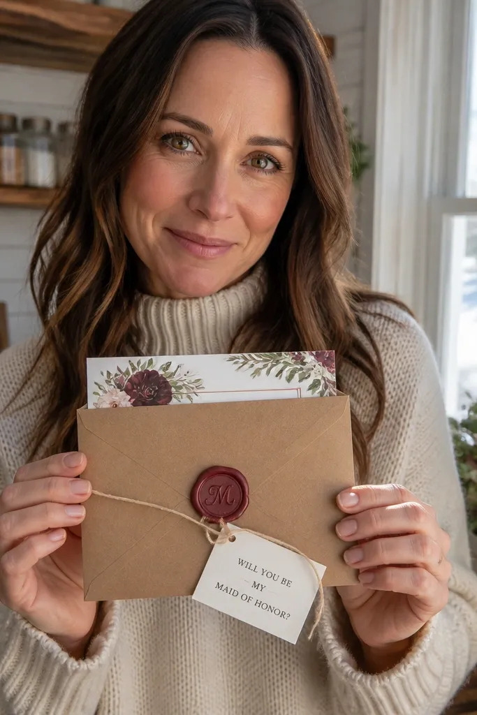
Wax seals look instantly elevated in photos, but you don’t need a real wax pour. A monogram seal sticker gives that same old-world vibe with less mess and lower risk for mail. Pair it with a small tag that holds the ask line, so the message stays centered and readable. This is perfect for a crisp, classic aesthetic and for bridesmaids who like traditional details.
Choose a cream or ivory card base and print clean text in black or charcoal. Add a round monogram seal sticker at the top right and attach a small rectangular tag under it with the main ask line. Write the “yes” option on the tag and keep the rest minimal. For mailing, keep the seal flat and avoid raised ribbon elements that can catch or peel.
Quick tipUse the same monogram letter style on both the seal and the name line for consistency.
Skip thisSkip glittery gold seals — they often look sparkly and messy on camera.
12. Sage Green Envelope Liner Reveal Card
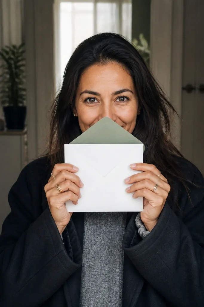
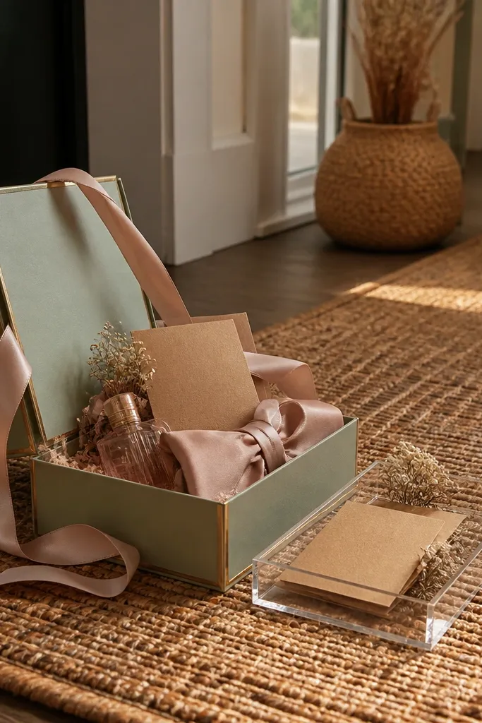
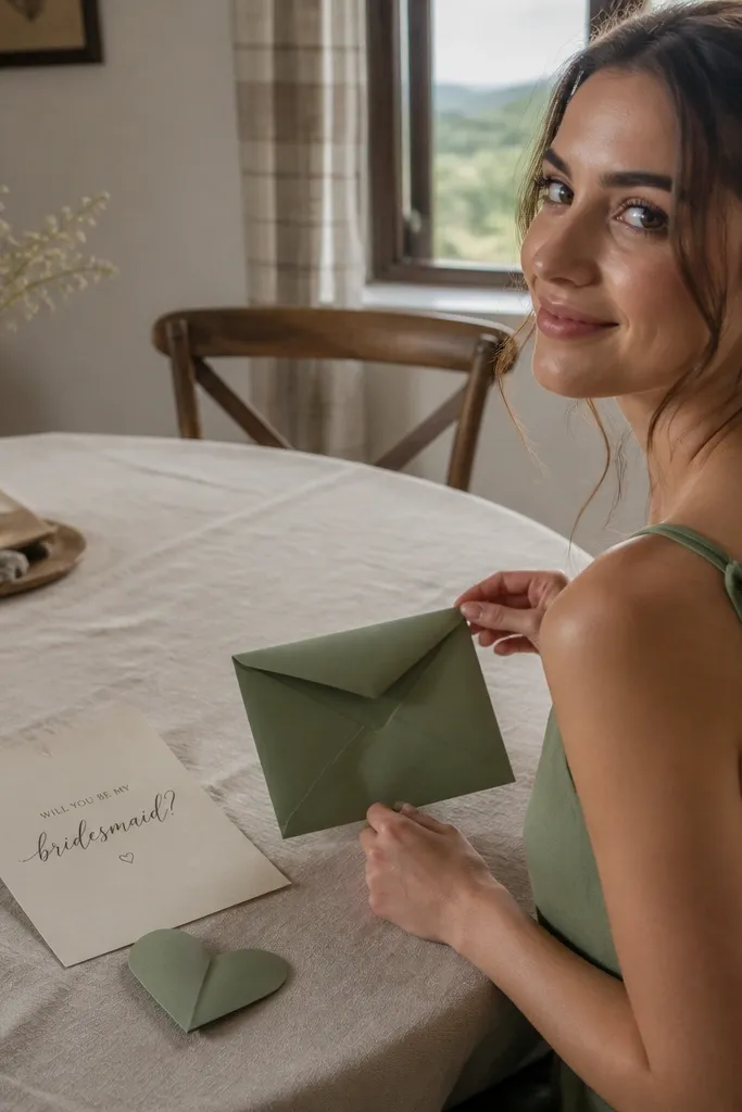
This idea wins because the reveal happens during unboxing. The card itself can be minimal, but the sage liner color creates a strong aesthetic moment when she pulls the card out. It’s also practical: you can keep the card flat for shipping and still make it feel special. This is a great match for weddings with sage, olive, or botanical palettes.
Pick a minimal card design with the ask text centered and printed in one ink color. Cut matching envelope liner paper and glue it inside the envelope, leaving a clean border. When she opens it, the liner frames the card and makes the photo look styled. Add a small sticker on the envelope flap that repeats the liner color so the whole set feels intentional.
Test the liner color against your card base under daylight — sage can swing green-gray fast.
Don’t use a liner pattern with tiny details; it can look muddy in photos.
13. Hotel Keycard Insert with Mini "Stay With Us" Ask
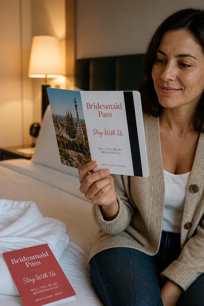
If your wedding has a travel weekend vibe, a keycard-style insert makes the ask feel like part of the trip. The visual is clean: a rectangle with a photo panel, a magnetic strip graphic, and bold “Bridesmaid Pass” wording. The best part is clarity — it’s obvious what she’s holding and why. This is ideal for destination weddings where you want the bridesmaid role tied to staying together.
Use a standard card base and attach a keycard-shaped insert on the inside or front. Print a faux keycard design with a photo strip and a clear “Will you be my bridesmaid?” line. Add her name where the keycard name would go, then include a date for the wedding weekend on the back of the insert. To keep it mail-safe, keep the insert thin and use a plastic sleeve only if you’re hand-delivering.
Choose a keycard color that matches your wedding palette so it looks coordinated, not random.
Don’t cram the insert with tiny numbers; it reads like a prop instead of a thoughtful card.
14. Tropical Leaf Line Art with Color-Block Title
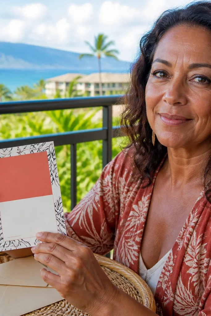
Leaf line art looks sharp and modern, especially when you keep the ink black and let one color block carry the mood. Use a single bright accent like coral, turquoise, or sunny yellow for the title area. The rest should be clean spacing so the card feels airy, not crowded. This is a strong pick for beach destinations, garden venues, and bridesmaids who like bold, playful design.
Print or draw leaf line art on the left or top edge of a white card base. Add a color-block rectangle across the center where the ask line sits in white or dark ink for contrast. Include her name in small caps under the ask in the same ink color as the leaf art. For assembly, use matte adhesive so the color block doesn’t peel in humidity.
Quick tipUse matte colors, not glossy — glossy accents cause glare in photos.
Skip thisAvoid multi-color leaf art; it looks like clipart when printed small.
15. Sunset Gradient Panel with Silver Foil Name
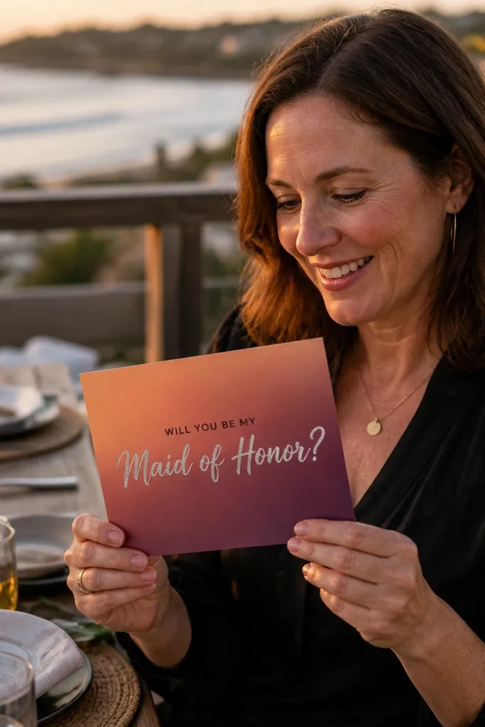
Gradient panels look cinematic, and silver foil adds a premium finish without being flashy. Keep the gradient simple: one diagonal sunset sweep, no extra icons. Put her name in silver foil on top of the gradient so it catches light when she tilts it. This card is perfect for destination asks with evening dinners, coastal sunsets, or any palette built around peach and blush.
Use a matte card base and print a smooth sunset gradient panel that covers only the center area. Place a silver foil sticker or foil-printed name across the gradient, then add the ask text in a dark gray or black strip beneath it. Keep the typography to two styles: one for the ask, one for her name. If you’re mailing, avoid thick foil edges that can scratch other items in the envelope.
Quick tipLeave a small border of plain card around the gradient so the design doesn’t look like a full-bleed poster.
Skip thisDon’t add extra sparkles or icons — the gradient already does the heavy lifting.
16. Botanical Border with One Bold Flower Stamp
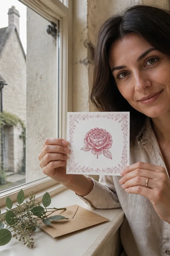
A thin border frames the whole card and makes it feel finished, even if the central element is simple. Use one bold flower stamp in the center — like a rose, peony, or wildflower — and keep the rest as delicate line art. The contrast between thin border lines and one bold stamp reads clean in photos. This works for bridesmaids who love classic stationery and for weddings with floral themes that aren’t overly modern.
Choose a 5x7 or 4.25x5.5 card size so the border has room. Print a botanical border in a muted green or gray, then place one bold flower stamp illustration at center. Add the ask text in a serif font directly under the stamp, and include her name in a script-like font smaller than the main ask. Use a matching envelope with a simple address label so the whole set looks like stationery.
Print borders in a light ink tone so they don’t overpower the flower.
Avoid full floral pattern backgrounds; they swallow the text.
17. Geode Slice Accent with Clear Acrylic-Style Layer
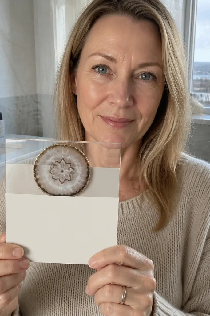
Geode slices look gorgeous because they have natural symmetry and light-catching surfaces. The trick for an aesthetic proposal card is to keep the geode image small and place it near the top, then let the text sit on a clean, matte area. Add a clear layer effect on top of the ask line so it looks like glass without making the card bulky. This fits glam weddings, winter color palettes, and anyone who loves crystals.
Print a geode slice image and crop it into a clean oval or hexagon shape. Add it to the upper third of a matte card base, then place the ask text in the center on a plain panel. Use a thin clear sticker sheet or a clear label with the text underneath for a glassy look. Keep materials flat for mailing, and seal the envelope with a sticker that matches the geode’s highlight color.
Use matte cardstock under the clear layer so the text stays readable instead of glare-y.
Don’t cover the whole card with geode — it becomes a wallpaper effect.
18. Minimal Black Card with White Script and Tiny Photo Dot
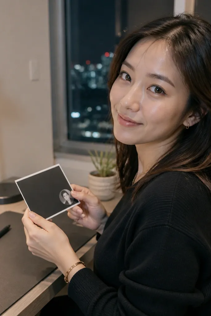
Minimal black cards are photogenic because they create strong contrast. Keep the design sparse: one line of white script, her name in a simple sans, and a single tiny photo dot in one corner. The photo dot is small enough to feel like a detail, not a collage. This is a great choice for modern bridesmaids and for weddings with clean, black-and-white branding.
Use a black 300-350 gsm card base and print white text in one script style plus a simple sans for her name. Add a circular photo sticker or printed circle photo near the top corner. Keep spacing generous so the typography breathes. For delivery, use a sturdy envelope and avoid glitter tape or raised elements that can leave marks on the card face.
Quick tipTest your printer’s white ink or use white vinyl lettering so the text looks crisp, not gray.
Skip thisAvoid multiple font styles — two is enough for a clean look.
19. Lavender Sprig Corner with Soft Lilac Wash Background
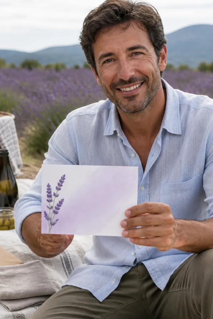
Lavender sprigs in one corner feel delicate and intentional, and the soft lilac wash background keeps it airy. The key is to keep the sprig in a single corner so the card feels balanced, not crowded. Use crisp dark text so the message stays readable against the pastel wash. This suits spring and early summer asks, especially if your wedding palette includes lavender, lilac, or soft purple tones.
Create a soft lilac wash background using a light watercolor print or a printed gradient that fades toward the bottom. Place a small dried lavender sprig in the top-right corner, then add the ask text in dark ink centered. Include her name in a slightly larger size under the ask. For mailing, seal the sprig behind a clear film so it doesn’t shift.
Quick tipKeep the sprig small; small lavender reads elegant on camera.
Skip thisDon’t cover the whole background with heavy watercolor texture — it blurs the text.
20. Cinematic Film Strip with "Scene: Bridesmaid"
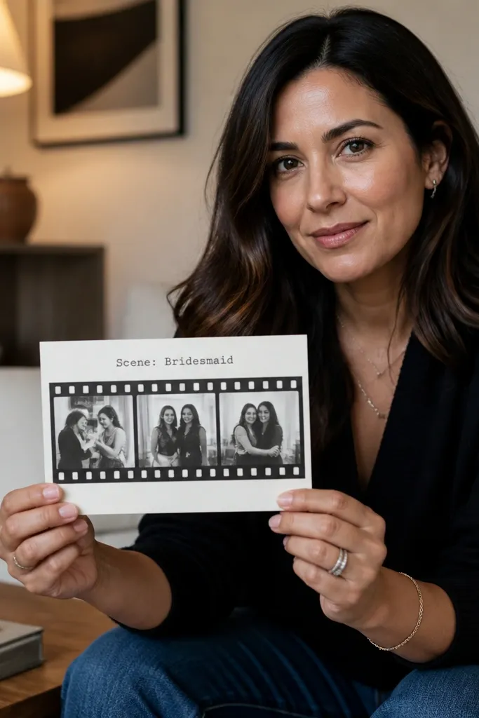
A film strip adds a storybook feel and looks great because it has built-in repetition. Use 3 small frames of your favorite moments together, then add a title like “Scene: Bridesmaid” above the ask. Keep the frame edges dark and the background light so the card doesn’t look heavy. This suits bridesmaids who love movies, photos, and a playful but stylish aesthetic.
Print a film strip template with 3 or 4 small frames and crop your photos for consistent spacing. Mount the film strip across the middle of a light card base, then print the ask line centered beneath it in bold type. Add her name in a small label style at the right side of the film strip. If you’re hand-delivering, you can add a tiny paper clapboard sticker for extra charm; for mailing, skip raised stickers.
Use consistent photo crop sizes — uneven frames make it look sloppy fast.
Avoid too many photos; three frames looks designed, five looks like a slideshow.
21. Folded Map Coordinates with Ribbon Bookmark
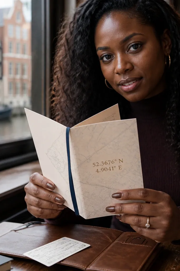
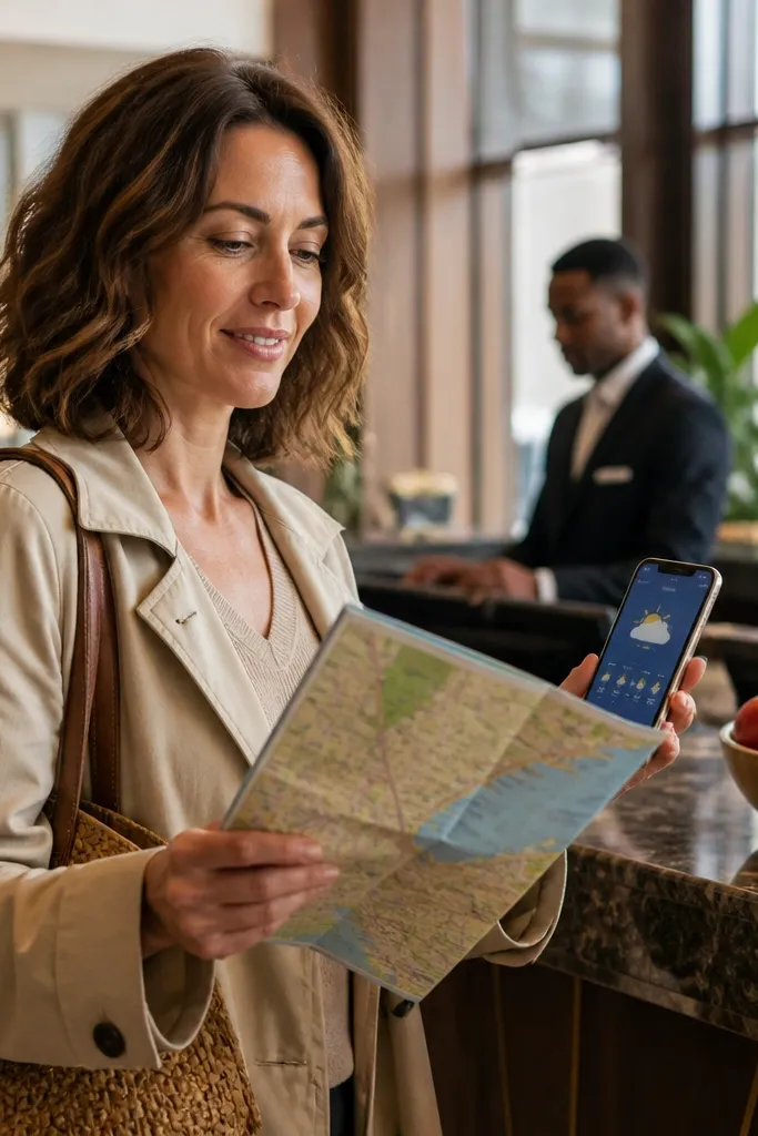
Coordinates look intentional because they’re specific, not generic. Folded map paper gives a travel feel, and the ribbon bookmark turns the card into something she’ll keep. Put the wedding location coordinates on the front and the ask on the inside so the reveal stays satisfying. This is a strong fit for destination weddings and for bridesmaids who love travel details.
Print a simple map background (no dense street text) and place the coordinates in a clean type block. Fold the map paper like a mini accordion or a simple trifold so it opens to reveal the message. Tie it with a thin ribbon that matches your wedding palette and attach the ribbon ends flat with tape. For shipping, keep the fold tight and use a rigid mailer if the ribbon is thick.
Quick tipUse coordinates in a readable format like 40.7128, -74.0060 — no abbreviations.
Skip thisDon’t use a full map with tiny labels — it becomes illegible once folded.
22. Color-Blocked Envelope + Matching Card Set
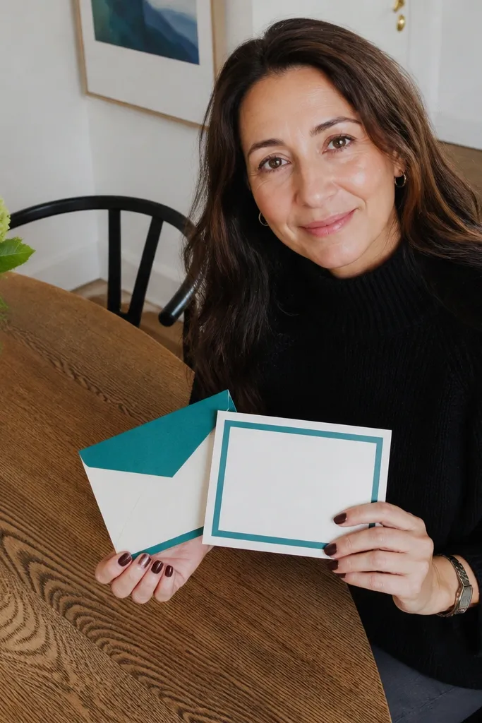
A color-blocked set looks cohesive because the envelope is part of the design, not an afterthought. Choose one stripe color and repeat it on the card as a frame or banner. When she takes a photo, the whole package looks like a planned stationery suite. This suits modern weddings with clean palettes and it works for both mail and hand-off.
Pick a stripe color like deep teal, dusty rose, or mustard and use it on both the envelope flap and the card. Print or apply a single stripe on the envelope front, then add a matching frame stripe on the card’s edge. Place the ask text centered in a contrasting ink color so it pops. Keep the design to two elements: the stripe and the text, so it doesn’t look busy.
Quick tipUse the same paper finish on the envelope and card (both matte) to avoid glare differences in photos.
Skip thisAvoid patterned stripes; solid color keeps it clean and photogenic.
23. Sunrise Time Table with "Departure to Yes"
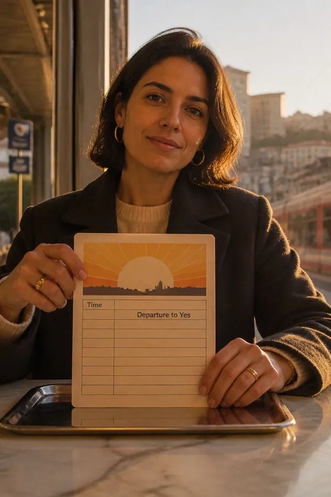
This idea looks quirky in a good way because it borrows from travel signage. A sunrise time table design feels like a plan for a weekend, and the ask line sits where a departure time would go. It’s visually structured, which makes it readable even when the card is photographed quickly. This suits destination wedding weekends and bridesmaids who like playful stationery.
Design a simple grid with 3-4 rows labeled like “Meet,” “Sunset,” and “Departure to Yes.” Put the main ask text in the last row and include her name as a small header. Use a gradient header (peach to light pink) and keep the grid lines thin gray. Assemble on a sturdy card base and use a thick envelope so the grid stays flat. For cost control, print the grid at home and add only one accent sticker.
Quick tipKeep the grid text large enough to read without zooming in photos.
Skip thisDon’t add too many rows; 3-4 keeps it stylish, not busy.
24. Matte Vellum Overlay with Underlayered Name
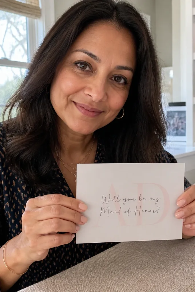
Vellum overlays add a soft, boutique look because the light passes through them. The best aesthetic trick is underlayering: print her name on the solid card, then place vellum over it so the name shows through slightly and feels layered. The ask text can sit on the vellum in a darker ink so it reads but still looks airy. This is perfect for upscale wedding vibes and it photographs beautifully in window light.
Use a solid card base and print her name on the center. Add a matte vellum rectangle on top, secured with a small corner adhesive so it drapes without wrinkles. Print or write the ask on the vellum in dark gray or black so it stays readable. For delivery, keep vellum pieces flat by assembling in a clear sleeve or using a rigid outer envelope.
Quick tipUse matte vellum, not glossy — glossy causes glare that hides the text.
Skip thisAvoid large vellum sizes; oversized vellum wrinkles easily in transit.
25. Paper Star Map with Coordinates and "Yes, Please"
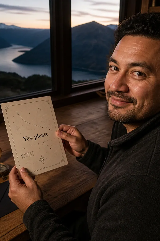
A star map card feels like a keepsake because it’s visually patterned and reads like a real travel artifact. Keep the design clean: a constellation line, a few star dots, and a coordinate block. Then put “Yes, please” in a bold type in the center so the message is unmissable. This is a strong pick if you want something romantic but still graphic and modern.
Design or print a star map background on a light card base and add a coordinate block in the lower third. Draw or print a constellation line connecting 5-7 stars near the center. Place “Yes, please” large enough to read in one glance and add her name beneath it. Use a dark envelope or a color-matched envelope so the star map doesn’t look washed out.
Quick tipChoose one constellation, not several — too many lines make it look like a chart.
Skip thisDon’t use tiny star labels; they disappear in card photos.