1. Pressed-Flower Letter with Deckled Edge Frame
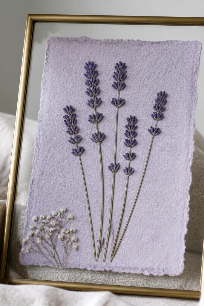
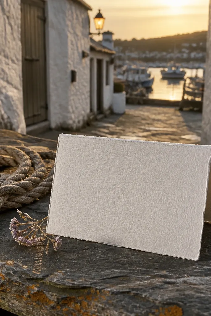
This idea looks expensive because it mimics boutique wedding stationery: tactile paper, real botanicals, and a clean frame that makes the keepsake feel curated. Use a pressed flower that matches your palette, like dried lavender for lilac tones or a small baby’s breath cluster for airy whites. The letter should include a single line that names the bridesmaid and a short “why you” message, then end with a note about keeping the flower. It’s especially meaningful if your group has shared moments tied to nature, spring, or outdoor weekends.
Quick tipPress flowers for at least 7-10 days under books, then handle with clean tweezers so petals don’t smear.
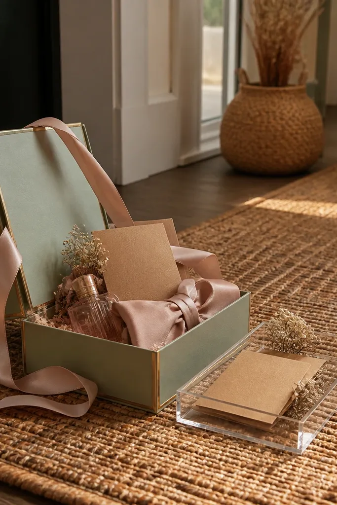
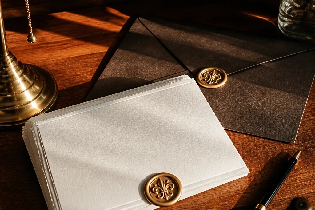
Step 1: Choose cotton-feel or textured paper in cream or soft blush, then cut to A6 and use an envelope in matte ivory or sage. Step 2: Press a small bloom, place it in a clear sleeve sized so it doesn’t float, and adhere the sleeve to the letter with two tiny corner dots. Step 3: Seal the envelope with a wax sticker in a muted tone (dusty rose or deep green) and add a matching return address label. Keep the message to 6-10 lines so the flower stays the visual star.
Skip thisDon’t use glossy flowers or bulky inserts — they catch glare and make the letter look homemade.
2. Monogram Wax Seal Letter on Deep Green Paper
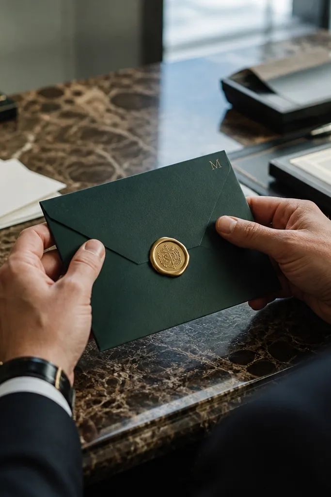
If you want the “luxury invitation” look without extra clutter, go monogram-forward. Deep green paper feels instantly premium, and a single gold monogram in the top corner reads like a formal invite. The letter body should be minimal: a greeting, a specific reason she’s your person, and a clear proposal line. Add the date and location for your first bridesmaid plan, even if it’s just “your first event together.” This works best for bridesmaids who like clean, classic aesthetics and for winter proposals.
Quick tipUse a thick gel pen for the handwritten line so it doesn’t bleed through textured paper.
Step 1: Buy textured deep green paper (or print on it) and cut to 5x7, then use a cream matte envelope. Step 2: Add a gold vinyl monogram sticker or heat-transfer style letter in the top left, leaving at least 1 inch of margin. Step 3: Seal with a wax sticker in black cherry or espresso and include a matching gold address label. Write the message in two font styles only: one serif for the main line and one sans for small text.
Skip thisSkip busy borders — two elements (monogram + seal) is what makes it look expensive.
3. Tiny Map Letter with "Our Route" Notes
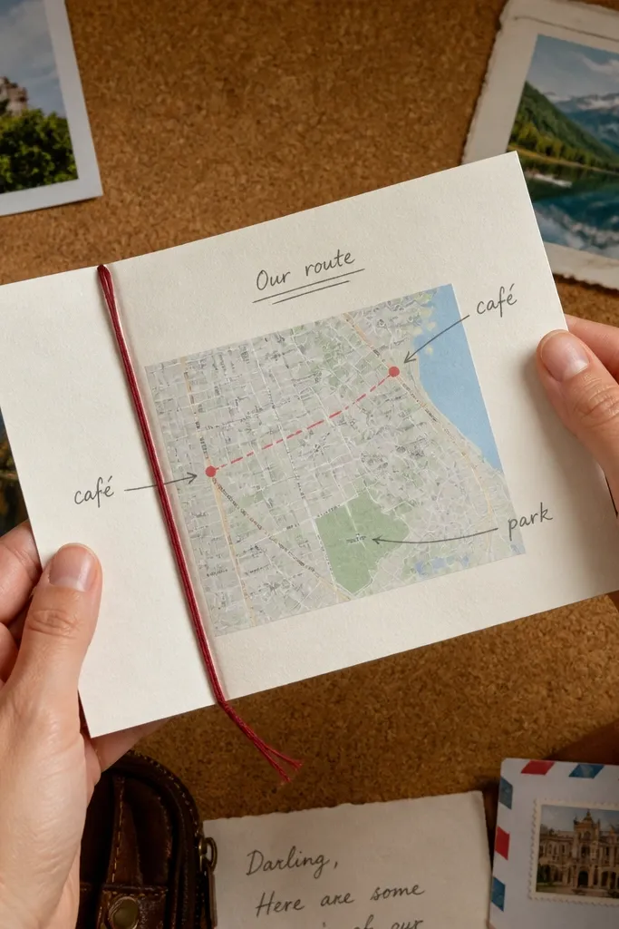
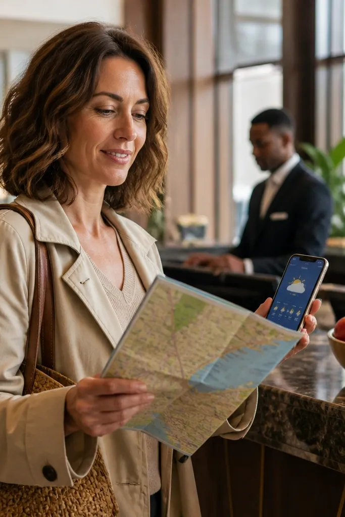
This one looks high-end because it turns a simple letter into a mini travel keepsake. Use a map of a place you both love — a hometown street, a favorite café neighborhood, or the area where you met. The letter includes a “Our route” section with short handwritten notes pointing to two or three spots. It feels meaningful because it’s personal and specific, and it photographs well since the map gives visual structure. It’s perfect if your bridesmaids are into travel, city weekends, or planning trips.
Step 1: Print a simple map on 90-110 gsm paper, then trim it to a small rectangle that fits in the letter (around 3x4). Step 2: Write short route notes on top with a black fine-tip pen, adding arrows and tiny dot markers. Step 3: Mount the map insert with a thin strip of double-sided tape at two sides only so it lies flat. Finish by adding a small line drawing of a compass rose in the corner of the main letter.
Choose maps with minimal labels so they don’t look messy once printed and framed by handwriting.
Don’t use a low-resolution map print — blurry text makes the whole letter look cheap.
4. Ticket-Stub Style Letter with a "Next Stop" Reveal
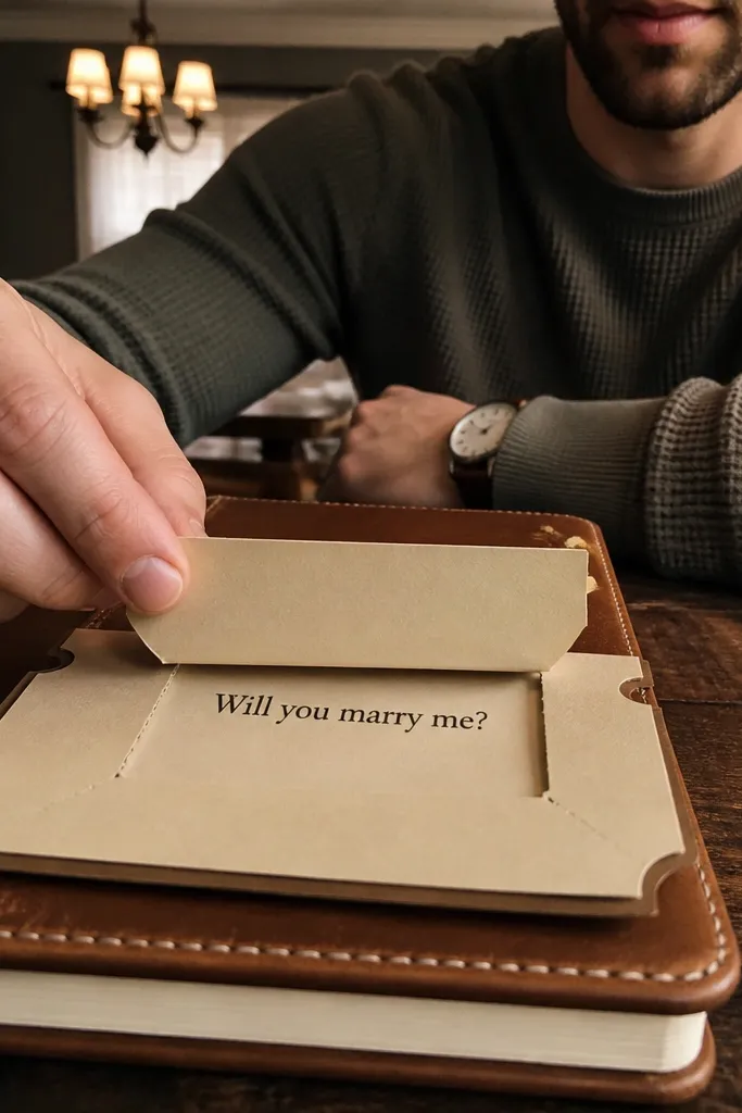
Ticket-stub design looks expensive because it adds a collectible format and a built-in reveal. The letter looks like something you’d keep, not something you’d toss after reading. Create a stub-style header with a faux perforation line, then tuck the main message behind a pull-tab. When she opens it, the proposal line appears like a “next stop.” This is meaningful for bridesmaids who love events, shows, or planning outings.
Quick tipUse cardstock for the pull-tab so it slides smoothly without bending.
Step 1: Format the letter as a 5x7 with a ticket header strip and faux perforation edges (use a consistent dotted line). Step 2: Add a pull-tab belly band: write the proposal line on a strip of cardstock and attach it so it slides out 2-3 inches. Step 3: Use a satin ribbon (burgundy or dusty pink) as the tab accent and seal the envelope with a small round sticker. Keep the main letter text short and reserve the best line for the pull-out.
Skip thisAvoid long paragraphs on the front — the reveal loses impact when there’s too much to read.
5. Handwritten Letter on Vellum Sleeve with Foil Name
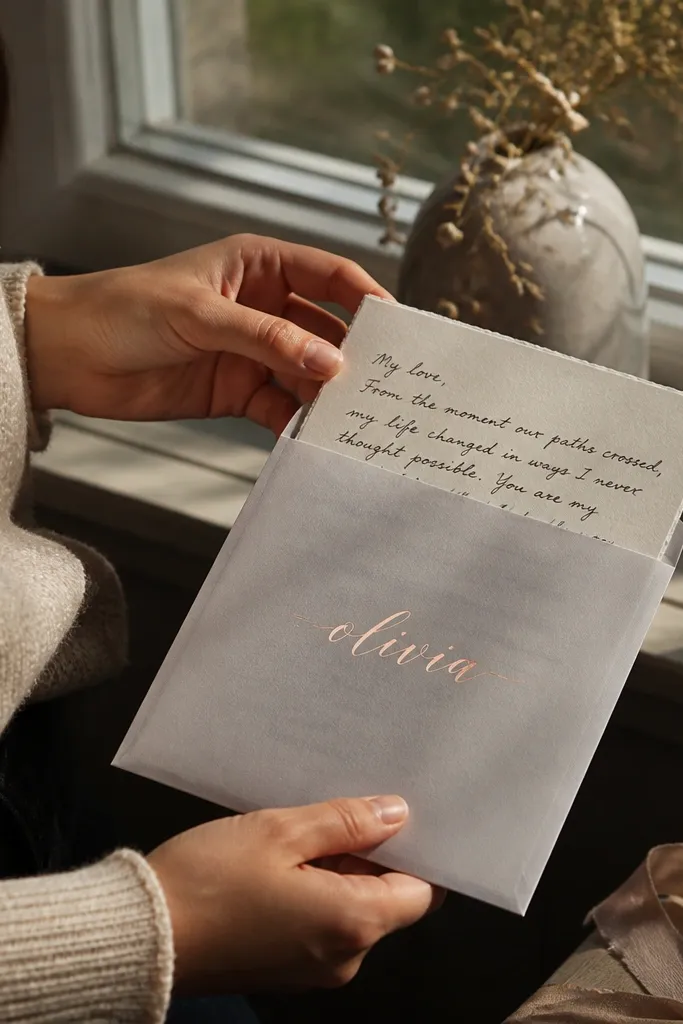
Vellum instantly reads “expensive stationary” because it layers light. Put your handwritten message on the letter, then slide it into a vellum sleeve that has her name in foil on the outside. The vellum makes the ink look softer and more intimate, especially in photos with warm lighting. This works well for bridesmaids you want to feel personally addressed, and it’s gorgeous for spring and fall proposals. Keep the overall palette to one: warm white, champagne, and one accent color.
Quick tipUse a smooth-writing pen so ink doesn’t skip on vellum edges.
Step 1: Print a 5x7 base on thick cardstock, then write your message with archival black ink. Step 2: Cut vellum to fit as a sleeve and apply a foil name label centered on the front. Step 3: Insert the whole piece into a matte envelope and seal it with a small wax sticker that matches the foil. Add one tiny icon (a single star or leaf) in the corner to keep it from looking too plain.
Skip thisDon’t tape vellum all the way around — the wrinkles make it look messy.
6. Art Print Letter with One Line Drawing Border

This is the cleanest “looks expensive” option because it looks like a small gallery print. Use a single-line border drawing that matches your wedding vibe: a simple arch, a bunch of flowers, or a passport frame. Put the proposal message in the center with handwritten emphasis on one sentence. The border gives structure and makes the letter look designed rather than typed. It’s ideal if your bridesmaids like modern design and you want something that doesn’t rely on inserts.
Quick tipPrint the border in a light grey so it looks like ink, not like a heavy graphic.
Step 1: Choose thick cream paper and set your layout with 1-inch margins so the center has room. Step 2: Add a one-line border printed in charcoal grey, then place your handwritten line in the exact middle. Step 3: Use a matte black envelope and a small wax sticker or seal label at the flap. Keep fonts to one serif and one sans, and avoid extra icons.
Skip thisAvoid multiple illustrations in different styles — the mismatch kills the premium look.
7. Rose-Gold Foil Script with Blush Envelope Set
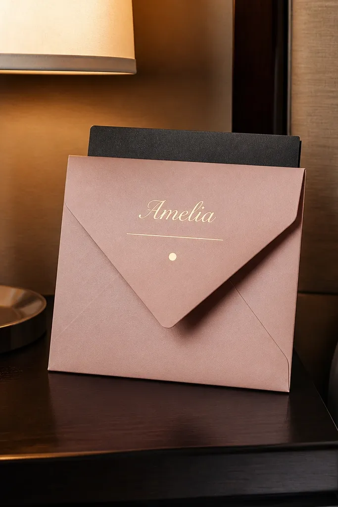
Foil script reads expensive fast, but it only works when it’s restrained. Put her name in rose-gold foil at the top and keep everything else simple in black or deep espresso. Add a thin gold line under the name and one small gold dot divider before the proposal sentence. This feels meaningful because the name feels “kept,” like a place card moment. It’s perfect for a romantic palette and for bridesmaids who love glam without being flashy.
Step 1: Use a white or ivory textured card base (A6 or 5x7) and a blush matte envelope. Step 2: Apply rose-gold foil for the name only, then print the rest in a single clean font. Step 3: Add one gold detail — a thin rule line or a tiny corner flourish — and seal the envelope with a blush-toned sticker. Write one handwritten line in deep espresso to make it feel human.
Use foil sparingly. One line of foil beats full-page foiling every time.
Don’t add glitter pen everywhere — it looks costume-y under flash.
8. Layered Belly Band Letter with Hidden Side Message
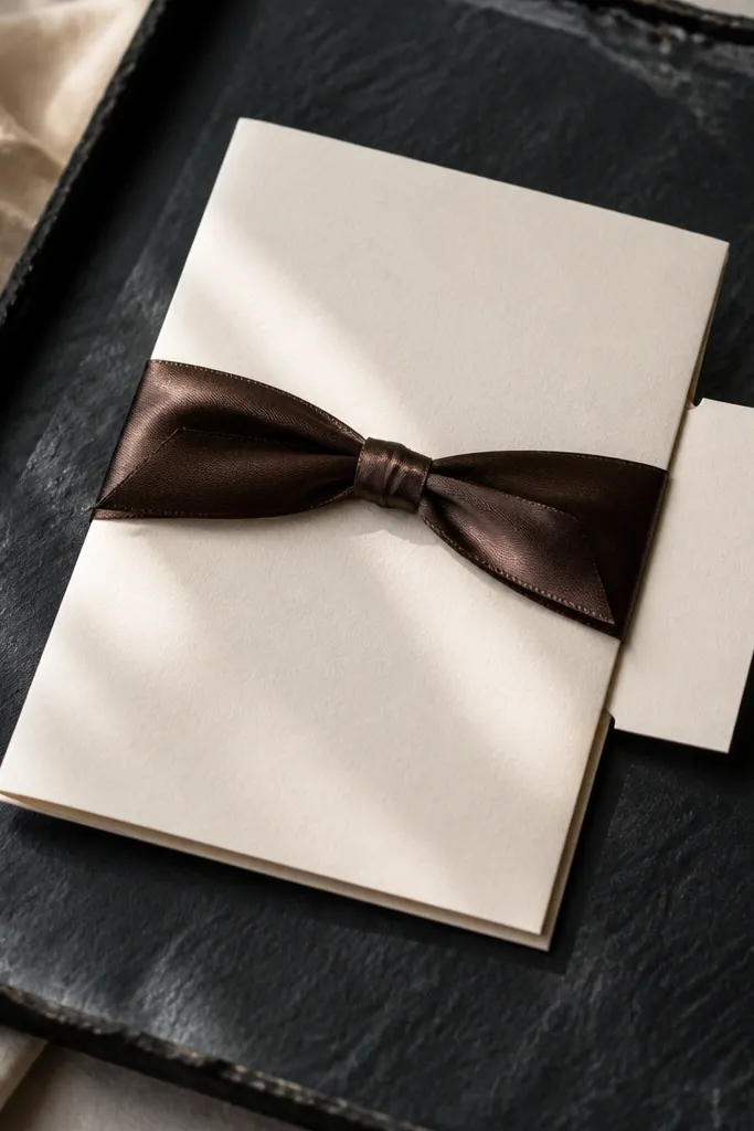
A belly band makes the letter look like a packaged set, not a single sheet. The trick is a hidden side message: write a short “you’re my person because...” line on a small strip under the band so it reveals when she slides it off. The main letter stays clean, and the surprise stays tucked. This is meaningful because it adds a moment of attention before she reads. It also photographs well because belly bands create layers and shadows.
Quick tipIf mailing, choose a slightly wider envelope so the band doesn’t compress and wrinkle.
Step 1: Use a 5x7 letter with a thick cardstock base, then wrap a belly band around it using a ribbon or satin paper band. Step 2: Place a thin hidden strip under the band that sticks out 1 inch on the side. Step 3: Seal the envelope around the packaged letter with a small round sticker so the band stays in place during mailing. Keep the hidden strip short so it feels like a secret, not a second letter.
Skip thisAvoid flimsy paper bands — they crease and make the whole set look fragile.
9. Monochrome Photo Strip Letter with Date Stamp
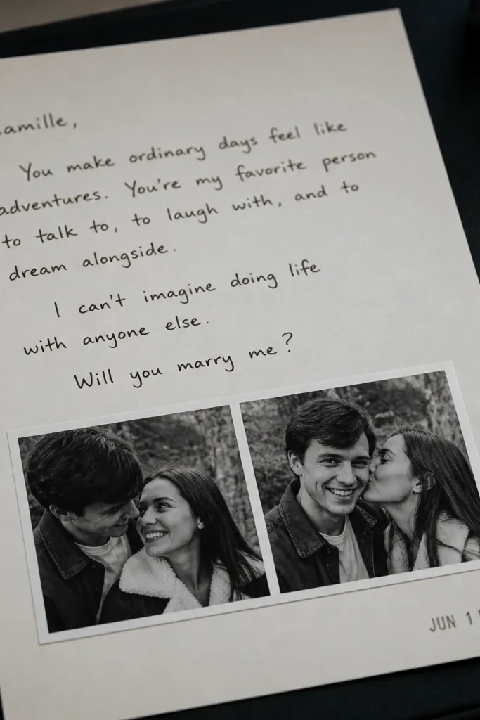
A monochrome photo strip looks expensive because it turns the letter into a small memory reel. Use 2-3 black-and-white mini photos cropped to show faces or a shared moment, then mount them as a strip on the lower third of the letter. Add a stamp-style date in the corner and write the proposal message above it. It’s meaningful because it ties the ask to a specific memory. This works best when you want a sentimental tone without writing a long essay.
Quick tipCrop photos tightly and remove busy backgrounds so the strip looks like design, not a snapshot.
Step 1: Print 2-3 mini photos in black-and-white on photo paper, then trim to a consistent height (around 1 inch). Step 2: Mount them as a strip and add a faux stamp date using a simple circular stamp graphic. Step 3: Place the strip on a textured cream letter and leave a big blank area above for the main message. Seal in a matte envelope and keep the overall palette monochrome with one accent like muted gold.
Skip thisSkip color photos — they look less premium in this layout and can overpower the text.
10. Embossed Cream Card with Raised Wax-Style Sticker
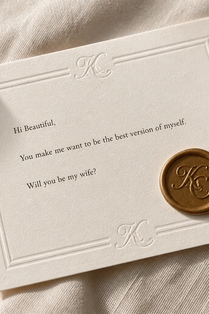
Embossing reads expensive because it adds dimension you can feel, not just see. Start with a cream embossed card where the border or monogram is slightly raised. Pair it with a raised wax-style sticker for a second texture layer. The letter content should stay tight and clean: greeting, why her, proposal line, and one line about what you’ll do first together. This is a strong choice for formal, classic bridesmaids and for proposals that need to feel “invitation-level.”
Step 1: Choose an embossed card base or emboss a simple monogram on a cardstock letter (use a template so it’s centered). Step 2: Add black typography with generous margins and a single accent line in gold or deep green. Step 3: Use a raised wax-style sticker at the top flap of the envelope and match it with a small address label. Keep the ink dark and matte so it doesn’t glare in photos.
Use a ruler and pencil lightly for alignment before final printing so the emboss stays perfectly centered.
Don’t add extra stickers — emboss + seal already gives you the expensive texture.
11. Satin Ribbon Wrap Letter with Cutout Window Card
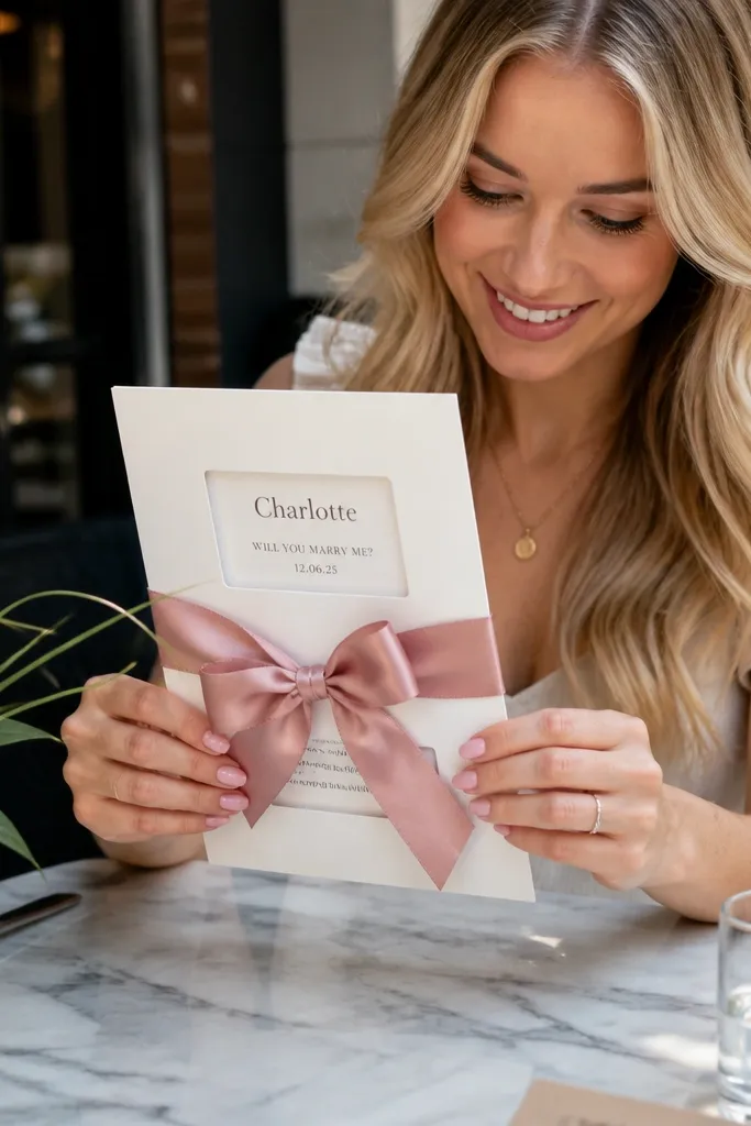
This one looks like a gift, not stationery. A cutout window lets the reader see a hint of the message before opening, and the satin ribbon adds that “boutique purchase” feel. Build the letter so the window shows her name in neat type or your proposal date. The inside holds the full message on thick paper. It’s meaningful because the reveal feels playful, and it’s photogenic because ribbons create movement and highlights.
Quick tipTie the bow off-center so it photographs with a natural angle instead of sitting flat.
Step 1: Use a 5x7 card with a small window cutout on the front and attach a message strip behind it. Step 2: Wrap the closed card with satin ribbon (burgundy, champagne, or dusty rose) and tie a simple bow on the side. Step 3: Put the ribbon-tied card into a clear sleeve or a rigid mailer if shipping, then seal the outer envelope. Write the main message inside in a clean font with one handwritten line for warmth.
Skip thisAvoid thin ribbon — it collapses and makes the card look like party favors.
12. Black Card Letter with Gold Ink and Tiny Star Motif
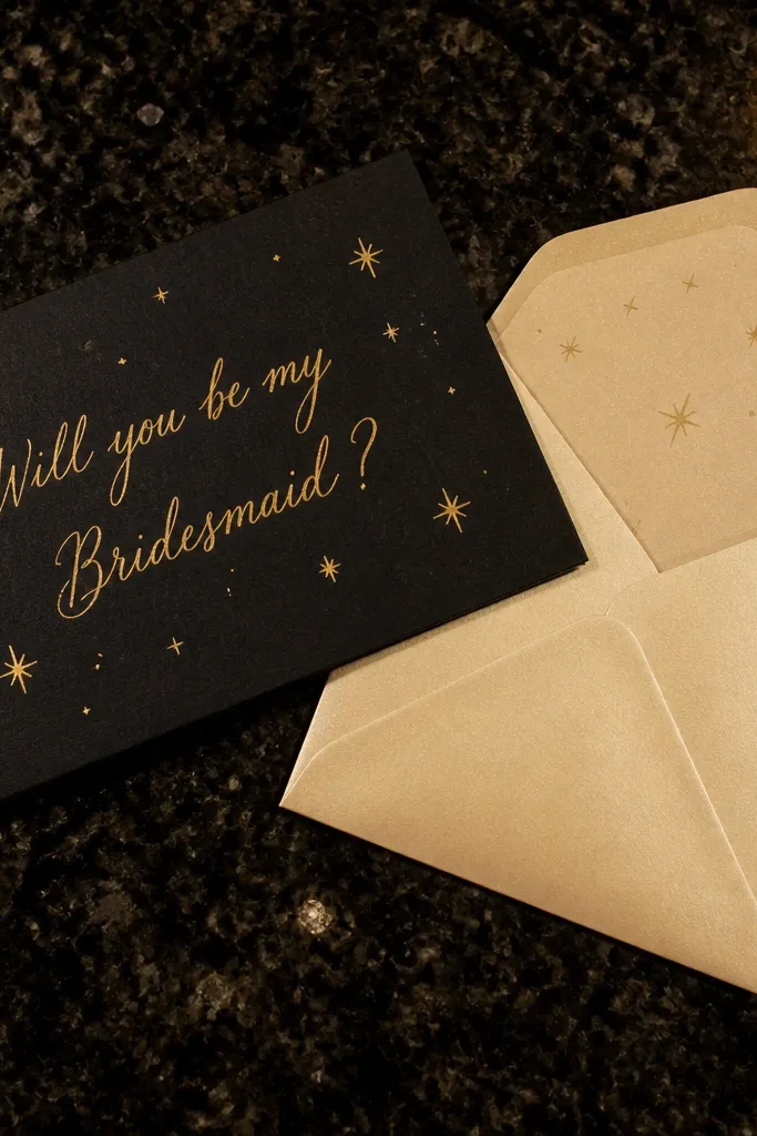
A black card letter looks expensive because it creates high contrast and makes gold ink pop. You don’t need much design — a single gold star motif and one gold handwritten line is enough. Keep the envelope lighter (cream or champagne) so the set looks intentional as a pair. This style is meaningful when your group loves nighttime plans, city lights, or a “going out” vibe. It also photographs beautifully because the black background makes text look crisp even on phone cameras.
Step 1: Use black textured cardstock in A6 or 5x7 and print the main message in a clean white or cream font. Step 2: Add gold ink for the proposal sentence and include a tiny star motif in one corner. Step 3: Seal in a champagne matte envelope and add a gold address label. Keep the letter short so the gold sentence stays the hero.
Test your gold ink on your paper before you commit — some pens look dull on textured stock.
Don’t use too many colors — black + gold only works when you keep it tight.
13. Botanical Border Letter with Watercolor Wash Header
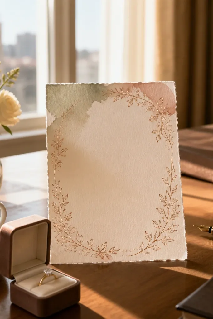
This looks expensive because the header wash gives it that art-stationery feel while the botanical border stays subtle. Use a watercolor wash in muted tones like sage, dusty pink, or soft terracotta, then draw a thin botanical border in the same color family. Place the proposal message in the center with dark espresso type so it’s readable. It’s meaningful because the design feels personal but not cluttered. This fits bridesmaids who like soft, feminine aesthetics and proposals in spring and early summer.
Step 1: Choose thick white paper and add a watercolor header strip across the top (keep it thin, about 1.5 inches). Step 2: Print or draw a light botanical border around the edges, leaving the center open. Step 3: Use matte envelopes in the closest matching tone and seal with a simple sticker or wax dot. Write the best line by hand in espresso ink so it feels warm.
Let the watercolor dry fully before writing — smudges ruin the premium look.
Skip heavy full-bleed watercolor — it makes the letter look like craft paper.
14. Travel Passport-Style Letter with Faux Immigration Stamp
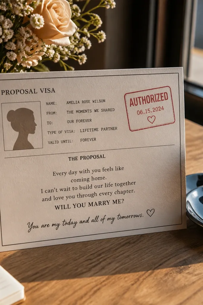
Passport-style design looks expensive because it’s structured and instantly recognizable, like a premium travel accessory. Create a faux “visa” panel that includes her name, then add a stamp graphic like “AUTHORIZED” or a date. The letter message sits in the center in clean typography, with a short handwritten line to personalize it. It’s meaningful because it frames your bridesmaid ask as an entry into your wedding journey. This works especially well if you’re doing destination vibes or if your friend group loves international trips.
Step 1: Format a 5x7 card with a passport-like layout: top header, name panel, and a central message block. Step 2: Add a faux stamp graphic in muted ink (black or deep olive) and keep it small so it doesn’t look like a gimmick. Step 3: Print on thick cardstock and use a matte cream envelope with a simple return label. Seal with a small wax dot and include a tiny “passport control” style line at the bottom.
Use a stamp color that matches your ink (deep olive with olive accents) so it looks like one system.
Don’t make the stamp neon — it reads like party decor.
15. Letter Set with Folded Map Pocket and Mini Photo
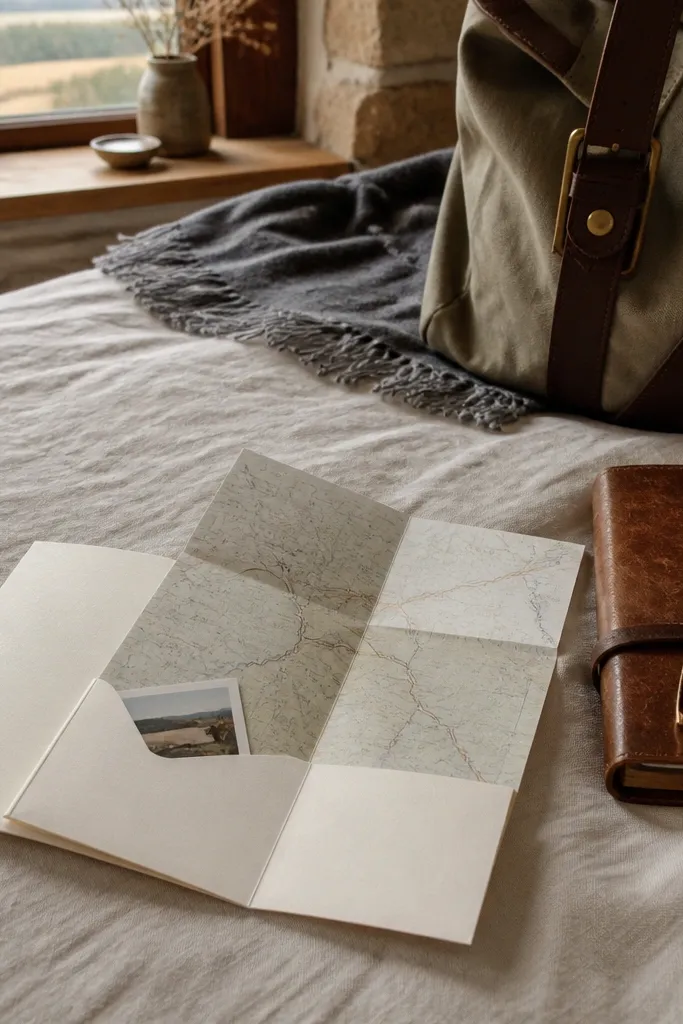
A pocket letter looks expensive because it adds a functional keepsake element. You’re not just writing — you’re packaging a mini memory with a map and a photo. The outside stays clean, but when she opens it, she finds a folded map card and a tiny photo tucked into the pocket. That surprise makes the proposal feel intentional and personal. It’s meaningful when you want to reference a place that matters and keep the overall tone cute but not childish.
Quick tipMake the pocket from slightly heavier cardstock so it holds shape during mailing.
Step 1: Use a 5x7 folded card and add an interior pocket made from matching cardstock (about 3 inches deep). Step 2: Insert a folded mini map card and a 2x3 mini photo behind the pocket flap so it pulls out easily. Step 3: Write the main message on the front panel in clean type and add a small handwritten line on the inside. Seal the envelope with a sticker that matches your map color (muted olive or warm terracotta).
Skip thisDon’t overstuff the pocket — thick inserts make envelopes bulge and look messy.